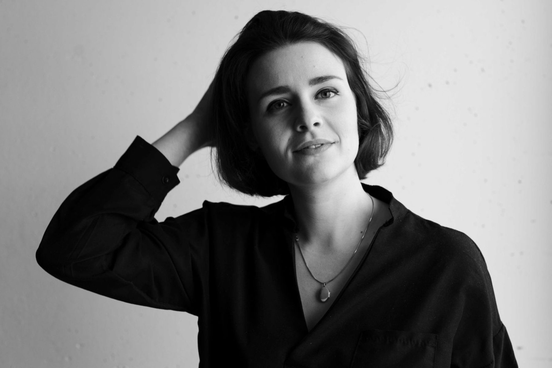
Behind Brands™: An interview with Marion Murvine from uppercase.
How did you get into the world of brand identity design?
I think the earliest thing that I can think of is genuinely loving letters and shapes! I remember seeing ancient Egyptian hieroglyphics that captivated my imagination, middle-age manuscripts that had the most illuminated and intricate little designs on every page, and calligraphy in a general sense has always been mesmerising to me. For my own creativity, I can remember going to Christmas parties for my mom’s job at the U.N. and the only way I could communicate with the other children was through our drawings. Which has and always will be, to me, magic.Marion Murvine. From there it is a lifetime of art, music, and anything that inspired me. I went on to study art direction and innovation in Geneva, Switzerland which is what put me on this career pathway.
Is there a perfect brand identity brief? What does it look like?
If there is such a brief, I don’t think it has ever fallen into my lap, at least not yet. The briefing can take so many different forms; from a keynote, to a pdf, to a simple chat at a cafe. Personally, I will always prefer meeting the client and discussing their project to fully understand what their brand means to them. During the meeting I love observing the client’s tone of voice, their body language, and what they emphasise — it often kicks off my creative process. I believe that being a good designer is being a good observer, highlighting details, and telling the right story.
Could you tell us briefly how the design process usually looks like at uppercase?
The design process at uppercase always starts with a nice cup of coffee, a pen, and a piece of paper. We often write down some of the keywords that were used by the client during the meeting. We also describe precisely the feeling that we want to give; from colors that come to mind, to references, to the tone of voice, we lay down on paper our first impressions and whatever starting point we can come to. Then come the mood boards. We take inspiration from everything; photographs, films, books, even going as far as looking at nature catalogues from the ’40s for illustrative work that inspires us.
From there we lay the groundwork for what the design will be and build on it and make iterations until it is a finished product that we know says exactly what we want it to say.
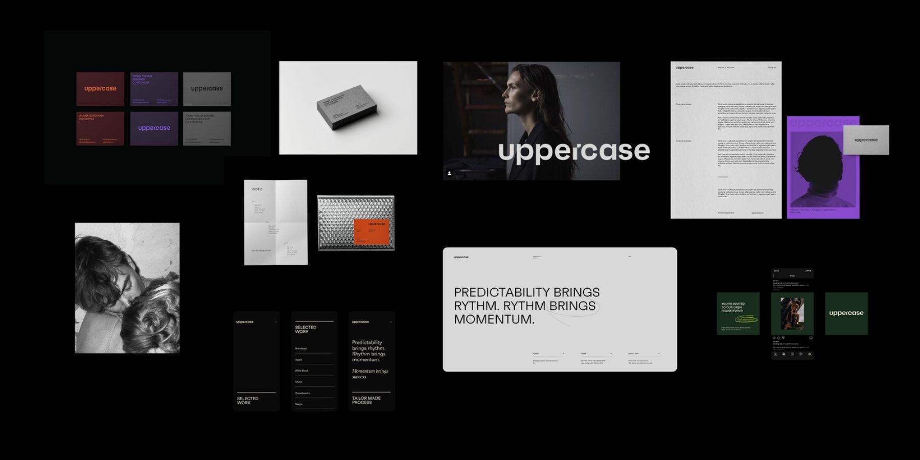
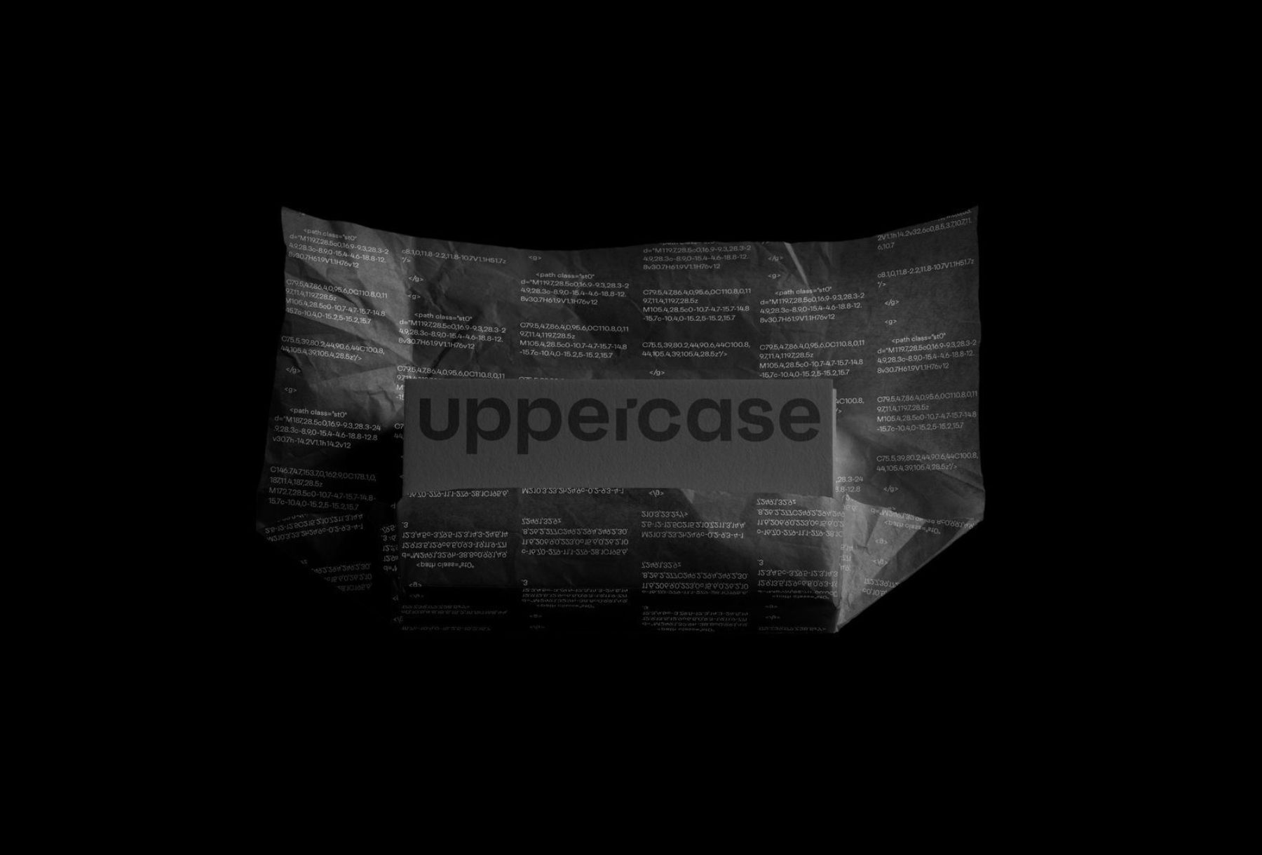
You recently rebranded your own brand identity. How do you creatively approach a project like that — from beginning to end? How is branding yourself different than branding a client?
When the team first started to talk about our rebranding, I had a certain vision in mind, yet the more I would work on it, the more questions it would raise. There is a reason why rebranding yourself is the most challenging project. It brings up the questions you have been feeling comfortable leaving out unanswered. Are we too techy? Do we lose clients by being more edgy/raw? How do we fit within the market? What are we trying to say? These questions were left unanswered for over a year before we finally landed on our logo. At the time I had already produced around five full rebrands, that all got this feedback “they are nice but…maybe…is that us?…it’s close…”
This project was a true quest of identity and the one project that will stick with me throughout my career. Going from such an open canvas to such a defined brand was a true personal success.
How was the team put together — and how many people are usually involved in a project?
I started working on the project alone at first with design crit sessions with my fellow designers Tommy Borgen and Daniel Tveiten. Later on, Tommy and I decided to fully commit to the rebranding in long after-hours workshops to wrap it up.
On a daily basis, we often work alone or in pairs and spar with the rest of the team through design review sessions.
What is your preferred client/studio relationship or process when working on a brand identity?
I don’t have a preferred client or studio relationship, but I do enjoy being in close collaboration with the people I work with. It is important for me to create a positive work environment in order for my creativity to strive.
What does uppercase do differently than other agencies in regards to brand identities?
I think there is no answer that wouldn’t sound cliche, but I think that with the way the brand identity is now we have captured lightning in a bottle.
Our agency is deeply rooted in the tech world, which allows us to have a seamless process within the different mediums. It allows us to elevate ideas to life quickly. If we want to work with sound generated patterns for an album cover, animation based on face recognition or typography distortions based on user input, we can. We look to ourselves to push existing boundaries, and boundaries we set ourselves.
Has brand identity design changed in recent years? What do you expect for the future?
I think brand identity design has definitely changed. Now everyone can technically create a brand, you can download a pre-made logo in less than a minute, everyone can take pictures with their phones, and even promote themselves on social media.
There is a lot of noise, and therefore I find it even more important to share and promote quality design, inspire others, and not forget about the craftsmanship the field requires. We are living in a fast-paced era of mass imagery production that forces us, designers, to continuously push boundaries. The true excitement for the past five years has been the growth of motion design, sound design, and AR.
As for the future, I can’t wait to help build it!
What are your thoughts on brand guidelines? How do they fit into the process?
Brand guidelines can be seen as a really tedious task by some designers, but I have always loved systems and order.
I started using Brandpad a couple of years ago, and since then it has reduced so many frictions during the handover process. The client has direct access to its assets and can easily share the link to the printer, developers if needed.
Before I would spend days creating the pdf and I felt the guidelines were not going to be used, I don’t have this fear anymore. During this “Corona time”, it has also helped to be able to collaborate online in a visual way.
Do you have a truth/manifesto/mantra you follow when working on identities — and what is uppercase’s?
For uppercase we do have a little saying, Tommy often says “All night, full fire” from the countless evenings sparring on design and typography while listening to music. I think that defines pretty well uppercase’s design team.
As for myself, I look to the late great King of Rock and Roll, Elvis Aaron Presley, “T.C.B”.
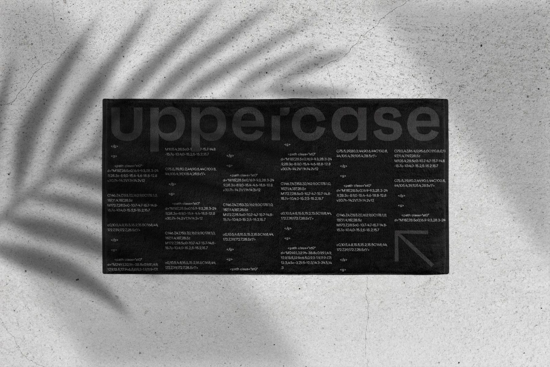
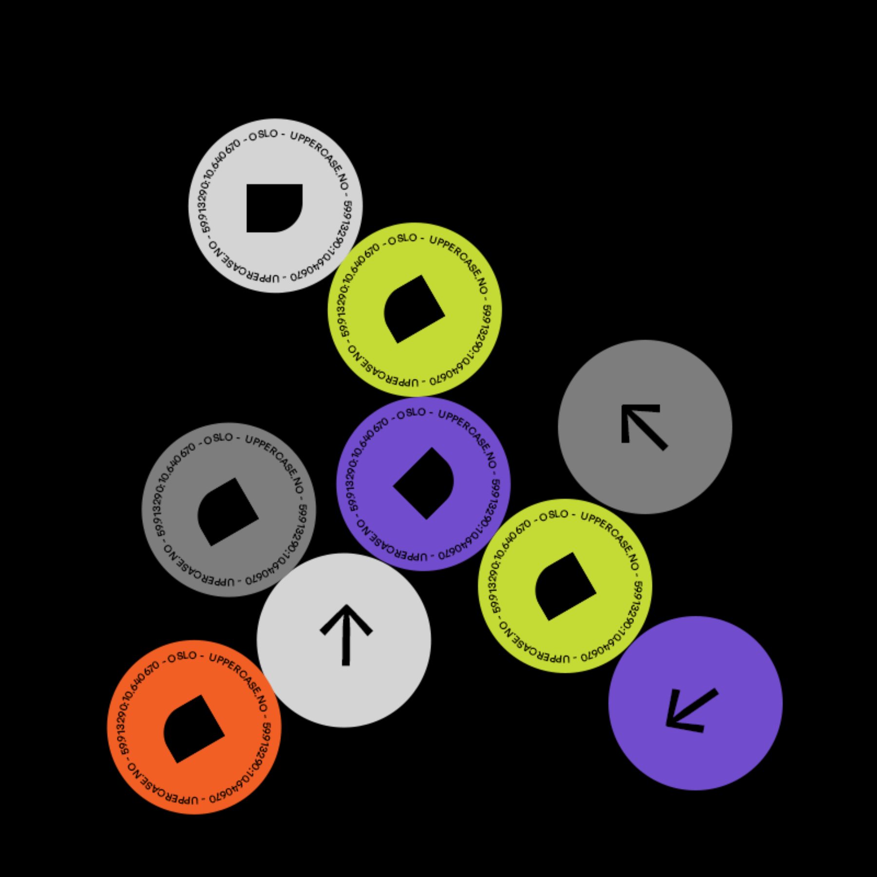
Marion Murvine is a talented young graphic designer working at uppercase, a digital design studio run by a passionate team of designers, developers, thinkers, and doers, who strive to help ambitious companies to adapt, adjust, and succeed. You can read more about them here, or check out Marion’s Instagram profile.