BenvenutI!
The Palazzo sub-brand stands as strong and confident as our winged lion. As such, it is imperative to follow a predefined set of rules that can ensure consistency, relevancy, and recognizability when used in all forms of communication. This guide explains how to properly use all of our brand assets and covers topics like logo usage, color systems, typography, and tone of voice.


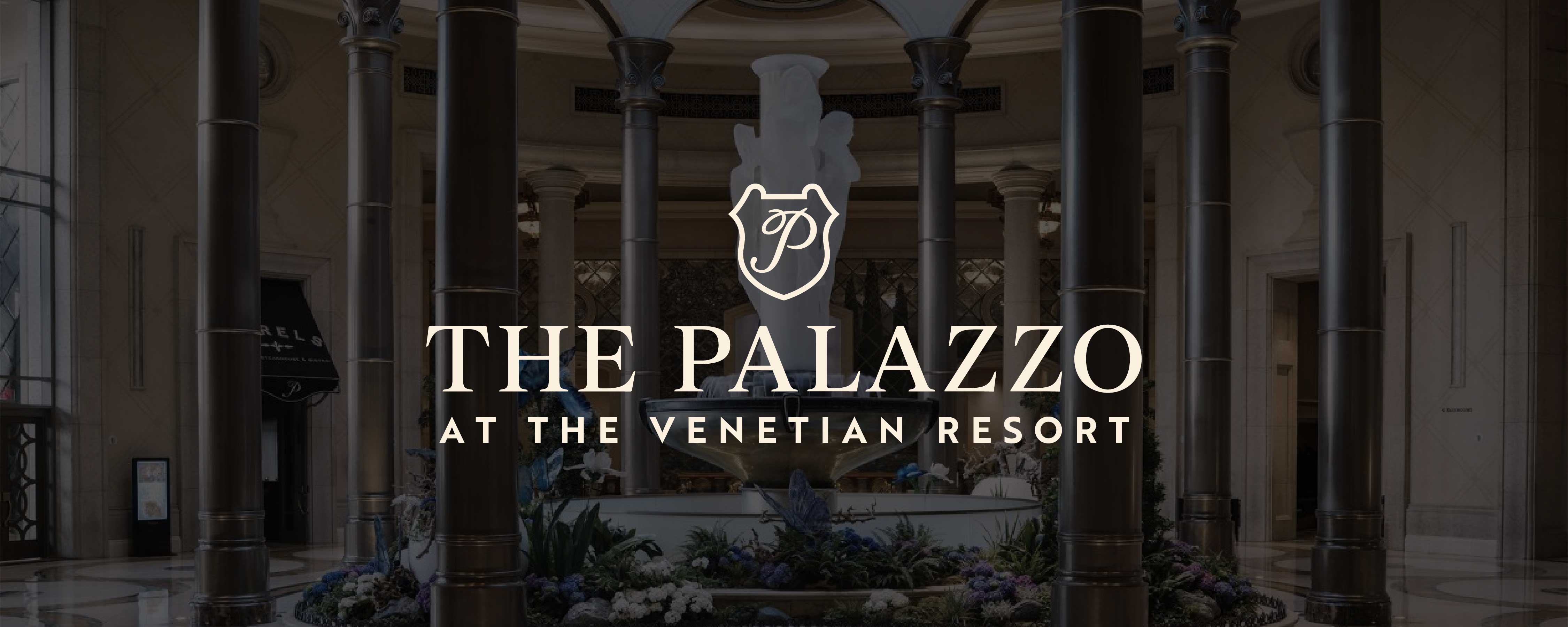
The Palazzo’s official lockup is composed of two elements: the shield frame and the flourished P. The elements’ relationship to each other has been set for optimal legibility and must not be altered or modified. There are multiple orientations of the lockup for a variety of layout compositions.


LOGOS
The Palazzo system is designed with a variety of logo lockups. Each lockup has a specific use case. The primary logo lockup is to be used in most cases, but other orientations exist to provide flexibility in the system.
LogoMark
Shield
The shielded P is the identifier for The Palazzo and should be used to maintain consistency across all marketing materials. The P letterform should always be combined with the shield and should not be altered in any way. Clear space is determined by half the height of the shield.
MINIMUM SIZE
.375 in H
36 px H


Primary Logo
HORIZONTAL
The horizontal lockup orientation is The Palazzo’s primary logo. The primary logo should not be altered in any way. Clear space is determined by half the height of the shield.
MINIMUM SIZE
.375 in H
36 px H
SecondARY LOGO
Vertical
The Palazzo’s vertical lockup is the preferred secondary logo. The mark should not be altered in any way. Clear space is determined by half the height of the shield.
MINIMUM SIZE
.5 in H
48 px H
WORDMARKS
Wordmarks are meant to be supplemented when a design allows for separation of our winged lion mark. Please use the appropriate marks to complement layout ratios.


PRIMARY Wordmark
HORIZONTAL
The horizontal primary wordmark is only to be used when vertical space is limited or when the brand mark is used separately from the wordmark to balance compositions. Clear space is determined by half the height of the shield. The marks should not be altered in any way.
MINIMUM SIZE
.25 in H
24 px H
SecondARY Wordmark
Vertical
The vertical primary wordmark is only to be used when horizontal space is limited or when the brand mark is used separately to balance compositions. Clear space is determined by half the height of the shield. The marks should not be altered in any way.
MINIMUM SIZE
.375 in H
36 px H


GUIDING LOGO PRINCIPLES
The Palazzo brand marks have an endless number of ways that they could be used INCORRECTLY. The below are examples of egregious design misuse. DO NOT alter the marks in any way. In extremely special circumstances where a mark must be altered for a unique print application, the application and design must be approved by The Venetian Resort’s Creative Director.

DO NOT use two colors

DO NOT create shield background

DO NOT fill the SHIELD

DO NOT use the P on its own

DO NOT USE shield AS A MASK

DO NOT place shield above vertical wordmark


TITLES & HEADERS
Stylistic treatments and flourishes should be used sparingly.
ALL CAPS - Works best with short headlines. (~4–6 words max)
Sentence case - Works best for longer headlines. (4+ words)
Stylistic italic flourishes - Use sparingly for the flourish to remain special and unique. Only uppercase letterforms should be styled, not lowercase. Please be careful about the awkward kerning caused when using these flourishes. Please hang flourishes as you would punctuation when centering and aligning type.
Please reference The Venetian Resort typographic examples for scale ratios between Romie and Brother 1816 in various placements.

SUBHEAD / BODY / Caption
SUBHEADS & CAPTIONS
Case: All caps
Tracking: 200 pt
Weights: Bold / ExtraBold / Black
BODY
Case: Sentence
Tracking: 10 pt
Weight: Up to Medium

WEB SAFE
Safe to use in email campaigns and as default fonts for web use.


The Palazzo color palette is the brand’s default when showing off the property across all marketing materials. The colors are organized to show a hierarchy based on the scale of the color block. Physical proofs must be reviewed and approved before final print production to ensure colors are produced accurately.
Palazzo bLUE
PMS 5395 C
RGB 7 / 31 / 54
CMYK 95 / 80 / 50 / 60
HEX #091F35
VENETIAN CREMA
PMS 468 C / PMS 727 U
RGB 226 / 200 / 159
CMYK 11 / 20 / 40 / 0
HEX #E2C89F DIGITAL
HEX #E2C79E PRINT
PALAZZO AZZURO
PMS 656 C
RGB 222 / 233 / 247
CMYK 11 / 4 / 0 / 0
HEX #DEE9F7
VENETIAN STONE
PMS 9080 C
RGB 251 / 240 / 223
CMYK 1 / 4 / 11 / 0
HEX #FBF0DF
VENETIAN GOLD
PMS 10128 C
RGB 187 / 139 / 51 CMYK 29 / 42 / 97 / 6
HEX #B28B33 DIGITAL HEX #B38B32 PRINT
VENETIAN FELT GREEN
PMS 357 C
RGB 37 / 84 / 58 CMYK 82 / 42 / 81 / 39
HEX #25543A DIGITAL HEX #27553B PRINT
COLOR Pairing
The Palazzo color palette can be used in any of the approved combinations shown here.


Merch


