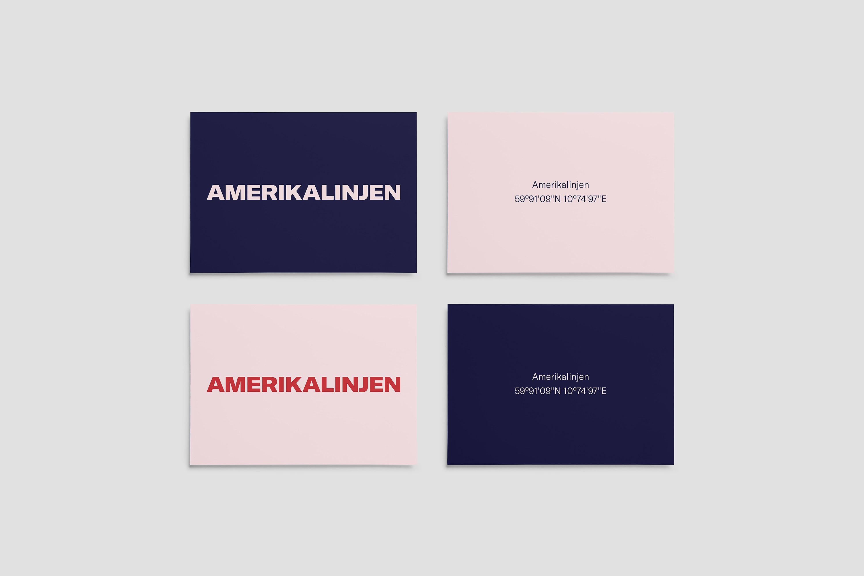
Welcome to the visual identity for Amerikalinjen. Treat it like you would treat a guest.

1. Amerikalinjen
Brand Platform
Our brand platform is our manifesto. Read it carefully.
Visual Identity
Password: newyork
Logo
The logo is designed to embody Amerikalinjens brand attributes: Eclectic, adventorous and inspiring. On digital surfaces the logo should always be in motion and reflect our positioning as the explorer and the reference to the compass.


Colors
Always use the colors that are shown. Never tweak or adjust colors without supervision.
AL Black
AL White
AL Blue
AL Green
AL Red
AL Pink
Typography
Introducing America, the official font of Amerikalinjen.
Weights:
— Standard Light + Standard light Italic
— Extended Light + Extended Light italic
NB! Remember to purchase liscense for your use here.
Aa Bb Cc Dd Ee Ff Gg Hh Ii Jj Kk Ll Mm Nn Oo Pp Qq Rr Ss Tt Uu Vv Ww Xx Yy Zz Ææ Øø Åå
1 2 3 4 5 6 7 8 9 !
Tone of voice
Always write in a way you would tell a story. Be warm and inspiring, include adjectives that brings a certain flavour to the cause you are writing for.
Example:
Pier 42 – your choice of cocktails from the original ships – refreshed with a contemporary twist (words as refreshed and twist are often used when speaking of cocktails and beverages)
The Gym – Sporting a full-sized boxing ring and anything else that’ll get your blood pumping. (Sporting and get your blood pumping creates a vision of what you can expect to find at the gym)
Remember this when writing for Amerikalinjen:
People don’t always remember what you say or even what you do, but they always remember how you made them feel.

Photographic Style
Amerikalinjens photographic style is inspired by the American director Wes Anderson. Aim for symmetrical, clear and colorful photography.


Inspiration
Follow these example to make whatever you are making pop!


2. Atlas


3. Pier 42

4. Gustav

Amerikalinjen
Jernbanetorget 2