VoteIdaho
Logo & Brand Guidelines
Welcome! Our VoteIdaho logo and brand guidelines are an online resource for making brand-based decisions concerning logos, colors, and typography. Many color and usage variations provide design flexibility while ensuring the brand looks its best in every application.
Contents
—
Primary Logo
Secondary Logos
Downloads
Primary Colors
Secondary Colors
Logo Clearspace
Improper Use
Logo Formats + Color Modes
Primary Fonts
Download
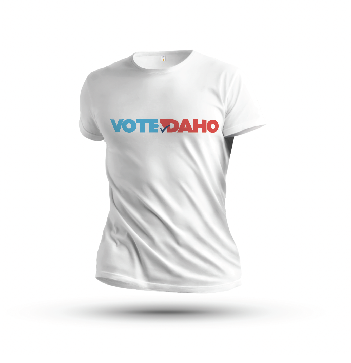
Wearables
Signage
CTAs + Buttons
Headers
Iconography
Tone/Composition
Color
Lighting
White Space
Depth of Field
01
—
logos
Our VoteIdaho logo comes in two configurations and multiple color schemes to provide design flexibility while ensuring it looks ideal in every application.
Primary Logo
—
The primary VoteIdaho logo should be used in most general and web applications. There are four unique colors depending on usage. Use the logos with white checkmarks on dark backgrounds. Use logos with blue or black checkmarks on white or light-colored backgrounds.
Secondary logos
—
Use the VoteIdaho.gov logo in applications directing the audience to the website.
Download all logos
02
—
color system
The VoteIdaho brand is comprised of six distinct brand colors — three primary and three secondary colors. Be sure to use the CMYK or spot (Pantone) values for any print application and RGB values for any digital application.
Primary Colors
—
Our four primary colors should be used in most general color applications.
Red
Light Blue
Dark Blue
Secondary Colors
—
Our secondary colors can be used in other applications such as websites and collateral.
White
Khaki
Light Gray

03
—
logo usage
Using our logos properly is a crucial step in upholding the VoteIdaho brand. Maintaining a strong brand is aided by careful, consistent design practices.
Logo Clearspace
—
Logo clearspace keeps typography, images, or graphic elements from crowding the logos. For all logos, use the height of the V in VOTE as a base for adding clearspace.


Improper Usage
—
Maintaining a strong brand means careful and consistent use of our logos. Please do not reproduce the logos in any other way than those specified in this manual. The example shown here, and all other deviations from the guidelines, are prohibited.

Do not change logo colors.

Do not stretch the logo.

Do not add strokes or outlines to the logo.
Do not change logo colors.
Do not stretch the logo.
Do not add strokes or outlines to the logo.

Do not crop the logo.

Do not alter or separate the logo parts.

Do not add drop shadows or other effects.
Logo Formats and Color Modes
—
All logos in this style guide are available in two basic file formats and three color modes, each for use in different applications and environments.
AI Format
AI is a vector format designed to produce high-resolution graphics for print. It is infinitely scalable, which means it can be used for anything from a business card to a billboard with equal clarity.
PNG Format
PNG is a raster image type. PNGs can have a transparent background and are ideal for websites and other digital applications because they can be placed over a colored background.
CMYK Color Mode
The CMYK color model is often referred to as four-color process because it utilizes four different colored inks — cyan, magenta, yellow, and black — to create an array of different hues. CMYK colors are mixed during the printing process, which can sometimes cause slight color inconsistencies throughout a printing run. It’s usually not a perceptible change, but it is something to keep in mind when using logos with specific color branding.
RGB Color Mode
The RGB color profile is used exclusively in digital design, as it represents the same colors used in computer screens, televisions, and mobile devices. Rather than ink, colors in the RGB (red, blue, green) color wheel are created by blending light itself.
Spot (PMS) Color Mode
PMS stands for Pantone Matching System, a universal color-matching system used primarily in printing. Unlike RGB and CMYK, spot colors or PMS colors are created with pre-mixed ink long before the image is produced, resulting in the most consistent color possible.
04
—
typography
Typography plays a vital role in communicating the right tone, personality, and idea from our brand to our audience.
Primary Font
—
Our primary VoteIdaho font will cover most typographic needs when representing the VoteIdaho brand.
Poppins
—
Appropriate for all body copy, subheads, and smaller headlines. Available in 9 weights from extra light to black, each with matching italics. (Google font)

Download fonts
05
—
applications
The following examples demonstrate the brand's application in visualized situations and mediums.


06
—
WEBsite styling
The following examples demonstrate how to use the brand in website applications.
Website CTAs / Buttons
—
For all website CTAs / buttons, use rounded rectangles. In normal mode, they should be our red color. For hover and click, use our dark blue.


Website Headers
—
When creating website headers, use the following examples as a guide. Background colors should be our brand colors (red, light blue, dark blue, khaki) with simple graphics or imagery. Do not use busy backgrounds.


Website Iconography
—
When using icons, be sure to use a simple, line art style with uniform line weight. For light or white backgrounds, use the icons in darks blue. If background is dark, use the icons reversed in white.

07
—
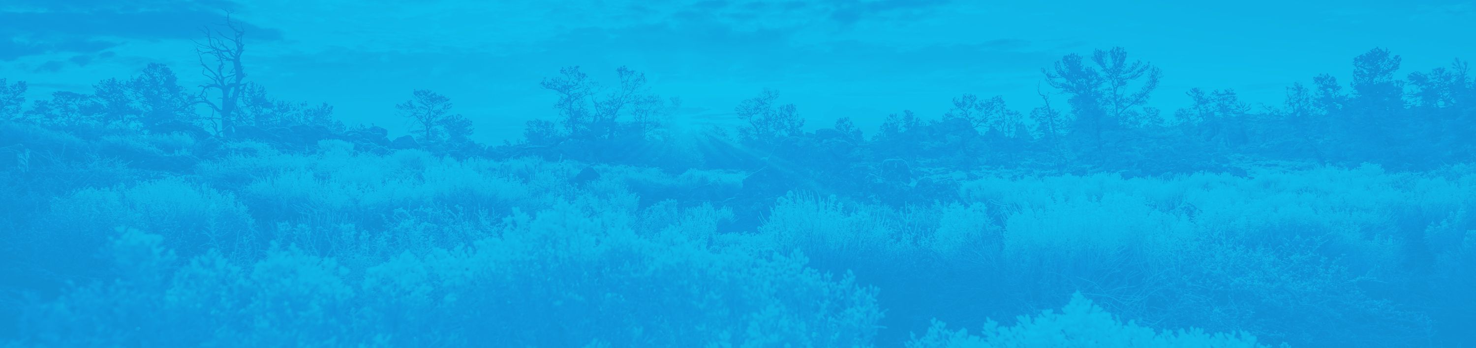
photography
Our imagery should always be representative of our brand values—integrity, honesty and our commitment to community.

Tone/Composition
Photos should evoke a feeling of authenticity; whether in settings of public service, community involvement, or real life moments. Avoid photos and settings which feel posed, unnatural and cliché. Avoid photos with special effects that depart from authenticity and realism.
Color
When possible, steer toward imagery with cooler hues with bright, white sources and negative space. If a desired photo fits your creative needs, but is warm in color, try adding a blue color filter to color-correct — so long as the photo remains natural looking.
Lighting
Brightness and naturally-sourced lighting helps convey a positive, realistic, and inviting feeling. Keep lighting natural and not oversaturated.
White space
When possible, keep photos uncluttered.
Use plenty of white space as headlines,
copy, and logos may be added.
Depth of field
Use depth of field for busier photos to
help keep focus on important aspects.
