VISUAL IDENTITY
GUIDELINES
Last updated
March 2024
These guidelines are intended to be a guide to
help protect and implement The Royal Foundation
brand successfully across a range of applications.
Driven by a desire to make a difference together,
The Royal Foundation is the primary philanthropic and
charitable vehicle for The Prince and Princess of Wales.
∙ These guidelines are best
viewed in Google Chrome.
∙ The menu above can be used
to navigate between sections.
LOGO
FULL COLOUR
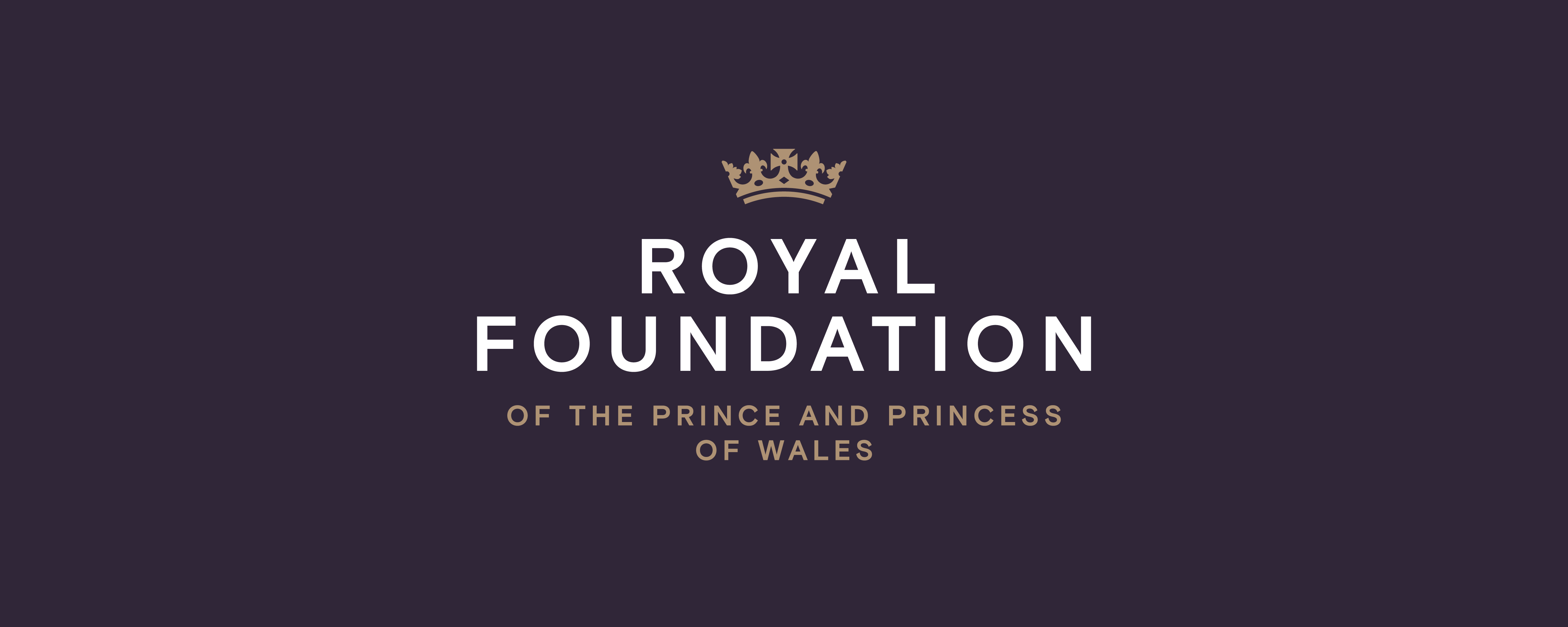
Our full colour logo is the primary and most important element of The Royal Foundation identity. This logo comes in two versions, positive and negative.
The example on the right shows the negative version of the logo, is to be used on very dark neutral backgrounds. When hovering over the example, the positive version of the logo is revealed, this is to be used on very light neutral backgrounds.
When using the full colour version The Coronet and Prince and Princess Endorsement text must always appear in Gold.
The Coronet is a new drawing based on the form specified by a Royal Warrant of King George V dated 19 November 1917.
The new drawing has simplified the forms to enable better reproduction in digital applications and at small sizes.
LOGO
SPECIAL
PRODUCTION
For special pieces of implementation the Coronet and Prince and Princess Endorsement text can be printed using Gold Foil to enhance the production of the stationery.
The Gold Foil should be specified
as Foilco 6125.
LOGO
MONO
For instances where the logo is used on images or where print limitations may create restrictions on colour usage, a mono version (in positive and negative) of the logo is available.
When using the mono version care should be taken to ensure there is sufficient contrast against the background.
LOGO
CONSTRUCTION
Our logo lock-up has been carefully constructed to create harmony by balancing each individual element with the relevant spacing and size.
The logo lock-up should never be adjusted and the spacing or size of individual elements should not be altered under any circumstance.
LOGO
MINIMUM SIZE
To ensure good legibility in all applications our logo should never be used with a height smaller than 25mm in print or 80px in digital applications.
LOGO
EXCLUSION AREA
To ensure our logo is always clear and free from infringement we have an exclusion area. This exclusion area is equal to the height of The Coronet on all sides. No other graphic elements should intrude this area.
LOGO
RECOMMENDED
SIZE
We always want a confident and strong presence in communications so as a guiding principle we should use our logo between 30-40% of the formats width.
LOGO
POSITIONING
Horizontally on all applications and positioned in one of three possible vertical positions relevant to the format’s margins; top, middle or bottom.
COLOUR
OVERVIEW
The main Royal Foundation colour palette
is a simple and refined palette consisting
of five colours.

COLOUR
CORE
Slate, Bone and White make up the
core of our colour expression.
Reflecting the essence of our sleek, sophisticated, and regal brand.
Slate
White
Bone
COLOUR
ACCENTS
Stone and Gold are used as accents colours — intended to highlight specific elements while also introducing warmth and earthy tones.
Stone
Gold
COLOUR
USAGE
Option 1
Slate is the dominant colour with White, Bone and Gold as supporting accent colours.
Option 2 (on hover)
White is the dominant colour with Slate being the secondondary colour. Bone, Gold and Stone are to be used as supporting accent colours.


TYPOGRAPHY
OVERVIEW
Our typographic voice is an important part of our identity and is a contemporary grotesque sans serif which reflects our modern approach.
Headlines and Body copy both use the same typeface Basis Grotesque, but in very different ways, detailed below:
Headlines
Always set in all uppercase
Auto line-spacing (120%)
160 Tracking
Centre or Left aligned
Body Copy
Sentence case
Auto line-spacing (120%)
20 tracking
Left aligned
Around 70 - 90 character line lengths

TYPOGRAPHY
RELATIONSHIPS
To maintain contrast between Headlines and Body copy we need to ensure a minimum size difference and paragraph spacing.
As a general rule our Headlines should be twice the size of the Body copy point size with a 100% paragraph space between the headline and Body copy, as illustrated in the diagram to the right.

PHOTOGRAPHY
STYLE GUIDE
As part of our new identity we have made simple photography style guides to help create a more consistent photographic approach across the organisation.
The examples on the right illustrate the guidelines shownbelow.
∙ Use a candid moment, not a perceived photo opportunity
∙ Capture relaxed and informal moments
∙ Show interactions and engagement with other people or each other
∙ Look for an interesting or unusual composition
∙ Have space around the subjects in frame, don’t crop tightly on them
∙ Look for images shot from the same level as the subjects
∙ Use natural and warm soft light, not flash photography
∙ Try to subtly link image colours across a shoot and reduce the range of colours where possible

Queries —
sophie.cohen@royalfoundation.com
