Introduction
These guidelines are a creative framework for how we bring the Global Fund brand to life.
The Global Fund is a complex organization with varied needs and audiences. Flexibility in expression is vital.
Our distinct brand system is built to flex between bold, expressive moments and calm, quiet confidence - while retaining a consistent look and feel.
Where each piece lands on the expression scale is dependent upon objectives, audience, application and channel.
Contents
01. Brand strategy
Brand positioning statement
The Global Fund brings humanity together as a powerful and persistent force, that proves the world’s deadliest infectious diseases can be beaten.
Brand themes

The Global Fund's purpose
A short, ambitious and impactful statement that explains why the Global Fund exists.
The Global Fund is a worldwide partnership to defeat AIDS, TB and malaria and ensure a healthier, safer, more equitable future for all.
Describing the Global Fund
An adaptable description that outlines the Global Fund's role and impact.
The Global Fund is a worldwide partnership to defeat AIDS, TB and malaria and ensure a healthier, safer, more equitable future for all. We raise and invest up to US$5 billion a year to fight the deadliest infectious diseases, challenge the injustice that fuels them, and strengthen health systems and pandemic preparedness in more than 100 of the hardest hit countries. We unite world leaders, communities, civil society, health workers and the private sector to find solutions that have the most impact, and we take them to scale worldwide. Since 2002, the Global Fund partnership has saved 70 million lives.
Bringing the Global Fund brand to life
Our persistent and collective efforts against the world’s deadliest infectious diseases are brought to life in three ways:
Collective force
The powerful and persistent energy which drives our impact
Scale and structure
The gravitas and worldwide presence of the Global Fund
Dynamic movement
Always moving closer towards our goals, with our partners


⬤ Quick links
02. Logo
Two logo formats
The Global Fund logo comprises two fixed elements: a trefoil and a wordmark.
The logo is available in two formats – stacked and horizontal.
01. Stacked
This is our primary version and should be used in most instances.
02. Horizontal
This is our secondary version, reserved for situations where height limitations are an issue, for example on a website header.
Monotone and color versions
Monotone logo: When placing the logo against our colorful brand graphics, we use the monotone logo only to add contrast, avoid color-overload and maintain the gravitas of our identity.
Color logo: The color logo is only used in the absence of any other brand expressions. E.g., an email signature, plain templates, step and repeat backdrops, white paper documents, or in co-branding situations.
⤓ Assets available
Our stacked and horizontal wordmark files are available as JPG, PNG, EPS and SVG files.
Trefoil
The trefoil within our logo represents the collective and dynamic forces working to defeat the deadliest infectious diseases. It symbolizes impact, unity and equalizer as a whole.
In general, the trefoil should never be used in isolation from our wordmark.

Clear space guidance
Allowing clear space around our logo is vital to retain clarity and brand integrity.
This clear space is determined by the ‘G’ in our logo and responds to the scaling up and down in size.
This guidance specifies the minimum clear space allowed. However, it’s preferable to give our logo as much room as possible when applying it within our communications materials.

Minimum sizes
Minimum sizing guidance for our logo is in place to ensure we maintain legibility at all times.
These minimum sizes are dependent on whether we’re using the logo for screen or for print. Both of which have slightly varied requirements.

Stacked positioning
When using the stacked version of our logo, it is generally preferable to position it in any of the corners.
However, in particular circumstances, we can position the logo in the center. For example, the front page of a presentation or report, or in a social post or campaign asset.

Horizontal positioning
The horizontal version of our logo is used in situations where height is an issue. In which case, we still adhere to the same rules as the stacked logo when it comes to positioning.
The horizontal logo can be used in any of the corners, providing it does not get overwhelmed by the other elements surrounding it.
The one difference is the horizontal logo is never to be used in the center of our communication.

Don'ts
Our logo is integral to our visual identity and should not be misrepresented in any way.
Though somewhat obvious, representing the logo properly is essential to maintain the integrity and gravitas of the brand.
Don'ts
01. Don’t squash it
02. Don’t use any other color
03. Don’t use a gradient
04. Don’t use only the wordmark
05. Don’t outline
06. Don’t separate the trefoil from the wordmark
07. Don’t use any of our other colors for the logo
08. Don’t use white on yellow
09. Don’t use a drop shadow
10. Don’t put the colored logo directly over our brand colors
⬤ Quick links
03. Lock-up relationships
Sub-branding
These are created sparingly and only when there is a strong reason to do so.
The sub-brand name should be written in Object Sans Regular, and follow the same x-height as the Global Fund wordmark.
The maximum length is 150% of our wordmark width. Anything longer should knock down onto a new line.
Please note, sub-brands must only be created with approval from the Marketing and Creative Direction team.
As with our primary logo, we should use the color version in situations where we have no other brand expression or presence.

Co-branding
The Global Fund is a partnership at heart and we work with many organizations on a day-to-day basis.
We respect the contributions of others by sharing the credit, and our approach to how we do this varies depending on the type of partnership.
Our approach to co-branding has three areas:
01. When we’re a lead partner
02. When we’re an equal partner
03. When we’re in a group of partners

Co-branding
01. When we’re the lead partner
We are the lead partner in scenarios where the materials carry our brand identity (and therefore follow our guidelines). These will primarily be used on our own channels when our time and resource was used for production.
In this scenario, our logo should not be locked-up with the other partners. Instead, we apply a decoupled relationship which indicates the communications materials are ‘from’ us and ‘supported by’ our other partner(s).
The partner logo is proportionally smaller than ours. This is to illustrate partnership hierarchy and not about trying to take up more real estate.
In situations where no other brand expression is applied, the color version of our logo is preferable unless there is particular reason to avoid it.

Co-branding
02. When we’re an equal partner
We are equal partners in scenarios where no ‘lead’ versus ‘supporter’ hierarchy exists within the partnership.
We apply a lock-up to indicate an equal relationship and both logos should be optically balanced. When we facilitate the partnership, our logo appears first.
Although we are not in control of how our partners’ logos look, we use simple guidance around our own logo proportions as reference for them. This enables logos of odd sizes to scale without disrupting the equal balance of the partnership.
Similar principles translate into vertical lock-ups where needed too. However, it’s important to remember that these scale references are a foundation for our lock-ups as there may be occasions where optically a partner logo must break the guidance we’re setting.

Examples of logo positioning when the Global Fund is in an equal partnership.

Co-branding
03. When we’re in a group of partners
In situations where the Global Fund are one of a number of partners, our logo should be proportional to the other logos.
If we are producing the materials, our logo should always appear first.
However, when other organizations are in charge of production, the Global Fund logo can appear wherever appropriate. Our minimum size and clear space rules should be respected here.
Again, in situations like this where we’re unlikely to have any other expressions of our brand, we should always use the color version of our logo.

Examples of logo positioning when the Global Fund is in a group of partners.

Campaign branding
Campaigns are crucial to increasing brand visibility and awareness among our audiences.
Our visual approach to campaign branding varies depending on the weighting and importance of the campaign in question.
However, to build brand equity and recognition, campaigns must always reinforce the core Global Fund brand identity and not become disconnected or isolated.
Consistently presented brands are 3.5x more likely to enjoy excellent brand visibility than those with an inconsistent brand presentation. Campaigns are therefore a chance to drive brand visibility and engagement, with each initiative building off the last.
This way, we increase audience recognition over time and get a better return on investment.
Message-led
The campaign mark should be designed to reflect the look and feel of the Global Fund brand, to create visual harmony and reinforce recognition.
No lock-up is required. The logoand campaign slogan are decoupled.
The maximum width and height of the campaign mark should be no bigger than the values described on the right-hand side. The intention here is to create flexibility for the future, while still guiding best practice.

Message-led
Here is an example of how we can give our campaign mark space, but it should still always be seen together with our logo on the same asset.

Integrated
There will be instances where our campaign is integrated to our logo. For example, the 20th Anniversary. In which case, we can make an exception for the safe space and create a lock-up that is a direct extension of the logo.

Equal hierarchy
For smaller campaigns, we can create campaign marks which have an equal to, and directly locked up with our logo. Again, the mark itself should be designed to reflect the look and feel of the brand to ensure visual harmony.
This lock-up functions in the same way as our co-branding example, though without a dividing line, as the logo and the campaign message are both equally a part of the Global Fund.
We should always optically align our campaign slogan with our logo. Only our primary, stacked logo should be used in this circumstance.

Equal hierarchy
When displaying a campaign mark in lock up with the logo, we should follow our logo positional guidance to ensure balance.

⬤ Quick links
04. Typography
Our primary typeface
Objects Sans is our primary typeface. We use it in two weights; Heavy, for headlines, impactful stats and other hero statements, and Regular for when reading time is a little longer.
This typeface represents the open, welcoming and approachable nature of the brand.
This typeface must be licensed from the type foundry Pangram for you to use it.

Our secondary typeface
Inter is used for any long-form body copy, as it is more accessible at smaller sizes than Object Sans.
Inter should never be used outside of this role. Its purpose is to be used alongside Object Sans and not instead of.
*Inter is a free, open-source font available through Google Fonts.

System fonts
Our System Font is Arial Black and Arial Regular.
System fonts help us maintain clarity, quality and consistency across our day-to-day work. For example, when writing emails and producing Microsoft Office documents.

Multilingual typefaces
We are a global brand with a global audience. This means there are times when we need to create communications that are not in English.

For these purposes, there are two typefaces that we recommend:
Object Sans has the Latin and Cyrillic alphabets included by default.
Noto Sans has one of the largest selection of languages in the world, as is available through Google Fonts.

Typographic Hierarchy
This is important for creating clear and direct communications. We use Object Sans Heavy to create bold and impactful headlines while Inter is reserved for body copy or other long-form paragraphs.
We should adhere to general rules of good typography such as font size, line length, line spacing. This will enable us to create distinctive and clear communications that retain character and accessibility.
Numbers play a vital role in demonstrating our global impact. Where possible, we should hero these data points through the use of the Object Sans Heavy font.
01. Object Sans Heavy
02. Inter Bold
03. Inter Regular

Minimum sizes
The Global Fund is committed to inclusivity and ensuring our work is accessible is an important part of this.
We should refrain from using type sizes that are too small or too big, especially where reading length is long.
We should also avoid using the heavier weights of our typefaces at small sizes as the letters will start to merge and become illegible.
01.
Object Sans Heavy is used for our larger headlines, and therefore will always adhere to accessibility and contrast guidance.
02.
Body copy at A4 size should be set in Inter at a minimum of 9.5pt.
03.
Captions are set at a smaller size than long form body copy. Captions should be 2 to 4 point sizes less than our body copy and set at 50% of black.

Examples
Here are some examples of how, despite some strict rules around legibility and clarity, we can still be typographically expressive and flexible in our communications.

Expressive numbers
Numbers are key to demonstrating our impact. Therefore, how we visualize them is paramount.
In static form: numbers must be sharp and crisp, ensuring the information is crystal clear with nothing encroaching on the legibility.
In motion: numbers can be animated to add dynamism and movement, by using the halftone treatment to ‘build’ or ‘amass’ the numbers into existence.

⬤ Quick links
05. Color
Our primary colors
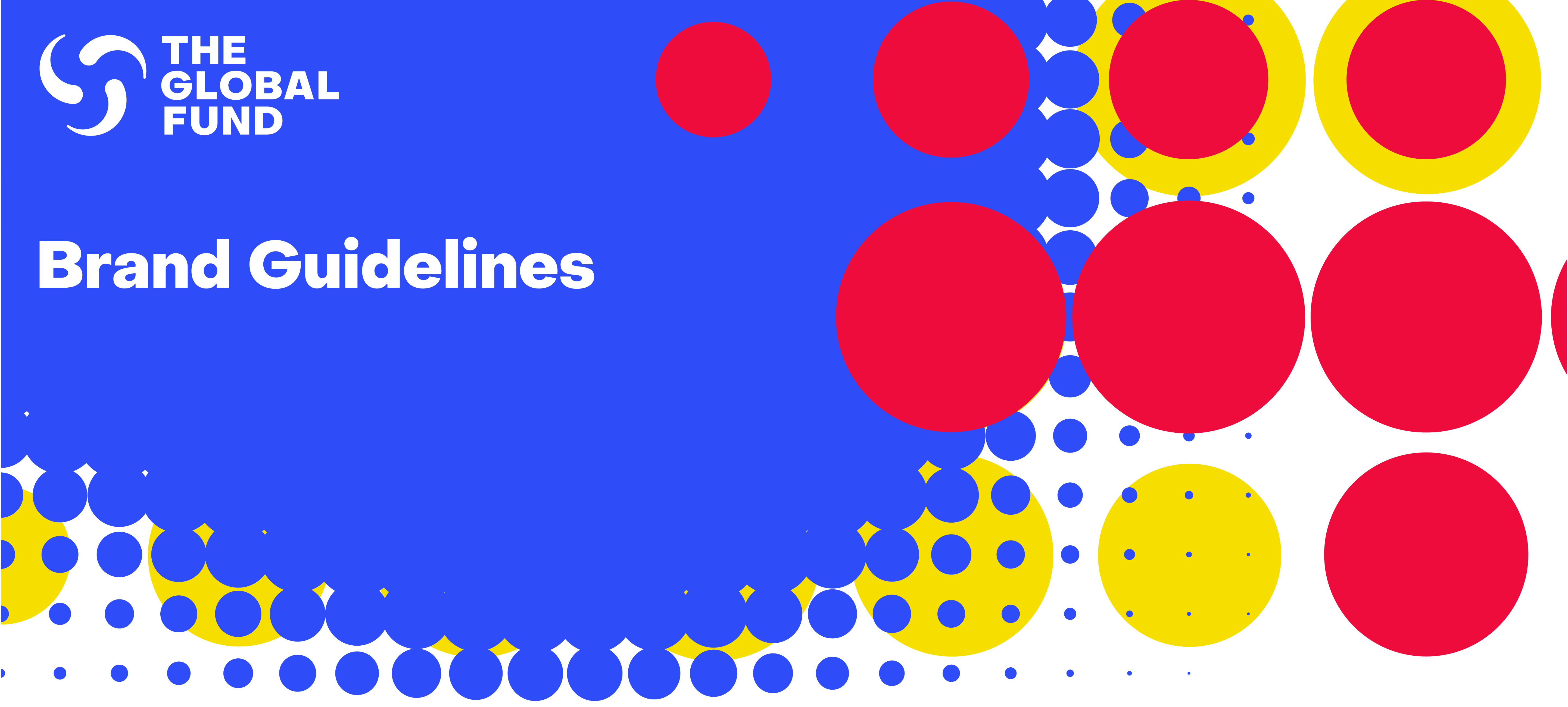
Our visual identity comprises three primary colors: red, blue and yellow.
Together, these colors represent our collective forces against the world’s deadliest infectious diseases. The colors are used in harmony and in equal measure to one another to represent the Global Fund as a whole.

Alongside our three primary colors we use black and white to add space and contrast.
White space is important and should be welcomed within our aesthetic. It helps us maintain gravitas across our communications, and stops our work from looking cluttered, garish or over-the-top.
White space should be seen as an asset to our color palette, and not a burden.
Clarity of information is vitally important for us, especially when demonstrating our impact.
Using the correct colors is vital to maintaining the brand integrity. We therefore do not deviate from the specified values.
100% Black
Plain White
⤓ Assets available
Color swatches available as Pantone, RBG and CMYK.
Color application
Across our visual identity, color plays a huge role in how we express ourselves and convey information.
In our brand system, there are three ways in which color is applied:
01. All three colors = brand as a whole
All three primary colors work together represent the Global Fund as one united entity.
02. Soft coding = disease specific
Where relevant, we can represent and distinguish one disease from another by employing soft color-coding. Red for HIV (the universal color), blue for TB and yellow for malaria.
03. Accent colors
The colors can be applied individually as accent colors to break up chunks of information and add visual energy and dynamism to our communications.

Core identity of the Global Fund
All three primary colors work together in harmony to represent the Global Fund as one united entity. Color balance is integral to our core identity.
If the yellow uses a small space, we use big dots to ensure they do not get lost. Or if the red is using lots of space, we use small dots to ensure they don’t overpower everything else.

Distinguishing information about one disease
There are times when we communicate about one specific disease rather than our collective work. For example, on a website section, in a report or when displaying data.
In these instances, we can apply soft color-coding to represent each disease and distinguish information:
01. Red for HIV (the universal color)
02. Blue for TB
03. Yellow for malaria
Soft color-coding means we can codify the colors when it is necessary and beneficial, but we can still use the colors with no coding attached when conveying non-disease specific information (see next section on accent colors).

Adding variety and pops of color
Where use of all three colors together isn’t applicable or possible, we can apply the colors individually as accent colors to break up information and add visual variation.
For example, as on website buttons, as background color in presentations, as an identifier over a photograph in marketing materials, or to display information in diagrams and newsletter sections.
Accent colors should be thoughtfully and carefully applied to avoid visual siloes, mis-representing the core identity and to avoid or mis-codifying information. For example, if displaying data on malaria, you should employ soft coding rather than accent coloring and stick to yellow).

Tints of our colors
Tinted shades of our brand colors are available to provide flexibility and create distinction between information. For example, when displaying data.
Tints should never be used at a brand communication level. They are a necessary functional tool, rather than a stylistic expression.
Tints of our colors are based on a simple rule thirds: 30, 60 and 90 percent of white and black are introduced to our core colors to give varying shades of contrast. See data visualization section for more information on using our tints.

Dramatic grey
The dramatic grey world provides a visual backdrop to the expressive forces of the Global Fund brand identity. It’s a visual representation of the fight against the world’s deadliest infectious diseases.
The collective force overwhelms the space to create a brighter and colorful future. It works best as a type only approach with strong and compelling messaging. This should be used sparingly in flagship communications and campaigns.

Accessibility testing
Color accessibility important when it comes to the ensuring visibility of messaging and information in communications.
We have created brand colors that pass AA testing to ensure those who are visually impaired can still engage with our communications.
Yellow is an obvious color for poor legibility when using with white – so this is not allowed. Instead, we should always use black on a yellow background where possible.

⬤ Quick links
06. Brand devices

⤓ Assets available
A collection of brand patterns that can be used to create new communications available in Adobe Illustrator format.
Image treatment: Halftone
A subtle treatment inspired by the movement in our trefoil logo. It’s dynamic and expressive enough to convey the brand while not distracting from the subject matter.
It’s primarily an image-only treatment and to be used without surrounding messaging (unless a Dot Sticker).
It works best when the crops are dynamic and asymmetric, sweeping through the composition.


Image treatment: Reveal
This is one of our most flexible and versatile assets.
A series of crops inspired by the curvature of our logo, it’s designed to show of the image while still providing enough space for our messaging.
It comes in 3 dot-sizes, Small, Medium and Large. These can be chosen depending on how much brand expression needs to be present in your communications.

Image treatment: Halo
This is most effective at highlighting the subject of an image whilst creating clear space for messaging.
It works particularly well when its integrated within an image, drawing the subject into focus.

Image treatment: Expressive Force
This is our most expressive and unique brand device. It turns any image into a distinctly Global Fund communication. Because it’s so effective, we need to be particularly careful when applying it:
We always aim for equal balance and distributing of color within the composition and we never place to heavily over the subject of an image.
It’s important to get a range of dot sizes to create visual interest and scale within the composition.
It should be integrated within the image. So it’s wrapped around and underneath the subject, never placed just on top or underneath. . It’s important that our dots align to the grid and again, overlap one another.
To avoid looking messy or chaotic, it’s important to ensure
our dots align perfectly within the grid.


Text emphasis: Spotlights
Throughout our communications we can draw emphasis and highlight specific stats and messages. These are designed to be consistent yet varied, so we always use our 3 primary colors and a range of dot sizes.
To be as impactful as possible, there should only be a limited amount of text within each dot.

Editorial device: Dot corners
Similar in use to the grid treatment above, the corner dot treatment is used to highlight and emphasise headlines within a document.
If you have a background color, you just need two collections of dots, otherwise ensure you use all three primary colors.

Text emphasis: Dot trail
One of our more minimal treatments, this is particularly effective when we want the Global Fund brand to take a step back. It’s used to introduce content that is serious, sombre in tone, such as documentary films.
It acts as a Global Fund endorsement and is at its best when it’s introducing or closing messaging.
Always include black or white dots when including the dot trail, as it ensures a level of maturity and sophistication.

Text emphasis: Dot stickers
These are used to add context to a photograph, such as the subject’s name, location or role. This demonstrates respect for the individuals in our images.

Text emphasis: Dot extract
This treatment works well with statements and quotes from the Global Fund.
Used like a signature of sign-off, it brings brand expression to what are often text-heavy compositions. To ensure simplicity, we never use more than three rows, each row having a maximum of four dots.

Text emphasis: Underline
Used to highlight a word or phrase.
Ensure it has rounded corners, a single color and only one is used per paragraph. It’s thickness should match the Bold weight of our Object Sans typeface.
It should be kept close to the baseline of the words we are highlighting, even allowing for descenders to overlap.

⬤ Quick links

The Vault
Where we place retired assets that are no longer in use.
They can be emblematic to a previous campaign, over-used in or just aren’t needed in the current day-to-day creative of the Global Fund.

⬤ Quick links
08. Motion
Motion
We have a ‘How to Move' guide that includes motion principles, video treatments and more.
Video assets include:
Animated logos
Animated brand devices
Dot trail animations
Lower thirds

⤓ Assets available
A 'How to Move' guide, animated logos, animated brand devices, dot trail animations and lower thirds. Additional assets available upon request. Contact marketing@theglobalfund.org.
⬤ Quick links
09. Photography
Overview
Photography is a rich and essential element of the Global Fund brand and is key to bringing our work and mission to life.
Impact
Photography enables us to go beyond numbers and capture the true impact of our work on people’s lives: health workers providing life-saving treatment, children growing up healthily and going to school, communities thriving.
Equalizer
Through photography, we give people a voice by telling their story, while ensuring every person is represented in a truthful and dignified way, regardless of status, gender, ethnicity, age, religion or sexual orientation.
Unity
Photography enables us to capture the spirit and energy of people coming together to achieve impossible goals. We celebrate the activism, the unlikely partnerships, the communities and the health workers who dedicate their lives to secure a better future for all.
We have a few approaches to our photography across the Global Fund visual identity. They include:
01. Scene setting:
Editorial whole story approach, demonstrating the wider impact of disease around the world.
02. Individual narrative:
Showcasing the macro stories of those on the ground, in the front line of these diseases.
03. Portraiture:
Reserved for our top line expressions, we hero the person and allude to the aspiration of a world without disease.

Sourcing good photography
The image should feel authentic, not staged*, and accurately represent the lives of the people that we serve.
The subject in the photograph should be the central focus in every image, not the message or opinion of the photographer.
People should not be shown as victims or passive recipients of aid, but as individuals who have agency and an ability control over their own destiny.
Strive to capture the passion, energy and commitment of individuals who are seeking better, healthier lives for themselves, their families, their community, or their country.
Always ask yourself the question: if the person in this photograph were me, would I want to be depicted in this way and in this context?
When using multiple images, make sure to cover a variety of different people across geography, gender, age, and socio-economic status.
*Our campaign-led imagery is an exception here as it’s not part of our day-to-day communications.

Things to avoid
01.
Avoid “stretching” or “squeezing” when resizing your photos.
02.
Be very deliberate when cropping your photos. Use your cropping tool to get rid of distracting elements, but don’t crop too tightly as you may lose a sense of context.
03.
Avoid unnecessary cluttering with multiple photos where a single large photo is sufficient to convey your message.
04.
Avoid superimposing text or graphics over people’s faces or bodies.
05.
Don’t over-stylize. Treat the original image with respect and always keep a sense of honesty and simplicity.
06.
Avoid the use of obscure angles in imagery, keep our photography looking simple.
07.
Don’t use photos that are copyright-protected or watermarked.

Crediting photography
We can credit our photographers
in one of a couple of ways.
01.
The credit is added as a footnote near the image.
02.
The credit is placed on the image.
All images we use need to be credited, regardless of platform.
Unless agreed otherwise with the photographer or agency, the credit format used for photos that we have commissioned is:
• The Global Fund / [first and last name of photographer].
• No copyright trefoil (©) is used.
• The closer the credit is placed near the photo, on a web page for example, the better. Just below the image is preferred.
• On the Global Fund website, photo credits are superimposed on the banner photo and revealed by hovering the mouse cursor over the image (or by tapping on the image on a mobile device). For images inside the body of the text, photo credits are placed at the end of the caption, below the photo.

Isolated portraiture
We use portraiture to capture an individual’s personal story, to put a spotlight on the empowerment of an initiative, or to convey strength, warmth and emotion. This approach should be considered in isolation of our day-to-day photography principles.
This portraiture should only be used as vehicle to carry direct brand messaging, and not to be used in abundance, its role is reserved for use in places like front covers of our reports, OOH campaigns, leading social content or other flagship communications.
We source studio shot portraits that are isolated against a background. They have strong contrasting light and use sharp angles and have an aspirational glare; looking either to the right or upwards.
01. Jessica Felicio
Unsplash - QS9ZX5UnS14
02. Lucas Gouvea
Unsplash - AOEWUEH7YAS

Isolated portrait art direction
01.
Once we have our portrait, we then take the sourced image and, using Photoshop (or something similar) we put it through a few steps to get to our finished expression.
02.
First we de-saturate the image if needed, making sure there is a high contrast of black and white and not much value in the grey tones.
03.
We cut this figure out so that we can layer our dotted expression in front and behind to create our final composition.
It’s important to note that our portraiture should always be used in combination with our most expressive brand device.

⤓ Assets available
The Global Fund Digital Media Library can be found here digital.theglobalfund.org.
To request access, please choose “Register” in the top menu. For any other photography enquires, please contact: photos@theglobalfund.org.
⬤ Quick links
10. Iconography
Overview
Icons are visual short-cuts, used to illustrate and distinguish between certain topics quickly and visually.
Icons are used in many different applications. For example, on our website, in our reports and in our presentations.
However, they are not to be used as illustrations within our communications. Their role is much more behavioral as opposed to being a decorative asset.

⤓ Assets available
Available as JPG, PNG, EPS and SVG files.
Example usuage
Our iconography should always be used in black or white. The only exception to this rule is our three primary icons for HIV, TB and malaria. which can be used in the respective colors, or contained within a colored circle.

Things to avoid
Keeping our icons looking and functioning consistently across our brand is important.
Don'ts
01. Don't change stroke thickness
02. Don't use gradients
03. Don't fill them in
04. Don't use dashed lines
05. Don't use other colors
06. Don't scale them too much
07. Don't use them over imagery
08. Don't reduce opacity
09. Don't repeat them

⬤ Quick links
11. Data visualization
Principles
As an evidence-based organization with unrivalled impact, data visualization is an important element of the Global Fund brand system and a fundamental tool in educating and informing our audiences.
Keep it clear and simple
Ensure that the data visuals are simple, clear and easy to understand. Adding extraneous information or unnecessary graphics can make it confusing, which defeats the purpose of data visualization.
Keep it purposeful
Ensure that our data visuals support us in telling our story as effectively as possible, whatever the story is. This means being thoughtful in choosing the appropriate graphs to illustrate the data. For example, bar graphs are excellent at showing differences in data, whereas line graphs are easily understood when displaying data over time.
Keep it truthful
Although obvious, there is an increasing trend for skewed statistics in the media. We hold ourselves to a higher standard and as a result, our data visualizations should always be representing the real data.
Overview
We have three different scenarios in which color can be used when it comes to data visualization.
01. Soft coding
(the three diseases)
When presenting data sets on the three diseases, we employ soft coding (red for HIV, blue for TB and yellow for malaria).
02. Mixing colors
(non-disease specific)
When presenting non-disease data sets in one document, presentation or report, you can use a mix of all colors (primary, tints etc). The user should decide what will best help represent their data.
Please note, this should only be done when disease specific data is absent to avoid any misinterpretation of information e.g. red meaning HIV.
03. Mixing colors (disease
and non-disease specific)
When presenting a combination of disease specific and non-disease specific data sets in one document, we only use primary colors to soft code the three diseases. Elsewhere we use secondary colors for data. We do not mix primary and secondary colors within data visualizations in this scenario.

Graph types
01. Bar charts
These use either horizontal or vertical bars to show changes in data across categories. These are especially effective when comparing subtle changes in data. However, always be mindful that showing too many bars can confuse the reader.
02. Area graphs
To show the change of values over a period of time. They are most commonly used to show trends, rather than convey specific values.
03. Dot matrix graph
To show the different proportions or distributions within a dataset. These can also be used to compare proportions across multiple datasets.
04. Line graph
Like area graphs, these are used to show a change in data over time. However, line graphs can often contain multiple lines to represent more data, making it easier to compare.
05. Proportional area graph
These are used for to provide a quick overview of the relative size of data. For example, comparing between existing data and target goals.

Layout and hierarchy
Every piece of communication or data visualization will need to be laid out uniquely to accomodate content.
However, we recommend using the following as a guide to help unify pieces of communication.
01. Title
These should lead every piece of data visualization and sit left aligned above charts, set bold in ‘Object Sans’.
02. Key
These should be positioned beneath the title of the graph.
03. Sources and notes
These pieces of information should always sit at the bottom of the page so as not to distract from the main title.

Graph specs
This is an example of the graph specifications on an A4 document. The end goal is to create consistency across our graphs which allows clarity for our readers.
However, these specifications may vary depending on document size and format.

Secondary colors
Additional colors are needed beyond our core palette for to help convey comprehensive sets of information.
There are four additional colors that complete a spectrum with our primary colors (red, yellow and blue). They have been selected to fit harmoniously with our core colors.
The additional colors are not soft-coded, and are intended to be used for to help communicate any topic of information.
When creating graphs or charts with many secondary colors, always place in this order:
1. Red
2. Orange
3. Yellow
4. Green
5. Aqua
6. Blue
7. Purple
These additional colors must only be used for data visualization, not within the brand expression.

Colors
This palette is built out to include tints of each color, to give users multiple shades to work with.
This will ensure we have enough colors when working with large data sets.

Colors – CMYK
CMYK reproduction of RGB colors is not always 100% achievable, particularly around the red/orange spectrum and vibrant hues.
We have chosen as close matches as possible under these restrictions.
The swatches on this page are included to give a better approximation of what to expect when the colors are printed in CMYK.

Complementary colors
This extended palette can be broken down to have a complementary color for each of our core colors.
This can help build contrast and emphasize information whilst still feeling disease-specific.
We’d recommend using these when pulling apart the differences within the data is important. For example, comparing data between men and women or two countries.

Using shades
Shades are useful when dealing with lots of categories within a data set to help show variety.
Users should use their creative diligence to decide what best helps represent their data set.
When the data is more comparative it’s best to use the complementary pairings to highlight this difference.
We utilise darker shades to represent an increase in weight or value. For example, darker shades the older people get.
01. Red for HIV (soft coding)
02. Secondary colors
(when not representing a disease)

Keylines
Our data should always include a ‘key line’ stroke around each individual data segment. This ensures that there’s enough legibility between data sets.
As a guide, key lines should be 1px strokes in most scenarios, however, lines may need to be thicker depending on the visualization being created.
The key lines should not distract from the data but help the users reading of it.

Projections
Within data visualizations we can also use small dots to indicate difference. They are especially useful when representing targets or future goals.
These should strictly be used for projections or goals.

Dots and how to create them
Within data visualizations we can also use small dots to indicate difference. They are especially useful when representing targets or future goals.
We use a hexagonal grid, as that maximises legibility regardless of shape or size.
Our guide would be to set a 5px circle within a 20px grid.

Pace
When including graphs in a longer document, we need to be mindful of the colors we choose compared to other elements within the document. For example, we want to make sure we are picking colors that fit harmoniously with the spread.
This means using the complementary colors as a guide when we can.

Things to avoid
01.
Don’t use dots at a large scale, this overcomplicates visuals.
02.
Don’t use the full palette in a random order. For complex data sets think about how to make the information as straightforward as possible to decipher. Too many colors makes it difficult to read and doesn’t make executions feel on brand.
03.
When using all the bright colors together (when presenting non disease specific data) don’t use them randomly. They should be used in the spectrum order as illustrated at the beginning of this chapter.
04.
When using a small number of shades and showing comparative data, ensure there is enough difference between the two colors being used.

⬤ Quick links
12. Campaigns
Using the brand DNA to build a campaign
It’s important for all our future campaigns to build on the Global Fund brand and help build recognition over time. This can be done by sticking to our roots and using our brand DNA to create diverse and impactful campaigns no matter the scale.
Our brand DNA consists of four core elements: our logo, colors, graphic devices and our typefaces.
With these simple ingredients, we can create campaigns that feel harmonious and symbiotic with the Global Fund visual identity.
These elements will of course be emphasized differently for our campaigns, which will help elevate it aside from the day-to-day communications.
We may lean heavily into type, or be bold with our three colors, or maybe it’s a graphic only campaign that uses the framing device – it’s a blank canvas ready for expression.

Incorrect approach
01.
Do not create a campaign mark that looks like it could be a corporate logo for another organization.
02.
Do not use colors that do not belong to our brand.
03.
Do not create a new brand device that does not sit in-line with our brand devices.
04.
Do not use any new typefaces.
05.
Do not dissect our logo.
06.
Do not use an Imagery style that goes against our photography principles.

⬤ Quick links
13. Assets
⤓ Logos
Our stacked and horizontal logos in English, French, Arabic, Chinese, Spanish, German, Portuguese and Russian. Available in JPG, PNG, EPS and SVG.
⤓ Brand devices
A collection of brand patterns that can be used to create new assets. Available in Adobe Illustrator format.
⤓ Motion devices
A 'How to Move' guide, animated logos, animated brand devices, dot trail animations and lower thirds. Additional assets available upon request. Contact marketing@theglobalfund.org.
⤓ Icons
Icon suite available in JPG, PNG, EPS and SVG.
⤓ Color swatches
Color swatches available in Pantone, RBG and CMYK.
⬤ Quick links
14. Contact
For further information
Branding and campaigns: marketing@theglobalfund.org
Photography: photos@theglobalfund.org
The Global Fund Digital Media Library can be found at digital.theglobalfund.org. To request access, please choose “Register” in the top menu.
Social Media: socialmedia@theglobalfund.org
⬤ Quick links