
Brand
Guidelines
Welcome! The Avery Hotel & Brasserie logo and brand guidelines are an online resource for making brand-based decisions where logos, colors and typography are concerned.
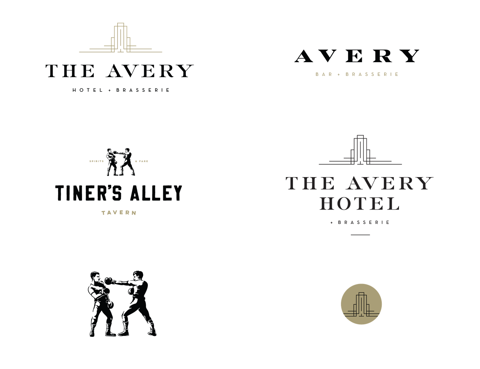
In addition to having three separate logo entities, there are a multitude of color and usage variations, to provide design flexibility and to assure the branding looks its best in every application.
Contents
01
—
the avery Hotel logos
03
—
TINER'S ALLEY LOGOS

01 The Avery Hotel logos
01A
—
Configurations
There are five unique logo configurations for the hotel depending on usage and application. Be sure to use the correct configuration at all times.

—
1. The Hotel + Brasserie logo should be used in all general hotel applications.

—
2. The Hotel logo should be used in all applications referring to the hotel only.

—
3. The stacked logo should be used in applications where the hotel needs to be emphasized.

—
4. The stacked hotel logotype should be used for horizontal applications where space is limited.

—
5. The horizontal logo should be used in applications where vertical space is very limited.

—
6. The short logo can be used in applications with very limited space.
01B
—
Color Variations
There are five unique logo color variations for the hotel depending on usage. Be sure to use the correct variation to ensure best results.

—
1. Black + Gold logos should be used for all materials with white or very light backgrounds.

—
2. White + Gold logos should be used for all materials with black or very dark backgrounds.

—
3. White + Black logos should be used for all materials with gold or medium-toned backgrounds.

—
4. White logos should be used for any one-color material with black or dark backgrounds.

—
5. Black logos should be used for any one-color materials with white or light backgrounds.

—
6. Gold logos can be used for materials with light or dark backgrounds.
01c
—
Clearspace
Clearspace keeps typography, images or graphic elements from crowding the logos. For all Avery Hotel logos, use the height of the uppercase “H” as a base for adding clearspace.


01D
—
Marks
When using one of the Avery Hotel marks, be sure to use the best color version for the application.


01E
—
Icons
There are nine different icon options for use depending on the background color and application context.
01F
—
Download
Download The Avery Hotel suite of logos, logotypes, marks, and icons below.
Note: to reduce folder size, not every color variation of every logo configuration is included. For details on which logo format to use, see section 05.

02 Avery Brasserie logos
02A
—
Logo configurations
There are two unique logo configurations for Avery depending on usage.

—
1. The Avery Tag logo includes the Bar + Restaurant descriptor below the name.

—
2. The Avery No Tag logo is simply the name.
02B
—
Color Variations
There are six unique logo color variations for Avery depending on usage. Be sure to use the correct variation to ensure best results.

—
1. Black + Gold logos should be used for most applications with white or very light backgrounds.

—
2. White + Gold logos should be used for applications with black or very dark backgrounds.

—
3. White + Black logos should be used for applications with gold or medium-toned backgrounds.

—
4. White logos should be used for one-color applications with black or very dark backgrounds.

—
2. Gold +Black logos can also be used for materials with white or light backgrounds.

—
3. Black logos should be used for one-color applications with light to medium-toned backgrounds.
O2C
—
Clearspace
Clearspace keeps typography, images or graphic elements from crowding the logos. For all Avery logos, use the height of the uppercase “E” as a base for adding clearspace.


02d
—
Download
Download the Avery suite of logos below.
Note: to reduce folder size, not every color variation of every logo configuration is included. For details on which logo format to use, see section 05.

03 Tiner’s Alley logos
03A
—
Logo configurations
There are five unique logo configurations for Tiner’s Alley depending on usage and application.

—
1. The Primary (Spirits & Fare) horizontal logo can be used in most applications.

—
2. The Primary (Spirits & Fare) vertical logo should be used in narrow or round applications.

—
3. The logotype should be used in applications where vertical space is very limited.

—
4. The Secondary (Boise Idaho) horizontal logo can be used in applications where location designation is desired.

—
5. The Secondary (Boise Idaho) vertical logo should be used in narrow or round applications where location designation is desired.
03B
—
Color Variations
There are five unique logo color variations for Tiner’s Alley depending on usage. Be sure to use the correct variation to ensure best results. For dark backgrounds, be sure to always use either the White + Gold or White version, as the the white illustrations are rendered differently than the black.

—
1. Black + Gold logos should be used for most applications with white or very light backgrounds.

—
2. White + Gold logos should be used for applications with black or very dark backgrounds.

—
3. Black & White logos should be used for applications with medium-toned backgrounds.

—
4. White logos should be used for most applications with black or very dark backgrounds.

—
5. Black logos can be used for one-color applications or applications with gold or light backgrounds.
03c
—
Boxers
There are three color variations for Tiner’s Alley Boxers depending on usage. Be sure to use the correct variation to ensure best results. For dark backgrounds, be sure to always use the White version, as the the white illustration is rendered differently than the black and gold versions.

—
1. Black boxers should be used for most applications with white to medium-toned backgrounds.

—
2. The White boxers must be used for applications with black or dark backgrounds.

—
3. The Gold boxers can be used for special applications with white or very light backgrounds.
03D
—
Clearspace
Clearspace keeps typography, images or graphic elements from crowding the logos. For all Tiner’s Alley logos, use the height of the uppercase “E” as a base for adding clearspace.


03E
—
Download
Download the Tiner’s Alley suite of logos, logotypes, and boxers illustrations below.
Note: to reduce folder size, not every color variation of every logo configuration is included. For details on which logo format to use, see section 05.

04 Brand Colors
04A
—
Primary Colors
The three primary brand colors that span across all Avery Hotel assets are black, gold, and white. See below for all RGB, CMYK, and Pantone values.
Black
Gold
White
04B
—
Secondary Colors
British Racing Green (BRG) has been used for several graphic assets including business cards and coasters.
Note on paper stock: ColorPlan by Legion Paper has a Racing Green color option that was used in 130# weight and 200# weight for business cards and coasters.
British Racing Green

05 Logo File Formats + Color Modes
05A
—
File Formats
All logos in this style guide are available in three basic file formats, to be used in different applications and environments.
EPS Format
EPS is a vector format that is designed to produce high-resolution graphics for print. It is infinitely scalable—which means it can be used for anything from a business card to a billboard with equal clarity.
JPEG Format
JPEG is a raster image type. JPEGs are primarily used for web and digital photography because of their small file size, but should not be used for printing unless they are used at a small size.
PNG Format
PNG is another raster image type. The main difference between a PNG and JPG is that a PNG can have a transparent background and is generally larger and higher quality. PNG is ideal for websites because they can be placed over a colored background.
05b
—
Color Modes
There are three basic color modes found in The Avery Logo suites for use in different applications and environments.
CMYK Color Mode
The CMYK color model is often referred to as four color process due to the fact that it utilizes four different colored inks to create an array of different hues: cyan, magenta, yellow and black. CMYK colors are mixed during the printing process itself, which can sometimes cause very slight inconsistencies in color throughout a printing run. It’s usually not a particularly perceptible change, but it’s something to keep in mind when using logos with specific color branding.
RGB Color Mode
The RGB color profile is used exclusively in digital design, as it represents the same colors used in computer screens, televisions and mobile devices. Rather than ink, colors in the RGB (red, blue, green) color wheel are created by blending light itself.
Spot (PMS) Color Mode
PMS stands for Pantone Matching System, which is a universal color matching system used primarily in printing. Unlike RGB and CMYK, spot colors or PMS colors are created with pre-mixed ink long before the image is actually produced, resulting in the most consistent color possible.
06 Typography
Adobe Garamond Pro
Please use Adobe Garamond Pro for most headlines and body copy for The Avery Hotel. Regular weight should always be used for roman and italic styles. Avoid bold and semibold weights.
Neutra Text
Use Neutra Text for small descriptors—often in caps—and can also be used for body copy at small sizes where Garamond is less legible.
Raleway (web)
For web applications where Neutra Text is not available, Raleway is a suitable replacement for body copy.
07 Patterns
07A
—
Diamond Pattern
The Avery "diamond" pattern can be used for web and print graphics. Two different weights, colors, and file formats are provided below.

07B
—
Mouse Pattern
The Avery "mouse" pattern can also be used for web and print graphics. Two different weights, colors, and file formats are provided below.

07c
—
Pattern Downloads
Download the Avery patterns below, available in AI and PNG formats.