
This brandpad provides a simple, yet robust set of brand guidelines that can be easily understood and communicated while leaving room for creative expression.
The following online document will guide you through some of the basic identity elements (such as logo, typeface & colour) and will provide some general rules for applying these elements across a variety of media types. While we prefer a standardised brand identity there may be situations that require a customised solution.
Our logo
Our main logo
Our simple yet friendly logo captures the essence of approachability and warmth through its minimalistic design.
The absence of a logo mark allows the focus to be on the typography, carefully chosen to convey a friendly and welcoming tone. The logo's simplicity not only makes it easily recognizable but also reflects the brand's commitment to providing a user-friendly experience.
Our logo is our main identifier and it should appear on all our communications, both print and screen.


Stacked logo
When space is at a premium we use a stacked logo to keep our brand concise and adaptable.
There are 4 variations of our stacked logo, which include left aligned, right aligned, small indent and wide indent.


Logo colourways
The logo is available in multiple styles, a full monochrome style in pure white or black, or alternating between the brand colours to complement the background palette.
Please see colour rules for information on these.
Do not use the logo in any other colour outside of the Talent Spaces palette.


Clear space & minimum size
The logo should always contain enough space to ensure a clean visual image. It should never be disturbed by other elements that can reduce its clarity. The amount of clear space varies in direct proportions to the logo size and is calculated using the letter height.
For the logo to be reproduced as clearly as possible, do not use the logo in less than 55mm for print and 200px for digital.


Our colour palette.
Our colour palette
Our primary palette is one of the brand elements that helps us to have impact in the market and stand out visually from our competitors.
It's welcoming, friendly and bold, which makes it pop both digitally and in print.
It is important to follow all the appropriate colour values in order to keep all brand communications visually coherent.
Orange
Yellow
Light Blue
Pink
Green
Dark Blue
Do's
Colours that work best together are orange and pink, yellow and green, blue and dark blue.
Don'ts
All colours work well next to one another but there are a few colours to not pair ontop of one another. Our black and white pair well with all our colours.


Our white works throughout the colour palette. White text should be used on colour backgrounds.

Our
typography.
Primary typeface
Our primary typeface is Mulish (Available through Google Font)
Mulish embodies a perfect balance between simplicity and expressiveness. Its clean and geometric letterforms give it a modern and minimalistic appearance. It is a versatile and functional typeface with a friendly character, making it suitable for both body copy and display type.
It is a friendly and clean san-serif font that captures the reliability and ease of the brand. It can be used in both digital and print.
We use a multitude of weights within our creative.
Bold
Bold Oblique
Regular
Regular Oblique
Light
Light Oblique
Secondary typeface
Our secondary typeface is All Round Gothic
(Available through Adobe Font)
It is a versatile font known for its elegance and modern aesthetic. With clean lines and rounded letterforms, it exudes a sleek and contemporary vibe. Its legibility and balanced proportions make it suitable for both print and digital media, offering clarity in various design applications. All Round Gothic strikes a harmonious balance between simplicity and sophistication, making it perfect for conveying professionalism and style.
All Round Gothic
For both fonts, the original kerning and leading is kept. We do not add extra space inbetween letters, nor remove space. For line spacing, the space should be a 25% increase of the font size. For example, 40pt font should have 50pt line spacing.


Our
imagery.
Our image library shows diversity, inclusion, equality and variety. Themes that are at the forefront at TalentSpaces.
Including a wide range of people, sometimes in work spaces, but without feeling too corporate.
There are hints of the brands colour palette within images and in assets we will match the background to the photos.
All imagery should be sourced and licensed as suitable.

Image example
When using sourced imagery, we zoom into a focal point (faces, hands, devices) instead of using a full image with lots going on. We then add lines or house the images in pill-shape mechanics to make it noticeably TalentSpaces. Sometimes we use a combination of both, but only use one colour on either the pill background or the line.
We match the colour of the line or background to the colour most prominent in the image.


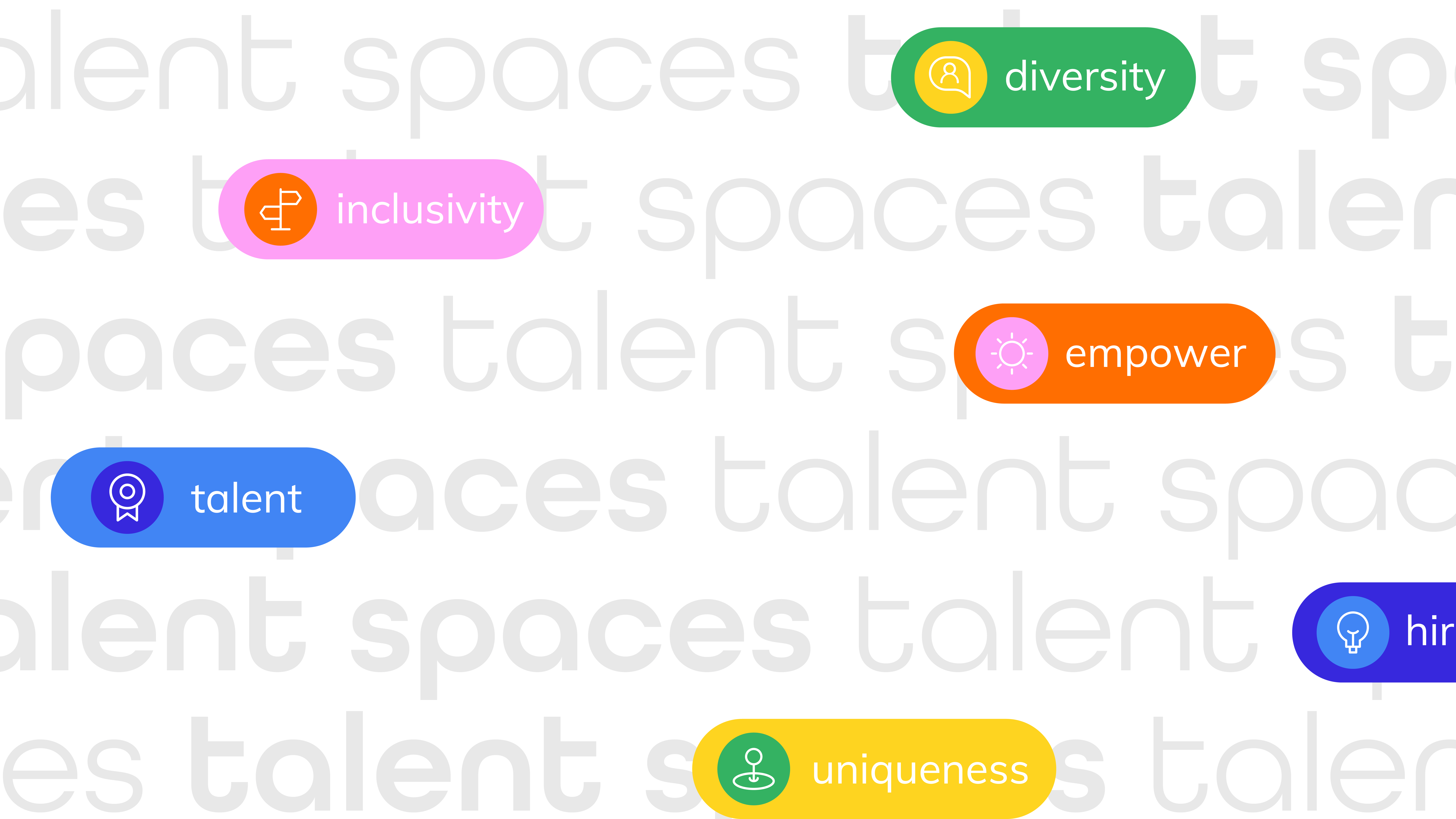
Pill mechanic
A pill / rounded edge shape can be used to hold both copy and imagery.
When using the pill with copy, the clear and minimum space padding rules stated previously should apply. This allows for breathing room and enough space to be legible.


When using the pill as a image holding device, the corner radius should be full, so that it's completely curved.
The pill height should be atleast double the width, and no longer than three times the width. Vice versa depending on orientation.
It should not be too too short, too circle-like, too long or too skinny.


Playful lines
Curved colourful lines can be put ontop of imagery to add a pop of colour and showcase the brands personality. Theres shouldn't be more than two colours used in one image.


The lines can also be used to hold the imagery on some assets. The line width should be atleast 1/4 of the asset size, so that the image takes up about one third or forth of the page.

Our brand
in action.


