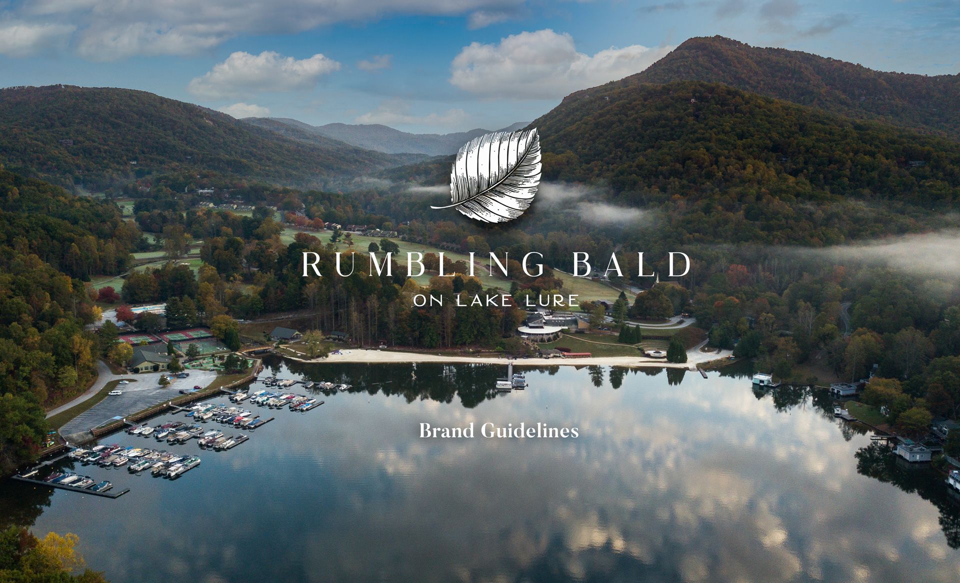
Rumbling Bald Brand Guidelines
A brand identity visually expresses and amplifies the core values of a company.
This Brand Identity Guideline provides a toolkit and documents the usage of Rumbling Bald language, visual elements and their application.
The purpose of this toolkit is to ensure consistency and recognizability of the brand across all channels of communication and offers direction for creating strong, recognizable, and effective communications.
Table of Contents
1. Language
2. Logo
3. Brand Architecture
3. Color
5. Typography
6. Visual Elements / Patterns
7. Social Media
8. Photography

Language
Consistency of language and tone are the core that holds the identity together.
Keep in mind these values when creating any type of communication.

Tagline and About Us
Close To Home, Far From It All
Welcome to Rumbling Bald, Lake Lure’s idyllic enclave of outdoor exploration and relaxation. Our home here in the mountains is built for tranquility and adventure, no matter how you define them. The natural gifts surrounding us are our greatest asset, offering a canvas to create memories, unwind, and reconnect.
Whether you’re most at home hiking the hemlocks of the Blue Ridge Mountains, floating or fishing the serene waters of Lake Lure, or challenging yourself on one of our championship golf courses, there’s something for everyone to discover here.
Live, stay, or stop by for the day; it’s all waiting for you at Rumbling Bald.
Purpose & Promise

Purpose
Our purpose is to reconnect people with what matters most: nature, family, and friends. Working together to protect our natural gifts.
Promise
Our timeless natural beauty and welcoming community create lasting connections, lifelong memories, and a renewal of body and mind.

Voice and Tone
The voice of Rumbling Bald is genuine, down-to-earth, and welcoming to all. We take pride in the natural gifts surrounding us and continually reflect gratitude toward them. We encourage adventure and exploration however you want to find them from tee times to mountain adventures.
We are: welcoming, authentic, simple, stress-free, nature focused, and timeless.
We are not: Formal, pretentious, exclusive, trying to be anything we aren’t.
Voice
Logo
1. Logo and Variations
2. Iconography
3. Clear Space
4. Minimum Size
5. Innapropriate Usage

Primary Logo

Logo Variations
There are a variety of options to choose from when applying the Rumbling Bald logo.
Each variation has different strengths depending on the format, size, and context of its application.


Icon Variatons


Clear Space
"Clear Space” is a technical term for the minimum required margin around a graphic. This space ensures that graphics are not in tension with other elements in a layout. The minimum required clear space is defined as the full height of the icon.
Logo
Icon

Minimum Size
Logo legibility degrades at smaller sizes. For the logo, sizing should always be ~0.33 inches (~100 pixels) wide or larger.
For smaller applications, use the icon.
Logo
Icon

Inappropriate Usage
Legibility is the highest priority when applying the brand to any medium.
Ensure logos are readable by following these guidelines on sizing and background color.
Do Not Outline
Do Not Stretch
Do Not Flip


Brand Architecture
1. Golf Courses
2. Restaurants
3. Communities
4. Amenities

Golf Courses
Apple Valley
Golf Course


Bald Mountain
Golf Course


Restaurants
Legends On
The Lake


The Gardens


Pinnacle Southern Kitchen


Communities
Shumont Estates


Waterside


Amenities
All ameneties to be written in Butler Medium font. The color of amenities can either be Forest Green or Alabaster. Please do not use the leaf logomark or "At Rumbling Bald"
Color Palette
Whether in our physical environments, online or in print, our two most commonly used colors are alabaster and forest green. Midnight black, hemlock white, tranquil blue, champion green, and a touch of sky blue round our our core color set.


Forest Green
Alabaster
Tranquil Blue
Midnight Black
Hemlock White
Secondary Color Palette
The secondary color palette should be used minimally where appropriate to support the primary palette.
Sky Blue
Championship Green
ADA Compliance
To provide equal access for all of Rumbling Bald's patrons, all designs are built to comply with the WCAG 2.0Success Criterion. Best compliance practices are to provide contrast between text and backgrounds and have all text comply with recommended sizes for optimum readability.

Text on images
The safest option for laying out text on images is placing dark text on a light, uncluttered area of the image. Make sure there is plenty of clear space around the text.
Text size
It is recommended that text size never goes below 10pt. Large text is easier to pass the contrast ratio and qualifies text 14pt bold and 18 pt regular. Small text is harder to pass the contrast ratio and qualifies text below size 14pt regular.
Correct text on color combinations


Typography
Butler is the Heading typeface in Rumbling Bald's system. Its main use cases are titles, large type, and subheadings.
Lato is the paragraph typeface Rumbling Bald's system. Its main use cases are body, small text, and numerals.

Heading
Butler Medium
30 pt / 40 pt, Tracking 0
Close to home, far from it all.
Subheading
Butler Regular
18pt / 24pt, Tracking 0
Western North Carolina's Best Kept Secret
Body
Lato Light
10 pt / 16 pt, Tracking 50
Welcome to Rumbling Bald, Lake Lure’s idyllic retreat of outdoor exploration and relaxation. Our home here in the mountains is built for tranquility and adventure, no matter how you define them. The natural gifts surrounding us are our greatest asset, offering a canvas to create memories, unwind, and reconnect.
Details
Late Regular
10 pt / 14 pt, Tracking 50
RumblingBald.com
Visual Elements
1. Patterns
2. Social Media Layouts
3. Social Icons

Patterns and Illustrations
The natural elements which inspired the logo are also reflected in the patterns and illustrations used across touchpoints. These are all supporting elements to the primary brand and should be used subtly to bring branded pieces together.
Polygonal Leaf Pattern
Tree Leaf Pattern


Light Leaf Illustration
Dark Leaf Illustration


Social Media
The platforms used for social media will be Facebook & Instagram. In the next sections are some guidelines to ensure consistency of design across all social media channels.

Profile Image


Facebook Cover


Social Post Templates


Story Post Templates


Photography
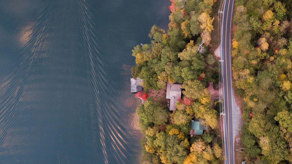
Rumbling Bald's photography captures the natural beauty surrounding us with dramatic angles and colors from unique perspectives. Photos should always be of professional quality and with a focused subject matter.


If you have future questions in order to produce any assets, feel free to contact meades@rumblingbald.com
Written and designed by 3 Owl for Rumbling Bald.