
1.0 - Brand Introduction
1.1 - What is a brand?
1.2 - Why is our brand important?
1.3 - Brand Legacy
2.0 - Identity System
2.1 - Wordmark logo
2.2 - Spacing and scaling
2.3 - Logo misuse
3.0 - The Ampersand
3.1 - Our symbol
3.2 - Ampersand guides
4.0 - Brand Finishes
4.1 - Colour palette
4.2 - Typography
5.0 - Imagery Style
5.1 - Imagery Style Examples
6.0 - Property Marketing
6.1 - Brochures
6.2 - Mail cards
6.3 - Stickers
6.4 - Press Advertising
6.5 - Signboards
6.6 - A- frames/ Pointer signs
6.7 - Window Screens
6.8 - Corflute Signs
6.9 - Flags
7.0 - Stationery
7.1 - Business cards
7.2 - Presentation folders
7.3 - Letterhead
7.4 - Notepads
7.5 - With comps slip
7.6 - Occasion cards
8.0 - Video & Photography
8.1 - Agent Photo Guidelines
8.2 - Property Video Guidelines
9.0 - Office Signage
9.1 - Signage Guidelines
10.0 - Office Marketing
10.1 - Vehicle Branding
10.2 - Window Screens
10.3 - A-frames
10.4 - Flags
10.5 - Pull Up Banners
10.6 - Press Advertising
10.7 - Mail Cards
11.0 - Sponsorship Logo
11.1 - Sponsorship Logo
11.2 - Spacing and scaling
11.3 - Logo Misuse


A brand is a collection of experiences that create an image of our business in the minds of our customers.
Only part of building a strong brand resides in logos, signs and advertising. Our reputation and personality are also based on a person's experience of the business, from the quality of our service to any interactions with our agents. Every experience contributes to this impression. Therefore, it's not just one person's job. It's all of us. We all have an important role, a shared responsibility, in managing and implementing our brand.
Together, we shape our brand.

So that we can all help build our brand – and our business – it's essential that all of our communication reflects our values and personality and leaves the right impression on our audiences.
Using these guidelines as described will enable us to deliver clearly positioned communication to everyone we reach and bring our brand to life in fresh and appropriate ways.

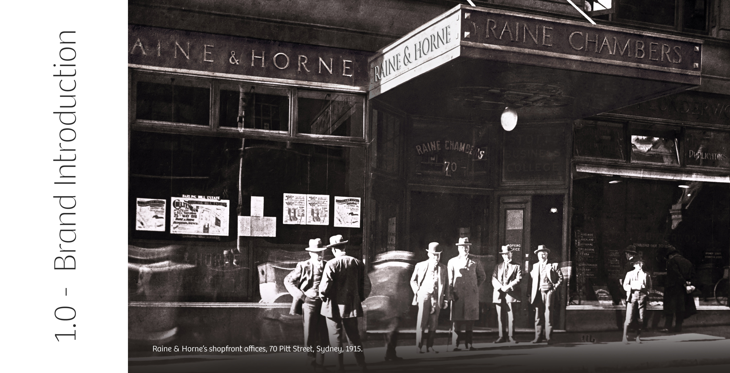
In 1883, real estate pioneers Tom Raine and Joseph Horne opened the doors of Australia's iconic property firm Raine & Horne.
Operating from Wentworth Court, Elizabeth Street in Sydney, Raine & Horne adhered to a set of business practices that have been maintained to the present day.
The property pioneers committed to personalised service and meeting a client's property needs across sales, leasing, management and consulting services for all types of property.
Today, Raine & Horne is an Australian Superbrand with international reach and has evolved to allow for growth and support within the franchise network.


The logo should be evenly spaced from a margin by no less than the height of the scaled Ampersand.


01. Do not crop the logo
02. Do not change the transparency of the logo
03. Do not shuffle around the
colours of the logo
04. Do not use different colours
05. Do not distort the logo
06. Do not outline the logo


At the core of our brand identity is a unique ampersand symbol representing our brand ideal, "Positive Partnerships".
Meaning ‘and’, the cursive Ampersand we know today dates back to the 1st century A.D, it has been discovered as graffiti in Pompeii, preserved by the eruption of Vesuvius in 79AD.
A cornerstone of our name and brand, the Ampersand was employed back in 1883 to bring together the names of our founders Tom Raine and Joseph Horne. Since then, the Ampersand has remained a core element of our Raine & Horne identity. It represents our promise to customers and the attributes of our personality, as individuals and as a united network.
Our masterbrand logotype is based on the shapes of this symbol, and our visual language has been derived from the curves. For this reason, the ampersand must never be recreated in any way by either manual or electronic methods. Only through consistency can our symbol realise its potential as a real estate industry icon and one of our business’ most important assets.


Primary Palette
For painting applications please refer to the signage document.


Secondary Palette
For painting applications please refer to the signage document.


Primary
To be used for titles or headings.

Secondary
To be used for subheadings and body copy.

Internal
To be used for email and fax.

Our name in writing


Any image chosen to represent the Raine & Horne brand should embody a sense of professionalism and assurance.
Where possible, choose photos that incorporate our brand colours and stay away from blatantly obvious stock images.


Each template has been designed using a simplistic, modern approach. We believe that a better client experience can be achieved by being strategic with the amount of details we include in our Property Marketing templates. Through the use of modern design principles and a touch of minimalism, we aim to encourage viewers to scan a QR code for greater information.
By sending clients directly to our website, we not only provide them with all the information they need about the property, but we can also enhance our lead generation efforts through Amplify which will collect valuable user data to better target our marketing efforts. Offering a choice in brand appearance allows our offices to cater to the diverse preferences and tastes of their clients.
By providing both light and dark variations of our Property Marketing templates, we ensure that each office can create a visually appealing and cohesive brand identity that resonates with their specific marketplace. We believe this flexibility will enhance our ability to connect with clients and establish a strong brand presence.


Consistently professional communication used every day strengthens our image and supports our claim of being industry experts. The way we correspond with customers has a significant influence on the way we are perceived to do business. It is essential we maintain a consistent look in all our communications including Stationery items.
Our office Stationery suite features a primarily white palette in order to match our new office signage. This clean and contemporary look conveys a sense of professionalism and reliability. It also creates a unified brand identity that reinforces our commitment to expansion.


01. Use a good quality camera
This will ensure you look professional, which will in turn evoke a sense of trust
for potential clients.
02. Choose a well-lit space with a nice backdrop
Natural lighting is recommended as it
produces warmer colour tones.
03. Frame should fit upper body, starting at the waist
This will be a comfortable distance from the camera and ensure important features such as your head and shoulders are not cropped out.
04. Show a friendly and approachable smile
To show you are likeable and trustworthy.
05. Attire should be business formal or business casual wear
For a presentable and professional appearance.
06. Keep the background consistent amongst all staff
To emphasise the team unity.


Our new signage design and colour palette was carefully and strategically chosen to stand out from the majority. We chose a primarily white look for our external signs to help distinguish ourselves, while supporting our on-going strategy to reclaim our rightful place at the top of the industry.
These elements not only give the offices a contemporary and professional look, but they also create a cohesive and unified brand identity across different locations as well as our Commercial and Rural brands. The use of high-quality materials and finishes adds a touch of sophistication, further enhancing the premium feel of our offices.


In the early 2000’s, our network decided to fly under the flag of our primary Raine & Horne logo without the differentiating inclusion of office names/locations. This was done so to showcase our size in the marketplace, as well as to enable the seamless future success and expansion of our offices.
This decision allowed our offices to grow quickly and expand their reach into new markets. It also enabled a more unified brand presence, making it easier for customers to recognise and trust our services. Continuing this approach means that offices can more easily maintain a consistent brand identity and leverage the reputation and recognition of the primary Raine & Horne logo.
To this end, we have been considered in our approach in what applications an office can use their individual office name/location. This includes local sponsorship as well as select stationery and property marketing templates. This not only facilitates for smoother expansion into new markets, but also instils trust and familiarity among customers, ultimately leading to increased business opportunities and success for our network.


When utilising Raine & Horne logos for sponsorship purposes, it is crucial to adhere to these specific guidelines to maintain the integrity of our brand. These logos are designed exclusively for offices to use for event or club sponsorship purposes and should not be used for any other purpose unless explicitly approved by the Corporate Marketing team.
As a general rule of thumb, sponsorship logos should always be placed in a strategic position that maximises visibility and exposure. Whether it's on event promotional materials, banners, or jerseys, the logos should be clearly noticeable using the right coloured logo for high contrast against the background it appears on.


The logo should be evenly spaced
from a margin by no less than the
height of the scaled Ampersand.
Office’s with more than one suburb in
their name should include a vertical
bar and space between each name.


01. Do not use a slash to separate suburb names.
02. Do not use an ampersand between suburb names.
03. Do not centre allign the text in logo.
04. Do not write out the logo.
05. Do not change the colour of the suburb name.
06. Do not change the colour of the logo.

We value clear communication and are here to support you in adhering to our brand guidelines.
If you have any questions or require further clarification about our new guidelines, please do not hesitate to reach out.
Trademark
The name Raine & Horne is a registered trademark
of Raine & Horne (Holdings) Pty Limited.
For any further information
Corporate Marketing Team
Email: marketing@corp.rh.com.au
Telephone: (02) 9258 5400

