Porcelaingres
Brand guidelines
Ver. 1.0, may 2023
Timeless
Straightforward
Human-centered
Vibrant
As part of the Italian Iris Ceramica Group, we manufacture high-quality ceramic stoneware surfaces. We are proud to be a part of this group, which has a long-standing reputation for excellence in premium ceramic solutions. Our production is based in Vetschau, Germany, as well as in Castellarano, Italy.
We are committed to providing our clients with the highest quality ceramic stoneware surfaces available on the market. We use state-of-the-art technology and the finest materials to produce tiles that are not only aesthetic in design, but also durable and long-lasting.
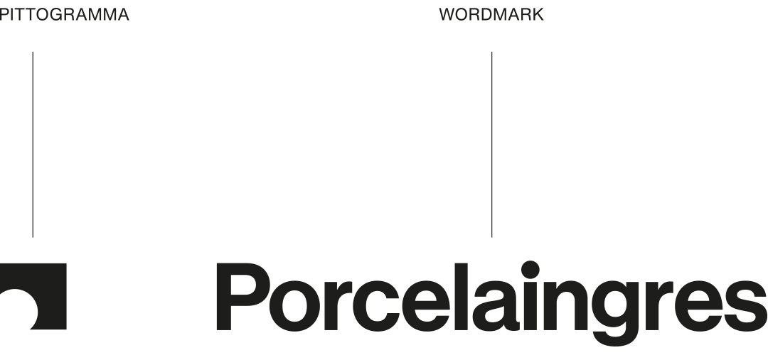
Logo
Our logo is clear, solid, timeless.
It consists of two elements: wordmark and pictogram.
Wordmark and pictogram are detached, giving more dynamism to the identity and greater value to both.
Wordmark and symbol are always both present in a ratio of h 1:1, 1:2 and 1:4. On printed supports they do not necessarily have to be present on the same side, but can be adopted separately in solutions like f/r type or digital supports like header/footer.


Only in exceptional cases, when it is not possible to respect the distances between the pictogram and the wordmark, it is possible to use the full version as in the example above.
Logo clearspace
When placing the logo, it's important to give enough space from the margins and other elements on the surface it's presented on. The clearspace principle derives from the size of our initial.


Logo placement
Orizontal images


Vertical images


Web


Sub-branding
The simplicity of our wordmark allows it to have various lock-ups when we communicate e.g. Vetschau, Berlin or Outdoor.
Never use only pictogram for sub-branding.


Co-branding
When we collaborate or partner with other brands, we have developed a system for co-branding. Either Porcelaingres leads or the collaborator leads. Both options are ok. We can choose between horizontal and vertical lock-ups.
Horizontal system:
Wordmark

Vertical system:
Wordmark

Logo sizing
Our logo is designed to work at all sizes. The minimum logo size is set to a height of 15 px, ensuring proper legibility. There is no set maximum size. If you go big, always remember to follow the rules of clearspace.
Logo color
The Porcelaingres logo should only be used with black, white and our brand colors. Black and white are the primary usage, but it's also allowed to practice our Camo Color System, when the logo is presented in split view with a photograph.
Logo on photography
When applying our logo on photography, always ensure enough contrast between logo and image to make it clear, crisp and legible.
Usage:
Wordmark+pictogram
Usage:
Wordmark/pictogram
Wordmark-pictogram placement
Always keep wordmark and pictogram distant. At least 4x (x=P or pictogram height) for vertical allignement and 1y (y=wordmark length) for horizontal allignment, as shown below.
Layer logo placement
Top sx


Top dx


Bottom sx


Bottom dx


Centered


Favicon


Misuse
Our logo should always be treated with love and appear consistent throughout all surfaces. Respect it please.

Remind:
Do not use the logo as part of typography.
Always use our brand typeface.
Colors
A new color palette that defines the entire visual identity for a more contemporary and
dynamic look.
Black and white are the basis on which the other colors move. These two colors guarantee us a color palette in line with the values of the brand. To these are added secondary colors that warm up the palette and some accents that we will need to highlight information and that we will use with caution. Yellow is the color we designate for institutional communications.
Primary
PG black
PG white
Secondary
Warm grey
Skin
Sage
Powder blue
Grey shades
Dark grey 3
Dark grey 1
Light grey 3
Dark grey 2
Neutral grey
Light grey 2
Specials
Silent green
Accent blu
Millenial pink
Aubergine
Our accent
PG yellow
Colored background
with type
Always make sure you have a solid contrast between the background and the text.

Camo color system
If the logo appears in split combination with photography, try to choose a color from our palette that is the closest match to the most prominant color in the photograph.


Typography
Neue Haas Grotesk:
much more than a revival
Neutral, rigorous, it perfectly expresses the characteristics of Porcelaingres. The new version, designed in 2011, brings a typography classic into the digital age. The new logo is also based on an elaboration of this font, which will be used throughout the corporate identity.
This is our voice.
This is our character.
Confident, real, fair.
Neue Haas Grotesk is clear, accessible and contemporary. It is an indisputable title when applied in bold, but is also functional for body text. All texts with negative kerning have been abolished.
In order to be used both for printing and for the web it is necessary to purchase the font license in the formats Display and Text.
Weights
Every weights of the font could be used.
Those below are the favorite ones.
Neue Haas Grotesk
Roman

Neue Haas Grotesk
Medium

Neue Haas Grotesk
Black

Sizing
When establishing the typographical system, strive to keep the styles as follows, respecting the desktop and mobile dimensions. Sizing is the main tool to create an effective hierarchy.
H1
Desktop — 80 px
Mobile — 80 px
Abc
H2
Desktop — 60 px
Mobile — 30 px
Abc
Body
Desktop — 22 px
Mobile — 18px
Abc
Alignment
Large typography should always be left-aligned or centered. It should never right-aligned or justified.


Smaller typography should always be left-aligned. Never centered, right-aligned or justified.


Another thing:
Never use all caps for your headline.

Tracking
Tracking is the spacing between glyphs applied to an entire box of text. To be sure of set it correctly put this value to "0".
Below are some guidelines to follow.
Correct tracking

Too tight tracking

Too loose tracking

Kerning
Kerning is the spacing between each individual letter in a word. Once tracking is set correctly, go into each word and manually adjust the kerning to make sure it sits perfectly. When working in design software, kerning should always be set to Metric.
Below are some guidelines to follow.


Leading
Leading is the space between lines of words. Leading should be optically bigger than the spacing between words, which again should be greater than the tracking. This will result in perfect legibility. Follow this principle for both print and digital type setting.
Correct leading

Too tight leading

Too loose leading

Misuse
There will most definitely be occasions where type issues arises, that isn’t shown in the examples seen until now. In these cases, refer to the guidelines and be as logical as possible. Try to find solutions that feels consistent and correct with the overall brand aesthetic.
Tone of voice
Principles
We always prefer a clear and natural copy that limits all forms that weight down and lengthen written communication. Examples of forms that weight down communication are incisors, adverbs and verbs in the gerund manner. We choose the right words to ensure a concise communication that erases the superfluous. To “weak” words and phrases we prefer “strong” ones, that are direct and clear words and sentences.
We are:
Refined
Factual
Smart
Clever
Clean
We are not:
Sarcastic
Funny
Political
Wrong
Sloppy
Videography
Video layouting
Below, an example of storyborard for collection videos
1. Intro
2. Collection
3. Ambience
4. Outro
We are watching you,
respect our guidelines!