Brand Guidelines

About these guidelines
We have provided these guidelines for Octopus Legacy in order to keep brand cohesion and consistency throughout all assets produced going forward.
These guidelines can, and should, be accessed by the team producing assets for Octopus Legacy.


Our mission
Death is a conversation
Practically, financially, emotionally. Too many people aren’t prepared for death, because we see it like the full stop that’s waiting for us at the end of our lives.
But what if we treated it more like a question? Not the last word, but an invitation: for more words, more questions. More conversation.
Octopus Legacy is a place to plan for death and find support following a loss. But it’s also a challenge: to create a legacy that connects you to the people you love. While you’re here. And after you’re gone.
Brand values
In life and in death. Death can come between us. But it can also make us stronger. We see a world where people work out the real meaning of legacy, one that connects to them. We’re here to make that world happen.
Hero:
The connection seeker
Problem:
Death feels final
Guide:
Octopus Legacy
Magic Power:
We spark conversations that connect generations
Brand Belief:
Death has the power to connect us
Villain:
The disconnected death
Tone of voice
The death guide
In the bright room of our breezy office, surrounded by lush, green plants, we sit opposite a client and talk to them about legacy. Asking: “How do you feel about death?” “What do you love about life?” “How can we reconcile these two things?”. Occasionally straightforward, occasionally funny, always sensitive, we keep them on their toes, asking questions that encourage them to reframe their thinking and explore death's mysterious edges. Saying: “Have you thought about it like this?” “What if you gave that a try?”. Death exists in a dark room in their minds. We open the curtains and let the light in: show them it’s nice outside.
Life-affirming:
To talk to people in a way they resonate with
Illuminating:
To shine a light on life's biggest question
Forward:
To motivate change in behavious and relationships
Empathic:
To create a genuine and personal connection

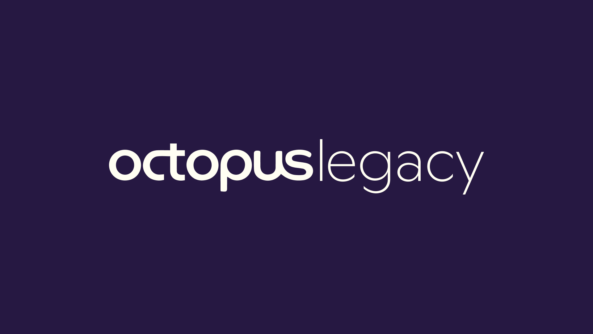
Wordmark and spacing
Hover to see visual


Spacing
We use the stroke width of the Octopus logo to space out Legacy.

Dos and do nots
1. Don’t distort the wordmark
2. Don’t make the wordmark
unreadable
3. Don’t break up the wordmark
4. Don’t apply an outline to the
wordmark
5. Don’t add special effects to
the wordmark
6. Don’t place content inside the
wordmark
Wordmark positioning
A guidance of position lockups we use for the Octopus Legacy wordmark.
This should be taken as a positioning guide, this is not suggested artwork.
1: Top Left
2: Bottom Left
3: Centre Bottom
4: Centre
Hover to see visual


Our colours
We have both Core and Legacy colours in our brand.
Core colours are taken from the core Octopus group colours, giving a nod to the wider brand and allowing us to fit into the rest of the brands.
Legacy colours give us the distinctive edge to differentiate us from other brands under the Octopus group.
Below you can find the values and codes for each of our colours.

Core Pink
Hex: #FF71CF
RGB: 255, 113, 208
CMYK: 0, 82, 0, 0
Pantone: 225 U/C
Core Purple
Hex: #261842
RGB: 38, 24, 66
CMYK: 77, 80, 10, 36
Pantone: 276 U/C
Legacy Purple
Hex: #8457E8
RGB: 133, 87, 232
CMYK: 62, 69, 0, 0
Pantone: 2088 U/C
Legacy Brown
Hex: #B8AB88
RGB: 184, 171, 136
CMYK: 17, 18, 43, 4
Pantone: 4525 U/C
Legacy Cream
Hex: #FFFEF3
RGB: 255, 254, 243
CMYK: , 1, 8, 0
Pantone: P 1-2 U/C
Legacy Blue
Hex: #88B3D1
RGB: 136, 179, 209
CMYK: 50, 9, 0, 0
Pantone: 291 U/C
Colour combinations
Our Core colours and our Legacy Cream are used as our main background colours.
We have specific colour pairing when setting type against these background colours.
Hover to see visual


Typeface
Our brand typeface is Roobert Pro.
For most cases, we use Roobert Pro set in Medium. There are some key moments where we need to create visual differences between text pieces, in this case, we can use the Bold weight.
Hover to see character


Characteristics
Hover to see visual


Typography size pairing
Setting type pairings together, we use a third scale to help ensure correct hiearchy.
These point sizes are used as an example of the scale in correlation to eachother.

Leading and tracking
We have suggested leading size based on the scales in the above section.
Typography alignment
In our brand system, we can set blocks of text both Left and Centre aligned.
We suggest using Centre aligned for shorter, punchier lines of copy, and smaller prompts like questions and sign-off lines. Whereas Left aligned should be used for most cases where text should be read, ensuring legibility and accessibility.

Digital type scales
Opposite we have shown example type sizes utilising the scales previously mentioned in the guideline. This helps illustrate the notion of fluctuating leading when it comes to larger and smaller type size.
The buttons below links to the Octopus Legacy Figma documents which inludes all web typography styles.

Substitute typeface
Our substitute typeface to Roobert Pro is Figtree, which can be found on Google Fonts and is compatitble with tools like Klaviyo and Google Slides.
Please only use Figtree when there is no possible way to use Roobert Pro, and apply the same typography settings to Roobert Pro outlined above.


Social icon / favicon
For our social icon/favicon we have taken inspiration from our OL brand system, mimicking the roundel visual into a circle form. This is set in the Core Colours with the Core Pink being the main idefitable colour and linking the brand back to the Octopus group of brands.
For Instagram story highlights, we have two options that we can choose from depending on what content is chosen.
1. Legacy Colour dots
2. Blurred images
Our examples use the Legacy Colour dots as more brand-focused, serious skewing highlights. And using the Blurred images for more friendly, approachable and welcoming highlights.
Hover to see margin
Download your core icon
Download your secondary icons

Image direction overview
Drawing from our life-affirming tone of voice principle, our image direction should feel uplifting. Showing people in a way which feels warm and familiar, presenting everyday settings. We're not comedians but we're not afraid to add a light touch of humour where appropriate, channeling positivity and naturalness.
Please use the following images as a visual guide and reference point, but not for commercial use unless otherwise stated by the photographers themselves.

Image systems
We have two ways of treating images:
1. Memories Captured
2. Memories Blurred


Overall rules
Image corner radius
Corner radius should be sized proportionally and responsive to the the format of the image size.
Hover over to see the scale factors


Image System 1: Memories Captured
In reference to photos taken on an analogue camera, image system 1 revolves around the idea of a film strip, in which photos are shown in sequential order.
We can capture memories, moments, feelings, all of this on film and we want to evoke this through a visual system

Explaining the system
The film strip comes from images bing in and out of perspective on a rounded loop.
With the camera remaining focused and centred on the core image.

Because of this, we can see how this system locks up when in use.


Image System 2: Memories Blurred
Memories can be hazy, hard to remember exactly, often like looking through a frosted window into the past.
Even if we can't fully recall all the intimate moments, the feelings and emotions sit with us for life.
Our second image system references this through blurring images, creating an essence of the image. This will allow customers to relate to the image through feelings and emotions.

Explaining the system
To execute this, we essentially pull the image out of focus (adding a layer blur) and scale the image up.

To execute this, we essentially pull the image out of focus (adding a layer blur) and scale the image up.


Tier system overview
The brand system can be broken down into 4 Tiers. Identifying and showing examples of when/where these tiers should/could be used
We can see the overal summary of these tiers here.

Tier 1: Connect Roundels
Tier 1: Connecting roundels
Pre-produced motion stings that can be implemented and rolled out though web, socials, digital OOH and any other digital applications needed.
These can be downloaded from the button below.

Tier 2: Copy + Roundels
Tier 2: Copy + roundels
For consistency our corner radius' for roundels, image framing and any other shapes take influence from our typeface Roobert. Where the corners are geometrically rounded off.
Hover to see visual


Roundel alignment and spacing
For optical viewing, text within the roundels should have padding of 3/4 the x-height at the bottom, and half the x-height at the top. The left and right padding is equivelant to same height as the x-height.
Hover to see visual


Roundel blur
Typically used on hover or when placed over images, roundels should include a blur of 24%.*
*This percentage should be adjusted depending on scale of the roundle.
Hover to see visual


Roundel blur halo
When setting roundels against our Octopus Purple, we use a halo edge to make this pop.
This is produced by duplicating the blured layer behind the colour and setting this in our Legacy Cream.

Figma layers example

Roundel blur scaling
The blur that we have for the roundels should adjust according to the size of the round.
Because we can't cover all instances we have chosen to use the typographic scale examples that we outlined in the Typography section.

Roundel colour combinations
Here we show the DO's and DO NOT's for colour applicaiton of the roundels.


Roundel leading
When the roundel is added to copy, the leading should be increased to 112%.*
*This percentage should be adjusted depending on scale.
Hover to see visual


Tier 3: Copy + Roundels + Image
Tier 3: Copy + Roundels + Image
Combining longer form copy with images to build our brand system.
Hover to see visual


Here we show examples of the tier system in action using examples for Dsiplay ads, Online banners, etc.


Examples of portrait Banner ads/Online banners


When we can break the rules
While for the most part, we stick to the half and half system. We have some exceptions where we can break the rules, this example of using a centred image with specific copy lines.


Tier 4: Full Bleed Blur System
Tier 4: Full Bleed Blur System
Combining longer form messages with images


UI Components Overview
We have proposed a few UI elemnets that should be used in order to keep brand consistency.

Circular Buttons
We use the relative X height of the type on the design, as a guide to the size of the elements.


Button Colours
We can use these elements in the suggested colours here.

Text Button
For roundles, we use the 1.5 of the X height to scale the roundel.


Text Button + Arrow
For spacing, we have suggested a half x height for the space between elements.
*this is just a guide as we cannot cover all instances


Text Button Colour + Blur
When hovering over these elements, we can use the blurred effect in order to signal interaction.


Social Templates
Social Templates
We have produced 6 social template assets to cover a wide range of social content.

1. Type only
Using centre aligned text we can create punch text based content against our brand colours.


2. Type + blurred background
For longer for copy posts, we have produced a template that can house two type sizes, for varying types of copy.


3. Type + roundel
We have set up a roundel post for when we want to go forward with adding the highlight into the copy.


4. Image only rounded edge
For our image only with edge, we can use any of our brand colours as the base background.


5. Image only film strip
A template for using the film strip image direction, all images can be replaced in Figma, including the blurred image to help posts not seem repetitive.


6. Image only full bleed
We can, of course, opt to use a full-bleed image. This example doesn't include a blurred image, but this can also be added to this post type. This post type is great for drawing attention to the caption where further detail can be added. For our image only with an edge, we can use any of our brand colours as the base background.


Social template files


Google Slides
Google Slides
We have produced Google slide templates for all future decks.
This can be found in the link below.


Google Slides Template
FWIG File
FWIG File
We have visually designed an overview of the elements to go forward with for the FWIG File. We have included suggestions around printing method, bidings and finishes.


Strategy
Wordmark
Palette
Typeface
Substitute typeface
Icons
Tiering systems
Web handover documents
Social Templates
Google Slides
FWIG Files