NextUp Brandbook
Updated 2025
Brand System

Visual Guidelines
01 Brand logos
Our logo is the graphic representation of who we are as a brand and an organization. It is only to be used in the ways described here with acceptable variations.
Primary logo - Royal Purple
This is our primary logo.
Alternate usage logo options
Several alternate logo options with color pairings are available to bring the energy of our brand to life. These alternate logo options and color pairings are ideal in marketing communications created by a graphic designer, such as social media assets and digital and print advertising. Use only these combinations and do not mix and match color options.
Alternate usage - dark logos on Aqua, Light teal backgrounds
Pair with Dark color logos (Royal Purple, Black, Dark Gray, Dark Teal etc.)
Alternate usage―light logos on Dark backgrounds (Dark Gray, Black)
Pair with light color logos (Aqua, Light Teal, White, etc.)
Alternate usage―Dark logos on Light Gray backgrounds
Pair with dark color logos (Royal Purple, Black, Dark Gray, Dark Teal, etc.)
Alternate usage―Light logos on Medium Teal, Dark Teal backgrounds
Pair with light color logos (Aqua, Light Teal, White, etc.)
02 Logomark
The Fast forward icon is part of the NextUp logo lockup but can also be used on its own in any brand color or transparent overlay. It should never be rotated. The arrows should always be pointing to the right.
Fast forward icon in royal purple
04 Region logos
Region logos were created to be used specifically for region communications, including social media and event promotion. For these communications, the region logo is preferred over the brand logo. A full color in Royal Purple as well as alternates are available for use for each region and can be downloaded here. Please follow the usage and placement guidance outlined for the primary logos above.
05 Colors
Our palette is supportive. To maintain focus and priority on the substance of our message, subject of our photography & benefits of our programming, the NextUp color palette is intentionally selected to be complementary to those key elements.
Primary Palette
Shades of teal/aqua and gray for large majority of materials.
Dark Teal
Medium Teal
Light Teal
Aqua
Dark Gray
Gray
Light Gray 1
Plain White
Light Gray 2
Plain Black
Secondary Color Palette
Use Royal purple for logo colors; Use both for accent colors as needed
Royal Purple
Bright Purple

06 Typography
Our typographic style has been developed to deliver our work and communications with clarity, objectivity, and conviction.
All of our communications―from internal documents to client-facing presentation to blog posts for the public to see―should be concise and scannable.
Primary typeface―Hurme Geometric Sans
Used for headlines and website buttons
Hurme Geometric Sans No.1 & 2 includes seven weights with true Small Caps and obliques. Alternate characters and other Opentype features make for a versatile family that can be adjusted for specific needs. Hurme Geometric Sans No.1 and No.2 are essentially the same fonts, but with different sets of characters set as default.
Secondary typeface―Charter
Used for body and descriptor copy
This typeface is also known as Bitstream Charter. The styling of this typeface is totally based on Pierre-Simon Fournier’s characters and you can easily found this styling in the 18th-century typefaces like futura font.
This typeface is originally designed so that it can be used in the printing of low-resolution designs that are of around 300 dpi in the 1980s but now it is really suitable for every type of printing design.
Alternate headline typeface
Use Montserrat Extra Bold when Hurme is not available
Websafe Typeface―Source Serif Pro
Use when Charter is not available.

Photography Guidelines
01 Photography style
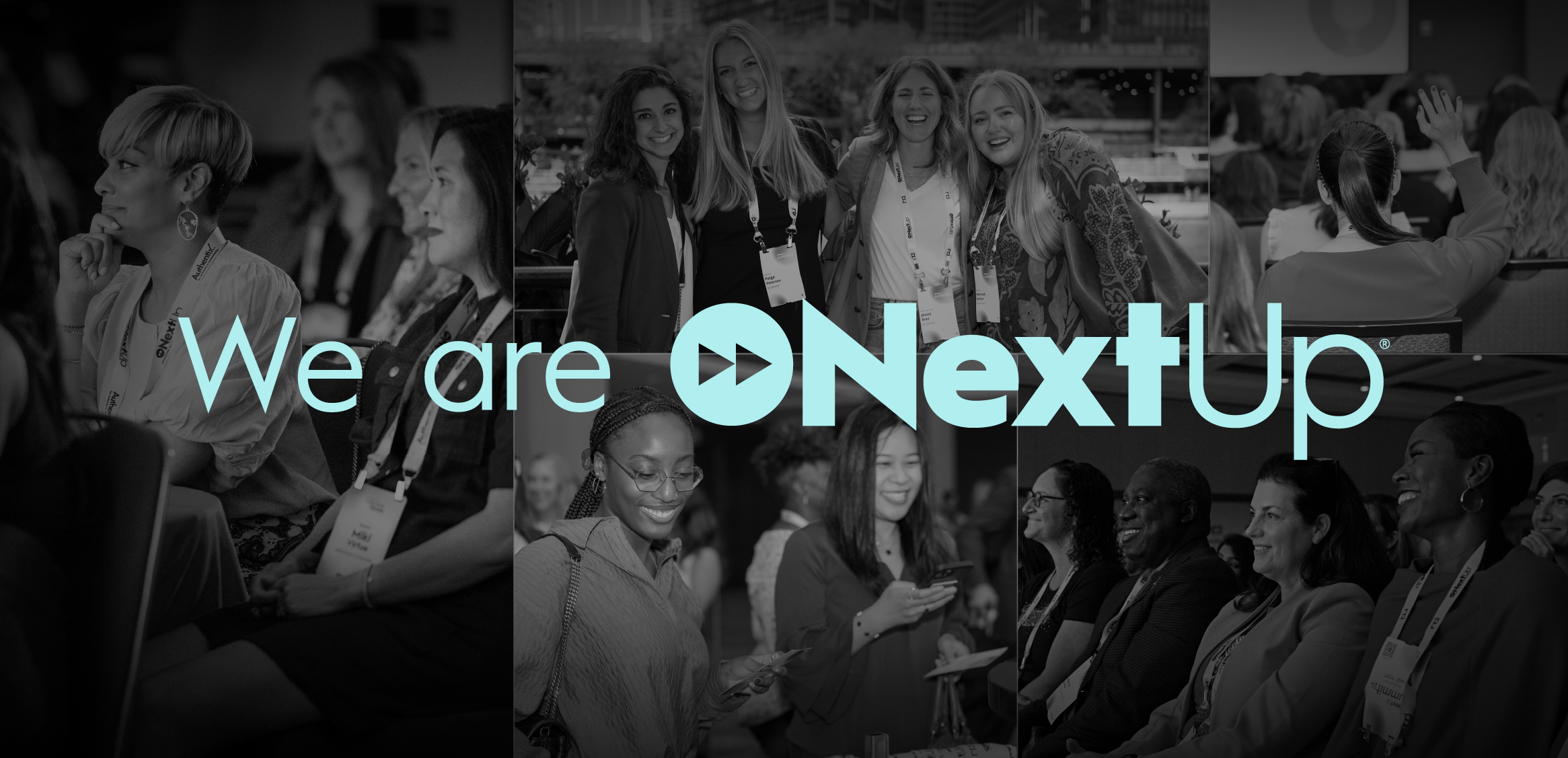
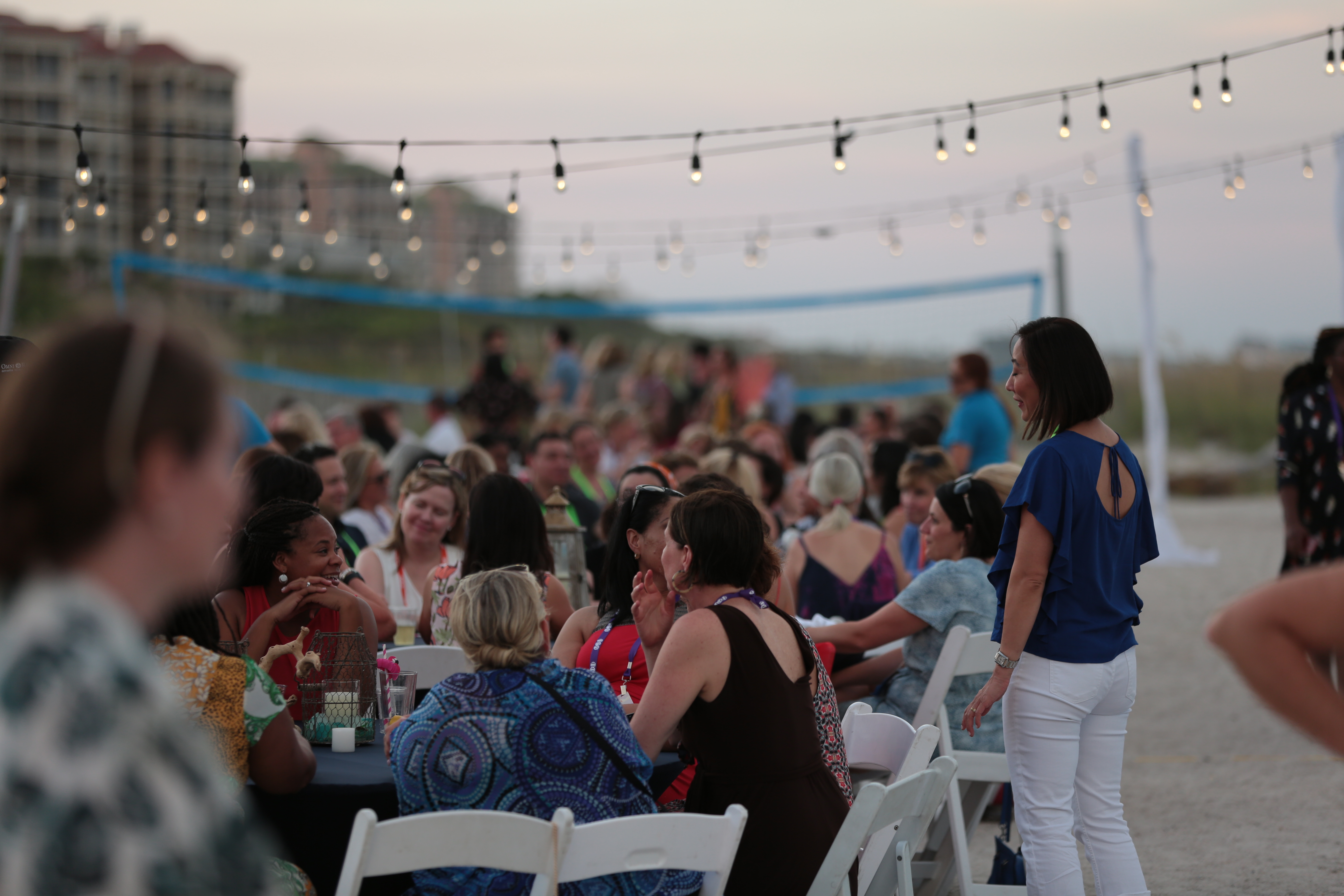
Photography should represent the diverse NextUp community and showcase a range of individuals across genders, ages, ethnicities, and career stages. High-quality, high-resolution, active photography featuring NextUp members, leadership, staff, and partners should be prioritized over stock imagery. Photography should be primarily in black and white, with some color photography for accents.


02 Photography dos and dont's
Imagery should not be too busy and should have a strong focal point.
Subjects should not compete with legibility of type when content is overlaid.
Do not use low-res photography or clip art.
While full-color photography is preferred, black and white photography may be used for portraiture, such as speaker or team member head shots.
Web Styles
01 Web Type

02 Buttons

Strong design executions


Verbal Guidelines
Just as with our visual guidelines, it’s important that we approach language
and written communication according to these standards to ensure brand impact and consistency.
Voice and tone
It’s not just what we say, it’s how we say it. NextUp’s voice and tone encapsulate how our brand’s personality comes across and is expressed emotionally.
Whenever and however we communicate, NextUp is:
Dynamic
We speak with passion, enthusiasm, and a boldness that shows that we’re going places—together.
Conversational
We spark and engage in meaningful dialogue, fostering authentic connection through optimistic, friendly communication.
Empowering
Our words have power, and we celebrate this fact by using punchy, actionable language to rally around our cause.
Inclusive
We use positive language that acknowledges and uplifts diverse viewpoints and experiences.
Expert
We speak with the confidence that comes with expertise, taking our role as a leader in the DEI&B space seriously and providing solutions at every turn.
Our Mission
Tagline
Advancing all women in business
Boilerplate: Short
NextUp is the leading national membership organization building the next generation of leaders and inclusive workplace cultures that advance all people in business, while addressing the unique barriers women continue to face. Open to all genders, we are a powerful, growing community of 100+ national corporate partners and 16,000+ members across 21 regions.
Boilerplate: Long:
Founded in 2001, NextUp is the leading national membership organization building the next generation of leaders and inclusive workplace cultures that advance all people in business, while addressing the unique barriers women continue to face. Open to all genders, we are a powerful, growing community of 100+ national partner companies and 16,000+ members across 21 regions. NextUp provides leadership development, resources, and programming designed to create equal opportunities for everyone. We conduct all programs and employment practices in full compliance with federal, state, and local laws.
Written Style Guide
Use these word styles when writing about NextUp.
NextUp
Always written as one word with capitalized “N” and “U." Our name should never be used as "Nextup," "Next Up" or any other variation.
Network of Executive Women
Moving forward, only use Network of Executive Women or NEW when referencing to the name change (i.e., "NextUp (formerly known as Network of Executive Women)...")
members or ambassadors
Should always appear lowercase, for example, "NextUp members."
Questions?
Reach out to us at connect@nextupisnow.org with any questions on how to bring the NextUp brand to life. Thanks in advance for helping us tell a consistent brand story!