Nelly Jelly
Visual identity guidelines
Last updated: 2022-04-06


Contents
You can always use the menu to quickly access the wanted section.
This icon indicates an image or text is interactive. Do hover and find out more!
Logo
Versions
Colors
Use
Colors
Primary
Secondary
Typography
Typeface
Do's and avoids
Customising type
Graphic elements
Main
Stickers & Icons
Compositions
Application
Social media
Presentation template
Email signature
Business card
Scarf
Products

Our logo!
Logo versions
All of Nelly's logo's. May seem like many, but all serve a purpose, so please get to know when to use which.

Main version
Used the most.
Can be used in blue also.
Must have enough contrast for legibility.

Outline version
We use this logo in places we need to look a bit more serious. For example - formal presentations and LinkedIn posts. Think of it as the "corporate" logo while the main is the "fun" one.

Small scale
Use this one when there is not enough room to showcase the whole logo - places like Youtube thumbnails, smaller size ads, favicons and so on.


Wordmarks
These versions of the logo are used on book covers. For more visual guidelines considering book covers please visit this link.

Character
This lockup can be used when showcasing Nelly's character combined with the main logo.
Logo colors
Nelly's logo is used mostly in two colors - blue and sand. You can also use black or white if needed.
For color codes click here.

Do's & Dont's
Quite simple but very important!
Apply to all logo versions.


Do's & Dont's
Logo letters should always be one-colored. If the background is multi-colored the priority is for the main colors.

Small applications like thumbnails, smaller size ads and favicons use the small scale version.

After placing the logo somewhere to your liking, make sure it sits neatly on a clear background.


Our colors!
Primary colors
Main Yellow
Main Purple
Main Blue
Yellow tone #1
Purple tone #1
Blue tone #1
Yellow tone #2
Purple tone #2
Blue tone #2
Main Sand
Sand tone #1
Sand tone #2
Secondary colors
Main Cream
Pink
Cream tone #1
Violet
Red
Cyan

Our typography!
Mikado
We use this typeface for Nelly's communication. Its rich family can serve many purposes. Scroll down and you will find various ways to play with type and experiment with various compositions.
Do's & Avoids
Type treatment is especially important! Use these examples to make sure typography is on point.


^
- When using different text sizes for hierarchy, they should contrast visually and not appear similar in size.
^
- Try not to italicize full sentences.
- The arc of curved text on top should be facing downwards! Curved on the bottom can be used in both directions.
^
- Contrast can be achieved through style difference or color, but using both is risky.
- Important headlines should be playful, incorporate colors!
Some important type treatment
& where it derives from.

Also!
Seperate your headlines using contrast and sizes. Use colors if you want even more contrast and hierachy.

Customising type!
Some situations will need expressive type,
do experiment. An example to get you started.


Our graphic
elements!
The main graphic element,
let's see how it's made.

Okay, and what can
we do with it?
We can
create backgrounds
We can
put photos in it
We can
highlight products


Some ground rules.
Just the right size.

Too big. Hard to identify the element.

Waaay too small.

Showing just the right part.

Showing the wrong part of the element.

Also, we are not interested in this.

Using two graphic elements is encouraged. Just find the right balance.

We are on shaky ground here. Please proceed with caution. If you do, use this type of composition rarely.

We encourage creativity, but this type of graphic language no longer belongs to Nelly Jelly's world.

We also have a corporate version of this element.
We use this graphic element in places we need to look a bit more serious, mostly in LinkedIn posts. Think of it as the "corporate" element while the main is the "fun" one.
This type of graphic element is usually combined with outline version of the logo.

We combine the main element with
stickers & icons

1
Starting with one of our main colors and the main graphic element.

2
Adding a product or photo in it. Still missing something...

3
Perfect. They should of course higlight an important communication detail.

Creating your own stickers & icons
If you ever need a specific one - draw your own! But make sure you add this distinctive detail to it.

Stills from the show
Highly recommended to use still images taken from Nelly's show to fill layouts with imagery. These images tell the story and create Nelly's world, use them!

Stills with the graphic element
Cropping still images presents some challenges. We should try to hide small details from the image which touch the edges of our graphic element. Sounds confusing so the example shown explains it.


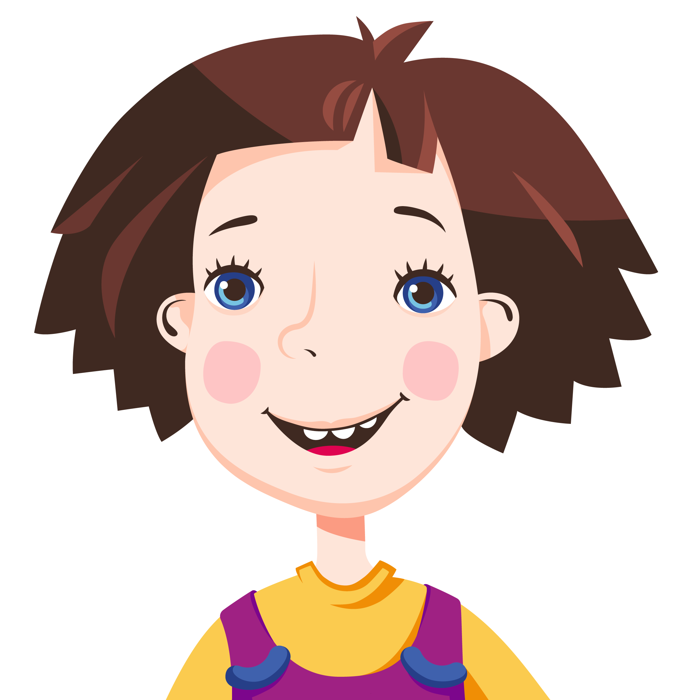
Nelly!
Our main hero is not static!
She's joyful, fun and should be seen as such.
Use these various expressions and poses so Nelly
doesn't look the same everywhere.


The next chapter will show how all of this combined looks!

Our applications!
Social media
Profile pictures
Recommended for all social media pages. Remember that LinkedIn should be treated as a more serious platform and use the outline logo version.
Do use Nelly's character in different suits / situations as the profile pictures occasionally!

Social media
!
Apply to social media platforms which use the square format.

Social media
Instagram grid
Every once in a while posts dominated in our main colors should appear as they remind and build our brand presence.

Social media
Instagram stories
Stories are a useful way to tell scenarios or stories (pun intended) as they offer the flow of time.
Size: 1920 x 1080 px

Short sequence of three stories, not animated. Start with the logo announcing something, then we show what we announced and finish with a reminder to visit our website.

A story broken down into key frames (animated). Same as before, although we now due to magic of animation we can show off more products.
Do use all of colors available!
Do use all of available graphic element variations!
Do use stickers and icons to bring more life!
Do have fun!

Social media

Social media
Facebook covers crop your design depending on what you are viewing it from - mobile or desktop. All elements should be focused more towards the center of the layout to avoid cropping out details.

Social media
Facebook covers
Still images applied with main colors and graphic element. Fresh and simple!

Social media
Facebook
ad carousels
Hover to see how backgrounds can intensify the design or vice versa - make it cleaner.


Social media
LinkedIn posts
Remember the place we need to look more serious? LinkedIn is one of them. Pay attention how everything is more static and boring.

LinkedIn covers use the corporate version of our graphic element. Everything is more in grid and static.

Hover to see how different we can communicate (LinkedIn vs Youtube). Always take this into account - there are situations where it's ok to look boring and static!


Social media
Youtube
Youtube is a place where we want to look colourful and fun! But do remember to follow basic rules we learnt along the way.

Email signature
For the email signature let's keep it easy and simple. Text set in our main blue and black, ARIAL typeface, company details in smaller size.
Ads should be small, containing only the absolute most relevant information.

Presentation template
- All that we have learned applied to the 16:9 format.
- Do use backgrounds!
- Do use colors and photography combinations!
- Do have fun!

Business card

Scarf


Package design &
products
In this chapter you will find various package design examples
for inspiration and some rules to follow so the end result
is one to be proud of!
In the majority of cases we use one of these three composition layouts:
The character logo based;
Logo and character equally based;
Character based.

We also invented these three categories to help you design,
give feedback and simply get to know how the brand works.
Brand
Mainly distinguished by the main brand colors.
Off-brand
Where we use everything brand-related except find our own colors.
Limited
Products with limited shelf time, which means we can have a bit more fun with the design.


Always keep in mind that Nelly can interact with the product itself as shown in this awesome example.


Graphic elements can interact with the packaging itself also, as the sticker shown here.

Have Nelly showcase the product, we need to know what is inside the packaging!


Only the logo and white glaze - but you know you are in for a good treat when you open this box.

Don't be afraid to have the character cropped and shown up close if of course the situation asks for it.


When you have to use two logos on the product - one of them has to be in its outline version.


Please be sensitive about where it is you crop our character!


