Brand Guide
UPDATED AUGUST 2022
Welcome to the Landkind brand guide, a resource to help ensure the consistent and compelling expression of our brand narrative and visual identity. Please abide by the rules outlined below, as the strength of our brand relies on cohesion and clarity.
Brand Positioning
DEFINING OUR BRAND
Our brand positioning is a stake in the ground that helps us stand out within our industry. Our brand ensures that our partners, colleagues, investors, and customers understand who we are, what we do, and why it matters. Each component of our brand is part of a cohesive, consistent, unique, and engaging story.
Our Name
behind the name Landkind
A play on humankind, mankind. To honor the earth, to be kind to the land and all it provides. To replenish, restore, and respect the natural world. Our name puts our sustainability mission front and center—but in human terms.
Definition
Having a compassionate nature toward the places we inhabit—our bodies and this earth.
Brand Persona
Landkind is the Health-minded Hero
Landkind boldly pushes against the status quo while continually striving for harmony amongst all living things.
Their ultimate goal is to ensure the health, wellness, and vitality of all beings, all ecosystems. They’re a big-picture thinker—aware of the interconnectedness and interdependence of beings across kingdoms and species.
When it comes to solving problems, they’re interested in identifying the root-cause rather than putting a Band-Aid on the symptoms. They reject off-setting and greenwashing. They shine a light on the things most others have blatantly ignored and right the wrongs of an unregulated industry. With empathy, intention, and fierce determination, Landkind calls forward the big questions and offers immediate, impactful, life-changing solutions.
ATTRIBUTES
■ Principled & persuasive
■ Compassionate & creative
■ Kind
GOALS
Investing in and protecting the wellbeing of people and the planet; Fundamentally shifting the ways people think about health and sustainability; Discovering new, sustainable ways for health-minded people to thrive.
VALUES
■ Transformation
■ Abundance
■ Exploration
■ Respect
■ Reformation
Brand Narrative
Have you ever wondered where supplements come from?
Have you ever considered what’s inside each capsule and container?
The troublesome truth is that the natural supplement world is inconsistent, unsustainable, and—might we say—a little unkind.
In our noble pursuit to benefit from the healing powers of plants, some of our most precious natural resources have been over-harvested and overtaxed. Lands have been depleted. Valuable medicinal plants are on the edge of extinction.
Through the standard process of harvesting, isolation and extraction, product purity has been compromised and ecosystems have been pushed to the brink.
It was reasonable to think “natural” meant safer, healthier, better.
Unfortunately, it just wasn’t true.
The time for change is now.
Landkind is on a mission to revolutionize the world of supplements.
From how we source and produce to how we test and measure—we’re fundamentally changing the way wellness products are made.
To us, sustainability isn’t just a marketing slogan—it's at the center of our process and our products. It’s the starting point of our science.
We’re raising the bar on safety and efficacy to meet the standards you should expect. Through bioengineering, we’ve unlocked the ability to consistently produce a pure bioactive product—using only a single plant.
As citizens of this earth, we have a moral responsibility: To learn from mother nature, to take as little as necessary, and to do what we can to ensure her longevity and vitality—because our own depends on it.
We are Landkind.
Ethical supplements for a well world.
Brand Messaging
Brand Lines
Ethical supplements for a well world.
and
Sustainable supplements that support well beings.
Messaging About Landkind
To be a well being, we need a well earth.
Landkind is an entirely new class of sustainable supplements, born from mother nature’s blueprint and precision engineered to reduce toxicity and advance human health.
Our revolutionary process enables us to harness the intelligence of evolution to create wellness products that are identical to what we find in nature, without ever harvesting more than a single plant. No more overtaxing or depleting fertile land. No more toxins, heavy metals, or residual solvents.
We’re raising the bar on safety, efficacy, and purity to meet the standards you would expect from pharmaceuticals. And we’re doing all we can to ensure the longevity and vitality of our earth—because our own depends on it.
Messaging About Our Sustainability
Headlines
We are more than just eco-friendly. We are Landkind.
or
Have you ever considered that what you’re taking to enhance your health might be harming the planet?
Message
We're utilizing nature’s ingenuity without destroying it. As citizens of this earth, we have a moral responsibility to take as little as necessary and do what we can to support mother nature’s longevity and vitality—because our own depends on it. We’re using nature’s blueprint to engineer pure plant compounds, only ever extracting a single plant to do so. In service of the Earth's precious ecosystems. And in service of you.
Messaging About Our Process
Headlines
Think “natural” means safer, healthier, more sustainable? Think again.
or
From a single plant: A new era of vitality.
or
Born from mother nature’s blueprint, made sustainable by science.
Message
From a single plant: A new era of vitality. Through bioengineering, we’ve unlocked the ability to consistently produce a pure bioactive product. This means all of the health-enhancing compounds without any harmful byproducts, precious ecosystem disruption, stress on other organisms, or stress on the environment. Exactly as nature intended.
Messaging About Our Products
Headlines
Raise your supplement standards.
or
What’s inside? All of nature’s healing wisdom.
or
Peak performance. Peak focus. Impossibly high standards.
or
Superior consistency, purity, potency.
or
Free from heavy metals, residual solvents, pesticides, and insults to your intelligence.
Message
Higher performance. Higher clarity. Higher standards. Most conventional plant-derived pills, powders, tinctures, and tonics contain pesticides, heavy metals, and residual solvents. At Landkind, we can ensure extreme consistency, purity, and efficacy thanks to our industry-changing processes. Care for yourself. Care for the planet.
—
LK-01 Pure Salidroside™
With conventional stimulants, your body’s receptors are being tricked into recognizing false energy (hello, caffeine). With your cells convinced that they aren’t actually fatigued, you push on further into your day while continuing to overtax your internal systems. Salidroside is different. It activates pathways in the power centers of your cells so that you can naturally produce more energy. Enhancing your metabolism. Enhancing your day-to-day wellbeing.
■ Sustainable energy
■ Improved metabolism
■ Cognitive function
■ Mental clarity
■ Reduced stress
■ Increased calm
A note about product names
Although treated in all caps on product packaging, product names—such as “LK-01 Pure Salidroside”—should always be typeset in mixed case when appearing within long-form copy.
Product names can be abbreviated—such as “LK-01”—on second mention.
A note about trademarks
When marketing our products, always add a ™ to the first instance of the product name within a given application.

Visual Identity
Expressing OUR BRAND
Our visual identity is more than a logo. It is a comprehensive visual language that must be leveraged anytime branded communication materials are created. The consistent application of our identity is critical in supporting the strength, clarity, and continuity of our message—all essential pillars of a recognizable, memorable brand.
Logo
The Landkind logo is an integral component of our identity system. Its consistent usage unifies a wide variety of communication materials.
Never attempt to recreate our logo. Download approved logo assets for use via the link.
We treat the natural world with kindness and reverence, protecting the land by distilling its wonders to create something altogether new and fantastical.
Our logo is a confident and sophisticated symbol of this philosophy: “Land” to the power of “Kind.” The superscript treatment of “Kind” alludes to the scientific rigor and precision underlying our approach and our products.
In copy, as shown throughout this guide, our company name “Landkind” should always be treated as a single word, typeset in mixed case with the first letter capitalized.
Our logo is available in black and off-white colorways. Never alter the color of our logo. To optimize legibility, always ensure that sufficient contrast exists between the logo and the background where it is applied.
Color Palette
Our restrained color palette is a critical element of our brand’s visual language, crafted to support our brand narrative while enhancing the vibrancy of our photography.
Avoid adding new colors to the palette. Download approved color swatches via the link.
BLACK
HEX #000000
R0 G0 B0
Off-white
HEX #F7F5F0
R247 G245 B240
Blue-gray
HEX #8FA4B2
R143 G164 B178
PMS Black
C0 M0 Y0 K100
PMS 454 — 15% Tint
C2 M2 Y4 K0
PMS 4149
C44 M11 Y10 K17
In application, our color palette is sophisticated, bright, and optimistic. Off-white and blue-gray nod to the purity of our product, and the clinical precision of our science. The palette’s minimal nature provides a neutral foundation for the rich, vibrant color and imagery expressed through our collages and photography.
Floods of off-white with black text should dominate most layouts. Floods of blue-gray or black should be used sparingly, when contrast or hierarchy is needed.
Typography
Our brand’s typographic system leverages the Suisse font suite. You can download approved fonts via the link.
Note: You must obtain a license to use the fonts within our brand system. If in doubt, please contact Grant Smith.

The Suisse font suite is a utilitarian font family from Swiss Typefaces that combines classic style with contemporary design qualities. Used within our visual identity system, it exudes a sense of rigor and precision.
Suisse Neue—our brand display typeface—is a modern slab serif with a distinctive intellectual tone.
Suisse Int’l—our primary typeface for long-form body copy—is a well-balanced, workhorse grotesk font that exudes a sense of sophistication, strength, and clarity.
Suisse Int’ Mono—the monospaced companion—adds technical and scientific tone to our brand language.

The examples you see above—as well as throughout this guide—demonstrate how to use the typefaces within our brand.
Headlines and body copy should always be typeset in sentence case. Reserve the all-caps treatment for small subheads, labels, buttons, and call-outs.
Precise layout grids, combined with relatively small text sizes and thin font weights, keep our typographic tone focused and technical.
Photography
The art direction of our photography—whether featuring products or consumers—is bright, optimistic, and focused. Its minimal nature complements the rich complexity of the collage work featured throughout the visual identity.

Product photography is studio lit on a neutral sweep. Lighting is bright and soft, with a slight warm tone. Compositions should feel open and spacious, focused on the product without superfluous distraction.
Download approved photographic assets via the link.

Photography of people—indicative of the consumer—is studio lit with soft, bright, natural lighting. Subjects are photographed on bright, neutral sweeps with a slight warm tone. The expressions of subjects should feel confident and optimistic. Candid, natural poses are critical. Subjects should avoid eye contact with the camera.
Download approved photographic assets via the link.
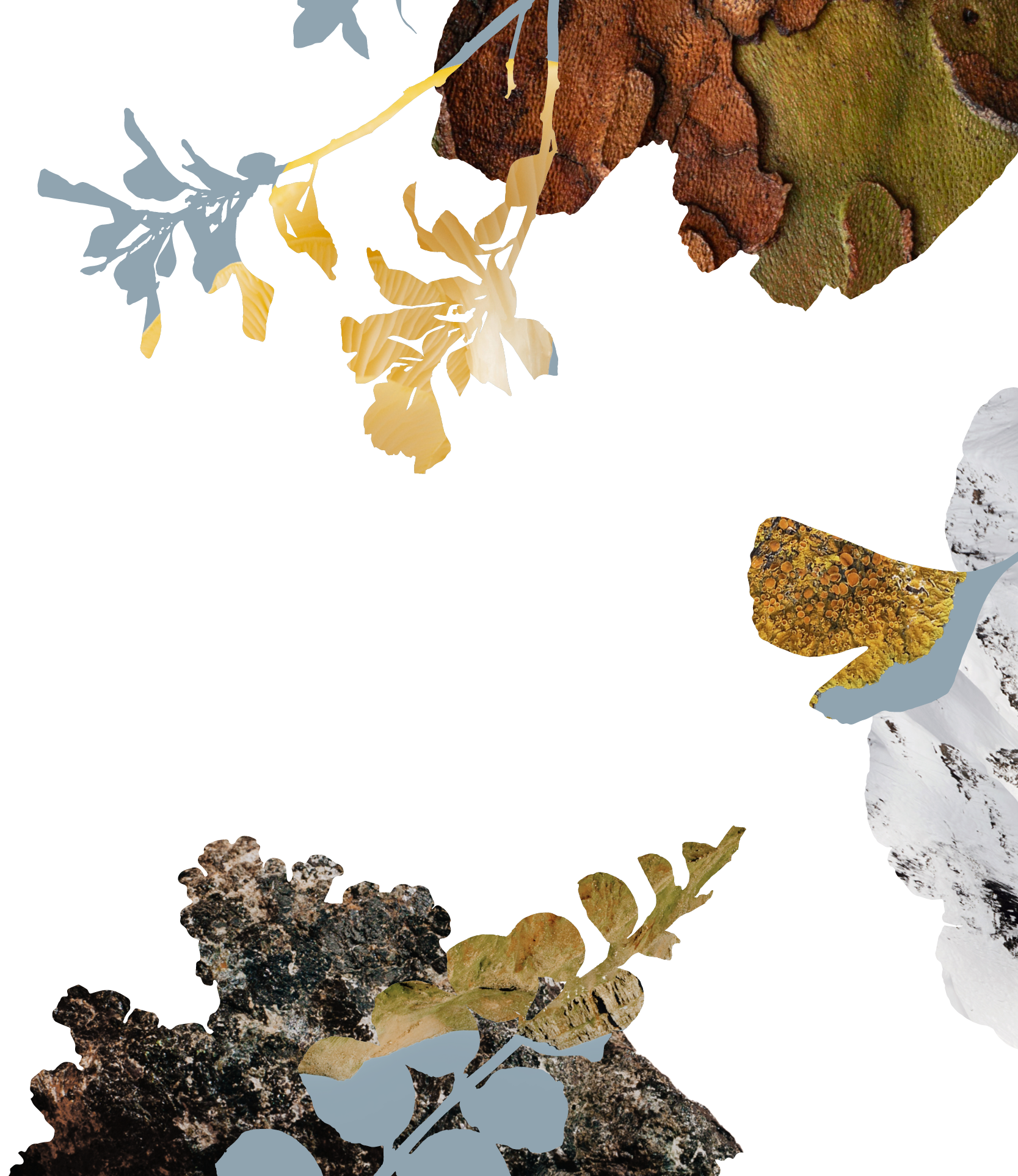
Collages
A system of photographic collages is a critical component of our visual identity. Each collage conceptually represents our reverential relationship to the land: visually distilling the wonders of the natural world to create something altogether new.
You can download approved collage elements via the link.

Layered collages—used in conjunction with photography of people, environments, and our product—communicate visual narratives about the harmony between science, nature, and humanity that lies at the heart of Landkind.
New collages may be created in addition to existing, approved compositions. Collages are built from photographic textures of the natural world, masked within vector silhouettes of plant-forms.

A library of approved organic vector shapes has been created for use, which should be leveraged to mask approved photographic imagery.

A library of approved photographic textures has been created for use, which should be leveraged when creating new collages.

When creating a new collage composition:
1. Begin with identifying your primary focal imagery—the uncropped imagery of people, environments, or products which will be surrounded by collage elements.
2. Place the organic vector shapes around your focal imagery. Layer your shapes in front of focal imagery whenever possible.
3. Fill in the organic vector shapes, using them as masks for photographic textures. Make sure your selections are visually complementary to the focal imagery. Many of the approved photographic textures are transparent, outlined PNGs. This allows for masks to remain partially empty or unfilled, which reveals our brand colors.

Fill vector masks with our blue-gray color when the background is off-white
Fill vector masks with our off-white color when the background is blue-gray.

Collage compositions can be used to complement focal imagery, create frames for content, or activate any composition when used at a large scale.

Sample Applications
putting it all together
Meant to guide and inspire, this is a showcase of how our visual identity should be brought to life in application. Each example illustrates an interpretation of the rules outlined within this document. Use this library as a reference for the creation of any new communication materials.
Website

Our website is a great reference for how our visual identity should be brought to life.
Ample white space is welcoming, exuding a sense of optimism while guiding the visitor to critical information. The typographic tone communicates a sense of detail and precision. Photography clearly presents products and people, while a rich suite of collages activates content modules throughout, keeping visitors engaged.
Marketing

A sample magazine ad showcases how each element of the visual identity system can come together to create a dynamic, captivating composition. Imagery is leveraged to tell a comprehensive narrative about the places on the planet we are focused on protecting. Thoughtful composition, typographic detail, and hierarchy are critical to clear communication.
Download the design files via the link.

A sample out-of-home billboard showcases the harmony between our products and our customers.
Download the design files via the link.

Some liberties with our guidelines may be taken when creating a series of visuals—such as when creating posts for social media.
For example: our logo and our branded collages do not need to appear on every expression. Instead, consider the overall experience and flow of the communication channel. Simplicity—as shown in the examples above—results in less repetition, wider variety, and greater intrigue.
Download the design files via the link.
Product

The LK-01 bottle and refill pouch shown here showcases the nuances of our typographic system. Attention to detail and thoughtful hierarchy is critical to the sense of intellect and sophistication that should be expressed by our brand.
Download the design files via the link.

The LK-01 product box—a study in contrast—is a good example of the range of ways the Landkind visual identity can be expressed.
The outside of the box showcases the brand at its most reserved, while the interior—bursting with vibrant imagery—is warm and welcoming.
The intentional play on contrast within this application makes for an impactful and memorable moment for the consumer.
Download the design files via the link.

Our product brochure showcases all of our visual identity elements coming together to tell a comprehensive story of Landkind, considering our philosophy and our LK-01 product.
Download the design files via the link.

Marketing Contact
It's okay to ask
Following these guidelines will help strengthen the impact of our brand. If you have questions about the creation of communication materials, please reach out for help.
Grant Smith
Copyright © 2022 Landkind, Inc. All rights reserved. Proprietary & Confidential.