Our brand
The Kongsberg Automotive brand assets represent the cornerstones of our visual identity. Their usage should always follow the rules outlined in the corporate brand manual.
The Kongsberg Automotive brand identity allows us to communicate with the world. It distinguishes us from our competitors and creates a sense of belonging to the company. It encourages external parties to easily engage with us.
It is essential that we control our brand to ensure that we don't compromise our corporate identity and include it in all company communication.
Our brand assets are password protected. If you need access, please contact corporate.communications@ka-group.com.
brand
elements
ROCK
Cool and composed. Based on Scandinavian heritage our brand is minimalistic and to the point. Fonts, colors, and brand elements are in perfect harmony, creating the whole.
WATER
Dynamic. Leaves room for creative solutions–developing powerful visuals of Kongsberg Automotive that makes a strong impact on our stakeholders.
SILVER
Effective and honest. Uncompromising in quality and consistent with our brand identity–a true representation of KA in all channels.
vision
and mission
VISION
WE DRIVE THE GLOBAL TRANSITION TO SUSTAINABLE MOBILITY
mission
On our path to becoming a true global leader, we put engineering, sustainability, and innovation into practice.
We seek to constantly improve our products, leverage our experience in cutting-edge engineering, and widen our scope to find new solutions and technologies that make mobility safer and cleaner.
Our ambition is to be second to none in all we do. This is how we unlock growth potential and create substantial value for our customers, our employees, and shareholders.
We take responsibility as a strong global team. We are committed to making a difference by developing our skill set and delivering excellent products.
Our logo
OUR LOGO IS A VALUABLE ELEMENT OF OUR VISUAL IDENTITY. THE FOLLOWING EXAMPLES ARE INTENDED TO DEMONSTRATE HOW TO USE THE LOGO ACROSS A VARIETY OF SITUATIONS TO ENSURE THAT IT IS ALWAYS PRESENTED IN THE BEST LIGHT.
PRIMARY
LOGO
This is Kongsberg Automotive's primary logo. The logo represents the mountains and the silver ores found in the mines of the town of Kongsberg, Norway, the birthplace of Kongsberg Automotive.
The logo's proportions and layout must always remain consistent. We encourage you to always use this version of the logo.
SECONDARY
LOGO
This is our secondary—horizontal logo. If space is a constraint, or if the media size is limted, we encourage you to use the secondary logo. The proportions and layout must always remain the same. .
symbol
Our symbol can be used separately from the wordmark, for example, as a watermark, label, stamp, pattern, or decor. It can also be used where the media types do not allow the appropriate full logo use, e.g. engraving on products, limited space, rough silkscreen print.
CLEARSPACE
A minimum area of clear space must always surround the logo. This area of isolation allows the logo to stand out by ensuring that no typography or graphic elements of any kind invade this zone. It also sets the minimum distance from any page edges.
SCALE
In order to maintian legibility, the logo should never appear smaller than these minimum sizes.
logo
colors
The following colors can be used for the logo when the background is very light or white:
> KA core blue
> granite gray 80 - 140
When the background is dark, use the white logo. It is best to place the white logo on one of the primary colors from our full palette (but not lighter than the shade marked with "80").

The white logo is also suitable for backgrounds with
photographs.
It should be carefully placed on photographs and illustrations. Avoid busy or complex backgrounds to keep the logo legible.
UNAPPROVED
USES
The success of the brand depends on the logo maintaining a consistent appearance in all communications.
In order to preserve the integrity of the logo, the following examples illustrate how it should not be used:
> do not put any text or graphic elements in the clearspace area
> do not put the logo closer to the page edges than the clearspace value
> do not change colors of the logo or elements of the logo - it should always stay one-color, in accordance with the color palette
> do not apply feather, gradient, drop shadow or any other filter or effect to the logo
> do not put the logo on busy or complicated backgrounds
> do not rotate, skew or alter proportions of the logo
the tagline
“Mobility solutions for the future” is Kongsberg Automotive's tagline and can either appear in a lock-up with the KA logo, as a separate wordmark, or as plain text. Do not use the tagline as a title or headline. Do not try to re-create the tagline versions, but use the files provided.
All the basic rules concerning the KA logo also apply to the tagline wordmark, and logo and tagline lock-up.


Our colors
carefully selected color palette serves our brand identity making it outstanding, coherent and fresh.
blue at the heart
Dynamic blue colors are at the heart of Kongsberg Automotive's color palette. Combine the blues together, or with grayscale to create the perfect KA look and feel.
Below you can see our primary and complementary colors.

primary colors
KA BLUE
PMS: 286
CMYK: 100 78 0 0
RGB: 0 50 160
HEX: #0032A0
SLATE BLUE 80
PMS: 549
CMYK: 58 18 17 10
RGB: 107 164 184
HEX: #6BA4B8
granite gray 140
pms: pantone Black
CMYK: 0 0 0 95
RGB: 45 41 38
hex: #2d2926
complementary colors
COPPER RED 100
PMS: 173
CMYK: 0 83 99 4
RGB: 207 69 32
HEX: #CF4520
AMETHYST PURPLE 120
PMS: 668
CMYK: 65 72 8 18
RGB: 97 75 121
HEX: #614B79
AURORA GREEN 100
PMS: 3405
CMYK: 92 0 85 0
RGB: 0 175 102
HEX: #00AF66
full palette
Six color families—three primary and three complementary, each divided into six swatches ranging from very dark to very light—makes up the full palette.
Here you can download color swatches for Adobe CC and the full color overview.


ka accent blue
RGB: 0 0 255
HEX: #0000ff
The Accent Blue color is intended strictly for use on screens (ex. websites, animations, videos, apps).
Typography
Our typography is an element which helps us build a strong and consistent appearance in various communication materials.
We have one main and one complementary typeface. Barlow is a font family for everyday use, as well as for use in publications, websites, presentations, etc. Crimson Pro is a font family for professionally designed publications.
barlow typeface
Barlow is a slightly rounded, low-contrast, grotesk type family.
The two main font-weights recommended are Regular for body texts, and ExtraBold for headlines and subheads.
Barlow font is released under open source license and is free to use both in non-commercial and commercial projects.


crimson pro typeface
Crimson Pro is a serif typeface family: contemporary, clear, classic and rounded.
Crimson pro is a font family used only in professional design publications.
Crimson font is released under open source license and is free to use both in non-commercial and commercial projects.


Photography
The images we use will tell our story. They define our values and help us illustrate our moods, situations, and the diversity of our environment.
The care and detail we put into our image choices demonstrate our strong commitment to coherent communication and the celebration of our work.
people
> Portraits: telling stories of employees.
> Reportage: pictures taken of a group of employees or individuals in a natural environment.
> The person/people should ideally be a Kongsberg Automotive
employees.
> Not staged, but capturing a moment or event in a narrative fashion.
> Aim for a natural look in both body language and the surroundings.
> Pictures should include a diverse range of people (age, race, gender, sexual orientation, ability, class, body type, etc.).
> Avoid front-flash.


products
> high-tech great quality products and environment
> showing how things work, conveying concepts and displaying details
> products held by employees
> products in production environment
> high quality realistic renderings
PLACEs
> Industry pictures (machines, cars, trucks, etc.)
> Textural images—abstract images that supplement the overall story and provide an alternative to the main story
> Landscapes with roads, construction sites, quarries, etc.
> Select locations for unique appearance, character, and feel—background colors are a plus
> Encourage aerial or side/front views for these kind of pictures
> Do not include monuments that a tourist would pose in front of


DUOTONE PICTURES
For use as background pictures or when quality of the picture is not good enough, we encourage to use duotone color mode for the photographs in either KA Blue/Slate Blue setting or different shades of Granite Gray.
Here is a simple online tool to change your pictures to correct duotones (just drag and drop your picture into one of the sites and then press download button):
BLUE >>>
GRAY >>>


Application
these examples show how to apply the ka's brand style in different environments.
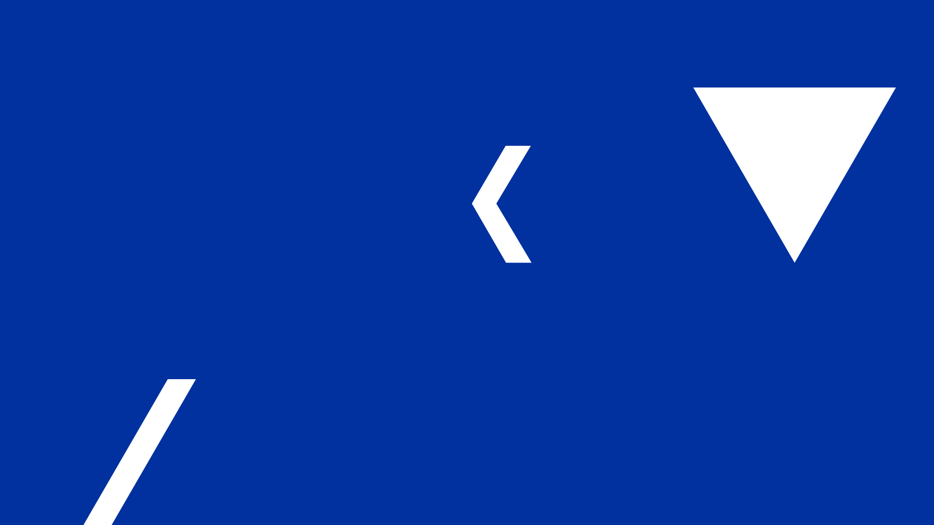
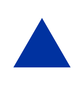
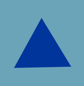
patterns
We created these three shapes to use as decorative elements in our communication.
They can be used as stand-alone details or assembled into patterns.


STATIONERY
Here is a preview of how our stationery looks like. If you need to print custom envelopes, business cards, letterheads or other stationery elements, download the templates below or reach out to: Corporate Communications

presentations
Here are some examples of our predefined presentation layouts.

editorial
and print
Here are some examples of our editorial and print design.
If you need support in creating a professional poster, ad, brochure, catalog or other printed material, please reach out to: Corporate Communications


icons


WORKWEAR
Each facility is responsible for ordering and maintaining work clothes for all its employees.
The colors of workwear should be as close as possible
to our primary color palette. The logo and additional graphic elements and texts should be printed or embroided with white, or one of our primary colors. Always place the logo on the left side of the chest and make sure it is the right size.


signage
To easily indentify our business and building, the Kongsberg Automotive logo must be clearly visible and correctly displayed at the front of the building. Logos can be backlit or externally illuminated. They can be printed on a backplate, cut out or made into a 3D sign.
The main entrance should be clearly signposted. This will ensure all visitors are guided to their desired location. All the texts and design elements used on signposts should adhere to the brand guidelines (e.g. logo clear space, fonts, colors, patterns).
The exact sizes, placement, materials, etc. should always be adjusted to the specific building and location, and consulted with a local supplier for the best effects.
We need to ensure that all signage is:
> Consistent
> Finished to a high standard
> Harmoniously integrated with the buildings and landscaping


interior
When decorating interiors in our facilities, we encourage the use of materials that correspond with our brand elements and our color palette.

COLORS
Neutral tones and natural materials should be predominant in all workplace environments. The KA Blue and Slate Blue colors can be used for accents, focus areas, and as a counterpoint to the otherwise light and professional environment.
PREFERRED MATERIALS AND ELEMENTS TO USE
White panels and surfaces, concrete and stone surfaces, metal, powder coated elements, matte paint, acrylic panels, glass, natural wood, screens, green plants

