Brand Guide
Last updated March 2020
01
Logo
Symbol and company name are carefully put together and the should never be changed. We have collected all the logo versions here. Be sure to use the right format for the right channel. Print format uses pdf files, and digital surfaces uses png or svg files.
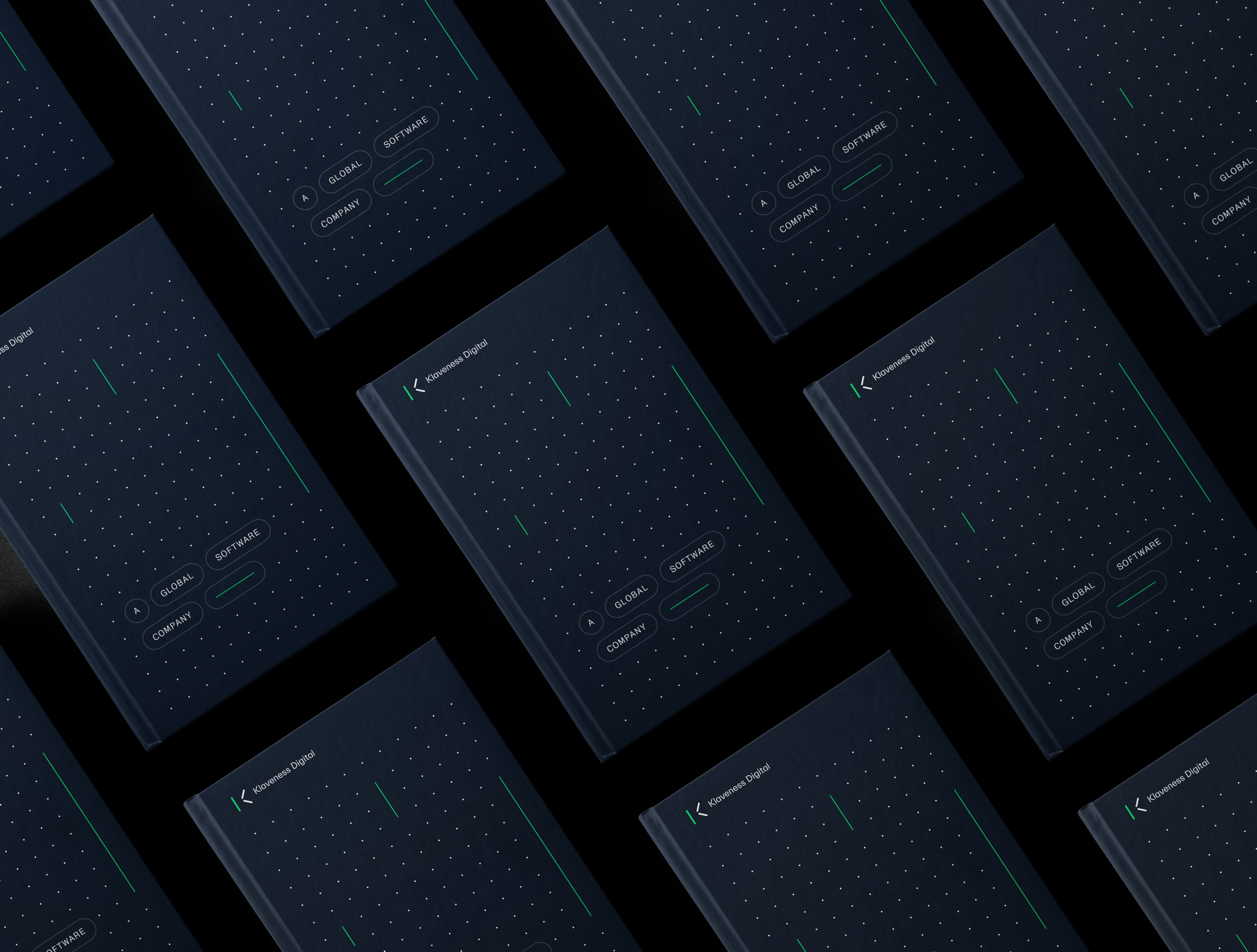
Main Logo
Logo is used in colors primarily on dark backgrounds. On light surfaces, the dark version of the main logo is used.
The main logo should as far as possible be placed in the left corner of the surface of where it is palced.
The main color logo should not be placed photos. Then only positive / negative logo should be used.


Safety Zone Logo


Logo Symbol
The logo symbol should preferably be used on digital surfaces, such as profile pictures or social media.


02
Typography
Everett is the profile font for KD. Everett is designed by Nolan Paparelli from Switzerland. The profile uses two variants of this: Everett Sans in Regular, for headings / displays, subtitles and quantity text. Everett Mono is used as a display font for eg. tags "bubbles" and as a supporting element to Everett Sans, its use should be limited.
Everett Sans (Primary font)
This is KD's primary font and is used in most cases. Headlines, subtitles, quantity text and display text.


Everett Mono (Secondary font)
Used in tags "bubbles"
and should not be used in headings or quantity text.


Typographic Hierarchy

System Fonts
System fonts are used on digital surfaces where the main font Everett cannot be used. Examples are in PPT / Keynote and in Word / Pages templates.
Avenir
Avenir replaces Everett Sans


03
Colors
The profile colors should always be used with the color codes given here. Be conscious when using colors. Provide satisfactory contrast and size of text and elements.
Color Palette
The colors are chosen to form the identity of KD. The colors are chosen to give the identity a modern expression that is particularly suitable on digital surfaces.
Deep Sea Blue
Binary Purple
Terminal Green
Sustainable Green
Mystery Black
AI Orange
Human
Morning Mist
Color Use
Although there will be a lot of white in the profile, it is the Deep Sea Blue color that is bearing and can be combined with all the colors in the palette. The color Sustainable Green works well as a background color and stands well in combination with Terminal Green in the palette.
Principles
Examples


04
Graphic Elements
The graphic elements are based on lines and circles - creating usable patterns and abstract shapes. The graphic elements can be used as a pattern / illustration in combination with the right color combinations.


05
Icons
The examples below show what the icons should look like, but a complete set of icons is not provided here. Icons are added here as they are produced.


06
Images
Photo is a key element of the profile and should be chosen carefully. A good combination of photos of people and situations is important to create variety and provide a picture of the people you meet in KD.
KD has 3 image styles in its identity - Company, industry and campaign. KD has 3 styles to meet the different needs and segments you want to communicate with.
NB! These pictures are for reference only and will be replaced as soon as KD takes their own pictures.
Company
(Primary Style)
This direction should focus on KD as a company and the people who work there.
Honest, documentary and warm.


Industry
This style should be focused on industry, people and situation. Cropped images that show details of the object, or drone images that capture the whole.
Detailed, technical, storytelling.


Campaign
This style should be focused on the individual and is best suited for articles / interviews for the purpose of eg, recruitment or portrait interview.
Do not overuse.


07
Examples
Here you see examples of the profile as it is thought to be on various surfaces.


Questions?