
Welcome to our brand guidelines
All here. Always up to date.
Our digital brand guidelines are just like a website. Everything is in one place, so you can just scroll to the information or assets you need. There are different formats for internal and external needs, and the guide is always up to date with the latest versions. Everything is also available for download!
Bringing our Companies together
Since the Kafrit Group was founded in 1973, the company has gone from strength to strength. Today we’re a global organization, employing hundreds of people. And while each Company has its own distinct identity, we all share the same purpose.
‘To unite talent and technology to drive the future of plastics, together.’
So when we communicate internally or with the outside world, we want everyone to know we’re part of the same family. A group with a singular look, who talks, acts, and leads our industry, together.
What are you looking for?
Our Group
Find assets and information to develop corporate materials for the Kafrit Group.
Our Companies
Find assets and information to produce materials for any of our Kafrit Companies.


Purpose
Our purpose is to unite talent and technology to drive the future of plastics, together.
This purpose is the driving force of our organization. The reason we do what we do, why we come to work every day. And although our group is made of many different Companies around the world, our purpose unites us.
Having a clearly-defined purpose helps us recognize and build on our synergies. So we can use them to create opportunities beyond us. In farming, communication, and construction – every industry that owes its progress and potential to plastic.


And when we stick to our purpose, we stick together. The Kafrit Group is where people, talent and technology team up, driving the future of plastics all around the world. No barriers. No fear. No limits.
Our Pillars
Supporting our purpose are our three pillars – Talent, Technology and Together to the future.
Let’s take a closer look.
Talent
Around the world, we have hundreds of talented colleagues and partners. All with unique skills, multidisciplinary knowledge, and deep industry experience. Innovators with brilliant ideas and the drive to see them through. People striving for excellence in everything they do.
But the real magic happens when we work together. There’s a spark, an energy. A belief that anything is possible. And that’s how we provide the best solutions for our customers.
Technology
After decades in the plastics industry, we have more than high levels of expertise, a strong focus on customer service, and vast technical knowledge. We also have a burning passion for innovation and transformation. A passion that drives us to seek out new solutions, new machinery, and fresh ways to give our customers just what they need.
And with the latest technology in our hands and new innovations within our grasp, there’s only one question. How far can we go?
Together to the future
The world doesn’t stand still, and nor do we. We’re always looking ahead, searching for new ways to sustainably grow and thrive. To push our technology and keep working on the next generation of solutions to benefit our customers. Working together in perfect synergy to achieve something great, today and tomorrow.
Together we have the power to drive the future of plastics – within our community and around the world. And we’ll keep doing it, today, tomorrow and always.
Our purpose in action
See our purpose come to life and get a look at the thinking and story behind our tagline, ‘Working together for the future of plastics’. This is our Storydoing.
And while we’re talking about how we communicate our story and purpose, here are some useful little language rules:
· We can say ‘the Kafrit Group’ or ‘the Group’.
· Subsidiaries should be called ‘Companies ’.
· We say ‘customers’, not ‘client’.
· Always write ‘plastics’ with an ‘s’ in the tagline and purpose.

Visual identity
Easily create visual materials for the Kafrit Group or Companies.


Communications for the Kafrit Group
All around the world, people are producing internal and external communications for the Group. If we’re consistent across everything we do, it’ll build trust with our customers and help make our brand instantly recognizable.
Whatever you’re creating, here are all the tools, guidance and downloads you need. Along with clear examples.


The Basics
Logo
Here are some simple rules about how and where you should use our logo.
over white
Wherever possible, use the two-color logo on a white background.

over red
With a red background, always use the logo in white for maximum contrast.

Over grAy
On a gray background, always use the logo in white for maximum contrast.

OVER IMAGES
When placing the logo over a very light image, you can use the two-color version. Anywhere else, use the white version.


Logo with tagline
When using the tagline as a lockup with the Kafrit Group logo, always refer to the original file or use the layout shown here.

Minimum Size
We’ve established a minimum size to ensure legibility of the logo and coherency across all applications. Make sure you use the appropriate version for each application.


Clear Space
There’s a clear space protection zone for our logo, so it can stand proud and uncluttered by other elements. So please keep the area shown free. For simplicity, the clear space is the width of the ‘G’ in Group.


Co branding
the Kafrit Group + Company
Co Branding of the Kafrit Group with one of the Companies is rare. In the case of a catalog, we prefer to use the Company logo on the cover, and the Group logo on the back. If both logos need to appear on the same page, use these guidelines.
The Family
When displaying the Group and all its Companies together, please use this layout as a reference for the minimum distance between logos. This helps to balance the proportions of the Group and Companies. But you can adapt the space between the elements, depending on how you’re using them.
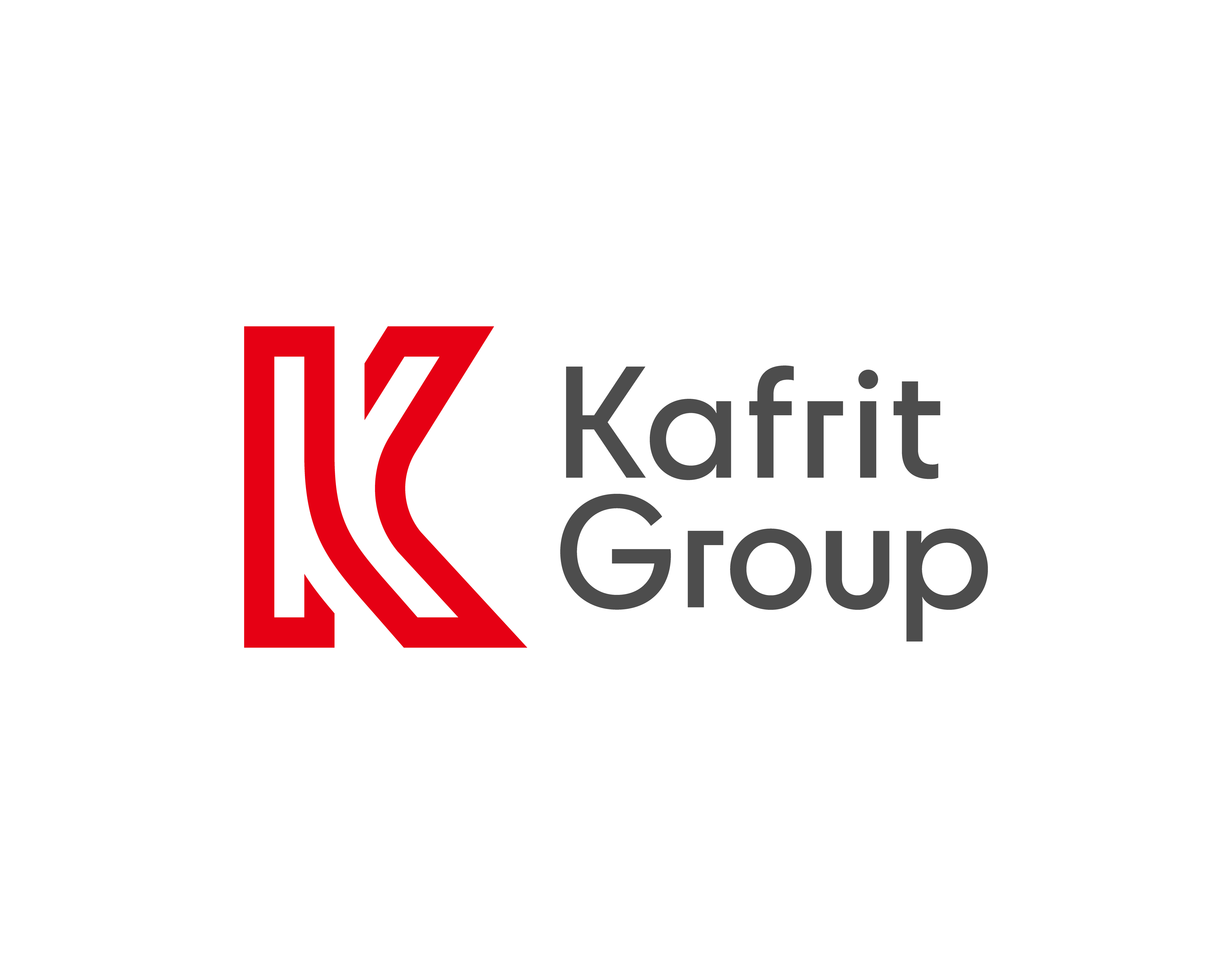
Symbol "Big K"
The Big K symbol isn’t just the initial of our name, its design has been inspired by the story of our Group.
The two parts of the letter K represent different paths coming together. Just like all our Companies are coming together, united under one brand umbrella.
At the top of the K, you’ll also see an open section. This stands for the way we’re always open to pushing new ideas and focused on providing solutions for the future.
And finally, the K is designed to reflect infinity. It’s a reminder that there’s no end to the possibilities and opportunities we have as individuals, as a Company, and as a Group.
The Big K symbol can be used on its own as an impactful decorative element to your communications. But to keep everything simple and clean, it should only be used in red over white, or white over red, gray or a photographic background.
over white
Wherever possible, use the Big K over white.

over red
Over red backgrounds, always use the Big K in white for maximum contrast.

Over gray
Over gray backgrounds, always use the Big K in white for maximum contrast.

Cropped BIG K
As shown here, you can also crop the Big K to use it as a design device – for example on the cover of a catalog.
Make sure the Big K is roughly twice the size of the area it’s placed in. This ensures an impactful crop. You’ll find more examples of how to do that in the Catalogs and Brochures section.
Colors
The Kafrit group Colors
These are the colors we use for both the Kafrit Group and all its Companies. Our preferred background color is white.
Always use the right color values. Don’t rely on automatic conversions or use CMYK colors for RGB output.
KAFRIT RED
HEX #e60014
RGB 230, 0, 20
CMYK 0, 90, 75, 0
Pantone 185C
Red is our main color. There should always be a touch of red in any applications, catalogs or merchandise you design.
If necessary, you can use these shades and tints to add contrast to report elements like tables and graphs. Just remember to never use them for the logo, or as the main color of any given item.

KAFRIT GRaY
HEX #4d4d4d
RGB 77, 77, 77
CMYK 0, 0, 0, 70
Pantone 425C
Gray is our other key color. Use it for text, background or as an accent color.
If necessary, you can use these shades and tints to add contrast to report elements like tables and graphs. Just remember to never use them for the logo, or as the main color of any given item.

WHITE
HEX #ffffff
RGB 255, 255, 255
CMYK 0, 0, 0, 0
White keeps the design clean and lets the content breathe. When in doubt, use a white background.
Kafrit Dark Gray
HEX #373737
RGB 55, 55, 55
CMYK 0, 0, 0, 90
Pantone 426C
Kafrit Dark Gray is a secondary accent color, for when the design needs more contrast than our primary gray can give you. It can also be used as a background color for on-screen applications like PowerPoint slides. However, it should be used sparingly and never in the logo.
PILLAR COLORS
We have assigned additional colors to our three strategic pillars – Talent, Technology and Together to the future. You can use these colors when you want to communicate a specific topic relevant to one of the pillars. Just make sure to use the correct color for the correct pillar.
Always use the right color values. Don’t rely on automatic conversions or use CMYK colors for RGB output.
TALENT
Use these colors to communicate a topic relevant to Talent. The main color should be Talent Yellow and the other two complementary. Don’t use these colors randomly.
WHEN CAN I USE YELLOW?
The Talent pillar is about people and employees. So use yellow for topics related to human resources, community work and customer experience.
Technology
Use these colors to communicate a topic relevant to Technology. The main color should be Technology Blue and the other two complementary. Don’t use these colors randomly.
WHEN CAN I USE Blue?
The Technology pillar is about innovation. So use blue for things like new product developments, breakthroughs or new machinery.
Together to the future
Use these colors to communicate a specific topic relevant to Together to the future. The main color should be Together Green and the other two complementary. Don’t use these colors randomly.
WHEN CAN I USE Green?
The Together to the future pillar is about sustainability or internal tools. So use green for sustainability reports or topics related to tools like CRM and catalogs.
Talent Yellow
Hex #ffc300
RGB 255, 195, 0
CMYK 0 15 95 0
Pantone 116C
Light Yellow
Hex #ffdc64
RGB 255, 220,100
CMYK 0 5 70 0
Pantone 114C
Deep YELLOW
Hex #be9100
RGB 190, 145, 0
CMYK 0 20 100 30
Pantone 118C
Technology Blue
Hex #0fc8f5
RGB 15, 200, 245
CMYK 75 0 5 0
Pantone 306C
Light Blue
Hex #6ee1fa
RGB 110, 225, 250
CMYK 50 0 9 0
Pantone 304C
Deep Blue
Hex #0f96b4
RGB 15, 150, 180
CMYK 100 5 0 35
Pantone 307C
Together Green
Hex #2db96e
RGB 45, 185, 110
CMYK 90 0 80 0
Pantone 354C
Light green
Hex #82d7a5
RGB 130, 215, 165
CMYK 40 0 35 0
Pantone 353C
Deep green
Hex #238c50
RGB 35, 140, 80
CMYK 100 0 90 30
Pantone 356C

In pictures, you can retouch one element to match the pillar color – like we’ve done with the shirt.

Or you can tint the whole image using the main pillar colour.

If your image already includes a green element, you can adjust the shade to match the main pillar color.
Font
Our brand font is Heebo. It has a mechanical skeleton and largely geometric forms, complemented by friendly, open curves that settle the letters into their natural widths. This makes for a comfortable reading rhythm, more commonly found in humanist and serif types. This is the only font you should ever use.
Heebo features a Latin and Hebrew alphabet and is freely available on Google fonts under the Open Source License. You can also download it here:
Hello I'm Heebo!
A B C D E F G H I J K L M N O P Q R S T U V W X Y Z 0 1 2 3 4 5 6 7 8 9 א ב ג ד ה ו ז ח ט י כ ל מ ם נ ן ס ע פ ף צ ץ ק ר ש ת

How do I use the font?
This image is a good starting point to show which weights to use. Our preferred weights are Bold and Light (although Regular is recommended over colorful backgrounds).
HOW DO I Install THE FONT on my pc?
1. Once downloaded, unzip the file by right-clicking the .zip folder and then clicking ‘Extract’.
2. Right-click the fonts you want and click ‘Install’.
3. To install all weights at once, simply drag the font files into this folder: C:\Windows\Fonts and Windows will automatically install them.
4. Restart the program you’re writing in and the fonts will show up in your menu.
HOW DO I INSTALL THE FONT ON MY MAC?
1. Once downloaded, unzip the file by double-clicking the .zip folder.
2. Double-click the fonts you want and select ‘Install Font’. Restart the program you’re writing in and the fonts will show up in your menu.
Business Units Icons
Each icon is created using the flowing strokes from our illustration design – a device introduced to represent different pathways coming together. This makes it easy for us to create new versions when needed, and ensures we have a coherent look right across our brand.
To make it easy to identify individual business units, each icon has been given its own color. As well as a shape inspired by the type of material, benefit or composition the business unit works with. These icons can be used in marketing materials, presentations, web content, infographics, diagrams, and on social media channels. And also as an illustration, as you can see here.
When printing, ideally, you should use four colors (=4c) to keep costs down. But you’ll find codes for different formats in the table below. These examples are RGB – please use color sample books or the color fans of the paint producers for an accurate color match.
The colors can also be brightened (e.g. when used as a background in tables).

Illustrations
These illustrations can be a decorative element on catalog covers and interior pages, as well as on websites or even murals. They take the linear elements of our logo and bring them to life, showing our confident, curious spirit.
The flowing strokes represent different pathways coming together, expanding and changing to create a new future. In the same way that our Companies come together.
You can also use this style to illustrate specific concepts. When drawing the line, keep it continuous with a consistent weight, and make sure it runs off the page.
This selection is a starting point. You can keep expanding the collection by designing new ones yourself. Just keep it simple!


Illustrations in pillar colors
You can also use the illustrations over and in the three pillar colors.
Have a look at our 2023 ESG Report to see them in action!


ILLUSTRATIONS OVER IMAGES
When using photographs, let the image shine through by using white line illustrations. In these examples, each image also incorporates a pillar color.

Image Style
We like to use clean and sharp images with a clear contrast. Always look for a high quality image and never use one that’s out of focus or low-res. If you can't get a good image, don’t use one at all. Here are the kinds of images we love:
PEOPLE
We love to show our talent. We’d recommend having your colleagues professionally photographed to get that authentic look.

Industry
Sharp and clean images of industry equipment helps express our expertise. And when you show people working, focus on the work itself, not the person.

Abstract
It’s difficult to find good pictures for some topics, so that's where abstract images come in handy. You can use images like these to illustrate technology, color expertise and innovation.

Image Downloads
Get started with our curated image collections. Any of these images can be used in presentations, catalogs or on websites.
a few Don'ts
Here are some examples of what you should never do with the logo, fonts, illustrations or photos. When in doubt, stick to the basic elements provided in these guidelines.
Logo
· Don’t use the logo in all red.
· Don’t create new versions of the logo.
· Don’t change the font of the tagline.
· Don’t add effects to the logo.
Big K
· Don’t use the K in outline.
· Don’t apply irrelevant colors or use the Big K to create patterns.
· Don’t use the K in red over gray.
· Don’t create ‘corner’ crops. There should always be some sort of curve visible.

illustrations and photos
· Don’t apply more than one color to the illustrations.
· Don’t create illustrations with hard edges.
· Don’t use old-fashioned or over-stylized stock photos.
· Don’t use Word Art or similar 3D illustrations.


Communication Style
Reports and Publications
Reports, such as ESG and ESRS, are increasingly important to us. Not only are they legal requirements with their own guidelines, they also let us present ourselves and our company information to stakeholders and a broader worldwide audience.
Our reports use a horizontal 16:9 layout, optimized for on-screen reading. With basic navigation options, it's easy to jump directly to the information you’re looking for. And as with our catalogs, they use an easy-to-follow grid system with lots of different design options.
When it comes to text, we should keep the information clear and succinct. Break up your pages with images, icons and infographics, and use white space to give your messages some breathing space.


CoNSTRUCTION
Our reports use a simple and flexible pattern. You can add to these designs, but we recommend starting with the template.
Menu
Make it easy to navigate the document with PDF interactivity. But only use anchors and hyperlinks, as this avoids compatibility issues with non-Adobe PDF readers.
Illustrations
You can use the already existing illustrations, and also use the established style to create your own. This lets you emphasize the topic of your content and draw the reader’s eyes.
Tables
All elements are predefined, so you can easily update and maintain the style of tables, including the ESRS table.
REPORT Examples
Here are some example pages from our 2023 ESG Report.


Catalogs and Brochures
Catalogs and brochures are our ‘shop window’. So they need to show our Group and Companies in a good light. All our content should be confident and engaging – but most of all it should be easy to understand.
Our catalogs and brochures use a basic grid system which is easy to follow. While at the same time offering lots of different design options.
When it comes to text, keep the information as succinct as possible. Break up your pages with images, icons and infographics. White space also helps to give your messages a bit of breathing space.


Cover
When it comes to creating your catalog or brochure covers, there are two designs you can choose from. Feel free to add to these designs, but we recommend starting with one of these templates.
Big K
Choose this option if you’re working with a very short title and you want the Big K device to have a lot of presence.
Frame
Choose this option for longer or more complex titles, and when you want to use illustrations or images. The height of the frame can then be adjusted to work with everything else.
Cover Examples
Starting with the frame option above, here are some ways you can customize this basic design to create something with real impact.
A Combine the cropped Big K with a black and white abstract image.
B Start with a red background and add an eye-catching illustration.
C Replace the Big K image with a photograph.
D For brochures focused entirely on one of the pillars (in this case Technology) you can also fill the whole cover with the appropriate pillar color and combine it with an illustration.


Inside pages
The inside pages of anything you produce should be set up following our grid system.
This grid system helps guide where text, images and our logo goes, and ensures there’s a generous border allowance around each edge of the page.
Interior pages Examples
Take a look at these interior pages. They show you how even within the set grid system, you still have plenty of flexibility to create interesting and dynamic pages and spreads. Use full-page images, try different colors as backgrounds to your text, or introduce illustrations to work with other elements.


Product Catalogs
Product catalog covers are designed using the same grid as catalog covers. But instead of using illustrations, you can add the relevant business unit icon. The relevant colour can also be introduced for the title text – just to give it more presence.
To create your product catalog cover, choose the most suitable template and build from there. For the interior pages, just use one of the magazine templates.And don't forget our curated image libraries, where you can browse lots of free-to-use images. Go to image library.
PRODUCT CATALOG EXAMPLES


Posters and Ads
Posters should attract attention. You can do this using bold blocks of color, big headlines and interesting images. It’s also important to keep your headlines short and to the point. People need to get the essence of the message you want to communicate within seconds – often just as they’re walking by.


We’ve created a couple of poster templates to get you started. Look at the logo placement, heading size, and how you can incorporate photographs, illustrations and background colors.
Poster and Advertising Examples
It’s easy to customize one of the standard poster templates to your own design. Combine text sizes, photographs, illustrations, icons and background colors. Try a solid color overlaid with one of our illustrations, a big photographic image for maximum impact, or a mix of all these elements. The only part of the design that’s set in stone is the logo placement.


Microsoft office
We want our new brand to feed into everything we do, so we’re making it easy for you to bring it to life in your day-to-day work.
We’ve created a Microsoft Office theme which automatically includes our brand fonts and colors. You can download it onto your computer or laptop, then set up your very own Kafrit screensaver or background. And when you need to create Word documents or PowerPoint presentations, you can use the simple downloadable branded templates.
How do I install the theme?
Download this file, unzip it, open Word or Powerpoint and just double click the Kafrit.thmx file. Make sure you’ve already installed our fonts beforehand. You can find out how to do that in the Font section – and you only need to do it once.

Microsoft Word templates
Whether you’re creating a letter, agenda or to-do list, download one of our easy-to-use templates to keep everything in the Kafrit Group brand style.

MICROSOFT Powerpoint TEMPLATES
Give an attention-grabbing, on-brand presentation with one of our PowerPoint templates. Just drop in your text and images and you’ll have a professional deck ready to go.

Business Cards
Got a new team member? It’s quick and easy to design and produce a set of cards. Our design is simple and only uses two colors, Kafrit Red and Kafrit Gray. Just download the Adobe Illustrator file, enter in the employee details, give it all a final check, and then it’s ready to be printed.
We recommend choosing a card between 250-350 g/sqm with an uncoated but smooth finish. Something like Fedrigoni Splendorgel Extra White works well.


Mail signature
Create your branded email signature with this simple template. Just download it, swap in your name, job title and contact details, then export it as a PNG file, ready to be copied and pasted or dragged into your email footer.


Application Examples
Our branding at work
Our new branding is flexible enough to be used across every kind of print or merchandise you might need to create for your team or your customers. Wherever you use it, follow our guidelines for maximum impact.
Here are some starting points and examples to fire up your imagination. These aren’t templates, but you can download sample JPEGs to inspire your designer or printer.


Downloads
Downloads
This is your ‘one-stop-shop’ of all the downloads available. Choose from individual files or a complete package.

Packages for Designers
This package contains:
Logo
Big K
Co branding
Color palettes
Font
Business unit icons
Illustrations
Kafrit Group stylesheet
Business cards
Mail signature
Application examples
This package contains:
Logo
Big K
Color palettes
Font
Business unit icons
Illustrations
Catalogue covers
Catalogue interiors
Product catalog covers
Posters and ads
Kafrit Group stylesheet
In this link you will find all files in their individual folders so you can choose freely what you need.
Packages for Employees
This package contains:
Logo
Big K
Co branding
Font
Business unit icons
Illustrations
Kafrit Group Stylesheet
Storydoing
This package contains:
Logo
Big K
Co branding
Font
Business unit icons
Illustrations
Microsoft Office Theme
Microsoft Office Word Templates
Microsoft Office Powerpoint Templates
Kafrit Group Stylesheet
Storydoing
In this link you will find all files in their individual folders so you can choose freely what you need.

Communications for our Companies
Our Group is made of many different Companies. But we want all Company communications to look like they come from one united family.
Whatever you’re creating for your Company, you’ll find all the tools, guidance and downloads you need here.
We’ve picked a few Companies to show you how everything should come together. But all our Companies share the same design principles.


The Basics
Logo
Here are some simple rules about how and where you should use our logos.
You’ll find the logo for your company in the appropriate format within the ‘Packages for Employees’ and 'Packages for Designers' download.
Over white
Wherever possible, use the two-color logo on a white background.
Over Red
With a red background, always use the logo in white for maximum contrast.
Over gray
On a gray background, always use the logo in white for maximum contrast.
Over images
When placing the logo over a very light image, use the two-color version. Everywhere else, use the white version.

Logo with tagline
When using the tagline as a lockup with your Company logo, always refer to the original file or use the layout shown here.


Minimum size
We’ve set a minimum size to keep the logo legible and coherent. Make sure you use the appropriate version for each application.


Clear space
The clear space protection zone for your Company logo helps it stand proud and uncluttered by other elements. For simplicity, the clear space is the height of the first letter in the logotype.


Co branding
The Kafrit Group + company
Co branding of the Kafrit Group with one of the Companies is rare. In the case of a catalog, we prefer to use the Company logo on the cover, and the Group logo on the back. If both logos need to appear on the same page, use these guidelines.
The family
When displaying the Group and all its Companies together, please use this layout as a reference for the minimum distance between logos. This helps to balance the proportions of the Group and Companies. But you can adapt the space between the elements, depending on how you’re using them.
Big K symbol
The Big K symbol isn’t just the initial of our name, its design has been inspired by the story of our Group.
The two parts of the letter K represent different paths coming together. Just like all our Companies are now coming together, united under one brand umbrella.
At the top of the K, you’ll also see an open section. This stands for the way we’re always open to pushing new ideas and focused on providing solutions for the future.
And finally, the K is designed to reflect infinity. It’s a reminder that there’s no end to the possibilities and opportunities we have as individuals, as a Company, and as a Group.
The Big K symbol can be used on its own as an impactful decorative element to your communications. But to keep everything simple and clean, it should only be used in red over white, or white over red, gray or a photographic background.
Over white
Wherever possible, use the Big K over white.
Over red
Over red backgrounds, always use the Big K in white for maximum contrast.
Over gray
Over gray backgrounds, always use the Big K in white for maximum contrast.
Cropped big K
As shown here, you can also crop the Big K to use it as a design device – for example on the cover of a catalog.
Make sure the Big K is roughly twice the size of the area it’s placed in. This ensures an impactful crop. You’ll find more examples of how to do that in the Catalogs and Brochures section.
Colors
The Kafrit Group COlors
These are the colors we use for both the Kafrit Group and all its Companies. Our preferred background color is white.
Always use the right color values. Don’t rely on automatic conversions or use CMYK colors for RGB output.
KAFRIT RED
HEX #e60014
RGB 230, 0, 20
CMYK 0, 90, 75, 0
Pantone 185C
Red is our main color. There should always be a touch of red in any applications, catalogs or merchandise you design.
If necessary, you can use these shades and tints to add contrast to report elements like tables and graphs. Just remember to never use them for the logo, or as the main color of any given item.
KAFRIT GRaY
HEX #4d4d4d
RGB 77, 77, 77
CMYK 0, 0, 0, 70
Pantone 425C
Gray is our other key color.
Use it for text, background or as an accent color.
If necessary, you can use these shades and tints to add contrast to report elements like tables and graphs. Just remember to never use them for the logo, or as the main color of any given item.
WHITE
HEX #ffffff
RGB 255, 255, 255
CMYK 0, 0, 0, 0
White keeps the design clean and lets the content breathe. When in doubt, use a white background.
KAFRIT DARK GRaY
HEX #373737
RGB 55, 55, 55
CMYK 0, 0, 0, 90
Pantone 426C
Kafrit Dark Gray is a secondary accent color, for when the design needs more contrast than our primary gray can give you. It can also be used as a background color for on-screen applications like PowerPoint slides. However, it should be used sparingly and never in the logo.
Pillar Colors
We have assigned additional colors to our three strategic pillars – Talent, Technology and Together to the future. You can use these colors when you want to communicate a specific topic relevant to one of the pillars. Just make sure to use the correct color for the correct pillar.
Always use the right color values. Don’t rely on automatic conversions or use CMYK colors for RGB output.
Talent
Use these colors to communicate a topic relevant to Talent. The main color should be Talent Yellow and the other two complementary. Don’t use these colors randomly.
When can I use yellow?
The Talent pillar is about people and employees. So use yellow for topics related to human resources, community work and customer experience.
TECHNOLOGY
Use these colors to communicate a topic relevant to Technology. The main color should be Technology Blue and the other two complementary. Don’t use these colors randomly.
When can I use blue?
The Technology pillar is about innovation. So use blue for things like new product developments, breakthroughs or new machinery.
TOGETHER TO THE FUTURE
Use these colors to communicate a specific topic relevant to Together to the future. The main color should be Together Green and the other two complementary. Don’t use these colors randomly.
When can I use green?
The Together to the future pillar is about sustainability or internal tools. So use green for sustainability reports or topics related to tools like CRM and catalogs.
TALENT YELLOW
Hex #ffc300
RGB 255, 195, 0
CMYK 0 15 95 0
Pantone 116C
LIGHT YELLOW
Hex #ffdc64
RGB 255, 220,100
CMYK 0 5 70 0
Pantone 114C
DEEP YELLOW
Hex #be9100
RGB 190, 145, 0
CMYK 0 20 100 30
Pantone 118C
TECHNOLOGY BLUE
Hex #0fc8f5
RGB 15, 200, 245
CMYK 75 0 5 0
Pantone 306C
LIGHT BLUE
Hex #6ee1fa
RGB 110, 225, 250
CMYK 50 0 9 0
Pantone 304C
DEEP BLUE
Hex #0f96b4
RGB 15, 150, 180
CMYK 100 5 0 35
Pantone 307C
TOGETHER GREEN
Hex #2db96e
RGB 45, 185, 110
CMYK 90 0 80 0
Pantone 354C
LIGHT GREEN
Hex #82d7a5
RGB 130, 215, 165
CMYK 40 0 35 0
Pantone 353C
DEEP GREEN
Hex #238c50
RGB 35, 140, 80
CMYK 100 0 90 30
Pantone 356C

In pictures, you can retouch one element to match the pillar color – like we’ve done with the shirt.

Or you can tint the whole image using the main pillar color.
If your image already includes a green element, you can adjust the shade to match the main pillar color.
Font
Our brand font is Heebo. It has a mechanical skeleton and largely geometric forms, complemented by friendly, open curves that settle the letters into their natural widths. This makes for a comfortable reading rhythm, more commonly found in humanist and serif types. This is the only font you should ever use.
Heebo features a Latin and Hebrew alphabet and is freely available on Google fonts under the Open Source License. You can also download it here.
Hello I'm Heebo!
A B C D E F G H I J K L M N O P Q R S T U V W X Y Z 0 1 2 3 4 5 6 7 8 9 א ב ג ד ה ו ז ח ט י כ ל מ ם נ ן ס ע פ ף צ ץ ק ר ש ת
HOW DO I USE THE FONT?
This image is a good starting point to show which weights to use. Our preferred weights are Bold and Light (although Regular is recommended over colorful backgrounds).
How do I install the font on my PC?
1. Once downloaded, unzip the file by right-clicking the .zip folder and then clicking ‘Extract’.
2. Right-click the fonts you want and click ‘Install’.
3. To install all weights at once, simply drag the font files into this folder: C:\Windows\Fonts and Windows will automatically install them.
4. Restart the program you’re writing in and the fonts will show up in your menu.
How do I install the font on my Mac?
1. Once downloaded, unzip the file by double-clicking the .zip folder.
2. Double-click the fonts you want and select ‘Install Font’. Restart the program you’re writing in and the fonts will show up in your menu.
Business units icons
Each icon is created using the flowing strokes from our illustration design – a device introduced to represent different pathways coming together. This makes it easy for us to create new versions when needed, and ensures we have a coherent look right across our brand.
To make it easy to identify individual business units, each icon has been given its own color. As well as a shape inspired by the type of material, benefit or composition the business unit works with. These icons can be used in marketing materials, presentations, web content, infographics, diagrams, and on social media channels. And also as an illustration, as you can see here.
When printing, ideally, you should use four colors (=4c) to keep costs down. But you’ll find codes for different formats in the table below. These examples are RGB – please use color sample books or the color fans of the paint producers for an accurate color match.
The colors can also be brightened (e.g. when used as a background in tables).
Illustrations
These illustrations can be a decorative element on catalog covers and interior pages, as well as on websites or even murals. They take the linear elements of our logo and bring them to life, showing our confident, curious spirit.
The flowing strokes represent different pathways coming together, expanding and changing to create a new future. In the same way that our Companies come together.
You can also use this style to illustrate specific concepts. When drawing the line, keep it continuous with a consistent weight, and make sure it runs off the page.
This selection is a starting point. You can keep expanding the collection by designing new ones yourself. Just keep it simple and abstract – don’t use this illustration style to draw specific objects.
ILLUSTRATIONS IN PILLAR COLORS
You can also use the illustrations over the three pillar colors.
Have a look at our 2023 ESG Report to see them in action!
ILLUSTRATIONS OVER IMAGES
When using photographs, let the image shine through by using white line illustrations. In these examples, each image also incorporates a pillar color.
Image Style
We like to use clean and sharp images with a clear contrast. Always look for a high quality image and never use one that’s out of focus or low-res. If you can't get a good image, don’t use one at all. Here are the kinds of images we love:
PEOPLE
We love to show our talent. We’d recommend having your colleagues professionally photographed to get that authentic look.
INDUSTRY
Sharp and clean images of industry equipment helps express our expertise. And when you show people working, focus on the work itself, not the person.
ABSTRACT
It’s difficult to find good pictures for some topics, so that's where abstract images come in handy. You can use images like these to illustrate technology, color expertise and innovation.
IMAGE DOWNLOADS
Get started with our curated image collections. Any of these images can be used in presentations, catalogs or on websites.
A few Don'ts
Here are some examples of what you should never do with the logo, fonts, illustrations or photos. When in doubt, stick to the basic elements provided in these guidelines.
Logo
· Don’t use the logo in all red.
· Don’t create new versions of the logo.
· Don’t change the font of the tagline.
· Don’t add effects to the logo.

BIG K
· Don’t use the K in outline.
· Don’t apply irrelevant colors or use the Big K to create patterns.
· Don’t use the K in red over gray.
· Don’t create ‘corner’ crops. There should always be some sort of curve visible.
ILLUSTRATIONS and PHOTOS
· Don’t apply more than one color to the illustrations.
· Don’t create illustrations with hard edges.
· Don’t use old-fashioned or over-stylized stock photos.
· Don’t use Word Art or similar 3D illustrations.

Communication Style
Reports ANd Publications
Reports, such as ESG and ESRS, are increasingly important to us. Not only are they legal requirements with their own guidelines, they also let us present ourselves and our company information to stakeholders and a broader worldwide audience.
Our reports use a horizontal 16:9 layout, optimized for on-screen reading. With basic navigation options, it's easy to jump directly to the information you’re looking for. And as with our catalogs, they use an easy-to-follow grid system with lots of different design options.
When it comes to text, we should keep the information clear and succinct. Break up your pages with images, icons and infographics, and use white space to give your messages some breathing space.
CoNSTRUCTION
Our reports use a simple and flexible pattern. You can add to these designs, but we recommend starting with the template.
Menu
Make it easy to navigate the document with PDF interactivity. But only use anchors and hyperlinks, as this avoids compatibility issues with non-Adobe PDF readers.
Illustrations
You can use the already existing illustrations, and also use the established style to create your own. This lets you emphasize the topic of your content and draw the reader’s eyes.
Tables
All elements are predefined, so you can easily update and maintain the style of tables, including the ESRS table.
Report examples
Here are some example pages from our 2023 ESG Report
Catalogs and BROCHURES
Catalogs and brochures are our ‘shop window’. So they need to show our Companies in a good light. All our content should be confident and engaging – but most of all it should be easy to understand.
Our catalogs and brochures use a basic grid system which is easy to follow. While at the same time offering lots of different design options.
When it comes to text, keep the information as succinct as possible. Break up your pages with images, icons and infographics. White space also helps to give your messages a bit of breathing space.
You’ll find the template for your company within the ‘Packages for Designers’ download.


Covers
When it comes to creating your catalog or brochure covers, there are two designs you can choose from. Feel free to add to these designs, but we recommend starting with one of these templates.
Big K
Choose this option if you’re working with a very short title and you want the Big K device to have a lot of presence.
Frame
Choose this option for longer or more complex titles, and when you want to use illustrations or images. The height of the frame can then be adjusted to work with everything else.
Cover EXAMPLES
Starting with the frame option above, here are some ways you can customize this basic design to create something with real impact.
A Combine the cropped Big K with a black and white abstract image.
B Start with a red background and add an eye-catching illustration.
C Replace the Big K image with a photograph.
D For brochures focused entirely on one of the pillars (in this case Technology) you can also fill the whole cover with the appropriate pillar color and combine it with an illustration.


INside PAGES
The inside pages of anything you produce should be set up following our grid system.
This grid system helps guide where text, images and our logo goes, and ensures there’s a generous border allowance around each edge of the page.
You’ll find the template for your company within the ‘Packages for Designers’ download.
Examples of inside PAGES
Take a look at these interior pages. They show you how even within the set grid system, you still have plenty of flexibility to create interesting and dynamic pages and spreads. Use full-page images, try different colors as backgrounds to your text, or introduce illustrations to work with other elements.
Product Catalogs
Product catalog covers are designed using the same grid as catalog covers. But instead of using illustrations, you can add the relevant business unit icon. The relevant colour can also be introduced for the title text – just to give it more presence.
To create your product catalog cover, choose the most suitable template and build from there. For the interior pages, just use one of the magazine templates.And don't forget our curated image libraries, where you can browse lots of free-to-use images. Go to image library.
You’ll find the template for your company within the ‘Packages for Designers’ download.
Product Catalog examples


Posters and Ads
Posters should attract attention. You can do this using bold blocks of color, big headlines and interesting images. It’s also important to keep your headlines short and to the point. People need to get the essence of the message you want to communicate within seconds – often just as they’re walking by.


We’ve created a couple of poster templates to get you started. Look at the logo placement, heading size, and how you can incorporate photographs, illustrations and background colors.
You’ll find the template for your company within the ‘Packages for Designers’ download.
POSTER and ADVERTISING EXAMPLES
It’s easy to customize one of the standard poster templates to your own design. Combine text sizes, photographs, illustrations, icons and background colors. Try a solid color overlaid with one of our illustrations, a big photographic image for maximum impact, or a mix of all these elements. The only part of the design that’s set in stone is the logo placement.


MICROSOFT OFFICE
We want our new brand to feed into everything we do, so we’re making it easy for you to bring it to life in your day-to-day work.
We’ve created a Microsoft Office theme which automatically includes our brand fonts and colors. You can download it onto your computer or laptop, then set up your very own Kafrit screensaver or background. And when you need to create Word documents or PowerPoint presentations, you can use the simple downloadable branded templates.
HOW DO I INSTALL THE THEME?
Download this file, unzip it, open Word or Powerpoint and just double click the Kafrit.thmx file. Make sure you’ve already installed our fonts beforehand. You can find out how to do that here – and you only need to do it once.

MICROSOFT WORD TEMPLATES
Whether you’re creating a letter, agenda or to-do list, download one of our easy-to-use templates to keep everything in your Company brand style. You’ll find the template for your company within the ‘Packages for Employees’ download.
MICROSOFT POWERPOINT TEMPLATES
Give an attention-grabbing, on-brand presentation with one of our PowerPoint templates. Just drop in your text and images and you’ll have a professional deck ready to go. You’ll find the template for your company within the ‘Packages for Employees’ download.


Business Cards
Got a new team member? It’s quick and easy to design and produce a set of cards. Our design is simple and only uses two colors, Kafrit Red and Kafrit Gray. Just download the Adobe Illustrator file, enter in the employee details, give it all a final check, and then it’s ready to be printed.
We recommend choosing a card between 250-350 g/sqm with an uncoated but smooth finish. Something like Fedrigoni Splendorgel Extra White works well.


Mail Signature
Create your branded email signature with this simple template. Just download it, swap in your name, job title and contact details, then export it as a PNG file, ready to be copied and pasted or dragged into your email footer.


Application Examples
Our branding at work
Our new branding is flexible enough to be used across every kind of print or merchandise you might need to create for your team or your customers. Wherever you use it, follow our guidelines for maximum impact.
Here are some starting points and examples to fire up your imagination. These aren’t templates, but you can download sample JPEGs to inspire your designer or printer.


New Companies
HOW TO ADD A NEW COMPANY TO OUR PORTFOLIO
When a new company joins Kafrit Group, you'll need to design the logo for it. Follow these instructions and work with the provided template to make sure that you create a logo that fits perfectly with the others.
Naming structure
Always keep the original company name but add a space and the country code at the end. We recommend using the Alpha-2 or Alpha-3 code according to the ISO 3166 international standard. Have a look at it here.
COMPOUND WORD
If the new company name is made up of more than one word, join the words with a hyphen. Then leave a space and add the country code. See the example below.
All names and country codes will be written in all caps, no exceptions.


Cy Bold
This is the font with which we write our company names. It is available as part of the Adobe Cloud subscription service.
Be careful though, this font comes with lots of alternate characters. On the left you can see which are the appropiate ones to use for our logos.
Downloads
DOWNLOADS
This is your ‘one-stop-shop’ of all the downloads available.
Choose from individual files or a complete package.
Which company do you work for?

Packages for Designers
This package contains:
Logo
Big K
Co branding
Color palettes
Font
Business unit icons
Illustrations
Business card
Mail signature
Stylesheet
This package contains:
Logo
Big K
Color palettes
Font
Business unit icons
Illustrations
Catalog covers
Catalog interiors
Product Catalogs
Posters and Ads
Stylesheet
Here you can find all availables files as individual downloads.
Packages for Employees
This package contains:
Logo
Font
Business unit icons
Illustrations
Stylesheet
This package contains:
Logo
Font
Business unit icons
Illustrations
Microsoft Office Theme
Microsoft Office Word Templates
Microsoft Office Powerpoint Templates
Stylesheet
Here you can find all availables files as individual downloads.
Packages for Designers
This package contains:
Logo
Big K
Co branding
Color palettes
Font
Business unit icons
Illustrations
Business card
Mail signature
Stylesheet
This package contains:
Logo
Big K
Color palettes
Font
Business unit icons
Illustrations
Catalog covers
Catalog interiors
Product Catalogs
Posters and Ads
Stylesheet
Here you can find all availables files as individual downloads.
Packages for Employees
This package contains:
Logo
Big K
Co branding
Color palettes
Font
Business unit icons
Illustrations
Business card
Mail signature
Stylesheet
This package contains:
Logo
Font
Business unit icons
Illustrations
Microsoft Office Theme
Microsoft Office Word Templates
Microsoft Office Powerpoint Templates
Stylesheet
Here you can find all availables files as individual downloads.

Packages for Designers
This package contains:
Logo
Font
Business unit icons
Illustrations
Stylesheet
Here you can find all availables files as individual downloads.
Packages for EMPloyees
This package contains:
Logo
Big K
Co branding
Color palettes
Font
Business unit icons
Illustrations
Business card
Mail signature
Stylesheet
Here you can find all availables files as individual downloads.


SITEMAP
Guidelines by brandbuch 2022, updated 2024