
Graphic charter
John Cockerill. A unique name for a unique enterprise. Much more than a simple logo, our brand summarizes all of the experience of John Cockerill. It expresses our unique position on the market: a diversified Group with common objectives.
From our visual identity to the way we behave and supply our services, our brand is reinforced through every interaction with our clients and our interested parties. By our attitudes and the individual examples we set, we are all ambassadors of John Cockerill.
This graphic charter ensures visual consistency to any publication or representation of the brand in the eyes of its target audiences.
Navigation

Logo
The logo is the principal element of our graphic charter. It reflects both our history and our potential for development. It is unique, simple, pure, obvious.
Logo
The logo exists and can only be used in black or white, no exceptions. The logo does not have a background color.
The visuals opposite are examples to help you choose the logo color (black or white) that has the best contrast on the background (in this case, the primary colors of our identity). Use these examples as a guide.
Recommended sizes
Printed: minimum 4 mm
On-screen: minimum 32×12px
Symbol
The symbol can only be used when the complete ‘John Cockerill’ logo is already in place in the document.
The visuals opposite are examples to help you choose the symbol color (black or white) that has the best contrast on the background (in this case, the primary colors of our identity). Use these examples as a guide.
Exception
Icon of an application (for example: Instagram/Facbook/Twitter)

Symbol + url
In certain use cases (in particular business cards...), it is interesting to associate the symbol with the URL. This integration allows a better identification of the brand. This type of use is subject to the same restrictions as those applied to the logo. The johncockerill.com URL is of the same size as the symbol and is located below it at a distance equivalent to the thickness of the line of the symbol. An equivalent breathing space is expected around this duo.

Aeration
In order to achieve coherence across all support materials and to ensure optimal visibility and impact, the John Cockerill logo always has to have at least one area of free and unfilled space around it.
The ideal amount of free space (1) is defined as half the width of the symbol, as shown in the illustration opposite.
Positioning
The John Cockerill logo is positioned in one of the four corners of the document. In order of preference, this will be the lower right corner (1), followed by the lower left (2), upper right (3) and finally upper left (4).
Unless it appears alone and surrounded by its comfort zone, the logo is never centered.
These same rules, aeration and positioning, apply to the positioning of the logo in zones which are square, horizontally or vertically elongated. In this last case, the logo may be positioned horizontally (e.g. tickets, panels…) or vertically (e.g. beach flag, bookmarks…).
Used alone, the logo may be centered.
Forbidden uses
Certain simple rules must always be applied when using the logo.
01 – Do not deform it
02 – Do not position it in a block
03 – Do not remove or displace any of its elements
04 – Do not use different colors
05 – Do not apply shadowing to it
06 – Do not use colors other than black or white.
Projects visual identity
For reasons of overall coherence and of identification of the John Cockerill Group, a single and same graphic line has been established to visually illustrate our projects and/or worksites.

Construction
The name and the baseline are written in lower case with the first letter of each word in upper case. The name may cover two lines maximum and the baseline no more than three.

Option of highlighting using bold (alternative)
If you wish to highlight a part of the name, you may use Halyard Display Semibold in combination with Halyard Display Book to create a contrast of weights. You cannot in this case use any color.
Important: the font of the baseline is always Halyard Display Regular!

Option of highlighting using color (alternative)
If you wish to highlight all or part of the name, you may use a principal color (one only) to create a contrast of color. You cannot in this case use any bold.
Important: the color of the baseline is always black or white!

Important: once a color has been chosen for the name, this can no longer be changed during use.

Variant of the designation
You may use the name on the background color chosen for the name when used on a white background.

As set out in the John Cockerill charter, please make sure that combinations of primary colors and black/white enable good legibility.

Colors
The palette of John Cockerill colors has been selected to create harmony and express the link between history, people, technology and the future. The colors are not associated with our sectors of activities. Their signification is common to the Group.

Principal colors
The principal colors of the brand are black and white, along with a hint of unifying colors to express history, people, technology and the future.
Bright White
HEX: #FFFFFF
RGB: 255/255/255
CMYK: 0/0/0/0
Attention Orange
HEX #ff7331
RGB 255/115/49
CMYK 0/65/100/0
MacCal 9801-40 Orange
3M SC 50-32 Orange
RAL 2008 Hellrotorange
Pantone 1585 C
Pantone 17-1350 TPX
Pantone 16-1364 TCX
Solid Black
HEX #000000
RGB 0/0/0
CMYK 60/40/40/100
MacCal 9889-00 Black
3M SC 50-12 Black
RAL Black
Pantone Process Black C
Pantone 19-4006 TPX
Pantone 19-4008 TCX
Base Grey
HEX #e5dddf
RGB 229/221/223
CMYK 5/10/10/10
MacCal 9889-04 Pearl gray
3M SC 50-93 Grey white
RAL 7047 Telegrau 4
Pantone 434 C
Pantone 14-3803 TPX
Pantone 13-3804 TCX
Informative Blue
HEX #9de2e7
RGB 157/226/231
CMYK 40/0/10/0
MacCal 9839-43 iceberg
3M SC 50-81 Soft blue
RAL 6027 Lightgrün
Pantone 636 C
Pantone 14-4812 TPX
Pantone 13-4720 TCX
Contrast Blue
HEX: #113a4c
RGB: 17/58/76
CMYK: 95/25/0/75
MacCal 9839-19 Dak blue
3M SC 50-905 Insignia blue
RAL 5001 Grünblau
Pantone 2189 C
Pantone 19-3921 TPX
Pantone 19-4033 TCX
Proportions of the colors
Every instance of page layout must give overall priority to black and white, while leaving space for one or other of the principal colors in proportions close to those of the attached graphic.
White ±40%
Generally constituted by the background of the page.
Black ±20%
Generally constituted by the mass of text.
Colors ±40%
Generally constituted by the use of photos, illustrations, charts and/or the use of the principal colors in solid.

Secondary colors
As far as possible, avoid the use of secondary colors. Nevertheless, these secondary colors may have a function, for example in illustrations giving information such as graphs and charts.
The secondary colors should not be used in the conception of layouts, as background colors, for tabs or similar uses.
Extended Yellow
HEX: #fdd17a
RGB: 253/209/122
CMYK: 0/20/60/0
PMS: 1345 C
Extended Red
HEX: #fc7c7c
RGB: 252/124/124
CMYK: 0/64/40/0
PMS: 1777 C
Extended Green
HEX: #c0ddb9
RGB: 192/221/185
CMYK: 30/0/40/0
PMS: 2260 C
Extended Purple
HEX: #c1b9db
RGB: 193/185/219
CMYK: 28/28/0/0
PMS: 2113 C
Extended Blue
HEX: #217092
RGB: 33/112/146
CMYK: 92/44/13/22
PMS: 2152 C
If you need to use other colors for large information graphics, add colors in the same tones.
Order of the colors
Always use the principal colors as a priority (with the exception of black and white) and then incorporate the secondary colors if necessary to add clarity, for example in information graphics.
The example opposite shows the correct order of use.

Incorrect uses
In order to ensure that the identity remains intact, there are a few simple rules to follow when using our colors in compositions. These should always be taken into account.
01 - No tints on the principal colors
02 - No shading
03 - No secondary colors in the compositions
04 - No transparency nor effect


Typography
The font selected for our documents is 'Halyard'. Without serifs, it illustrated our accessible, simple and human character, while displaying a strong personality. Internally, for documents drawn up every day (letters, presentations...), the font used is 'Arial'.
Halyard is the font used by external agencies.
For example, when producing roll-ups, brochures or Web pages.
Never specify a font smaller than 6 pts.
Text should always be left justified.
As a general rule, text should be in black or white. Nevertheless, the use of one of our principal colors in titles enables certain key elements of our communication to be highlighted. It is critical to verify the contrast for reading before any use.
This font will be found in the font catalogue of the Adobe CC subscription or via the Darden Studio casing.
The whole body of text should be written in Halyard Text.
The conception carefully drawn up by Halyard guarantees excellent legibility and is visually pleasing in all situations requiring a polyvalent font without serifs. It feels light, soft accessible and very human while retaining a strong and joyous personality – a good exercise in balance.
Note to professionals: make sure you open stylistic option 15 in the OpenType preferences in order to activate the use of the correct ‘Q’ character.
The indivisible spacing of the “ ” punctuation is to be preferred to the classic indivisible “ ” spacing which is much too long.
All titles are to be written in Halyard Display and can mix bold and principal colors.
200 anos
de experiência industrial
Salt is the new battery
Khi Solar One
Color contrast
It is important to take great care that texts are legible when the principal colors are used. Do not use colors other than black and white when inserting text into a block of principal color.
Salt is the new battery
Salt is the new battery
Salt is the new battery
Salt is the new battery
Salt is the new battery
Salt is the new battery
Arial is the font to be used internally for documents drawn up on a daily basis.
Arial is a system font on Mac OS and Windows. No downloading is required. The fact that Arial is freely available on Windows and Mac OS X has contributed to it being one of the most widely used fonts in the world.
Example of use: PowerPoint, Word, Email and Excel.
Alternative fonts
The Halyard font is well suited to numerous languages as it accepts a full range of Latin characters. The principal languages used in our company, English and French, are thus totally accepted. For more ‘exotic’ languages (Cyrillic, Chinese, Japanese, Indian…) we recommend that you use the fonts opposite.
Attention, all of these fonts do not necessarily possess a wide range of weights.
Script
Arabic, Cyrillic, Greek, Hebrew
Chinese (Simplified)
Japanese
Korean
Ge’ez
Persian
Urdu
Bengali
Devanagari
Burmese
Tamil
Sinhala
Thai
Windows
Arial
SimHei
Yu Gothic
Malgun Gothic
Nyala
Arabic Typesetting
Urdu Typesetting
Vrinda
Mangal
Myanmar Text
Latha
Nirmala UI
EucrosiaUPC
MacOs
Arial
PingFang
Hiragino Kaku Gothic
Apple SD Gothic Neo
Kefa
DecoType Naskh
Geeza Pro
Kohinoor Bangla
Devanagari Sangam
Myanmar Sangam
Inai Mathi
Sinhala Mangam
Thonburi
Co-branding
The goal of co-branding is to build a name and an identity that leverages John Cockerill's brand/reputation (its technological know-how, longevity, roots, robustness & durability) while differentiating itself from John Cockerill's operational activities. It is indeed a related/annexed activity to the Group's activities and not to create a new sector.

To meet the needs of internal clients (creation of companies with total, partial or non-existent links to the John Cockerill visual charter), the Group has developed a co-branding charter divided into 3 categories.
Category 1:
If the activity of the company to be created is related to the Group's core business (the activities of the sectors that meet the needs of our time), the company will be created with the name "John Cockerill", will apply the Group's graphic charter and will pay brandfees for the use of the brand.
Example: John Cockerill Defense
Category 2:
If the activity of the company to be created is related to one or more activities of the John Cockerill Group and if the target audience is different, the creation of the company and its developments are subject to the approval of the Group and its name will bear the name "Cockerill". In this case, the company will pay royalties for partial use of the brand and will have to use a graphic charter including only the essential elements of the graphic charter of the John Cockerill Group.
Example: John Cockerill Foundation
Category 3:
If the activity of the company to be created has no specific (or a minor) link with the activities of the Group and if the target audience is different, the company will be created, developed and managed autonomously without any reference to John Cockerill in its name. It will therefore not pay royalties to the John Cockerill Group and its graphic charter will have no link with that of the John Cockerill Group.
Example: Industrya
Graphic construction of the co-branding
In co-branding, the aim is to include a specific entity and associate it with the image of the John Cockerill Group while giving it creative latitude to express its own personality.
Taking into account this attachment to the "parent" visual identity, the use of certain imponderable elements have been defined in order to favour a general coherence and allow this filiation link to be identified:
• The name should ideally be presented on a maximum of two lines.
As far as possible, the name refers to the name “Cockerill” combined with another noun used to qualify the entity's activity.
• The symbol which is split to transform it into square brackets expressing the idea of belonging to and encompassing the entity by the Group.
The right bracket expresses the idea of power referring to the mathematical sign "exponent". We also find the idea of the abbreviation of belonging used in the English language with the principle of "'s".
The size of the brackets is established in proportion to the size of the font used to name the entity so that the whole does not compete with the original John Cockerill logo.
• The color of the co-branded entity's logo is black or white (depending on the background color on which it is used).
Primary colors = black + 1 color of your choice which is distinct from the colors defined in the John Cockerill Group's graphic charter but which must be in harmony with them.
Secondary colors (complementary colors) = primary colors of the John Cockerill Group, which favors the association with the general image of John Cockerill.


Photography
Photography is an essential element of our brand image. It enriches our communication because it enables us to show who we are and arouse emotion by combining descriptive and emotional images. The John Cockerill photographic style highlights our talents and our achievements. The images show the variety of environments in which we work, with authenticity as the central thread.
Categories
Our opportunities

Our environment

Our personnel

Category
Our opportunities
Images in this category express a culture of enterprise through visuals of people who find opportunities in their work. These may be ideas sketched out on a paper napkin, exchanges of experience, collaborations, workshops and other examples of interaction between two or more persons.
The photos have to be taken from the point of view of the observer. Always try to find natural light and try and incorporate some of the colors of the identity in clothing or other details (pens, cups…).

Category
Our environment
These photos show the diversity of environments in which we work. We have to try and capture the impressive side of our work environments, including the lines and form from an architectural point of view. Attempt to select images with pure lines, clear backgrounds, with changes of weather and with natural light.
The perspective should be simple, highlighting the subject. Add extra interest via different points of view, for example by looking down from above.

Category
Our personnel
Via the intermediary of these photos, we describe the skills and the knowledge incarnated by our members of staff. It has to be clear that we are passionate about what we do and that we are proud of our work. It may be relevant in certain cases to use ‘mentors’ interacting with employees and clients.
Try to enable the persons to feel at ease and look natural when they are being photographed. This is to avoid ‘scene-setting’ resulting in something which looks as though it has come from an image bank. When you are taking portrait photos of people, take them in their working environment so that you capture them in a suitable setting. This will enable you to achieve a photo which you find to be authentic.

Requesting images
Click here to download generic official photos.
If you wish to obtain specific photos, please contact:
communication@johncockerill.com
Illustrations / pictos
To ensure that communication and its content are more accessible and more attractive, use visual elements and illustrations to highlight the information, text or specific figures.
Our illustrations are made up of simple geometric lines and forms, easy to understand and designed to facilitate navigation.
We have two levels of illustrations to cover all our needs, from simple icons to more complex illustrations.
Icons
Icons are created on the basis of a 32 x 32 grid and should be simplified to a maximum in order to be legible in all sizes.
Outside of their use within an illustration, icons will be in only one of the principal colors, either in positive or negative.
Please note! The following examples can be used to create new icons. It is important to transmit new icons to the Communication department in order to consolidate the Group’s library.
Charts and illustrations
Illustrations should be simple and light. They will be composed of 2D and 3D isometric forms. The elements of an illustration will as a priority use the principal colors but this range can be extended to the secondary colors.
Attention! No effect, shadowing, reflection or shading can be used.


Informative charts
As for the illustrations, charts should be simple and clear. Charts will as a priority use the principal colors but this range can be extended to the secondary colors.
Attention ! No effect, shadowing, reflection or shading can be used.
Maps
Maps should be relatively simplified. They use light tones emphasized by principal colors for highlighting.


Page layout principles
Create an impression of depth and movement in a page layout which is accessible and attractive.
Page layout grid
Use a grid which corresponds to the content and level of complexity.
For the Web, the most frequently used grid is that of columns.
For printed formats such as annual reports over which you need more control, a modular grid may be more appropriate.
Whichever grid is selected, it is imperative that John Cockerill support material is always light and pure in appearance.
A script (javascript) dedicated to the creation of the ‘John Cockerill’ grid for the Adobe Indesign CC application can be downloaded below.


Superimposition and sliding
While it should not be used systematically, the superimposition of an image onto a block of principal color is a strong identifying factor.
The block of color has to have the same dimensions as the image or group of images which are superimposed onto it. It may however run off of the page. If necessary, the block of color may contain text.
Where titles are concerned, the text may be superimposed onto the block of color and run out into the image provided that the text – black or white – remains legible and that it does not mask essential elements of the image.

Attention ! The block can never be superimposed onto the image, even with an effect.


Forms and colors
The page layout of John Cockerill support materials is based on rectangles. It is only possible to add other types of forms in the case of simple and light illustrations using as a priority our principal colors dependent on their legibility.
In the case of the layout of a document of several articles, it is advisable to use only one principal color per article and to vary this in order to facilitate reading.


Examples of covers


Templates
Download here all the templates: letterheads, fax headers, email signatures, business card templates, welcome notice, organization note, press release and PPT.
Business cards
You can download the templates of the business card below:
- the classic European format template (85x55mm) with the information on the front and the symbol and the URL on the rear (JC-CV.indt);
- the classic USA format template (JC-CV-US.indt);
- the two-side template (JC-CV-RV.indt);
‘Two-sided’
For certain countries, it is useful to translate the card into a specific language. In these cases, it is necessary to use the ‘JC-CV-RV.indt’. template.
The available models have been configured to be used with the Arab, Cyrillic (Russian, Greek, Bulgarian…) languages, along with Chinese, Latin-based (English, Spanish, French, Italian…).


Word header

Email signature

PowerPoint
When you are making a presentation for John Cockerill, try and use visual elements to convey your message instead of long blocks of text and a large number of points. Try and limit the quantity of information on each slide.
Keep it simple, accessible and interesting.


Examples of stationery / brochures
Use these as a source of inspiration when creating new solutions to be used at John Cockerill. We like clean page layouts, where the information is easy to understand and where our identity comes to life.
Envelopes

Notebooks and cards

Two-sided file


Binders

Advertising insets

Examples of goodies, stands & leisurewear
Use these as a source of inspiration when creating new solutions to be used at John Cockerill. We like clean page layouts, where the information is easy to understand and where our identity comes to life.
Polo shirt and t-shirt


Roll-up

Feather flag

Flags - tarpaulins

Cup

Umbrella

Briefcase
Cloth bag


Pen
Attention ! The symbol can only be used alone when the full ‘John Cockerill’ logo is already present.

Stand


Press release folder

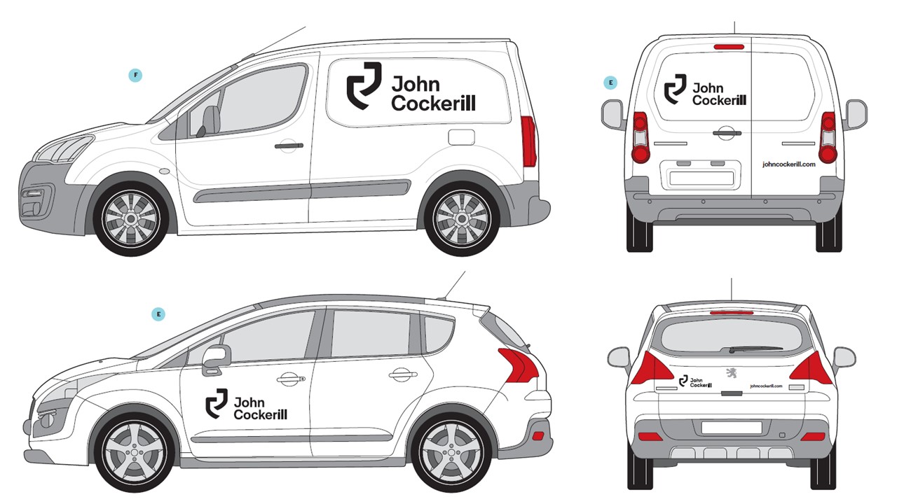
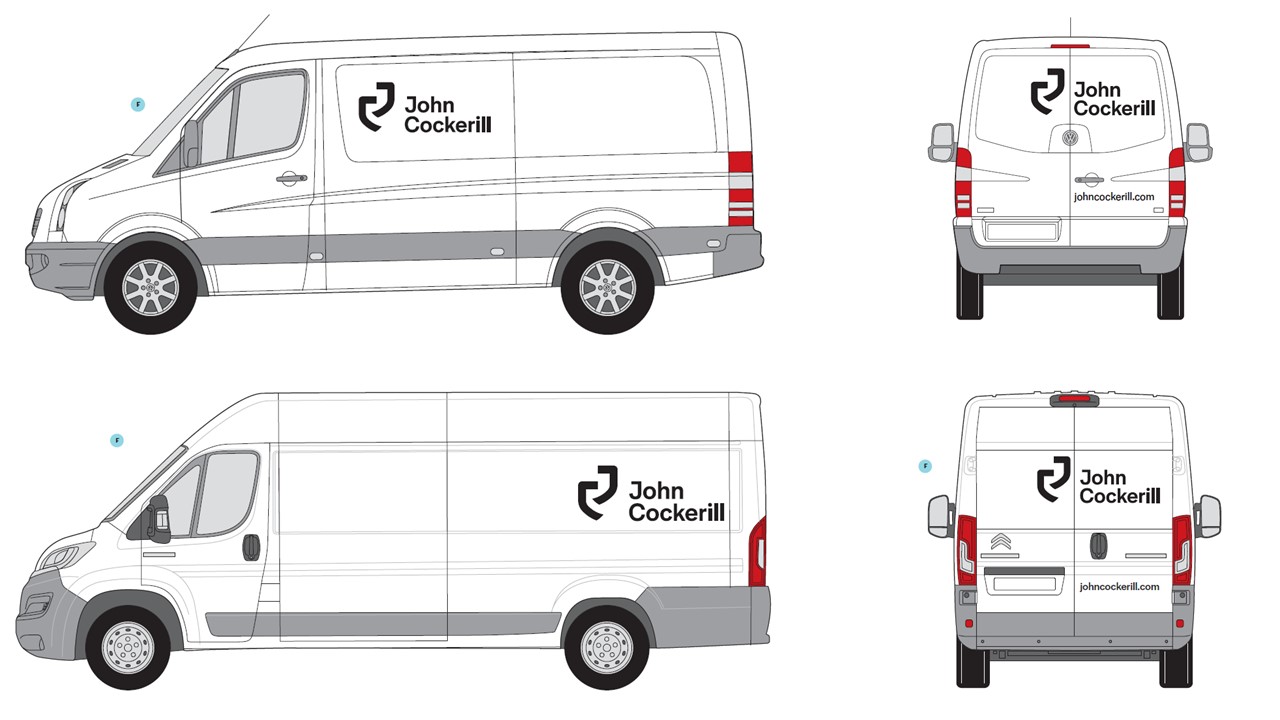
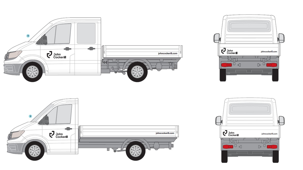
Vehicle signage
Building signage