Some think of brand as slogans and logos.
Our brand is the reflection and experience of everything we do and say, the stories we tell, the value our products carry, everything we share. The Brand Center gives you a foundation of principles and resources to maintain and expand the Heartland brand in all production areas.

We meet people in their story instead of trying to write them into ours.
Voice
Fintech content can be full of confusing terms and obscure acronyms that clutter your writing and make readers lose interest. There’s a better way.
As the people’s champion, it’s only appropriate that we speak using short sentences and simple language that make any topic feel approachable.

Voice and tone
We aim to be human, so our writing is conversational, playful and clever.
We aim to be trustworthy, so our writing is authentic,
candid and clear.
We aim to be empowering, so our writing is confident, positive and informed.
Our voice goals and principles to get a feel for the qualities the Heartland voice should embody.
Genuine
You can’t fake warmth. We have it because our connection to our customers is real. We cheer for every success and feel the sting of every failure.
Helpful
Like any good entrepreneur, we know what matters. We lead with actionable verbs, delete clutter and focus on benefits that are meaningful to the customer and their vision.
Relatable
Fact: Business owners are also consumers. Instead of letting our B2B business model create a stiff, formal voice, we speak in an accessible way that’s informed by our audience’s challenges and passions.

Writing goals and principles
Every piece of content we create is an opportunity to engage readers, share our passion for successful businesses and leave a positive, lasting impression. To help you on your way, we’ve got some tips for writing that builds connection.
Champion the customer
Live in their shoes. What do they care about? What keeps them up at night? How can we meet their wants and needs? Use empathy to solve their challenges — even the ones they haven’t discovered yet.
Take only the space you need
Entrepreneurs are short on time. Edit out copy that isn’t serving an intentional purpose. Focus on showing readers the real-life benefits instead of telling them about technical features.
Entertain while you educate
Help business owners get the important information and data they need without abandoning your warmth and sense of humor. It can be important and fun.
Keep the right perspective
We are not the hero of the story, our customers are. Speak to them directly and prioritize “you” (the customer) over “we” (Heartland). Think like an empathetic, supporting partner, helping them reach their full potential.
Resist the impulse to flex
Don’t fall into the trap of being overly technical or formal. It’s condescending and no fun to read. Be knowledgeable, but always casual and friendly. In summary: If it feels like a flex, delete it.
Do the heavy lifting so they don’t have to
Research thoroughly so you can provide simple, well-rounded explanations. Write scannable copy using short sentences, simple words and an active (never passive) voice.
Treat every entrepreneur with respect. We can educate business owners without talking down to them or showing off.
Tone it down
Instead of words/sentences like this:
• Sophisticated
• Cutting edge
• Merchants
• Competitive landscape
Heartland delivers sophisticated, cutting edge technology solutions to ensure merchants excel in today’s competitive landscape.
Try words/sentences like this:
• Complete
• User-friendly
• Businesses/you
• Competition
All kinds of businesses trust Heartland to deliver a complete, user-friendly solution to help them thrive and beat the competition.
Style
We have a unique style, rooted in AP and optimized for digital marketing in the small business, fintech space. We prioritize clarity, visual harmony and the sensibilities of busy, modern readers. You can find our style guide here.
At a glance:
• Headings: Use sentence case. End punctuation is optional unless other punctuation is used. Keep all heading treatments consistent within a piece. Use % and numerals instead of spelling them out.
• Keep common, familiar terms like email, ebook, internet and website lowercase with no hyphens.
• Say goodbye to the Oxford comma.
• Spell out acronyms on first use with these common exceptions: POS, PIN, ACH, IT, US, EMV.
• Hyperlink citations and stats within body copy instead of including footnote citations.
Who we are
Our boilerplate messages and elevator pitch give you a quick snapshot of the services we offer and the qualities that set us apart. Feel free to use these descriptions verbatim in press releases and other similar materials.

Standard boilerplate (71 words)
Heartland, a Global Payments (NYSE: GPN) company, is the point of sale, payments and payroll solution of choice for entrepreneurs that need human-centered technology to sell more, keep customers coming back and spend less time in the back office. Nearly 1,000,000 businesses trust us to guide them through market changes and technology challenges, so they can stay competitive and focus on building remarkable businesses instead of managing the daily grind. Learn more at heartland.us
Literal short version (44 words)
Heartland, a Global Payments (NYSE: GPN) company, is the point of sale, payments and payroll solution of choice for entrepreneurs that need human-centered technology to sell more, keep customers coming back and spend less time in the back office. Nearly 1,000,000 businesses trust us to guide them through market changes and technology challenges, so they can stay competitive and focus on building remarkable businesses instead of managing the daily grind. Learn more at heartland.us
Alternate short version (41 words)
Heartland, a Global Payments (NYSE: GPN) company, helps nearly 1,000,000 entrepreneurs make and move money, manage employees and engage customers with human-centered technology solutions that allow them to rise above the daily grind and lead their businesses into a brighter future. Learn more at heartland.us
Elevator pitch (100 words)
Nearly 1,000,000 entrepreneurs trust Heartland to provide the technology to run and grow sustainable businesses--technology to make money, move money, manage employees, and engage customers. We develop tools to help entrepreneurs respond to market changes and stay competitive. We know it’s not enough to just look good and have fancy features. That’s why Heartland delivers human-tech across all of our solutions, service, and support. All designed to help entrepreneurs overcome the challenges encountered every day. Learn more at heartland.us.
A clarification: Our credo is not a tagline.
The Heartland credo “Entrepreneurs Respectfully Serving Entrepreneurs” is an internal compass for our organization. You may see it printed on older materials, but it should no longer be an outward facing message.
The Heartland customer experience is heavily influenced by our credo, of course. But it should never be included in printed assets, displayed on screens or talked about with prospects or customers.

The Heartland Blog
Our blogs are an important way to help interested prospects absorb the Heartland message. They span the awareness, consideration and decision phases of the buyer’s journey. They are the primary way we:
Demonstrate our mission of helping businesses thrive
Blogs are a great way for us to express our opinions about how to run a better business. They help us deliver the thought leadership that positions us as a true partner instead of a vendor.
Drive traffic to our website
We use blogs to cast a wide net with our social media and SEO strategies. They help us boost and capture more clicks, improving our search engine rankings as well as our customer/prospect engagement.
Increase our inbound, marketing-qualified leads
Well executed blogs increase inbound leads, which turn into prospects and lead to more closed/won sales.

Blog post elements
Rules are made to be broken. BUT we break them to improve outcomes, never because we’re lazy or uninformed. A master baker may not follow the recipe to a T, but they’ve mastered the fundamentals of baking, so variations enhance the flavor and appearance of their work. This too is our goal.

Headlines
Use a central keyword or phrase when possible. Shoot for 10 words/60 characters on average.
Leads
Start with a hook to capture interest. Summarize the content and state the value of the piece to the reader.
Subheadings
Use phrases instead of single words or terms. That way, they can be skimmed and read as an outline for a general grasp of the key concepts within the blog.
Body
Use readability scoring. Keep sentences and paragraphs short. Use text breaks including subheadings, pull quotes, images, etc. every 150 words on average.
Links
Include at least one link to another piece of content, as well as a link to our website (product page or home).
Citations
Summarize low-value, third-party sources with no link, but do link out to high-value, third-party sources with lots of traffic. Never link to our competitors.
SEO
Use keywords in every blog with support from a keyword optimization tool like Clearscope, but be wary of keyword stuffing. If it sounds awkward, reword it.
CTA
Include a closing call to action in every blog, even if it’s only to read a related piece of content. Be sure to balance selling with helping.


Bringing structure to design
One main goal of this brand system is to provide a consistent structure for our design standards. We have many creative people with unique styles and voices under one roof, which can be inspiring – and messy. To keep the brand from feeling disjointed, we have a framework of core components, so the elements existing inside of it can be used to solve for the variety of solutions needed across the brand.
Consistent and grounded
Core elements – like our logo, photography, typography and color palette – keep us grounded and consistent. These foundational components work together to ensure our brand is recognizable wherever people interact with it.
Diverse and expressive
The elements of our design system promote creative problem solving. Our standards for visual elements like graphics, illustration, animation, and photography allow us to communicate to a broader range of audiences across touchpoints.
Audience first design principles

Simplify and Connect
We take only what is needed to solve the problem and remove the rest. It is not considerate to distract the user with decorative noise.
Connection is at the core of our brand and design
system. Consistent use of our essential elements will bind Heartland messages and visuals into our audience's mind.

Focus and Structure
We are respectful of our viewers' attention with intentional direction and purposeful content. We are consistently clear and direct in what we say, and how we design.
Trust comes from what is familiar. Repetition becomes recognition when we pay attention to detail and key standards are executed repeatedly across brand touchpoints and
experiences.
These elements work together
to create our brand system.

Logo
The Heartland logo is the tangible symbol of our brand, representing who we are: our values, our expertise, our people, our offerings.
An enduring wordmark
Heartland’s success stems from the trust and reliability of our people and solutions. The structure and subtlety of the Heartland logotype reflects that same lasting familiarity and equity in our brand. The logo is both strong and approachable. It is vital to use and reproduce our branding properly to maintain the respect and quality our brand embodies.
Heartland is part of Global Payments. The logo includes a small identifier to convey this. The combined logo should always be used, and the identifier never typeset separately.
If you need to use the Genius product logo for Global Payments retail, restaurant and enterprise POS solutions, contact brand@globalpay.com.
Logo color
Color plays an important role in establishing the perception and position of a brand. Heartland’s logotype should be consistently presented using these approved logo color options. For digital applications, use the Hex values shown below. For print and physical production use the PMS code or CMYK color formulas.
The Heartland logo should only be used in the following colors. 1)white on dark, 2)light gray on white or 3)charcoal on white background. Never reproduce the Heartland logo in other colors*.
Medium Gray
Where there are monochromatic print reproduction limitations, this charcoal color option is appropriate for most white backgrounds.
Light Gray
This subtle gray logo is a common softer branding choice that should only be used on white backgrounds.
True White
The Heartland logo
commonly lives in spaces
and should complement its
surroundings best in a
simple reversed white.
The Heartland logo should be white when used on top of photography.
Minimum logo space
The minimum clear or white space required around the logotype must be the width & height of the "H" in the Heartland wordmark. Providing additional space around the logotype is preferred..
Logo production sizing
Logo reproduction impact and legibility vary by application. For quality and consistency, use the optimal sizings for appropriate branding across digital and print touchpoints, never reproducing the logo too small to be legible or too large to be tasteful.
Digital
Optimal Print
Maximum Print or Embroider
Logo dont’s
We build trust and familiarity in consistency. Do not deteriorate brand with any of these common mistakes of logo reproduction.

Avoid stretching or compressing the logo

Avoid any unapproved logo colors

Avoid using the logo in a sentence

Avoid outlining or combining colors with the logo

Avoid manipulations of logo spacing

Avoid placing the logo in a shape or container

Never lock the logo to a tagline, event, descriptor or other brand

Avoid adding effects like shadows, dimensions and gradients to the logo

Avoid using the old version of the logo. An easy way to tell is by looking at the "t". The newest "t" has a slant

Avoid using the logo over a busy, dark background

Avoid rotating the logo

Seriously
Strong logo examples
Quality begets quality. Here are a few strong examples of proper logo use.

Global Payments identifier
The Heartland brand is a part of the Global Payments family, and Heartland designs should often include the identifier -
“A Global Payments Company.”
NOTE: The identifier is not a part of Heartland’s logo. Its purpose is to identify the brand with Heartland's parent company, Global Payments, Inc. Not all applications are solved the same way. General rule of thumb is that the identifier should be present in the brand experience but not always prevalent. It should never appear to be integrated with the Heartland logo.

Email Example

Software Example

Print Example

Labels & Descriptors
When the design solution is dealing with a label, descriptor or co-brand in near proximity to the Heartland logo, please maintain appropriate space and balance and use the precise separator as defined below.


✓ Do
Do include logo in every product experience with proper presentation.
X Don't
Don’t directly lockup product names or features to our logo as one name or in combinations other than described above.
X Don't
Don’t use our logo in a sentence. Type out our name as if speaking in copy or headlines if needed.
Partner Co-branding
Co-branding is appropriate when we collaborate with Heartland's wonderful partner brands or co-host events. To communicate a shared unified vision through consitency, when a co-branded identity is required and Heartland is the primary brand, it should adhere to all visual brand guidelines.
Whenever Heartland is the primary brand experience it is appropriate that partner logos should come after the Heartland logotype as displayed below. If Heartland is the secondary brand, it should come second. * In most cases, whichever brand contact or call to action is included, then that should be the primary brand experience.
In both variations, be sure to space accordingly and size both logos so they’re optically balanced. Both logos should appear visually equal in size, weight and space. Use monochromatic options for each logo, so that brand colors do not clash.


Color
Our palette is supportive. To maintain focus and priority on the substance of our message, subject of our photography & software in our solutions, the Heartland color palette is intentionally selected to be complementary to those key elements.
White space is your friend.
Color principles

Focus and balance
By using white space liberally, you make it easier for viewers to focus on the content, and you create space for the copy and visual elements to breathe.
Incorporating color elements and accents carefully and sparingly helps create flow and avoid overwhelming the viewer with too much color.

Clarity and accessibility
Neutrals help build clear hierarchies, structure, and environmental depth. These tones also provide an important utility and should be used consistently across digital experiences.
Ample contrast is key to making sure our communications can be seen by everyone, including people affected by visual impairment and color blindness.

Logo color
The Heartland logo should only be used in the following colors: 1) Light Gray on white background 2) Medium Gray on white background, or 3) White on a contrasted background.
*Do not reproduce the Heartland logo in other colors or on top of other colors.
Logo Light Gray
HEX: #b0b4b5
CMYK: 3, 1, 0, 29
PMS: Cool Gray 6C
Logo Medium Gray
HEX: #596063
CMYK: 10, 3, 0, 61
PMS: Cool Gray 10C
Primary & neutral colors
When needing supportive elements or structure, first consider Heartland’s blues and neutral shades. These trusted colors offer structure and direction to guide the eye across the composition.

Light Gray
HEX: #b0b4b5
CMYK: 3, 1, 0, 29
PMS: Cool Gray 6C

Medium Gray
HEX: #596063
CMYK: 10, 3, 0, 61
PMS: Cool Gray 10C

Neutral
HEX: #efefef
CMYK: 4, 3, 3, 0
PMS: Cool Gray 1C

Dark Gray
HEX: #33393d
CMYK: 73, 62, 56, 44
PMS: Cool Gray 15C

Navy
HEX: #003c71
CMYK: 100, 58, 9, 46
PMS: 541C

Action Blue
HEX: #1362e2
CMYK: 90, 48, 0, 0
PMS: 285C
Accents
Use discretion and subtlety when including accents. These colors should never be the dominant color or visual in the design. They are meant to compliment our images or support visual balance. We use two natural cool accents and two natural warm accents that can accompany or support the rich hues in authentic photography.

Teal
HEX: #259f9f
CMYK: 78, 17, 40, 0
PMS: 2226C
Medium Teal
HEX: #9bd4d6
CMYK: 58, 13, 30, 0
Light Teal
HEX: #d0efef
CMYK: 31, 7, 16, 0

Plum
HEX: #563d82
CMYK: 87, 99, 0, 8
PMS: 7680C
Medium Plum
HEX: #9180b8
CMYK: 52, 59, 0, 5
Light Plum
HEX: #e6d6ea
CMYK: 17, 20, 0, 2
Medium and light tints of accent colors may be used where appropriate.

Gold
HEX: #ffbf3f
CMYK: 0, 28, 87, 0
PMS: 136C
Medium Gold
HEX: #fed78e
CMYK: 0, 21, 65, 0
Light Gold
HEX: #fbe2b9
CMYK: 0, 11, 35, 0

Orange
HEX: #ed7a23
CMYK: 0, 71, 100, 0
PMS: 1595C
Medium Orange
HEX: #f19255
CMYK: 0, 53, 75, 0
Light Orange
HEX: #f5bb94
CMYK: 0, 28, 40, 0
Adobe brand library
Access exact color codes and approved logos via the Adobe Asset Library.
Color selection for mood
It is important to maintain a sense of hierarchy, balance and harmony when using Heartland’s color palette. Our color system allows for flexibility, but exercise restraint. When choosing photography, select images that include our color palette; never using more than two of our accents in a design.


Complementary color selection
At the heart of color theory, complementary colors are opposite hues on the color wheel. As creators, knowing which colors are complementary to one another can help you make good color decisions.
- Never use more than two accent colors.
- Never use colors that clash


Color ratios
A key principle of our brand is ‘balance,’ and this is especially important when it comes to color.
In most cases, designs should be 50% white space or more, with photography or neutral grays holding secondary amount of space, and accents making up 5-15% of a design. When in doubt, remove unneeded color.


Strong color balance example.


Typography
The quality in our brand is reflected by our attention to detail. It is present in our products, our service model and our designs. Please take the time to typeset well.
Inter™ is a simple typeface.
Inter™ is a variable font family carefully crafted and designed for digital experiences.

Type hierarchy
Good typography adds value to the content of a page. Maintaining a strong typography hierarchy makes text easier to consume and understand. Bad typography, on the other hand, can make even the best information impossible to read and understand.

Type setting
Take the time to typeset!
Type tracking
The typeface requires space to breathe comfortably within text and headlines and is more legible when spaced appropriately. 11 tips for improving kerning
*Some exceptions for treatment of a headline.
Paragraph formatting
Paragraphs are best read if they are left-aligned with a balanced amount of leading in between lines. Avoid widows and orphans.

Headlines
For H1 Headlines only, creators can combine thick and thin font weights to create emphasis and visual focus when needed.


Photography
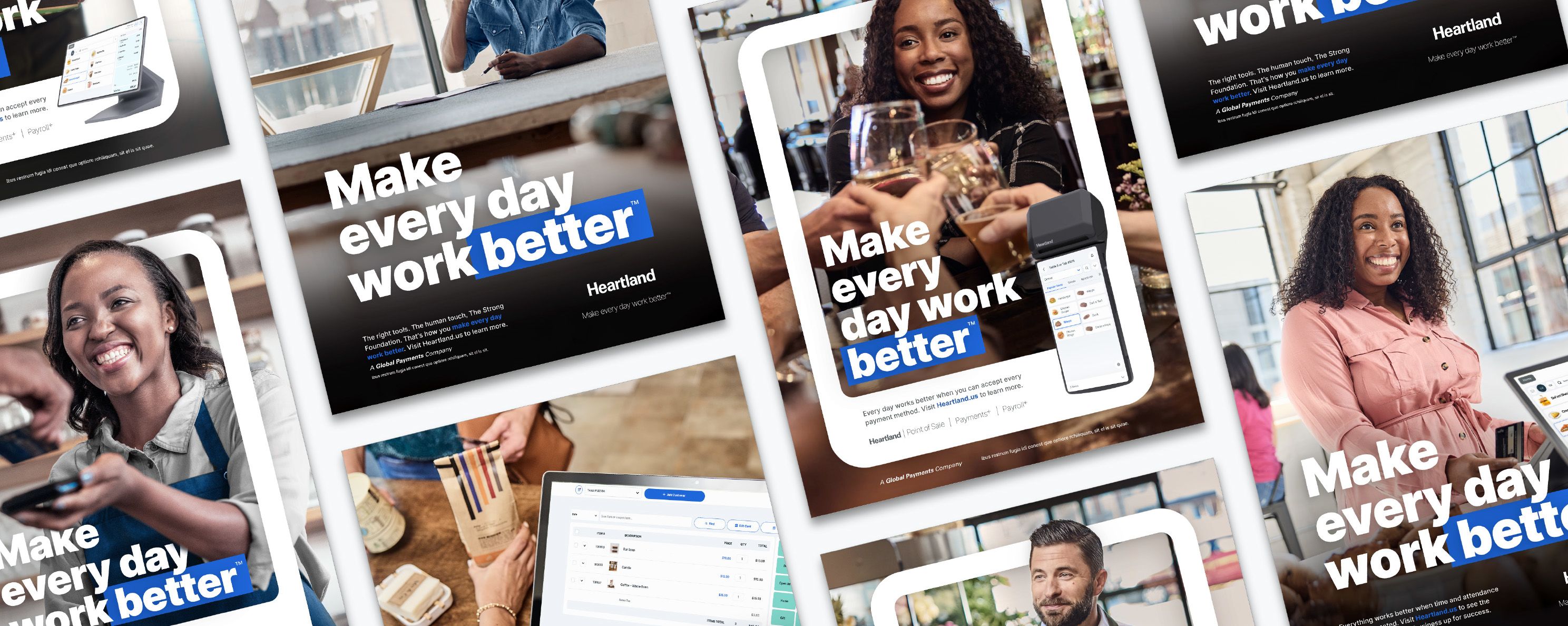
We will represent a diverse people in the Heartland community through photography where authenticity and inclusivity is essential. We spend time in their spaces and capture moments that represent all entrepreneurs and their businesses.
Photographic style
Our style is authentic and optimistic and captures moments with lighting that is bright and diffused, where colors are vibrant but not overly saturated. Our approach is editorial, like documentary filmmaking or journalism. The result is composed images that feel like frames from a film, active and moving in their portrayal of a story.

Photographic guidelines
Lighting:
Aim for natural light whenever possible, as it enhances warmth and authenticity.
Utilize golden hour (early morning or late afternoon) for soft, warm light.
Avoid harsh shadows or overexposed areas, ensuring a balanced exposure.
Colors:
Emphasize warm tones such as earthy hues, oranges, and yellows.
Use vibrant colors to evoke a sense of liveliness and energy.
Maintain a consistent color palette throughout your brand's photography.
Authenticity:
Encourage natural interactions and emotions between subjects.
Avoid overly posed or staged shots, opting for candid moments.
Capture real people in relatable situations that resonate with your audience.
Post-processing:
Enhance brightness and warmth to create a welcoming atmosphere.
Maintain a balanced approach to avoid overly saturated or artificial-looking images.
Retain a level of detail and clarity while preserving a natural appearance.
Composition:
Focus on capturing the subject's emotions and genuine moments.
Emphasize a clear focal point to draw viewers' attention and create impact.
Experiment with different angles and perspectives to add interest.
Composition principles
The best photos have a clear focal point and are framed in such a way as to highlight what the viewer should focus on. In choosing photography, the hardware/software will be secondary to the interaction of the people in the image.
Framing

When cropping, choose a common aspect ratio unless the layout or design calls for a specific crop. Be sure to show at least 75% of software or product and avoid cutting the Heartland logo off of the image.
Focal point

When cropping, choose a common aspect ratio unless the layout or design calls for a specific crop. Be sure to show at least 75% of software or product and avoid cutting the Heartland logo off of the image.
Cropping

When cropping, choose a common aspect ratio unless the layout or design calls for a specific crop. Be sure to show at least 75% of software or product and avoid cutting the Heartland logo off of the image.
show moments in photos

show people in photos

show spaces in photos

Photography do’s and dont’s
When selecting stock images make sure to consider the following.

Do use natural poses, lighting and colors.
Do show diversity in age, race, gender and abilities.

Do choose relevant images and interesting compositions
Do use authentic images that capture a moment.

Don't use posed images where the subject looks at the camera.
Don't overlook proper representation of our diverse people groups.

Don't show products that aren't approved by marketing.
Don't use filters or harsh lighting and avoid harsh cropping.
Image treatment dont’s
Good photography stands on its own and should not need extra treatments.

Avoid over stylized or photoshopped images.
Avoid using black and white photography. The warmth and realness of our images is the key element to our designs.

Avoid using color overlay on photograph.
Avoid using multiple unrelated product images together.
Use of products in imagery
Our products facilitate great customer moments. Make sure to feature our products in beautiful ways in photography. The technology can be the focus of some shots or an accessory in another, but should always be represented crisply and well lit.
Use imagery that captures real-life moments of people using our product.

Us imagery that includes products in their environment as the hero focal point.

Use high quality technical imagery of our products to showcase the beauty of their design.

Use of software in imagery
Because we are software-driven and customer-centered, showcasing both authentic human moments combined with our excellent software is a great way to create a dynamic design visual. Make sure to feature our software with precision and care. Use the examples below for style and direction of incorporating software into imagery.


Soft UI style
Lorem ipsum dolor sit amet, consectetur adipiscing elit, sed do eiusmod tempor incididunt ut labore et dolore magna aliqua. Ut enim ad minim veniam, quis nostrud exercitation ullamco laboris nisi ut aliquip ex ea commodo consequat.

Software components can be layered within the imagery. Always make sure and use contextually accurate software and items to tell a story within the image.
Use 1-3 components from the software in dynamic layers, composed with the related photography. Consider size and visual balance of the collage as well as how much is "too much."


Software shadow styles


Technical imagery
We've created a proprietary illustrative style for our hardware for use in product support or marketing related collateral.


Iconography
Icons are a great design tool to reinforce broader ideas with simple visuals and to direct the eye across a design. Icons are a tool, not a decoration. Please use them sparingly and intentionally.
Videography
Video is the most engaging format of content for storytelling, communicating and explaining complex ideas. Great videos come from the intersection of many of the production principles above. Style, mood, music and pace must mirror the essence and quality of the Heartland brand.

UI Style guide
We create clean responsive designs with a consistency that matches the brand. Users should not feel that they must spend unnecessary effort to understand our materials or perform tasks.
Web type


Balance, space and shape are key elements of the aesthetic integrity of the Heartland brand.
Strong design examples

*The web design above 1) leads with authentic and dynamic photography followed by 2)a clear and concise headline and call to action.


*The content design above 1) incorporates multiple design principles and shows a 2) consistent quality throughout.

*The design above 1) balances imagery and whitespace and 2) uses subtle complementary colors to direct the eye.

*The design above 1) combines product experience and photography 2) to create a relatable moment.

Tools and Templates
Presentation Template
A Google Slides presentation is template available to help you build, strategize and communicate across the brand.
Photography
Our core images can be used throughout marketing and communications. We encourage the use of these images across projects, as it will help with both consistency and recognition.
Icon Library
A library of commonly used icons across the brand.
Logo Package
Download current Heartland Logo Package.
Company Store
Get the latest gear for you and your teams.
Video Library
Video is a great way to share our story and the story of our customers. Our YouTube video library includes all current videos available.
Email Signatures
Email is a primary form of business communication. It is important employee email signatures convey a clean, professional and consistent image.
For quality reproduction, Heartland's email signature intentionally uses only black type with no color or graphics.
Follow these steps to bring your email into accordance with the brand standards: (or click here for a tutorial)
1. Log in to your Corporate G Suite account
2. Open Gmail
3. Select the "Gear" icon in the top right corner, then select "Settings from the dropdown menu
4. Scroll down to the "Signature" section
5. Add your contact information and style using the Sans Serif typeface as shown in the example to the right.
6. When finished, scroll to the bottom of the page and select "Save Changes"
Important: DO NOT ADD logos, color, graphics, personal content, quotations, non-company links or images to Heartland's email signature or below.


If you have questions about any of these guidelines, please contact brand@heartland.us
Heartland Brand Guide | Version 1.2 | Updated 10/27/23
©2025 Global Payments Inc. All rights reserved. All trademarks contained herein are the sole and exclusive property of their respective owners. Any such use of those marks without the express written permission of their owner is prohibited. Heartland Payment Systems, LLC is a registered ISO of Wells Fargo Bank, N.A., Concord, CA; Synovus Bank, Columbus, GA, First National Bank of Omaha, Omaha, NE; and Deutsche Bank, New York, NY. TSYS Merchant Solutions, LLC is a registered ISO of Wells Fargo Bank, N.A., Concord, CA; Synovus Bank, Columbus, GA; First National Bank of Omaha, NE; and Deutsche Bank, New York, NY for Visa and Mastercard transactions only. Global Payments Direct, Inc. is a registered ISO of Wells Fargo Bank, N.A., Concord, CA. OpenEdge Payments, LLC (operating as Global Payments Integrated) is a registered ISO of Wells Fargo Bank, N.A., Concord, CA.