Concept
The Handkraft concept follows three key values.
Handkraft is scandinavian design craft at its finest. Our values are simple and rooted in our vision. We are minimal, as we believe every form should have function. We are solid, as we believe in quality over quantity, and we are durable, as we believe in creating things that last a long time—both visually and materially.
These three values should be apparent and clear in everything we do—be it creating new product collections or communicating to customers.


Craftmanship is a way of life.
Handkraft draws from a rich heritage of woodmaking and craftmansship. This love to our craft is what drives us—and is never to be forgotten. Our materials and how we treat them is what creates our value, and our dedication to the materials is what seperates us from others.
The Handkraft shop was started by Hans Kraft in Odense, Denmark in 1743. Since then, our Handkraftmen have been making timeless pieces of furniture out of the worlds best materials. We are proud to have stayed true to our craft for 275 years and counting.
Heritage

Wordmark
Form follows function.
The Handkraft wordmark is simple, clean and handmade, just like our furniture. It speaks to our heritage as craftsmen and our vision of simplicity. Always present the logo centered and with plenty of space so the wordmark can breathe.

How we talk is how
we are perceived.
For people to really listen, you have to have something to say. That why we should only speak if we have anything interesting for people to hear. When we speak, we speak clearly. We write in short sentences and with a simple language.
Tone of voice
Typography
Typography helps the message come through.
Handkraft brings our messages to life by utalizing two different fonts; one sans serif and one serif. These two work together to create depth and texture to our content.
Work Sans, the Sans, is used for headings and short paragraphs of text. Cormorant Garamond, the Serif, is used for running text and longer paragraphs, due to it's readability. Together they create a fine balance of minimalism and elegant craftsmanship.
Work Sans
Aa Bb Cc Dd Ee Ff Gg Hh Ii Jj Kk Ll Mm Nn Oo Pp Qq Rr Ss Tt Uu Vv Ww Xx Yy Zz 1 2 3 4 5 6 7 8 9.
Cormorant Garamond
Aa Bb Cc Dd Ee Ff Gg Hh Ii Jj Kk Ll Mm Nn Oo Pp Qq Rr Ss Tt Uu Vv Ww Xx Yy Zz 1 2 3 4 5 6 7 8 9.
Icons are visual
guidance for words.
Words will never be as valuable as visuals, but sometimes to many images at once cause cognitive overload. To help balance this, we use icons. Communicatively speaking, icons fall right between text and images and can help create a visual aestethic where images are too much or not applicable.
Icons used for the Handkraft identity should be simple, easy to understand and visually representative for the product.
Icons
We use colors to
visually explain our values.
The colors used for the Handkraft identity are handpicked to communicate our values and beliefs. Our colors represent natural materials used in our collections, with a focus on creating the appearance of a matte texture.
Colors
Black
Concrete
Light Grey
Wood
Clay Stone
White
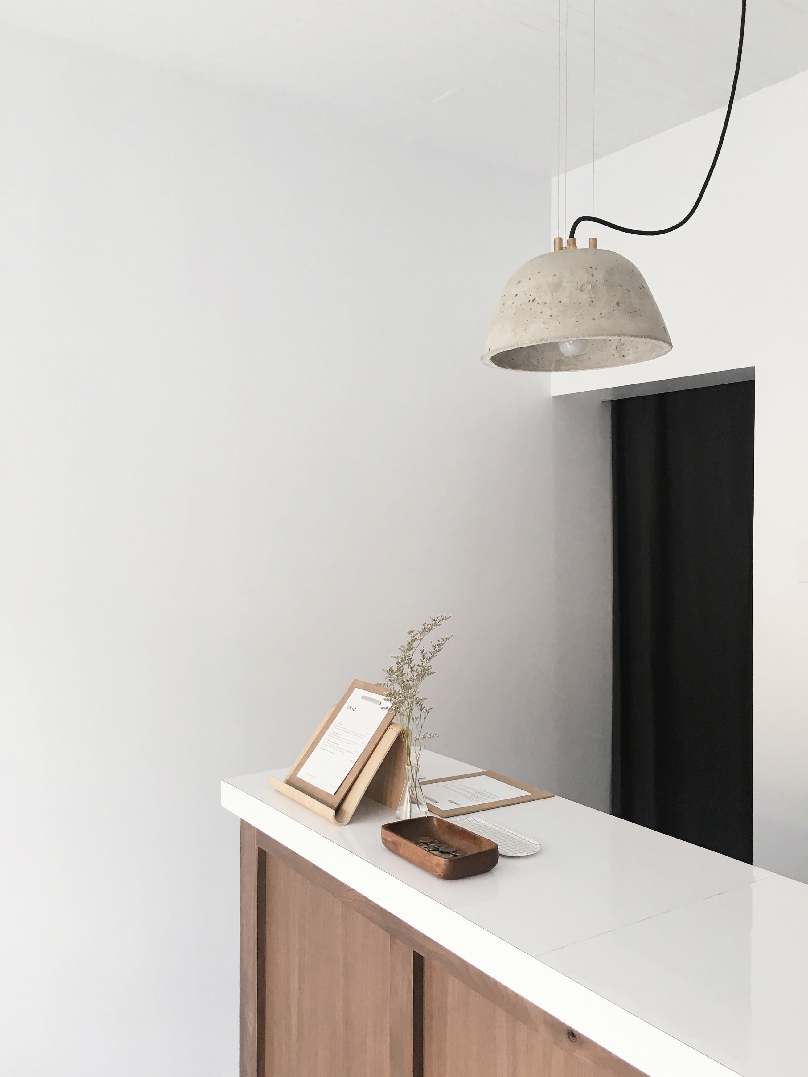
Imagery
Things that feel good should look good.
Images play a big role in the Handkraft identity. While text can explain craftmanship, images can explain design, and thus, the two are commonly used together. Image guidelines follow two simple rules.


Templates


Advertisement
Handkraft follows a strict communicational structure for all advertisments and brand communication. In addition to our tone of voice, we structure layouts and communication to fit our values and strategy.
This includes layouts of all types of ads and across all channels. When in doubt, please get in touch with your contact.
Header here.
Each ad message is always 50/50 visual and textual. Based on the placement, each message is set up with a header and following paragraph of text. No matter if the text is on the left (like this) or on the right, text is set to adjust left. The paragraph should be short and to the point. Always accompony the message with an image referencing the message or vice versa.
Handkraft
Modern Scandinavian Design.

Questions?