These brand guidelines are a toolbox filled with strategic, verbal, and visual components, which offer direction for creating strong, recognizable, and effective communications.
This resource helps ensure consistent application through a range of expressions across the gusto! brand identity.

brand strategy
Our internal brand strategy includes a set of components that capture the essence of who we are. Every touchpoint of our brand should be anchored by this work. Distilled down into compact words, phrases, and personas, these elements help us stay focused and grounded and allow us to define our ideal reputation.
*This material is not public facing.
context
In a market where “fast” can often mean “junk,” gusto! aspires to refresh expectations and expand horizons. Driven by a passionate spirit, gusto! shops aspire to create exclamation points in every day life through life giving food, connections and spaces. The new south's got something to say and we're empowering choices worth making with through dine-in, delivery, drive-thru, and catering options.
position
gusto! is the fast casual
restaurant known for
sharing & daring.
rationale
• A varied menu of adventurous and eclectic global bowls and wraps.
• Sharp interior designs that make great backdrops for memories.
• A focus on building people up and fostering growth.
personality attributes
Fun-Loving
Driven to delight everyone we meet, we’re witty, warm, and lighthearted.
Disruptive
Spirited and adventurous, we’re on a quest to rekindle our love for the colorful, the flavorful, and the fresh.
Crisp
Careful and precise, we consider every detail and strive to keep things fresh.
Reliable
Consistent, present, and responsive, we inspire confidence, win loyalty, and earn credibility.
Vibrant
Bright and lively, we strive to be generous neighbors, invested employers, and proud citizens.
target audiences
the lunch scout
The Lunch Scout is looking forward to a quick, flavorful bite that won’t make her feel guilty or gross. A conscious consumer, she rewards values-driven companies with her loyalty—and makes a point to tell her friends.
“I love that I can get a filling, fulfilling, and quick meal without breaking the bank.”
the visible tastemaker
Energetic, enthusiastic, and exacting, the Visible Tastemaker is looking for a delicious and healthy meal that’ll also look great in her grid. An avid exerciser, amateur brand ambassador, and local influencer, she wants to feel considered and loves to be seen.
“My squad loves to follow up a great workout with a visit to gusto!”
the fledgling foodie
To him, a good meal isn’t just fuel; it’s a real treat worth looking forward to. A fan of food and travel content, he fancies himself an enthusiast, not an expert, and bristles against the pretentious. He loves to get out of the house, sit on the patio, and try new things.
“A visit to gusto! gets me out of my comfort zone, but I always love what I taste.”

verbal identity
Strong communication requires clarity and consistency, and our verbal components serve as starting points and guardrails for writing on-brand, across all applications. They help us externally express our brand personality and position—emphasizing to the world who we are, why we matter and how we are different from other products in our space.
our name
We named gusto! after the force that drives the curious, the daring, and the driven. It’s a sense of enjoyment, zeal, and excitement about what’s around the next bend. It’s at the heart of everything we do, every decision we make, and every bowl we serve up. And if we do our jobs well, it’s the feeling our diners will leave with.
We format our name in all lowercase, no matter what. When we’re talking about our restaurant, we always include the ! When we’re referring to our signature gustos that go with bowls and wraps, we nix the !

brand voice
Our brand voice is how we speak to the world. A defined brand voice helps us own a distinct personality and remain consistent across our communications.
Depending on context, our tone might vary slightly from one entity to another, but we should never stray from our core brand voice.
fun-loving
We don’t take ourselves too seriously, and pepper our messaging with an easy-going humor that’s approachable and relatable.
crisp
We keep things short and sweet, speaking succinctly and unambiguously.
disruptive
We sound just as bold as our flavors, and use punchy phrasing to stand out among the competition.
reliable
We sound consistent wherever customers find us, whether in a store or on a screen.
vibrant
gusto! is for the people, and we bring them into the conversation by using pronouns like “our,” “your,” and “we.”
sample headlines
The quickest, most effective way to bring our brand voice and personality to life is through a headline. Typically the largest, most prominent message on a page, headlines summarize what comes next and draw the reader in.
Typical applications include the “title” of a web page, billboard, or section of a brochure.
When formatting headlines, typeset them in lowercase. Do not use Titlecase. Only use sentence case with longform copy.
general headlines
a stealthy kind of healthy.
we’re fresh out of boring.
full-bloom flavors.
full-hearted service.
spicy.
smoky.
crispy.
zesty.
crunchy.
herby.
when it comes to your lunch, don’t settle for “fine.”
you were given 10,000 tastebuds.
don’t waste ‘em on boring food.
a bright palette
(for bold palates)
go ahead. acquire some new
tastes.
what if your favorite meal is out
there…and you just haven’t met it yet?
your new jam is right around the
corner.
good things come to those
who dare.
once you go gusto! there’s no
looking back.
find a new flavorite.
mighty real food, served mighty fast.
true flavor isn’t beige. eat in color at gusto!
go ahead. chew with your mind
open.
hiring headlines
seeking flavor champions.
hunting growth mindsets.
wonder. spirit. kindness.
we’re here for it.
catering headlines
Note that some lines are designed to be communicated in a headline/subhead relationship.
lucky you! this gathering’s got gusto!
put down the sad sandwich. gusto! caters.
spoil the office with gusto! catering.
happy tummies, better work.
bring gusto! to the office.
spirit-lifting lunches.
make some new best friends with gusto! catering.
we cater to every taste but boring.
one-liner
This is a quick descriptor we can all use to introduce who we are and why we stand apart in one, simple sentence. It should touch on high-level information without getting into detail, empower us in a conversation and encourage a deeper discussion.
We’re good energy givers, with our food, our spaces, and our human connections.
opening paragraph
This is how we introduce our brand to the world in one succinct paragraph. It is meant to serve as a starting point that can be shifted and built on to apply to specific audiences and contexts.
Sample applications:
Intro copy on marketing collateral ‘About Us’ web page intro
We started gusto! because we were curious.
Could we seek out global flavors (smoky chipotle! zesty ginger! herby tzatziki!) and give them a home together? What if we produced beautifully balanced meals in record time? And what if we had fun while doing it? Would people get it?
It turns out we weren’t the only ones on the hunt for something new. We’ve had the good fortune to meet thousands of folks hungry for
the bright and the bold. It turns out that curiosity’s not just an impulse. It’s a spirit that lasts a lifetime. And we believe it’s worth sharing.
key messages
Since our opening paragraph can’t do all the heavy lifting, our key messages allow us to expand on important aspects of our brand.
how to gusto!
At the heart of the gusto! experience is a question designed to unlock a world of possibilities: what’s your gusto?
Each of our gustos combines a signature sauce, salad, and garnish to tell a big, bold flavor story. From zesty and robust to spicy and sweet, we’ve got a gusto for every taste, mood, and impulse. Start by choosing a gusto and then pick a protein. We’ve got vegetarian, vegan, and gluten-free options, so you’re covered no matter what. Finish it off by selecting a base and you’ve just punched the ticket to deliciousness. No matter which meal you choose, you’ll get an order of our house-made sweet potato chips because we care about you.
First time? One of our co-pilots is standing by to help plan your journey. While you’re with us, we want to know your name, hear how your day’s going, and remember you on your next visit. At gusto! we give a damn, and you can taste it.
gusto! catering
Whether you’re hosting a lunch meeting or you have something to celebrate, gusto! catering lets you gather in good taste. We pack all the variety of gusto! into individual bowls delivered right to your door.
Start off with two bases — brown rice and mixed greens — then pick two proteins and two gustos to make it official. Your order comes with a boatload of sweet potato chips, and you can even add on dessert and drinks. We’ll bring the bowls, (compostable) forks and napkins, you bring the crowd.
join the gusto! team
Never met a stranger? Let’s be friends. Our team comes from different backgrounds, but we’ve got the same energy: unflappable, totally friendly, and genuinely enthusiastic about serving others. If this sounds like you, it sounds like you’ve got gusto! We’re always on the lookout for folks with a positive outlook on life and ambitions to grow. Because we take our team as seriously as we take our food, we invest in you for the long haul. Work with us, and we’ll definitely work for you.
the gusto! story
After playing football at the highest levels, Nate Hybl made a play to follow his passion. Inspired by the immortal words of leadership expert Dale Carnegie, he wanted to live every day “with gusto.” Putting that idea into practice, Nate pursued his belief that food could—and should—be a moment of discovery, a mini-experience that adds a little bit of oomph to the day. He saw something missing in Atlanta’s quick-casual scene. There were plenty of chicken options, but few were healthy (let alone customizable). Tons of places to grab a quick bite, but how many fast casual restaurants are bound and determined to make every bite meaningful?
Nate envisioned a restaurant where “fast” didn’t mean flavorless, and where people are the primary investment. For a few years, he was a man with a plan, a minivan and a grill, roving across metro Atlanta and nudging people out of their comfort zone. Soon after, the first gusto! was born. Today, we’re still going strong and keeping the city nourished with complex flavors in a simple meal.

visual identity
Our visual identity is a comprehensive, yet unified system comprising of core elements such as brandmarks, typography and color and a range of graphic assets. This kit of parts is designed to be flexible and expandable in order to help us bring our visual identity to life in creative yet cohesive ways.
The gusto! visual identity system is built upon visual principles like layout, whitespace, rule of thirds and hierarchy. To effectively define and maintain our brand, adhere to the guidelines and frameworks shown below, as gusto! is expressed across a wide variety of touchpoints. For a sampling of these expressions, see applications section.
brandmarks
Adhere to approved marks and colorways shown below. gusto! gold is always present when one of our core brandmarks shows up.
The exclamation point and exclamation burst are submarks and are not meant to perform as a logo, but are acceptable for use within gusto! materials in a secondary instance.

primary brandmark on white
primary brandmark on deep blue
primary brandmark on ice gray

logotype on white
logotype on deep blue
logotype on gusto! gold

exclamation burst on white
exclamation burst on deep blue
exclamation burst on ice gray


exclamation point on white
exclamation point on deep blue
exclamation point on gusto! gold
exclamation point
This submark should typically be used at a 10° angle, and not represented vertically. It is encouraged that it be used creatively and boldly throughout the graphic brand and physical environment, pending review.
exclamation burst usage
This submark might appear in our secondary colors when associated with the menu—all uses subject to review.
alternative gusto! burst logo
the reverse gusto! burst logo is used sparsely. It is mostly seen when working with a gusto! gold background, or when there is not enough contrast between the background color and the primary gold gusto! burst logo.

typographic assets
what's your gusto manifestations
These visual assets are secondary only to our brandmarks. This core question does the work of helping operationalize the correct pronunciation of our name. This question aids in the ordering experience. It points to an awakening of curiosity and functions as a brand anthem. Refer to our visual framework for direction regarding when to use the script versus the 3D style.


knock out helvetica
This visual typography treatment is a nod to leaning into being bold. With the caps locks and and knocked out top layer this treatment is used for stand alone headlines, not body copy.
Check color combinations below to make sure you achieve the best contrast when pairing the layers.

knock out cooper
This visual typography treatment is a nod to leaning into being bold. It's knock out helvetica's fun cousin- again check color combinations to achieve the best contrast when pairing the layers.

heard! exclamations
These visual assets are secondary only to our brandmarks. "heard!" is the acknowledgment of confirmation, and speaks to one of the company's values in action- first to listen. This wordmark is associated with the playful side of our brand.


gusto! bowl identity system
This identity system was created to brand the unique gusto! bowls. Each bowl, as well as specials, will be assigned a specific color to be used on menus, promotional materials and social media marketing. There are two versions of this system, the gusto! burst + name, and the gusto! exclamation point + name.
gusto! burst + name
Spacing rule: Based on the radius of the burst (lime green line). The lettering is left justified a quarter of that distance of the radius (darker green line).
Name placement: The name of the gusto! needs to fit and be evenly spaced within the box. The box was created based on the points of the gusto! burst.


gusto! exclamation + name
Spacing rule: Based on the radius of the exclamation (lime green line). The lettering is left justified half of that distance of the radius (darker green line).
Name placement: The name of the gusto! needs to fit and be evenly spaced within the box. The box was created based on the points of the gusto! exclamation.


secondary logos
this section showcases different logos within our brand.
Local Operating Partner logo
This logo is an identity for our local operating partners. It will be used on marketing materials, internal communications and be seen within shops.

Intentionally Fostering Growth logo
We are a purpose driven company and our purpose/ brand promise is “to intentionally foster growth”. This applies to our team members, our guests, our communities, and our impacts. We use this logo as an accountability tool.

gusto! Fam Club logo
When developing our rewards app we knew we wanted to make our guests feel like they were a part of a special club. The Fam Club logo pulls inspiratin from sports logos- punchy, but welcoming.
icons
gusto!'s iconography serves the functional purpose of quickly communicating our bases on menu. Our icons can be set in deep blue or black, matching the typographic color on each menu at hand. The kids menu icons are intentionally smaller; ensure that scale is not altered so that stroke weight stays consistent amongst the set.

emojis
Our unique emoji style allows for shorthand within our communications, while maintaining visual distinction and cohesion with our visual language.
When creating additional emojis, maintain the colorway, scale and general style shown in this set. Do not use emojis outside of this style.

color
primary palette
Whether in our physical environments, online or in print, our two most commonly used colors are white and gusto! gold. Black, deep blue, ice gray and a touch of bright blue support these two to round our our core color set.
gusto! gold
white
black
deep blue
ice gray
bright blue
colorways
Our primary palette is designed for flexibility. The colorways below show a few possibilities for how gusto! can show up as the same brand in different contexts.
For example, colorway A might be assigned to the Chamblee location, given the store is primarily white with black details. Colorway A would translate to a drive thru and in-store menu that use black typography. Colorway B might be assigned to the Avalon location, which uses blue details and promotional banners. The Avalon menu might use blue typography. Colorway C might be used for a billboard, and colorway D might be used across the website.

secondary palette
Our varied and vibrant secondary palette is driven by the ingredients and flavor profiles of our gustos. Each gusto has its own swatch. However, collectively, these swatches can be sprinkled throughout the brand via photography to add visual flavor and to connote the spirit of our food outside of the menu.
selecting a seasonal color
The rotating gustos are each assigned a new swatch. When selecting a color for each new seasonal special, consider color notes within the dish. Further, consider a selection that fits cohesively within this secondary palette—bright but not overly saturated. Additionally, aim for a tone that is not drastically lighter or darker than the other gustos.
chipotle mango avocado
tzaziki lemon artichoke
polynesian chili mango
ginger lime peanut
sweet soy sriracha
queso verde queso
tahini cucumber feta
typography
Helvetica Neue Bold, -40 Letterspacing
AaBbCc
Helvetica Neue Medium, -20 Letterspacing
AaBbCc
Helvetica Neue Heavy, -20 Letterspacing
AaBbCc
Helvetica Neue KnockOut, -40 Letterspacing
AaBbCc
when using 3 lines or less, with Helvetica Neue Bold or Medium
leading should be 32
when using more than 3 lines, with Helvetica Neue Bold or Medium
leading should be 23
gusto! is committed to Neue Helvetica Bold and Medium, regardless of the the medium. When Neue Helvetica is not available, use Helvetica as system alternative.
Typeset brand messaging with tight but consistent leading, so long that ascenders and descenders do not overlap. Typeset body copy with looser leading, using a 3:4 ratio as a general guide. (e.g., 16:21)
Consider maximum color contrast and typographical hierarchy, (as shown below) so that gusto! communications adhere to accessibility best practices. *Note that when paired with white or ice gray, gusto! gold does not pass WCAG contrast testing.
h1
h2 bold
h2 medium
h3 descriptor
body copy bold
body copy medium
h1
h2 bold
h2 medium
h3 descriptor
body copy bold
body copy medium
h1
h2 bold
h2 medium
h3 descriptor
body copy bold
body copy medium
h1
h2 bold
h2 medium
h3 descriptor
body copy bold
body copy medium
h1
h2 bold
h2 medium
h3 descriptor
body copy bold
body copy medium
h1
h2 bold
h2 medium
h3 descriptor
body copy bold
body copy medium
h1
h2 bold
h2 medium
h3 descriptor
body copy bold
body copy medium
h1
h2 bold
h2 medium
h1
h2 bold
h2 medium
h1
h2 bold
h2 medium
h3 descriptor
body copy bold
body copy medium
secondary font of fun
Cooper is the more approachable, funny friend of Helvetica Neue within gusto!'s brand. This typeface can be applied in any application when gusto! wants to feel more friendly and fun.
Cooper Black STD, 0 Letterspacing
AaBbCc
hi
hi
hi
hi
hi
hi
hi
hi
hi
photography
— sample galleries
photo categories
our food
our people
our environments
our communities
Photography is a window into the gusto! experience and a vital component of our visual language. By telling our story with compelling and tastefully selected photography, we win the interest of the customer. Overall, our imagery is bright, crisp, and genuine. Additional style cues apply to each category.
When creating touchpoints that utilize photography, keep layouts simple, making one image the hero. Do not rely on photo collages, which risks diluting visual interest and cluttering the message. Refer to the applications section.

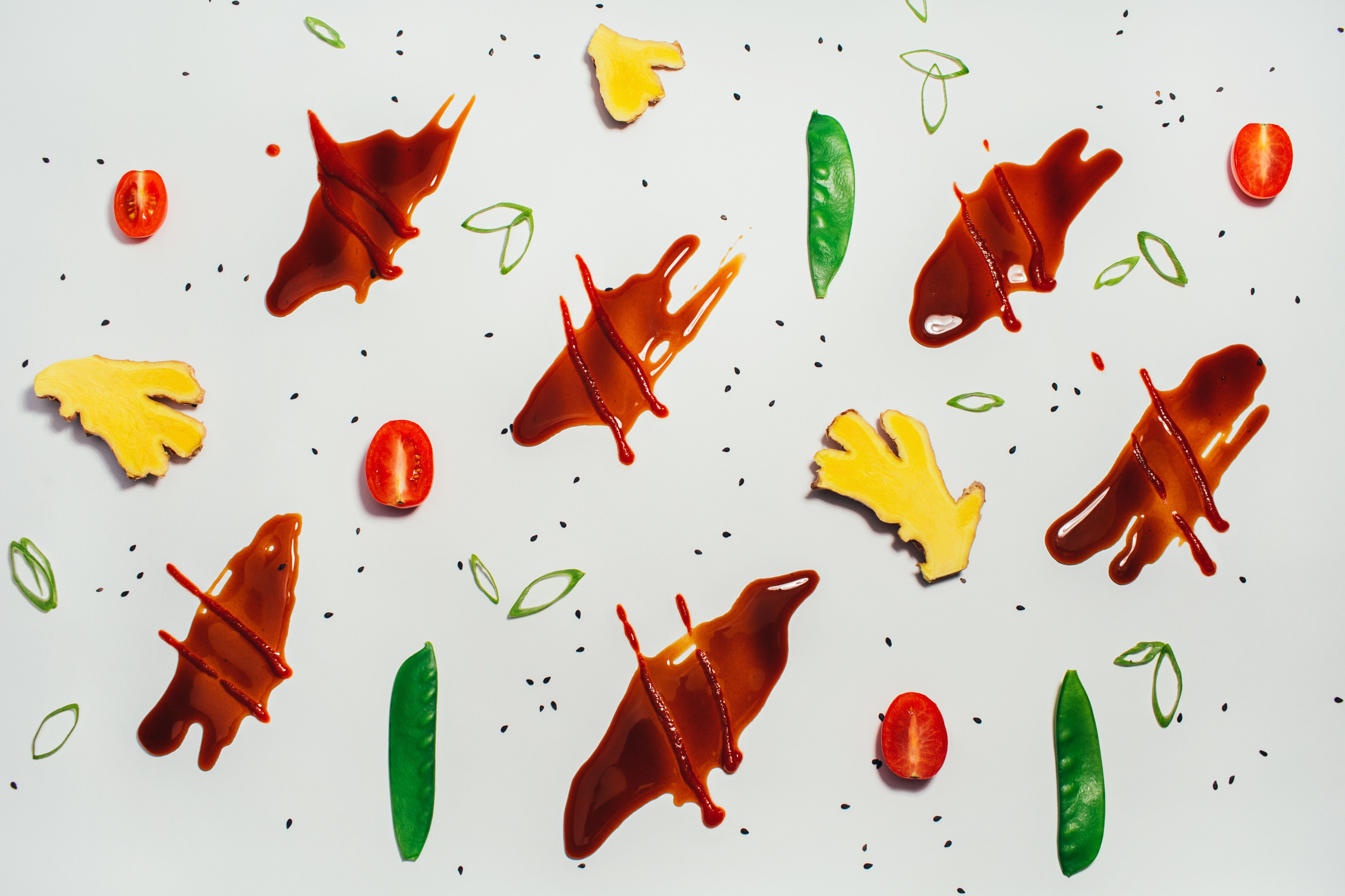
our food
Isolated food shots are utilized when we need functional images, say for our menu. These are often shot on white, ice gray or have transparent backgrounds so that brand color can be layered in. They can also be photographed on colored backdrops in our palette.
These images range from a key ingredient (chicken) to a gusto (sweet soy sriracha) to an arrangement of food (catering).
Wallpapers are artful expressions that highlight our ingredients. Use these assets on social, web and as artful prints inside our restaurants.
Food photos that lightly include people might range from a more styled catering shot with colored backdrop, to an image that feels more in-context at a drive thru, restaurant or catering location.


our people
This category includes both genuine in-context shots and studio-portrait sessions where brand color is brought in with backdrops. Images in this category should always feel light and bright. Aim for a natural feel rather than a scene that appears composed.
Focus on relationships with others or the food. Cropping in can help. Include our team members in their gusto! environment, or enjoying our bowls or wraps. Expressive emotions. Showcase their gusto.


our environments
Images are clean, crisp, and bright, without being overexposed or oversaturated. Whether empty or full of commotion, shoot both interior and exteriors using as much natural light as possible. Do not use overstylized filters on our images. (The images shown below are slightly too desaturated.)


our communities
Our brand voice and visual language are more flexible on social than anywhere else. This imagery category lives mostly on social, when we need to tell stories outside of our core space.
This category is the most varied, utilizing images that might range from an iPhone shot of our team serving the community, to a photography partner's image of an event. Though this category is vast in subject matter and tone (ranging from cheeky to serious), we aim to keep the visuals as consistent as is possible. Where feasible, edit image contrast, lighting and vibrancy to achieve a crisp aesthetic that works well next to our other photo categories.


pop culture
Memes, gifs and branded graphics are seen within our social media platforms. This is a way to show the brand's personality, pride and voice.


visual framework
This framework illustrates the flexibility in our visual language across channels. For more functional applications, use elements that feel like a number two pencil. For more expressive applications, utilize elements that feel fun and vibrant, taking more visual risk.
typographic applications
Varying our typographic styling can change the emotional effect of our communication. For more functional contexts like menu or signage, consider smart and simple typographic solves that do not distract from the message. For more expressive moments, consider wilder expressions that still feel within reach of the gusto! visual language.

color
For moments of brand introduction, like an advertisement or the homepage of the website, adhere to the left side of our spectrum. For tangental moments, or experiences that follow brand introduction, like swag or social media posts, color becomes more expressive and varied.

graphic assets
The context of our assets determine their role in our spectrum. Our icons are simple and functional because of their role on our menu, offering a "quick get" to new customers. Our bursts and emojis are more expressive for moments that are appropriate to show more personality.

applications
Applications should always be designed according to their context and role within the customer's journey. Moments of introduction should be functional and more stripped back in order to achieve quick, clear communication. Contexts that are more in-depth, offer appropriate room to create possibilities beyond our number two pencil.

applications
— a sampling of brand touchpoints to cast vision


If you have any questions regarding this guide or its contents, contact Nate Hybl at nate.hybl@whatsyourgusto.com