Greenville Triumph
Brand Guidelines
Ver 1.0, April 2026
Greenville Triumph
Welcome to the Greenville Triumph brand manual. These guidelines exist to ensure every visual and verbal expression of our brand reflects the spirit of the Upstate, resilient, unified, and forward-moving. Please use them with care and consistency.
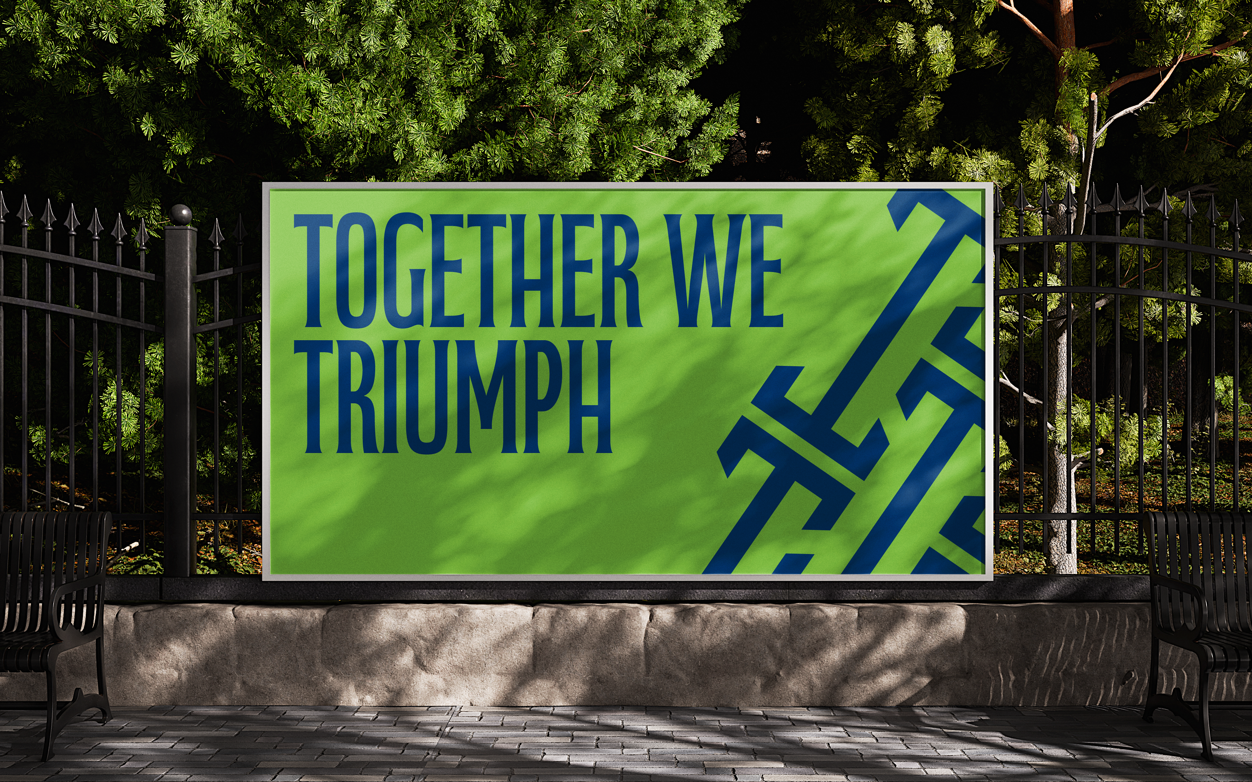
together we triumph.
Time and again, the Upstate has chosen perseverance, progress, and hope. Today, we carry that spirit forward. As a professional club and community anchor, Greenville Triumph SC is part of the region’s infrastructure. We contribute to economic vitality, enhance quality of life, support talent attraction, and build pride across the communities we serve.
We believe soccer connects people across cultures, languages, and backgrounds, creating community, opportunity, and a sense of home.
We believe championships are won together, on the field and in the stands, when a community rallies around a shared dream.
We believe the game should be accessible to all, and we are committed to meeting people where they are so everyone has a place in the Triumph story.
Tone of voice
Do not
· Use overly corporate or detached language
· Be aggressive or exclusionary in tone
· Overcomplicate the message, clarity is strength
main logo
The primary logo. Use this as the default in all brand communications where space and context allow.

simplified logo
A reduced version for smaller applications such as profile pictures, app icons, or embroidery where detail may be lost.
Logo
The Greenville Triumph logo system is built for flexibility without compromising consistency. Each variation serves a specific purpose and should be used accordingly.

wordmark logo
The typographic version of the logo. Use when a more understated or horizontal lockup is needed, such as in sponsorship contexts or co-branding situations.

do not
· Stretch, distort or change
· Skew, rotate or cut
· Place on low contrast backgrounds

H1 – Fabiola Capitals
Greenville Triumph SC
H2 – Fabiola Capitals
Built by this community, for this community
H3 – Fabiola Capitals
Together we rise, together we Triumph
H4 – Inter Black - 24px (Black, 900)
Should be used on all surfaces
Body – Inter Regular - 16px (Regular, 300)
Greenville Triumph SC exists to reflect and strengthen the spirit of the Upstate, a region defined by resilience, reinvention, and unity.
Typography
Our typography system uses two fonts that work together to create a balance between character and clarity.
Fabiola Capitals is our heading font. It carries the energy and personality of the brand. Bold, confident, and distinctive. Use it for titles, headlines, and key statements.
Inter is our body font. Clean and highly legible, it supports the heading font without competing with it. Use it for body copy, captions, and supporting text.
Do not:
· Use the heading font for long stretches of body text
· Introduce additional fonts outside this system
· Stretch, condense, or alter the fonts in any way
· Use decorative or script fonts as substitutes

COLOR PALETTE
Our color palette is built around two distinct but complementary identities: Greenville Triumph and Greenville Liberty, united under one visual system. Colors are divided into primary, neutral, and accent roles. Maintaining the right balance between these is key to a consistent and intentional look.
Primary colors
They form the base of everything we create. Use them dominantly and consistently across all brand expressions.
Colors
Do not
· Combine both accent colors in the same layout
· Introduce colors outside this palette
· Use accent colors as backgrounds across large areas
Greenville Blue
Triumph Green
Neutral tones
Neutral tones provide balance and breathing room. They support legibility and prevent layouts from feeling overloaded.
Upstate Fog
Morning Mist
Deep Night
Accent colors
Accent colors are used sparingly to add energy and draw attention. Limit their use to highlights, calls to action, or key graphic elements, overuse will dilute their impact.
Electric Lime
Light Green

gradients
Our gradients are built from the primary color palette and used to add depth and atmosphere to layouts. They should feel intentional and on-brand.
Use gradients as background treatments, overlays on photography, or graphic elements. Always transition between colors that exist within the palette. Ensure any text placed on a gradient has sufficient contrast to remain legible.


elements
Our graphic elements are derived from elements rooted in the identity of the club. They serve as supporting texture, adding depth and visual interest to layouts without overpowering the primary brand elements.
Use patterns as backgrounds, overlays, or framing devices. Always ensure sufficient contrast with any text or logo placed on top.


Photography
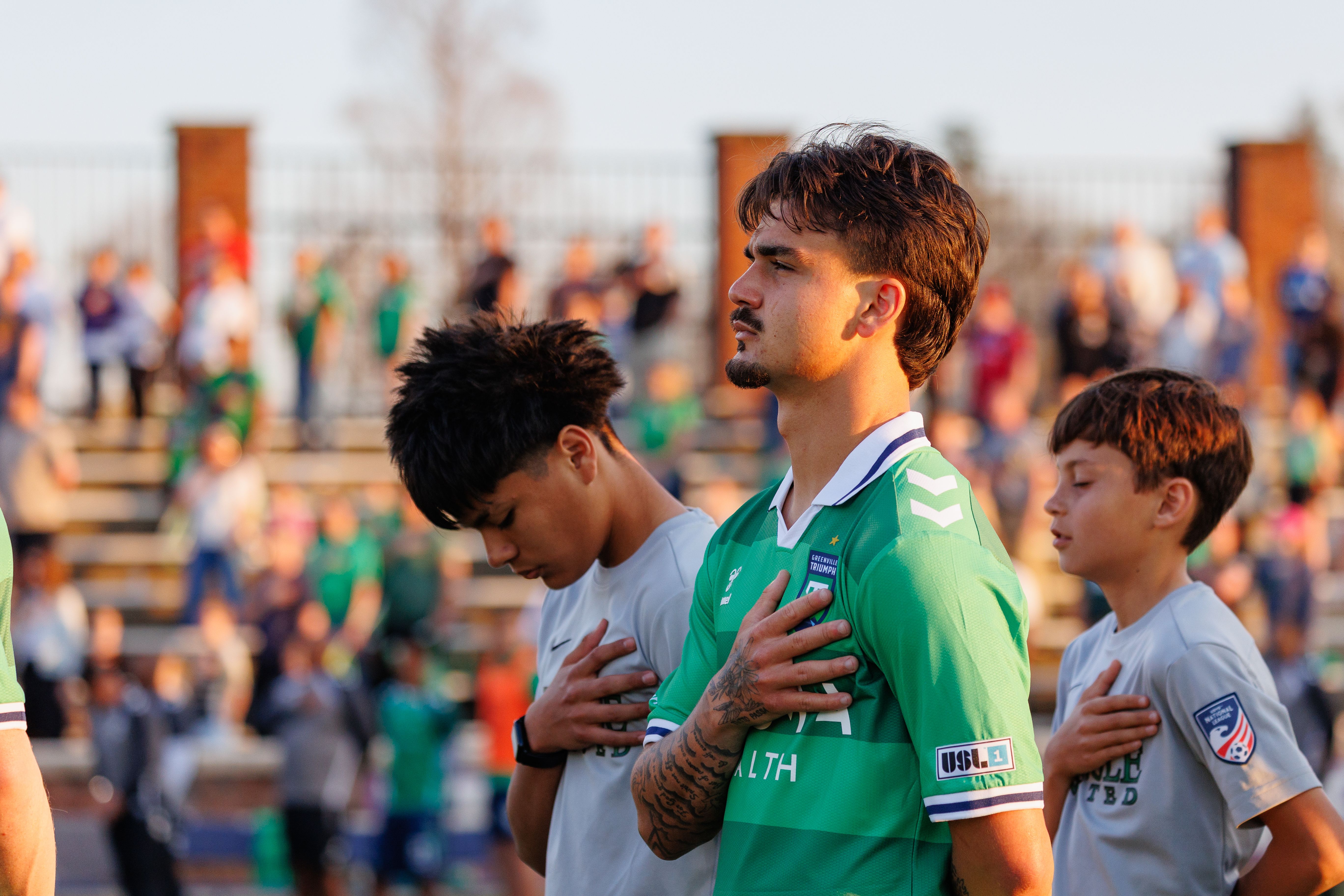
Photography should feel authentic, energetic, and community-driven. We show real moments on the pitch, in the stands, and across the Upstate.
Imagery should reflect the diversity and spirit of our community, favoring genuine emotion over staged or overly polished shots.
Apply color treatment consistently to maintain a unified look across all channels.


Design examples
The examples below show the brand system applied across a range of real-world touchpoints.
Use these as a reference for how color, typography, logo, and pattern work together in practice. The templates shown are ready to use and can be found in the asset folder.

together we triumph