Brand
Guidelines
Welcome to the GoTo Brand Guidelines. Here you'll find everything you need to know about usage standards for our corporate brand and portfolio-level sub-brands, including LogMeIn and GoTo Connect.
Using these guidelines
Please follow these guidelines carefully to keep our brand feeling consistent. If you have questions or need additional guidance please contact the Brand & Creative team on Slack at brand_creative or via email.
Contents
Localized Brand Guidelines
Corporate Messaging
Portfolio-Level Messaging: GoTo Connect & LogMeIn
1.0 Tone of Voice and Editorial Style
Our Pillars
Messaging examples
How we talk about us
Brand Architecture
Localized Editorial Style Guidelines
Product Names
Style and Usage
Punctuation
Inclusive Writing
Social Media
GoTo Logo Construction
GoTo Primary Colorways
GoTo Mono Colorways
GoTo Logo on Colors
GoTo Logo Clearance
GoTo Product Logos
GoTo Mnemonic Logo
GoTo Improper Usage
LogMeIn Primary Colorways
LogMeIn Mono Colorways
LogMeIn Logo on Colors
LogMeIn Logo Clearance
LogMeIn Product Logos
LogMeIn Mnemonic Logo
LogMeIn Improper Usage
Internal Logos
Logo Downloads
Color, type and accessibility
Primary Palette
Secondary Palette
Product Specific Colorways
Product colors in use
Our Typefaces
Type Hierarchy
Typography Alignment
Type on color
Fallback Fonts
Graphic Elements
Graphic Language
Graphic Language: Fixed
Graphic Language: Flexible
Graphic Language: Free
Iconography
Graphic Language Improper Usage
Downloads
Localized Photography Guidelines
Fun
Workplace
Brand Yellow
Photography Usage
Product - Devices
Contact Us
Have questions or need guidance? Looking for something else? Comments? We would love to hear from you.
Find us on Slack: brand_creative
Connect via email: brandcreativeupdates@goto.com

The GoTo Brand
More than two decades ago, we set out to help people and organizations do their best work—simply and securely—from anywhere. Today our mission has evolved: to continuously improve human experiences for an AI-enabled workforce.
As the leader in cloud communications and IT, we address real-world challenges with practical innovations and a customer-first mindset. Our secure, reliable, and AI-enabled solutions are simple to adopt for small and midsize businesses and scalable to enterprises worldwide.
Country- and Region-specific Brand Guidelines
This region-specific and country-specific guidance provides additional support that should be used in tandem with the core GoTo Brand Guidelines found on this site.
Corporate Messaging
Vision Statement
What our perfect world looks like.
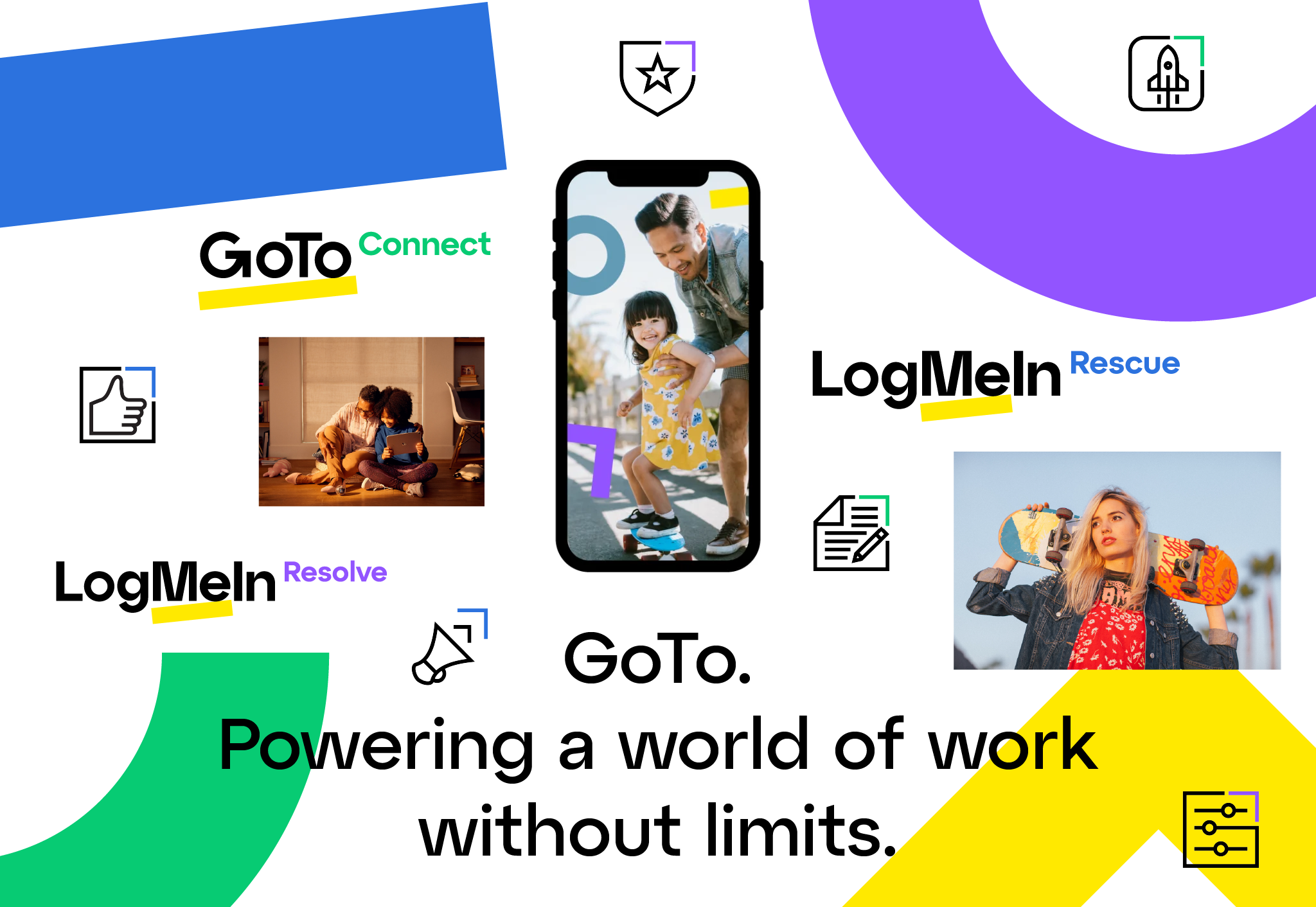
Powering a world of work without limits.
Mission Statement
What we do & who we do it for – right now.
To continuously improve human experiences for an AI-enabled workforce.
Positioning Statement
How we want to be perceived in the market.
As the leader in cloud communications and IT, GoTo addresses real-world challenges with practical innovations and a customer-first mindset. Our secure, reliable, and AI-enabled solutions are simple to adopt for small and midsize businesses and scalable to enterprises worldwide.
Key Attributes
What we offer.
AI-powered cloud communications.
AI-enabled unified endpoint management and remote support.
Secure, reliable, and customer-centric experiences.
An engaged workforce dedicated to driving success for our customers, partners and employees.
Differentiation Pillars
Why we're better.
1. Commitment to Simplicity: Effortless experiences from purchase to product and every moment beyond.
2. SMB Champion: AI-enabled solutions purpose-built for the needs of small and midsize businesses.
3. Customer-Centricity: A duty to customer success through personalized end-to-end care.
4. Security & Privacy: Comprehensive controls and zero trust architecture to protect data and infrastructure.
5. Reliability & Availability: Consistent high performance with unbeatable uptime on any device.
6. Results-Driven Culture: Inclusive workplace that values ownership, transparency, and career growth.
Portfolio-Level Messaging
Whether we're talking about GoTo Connect or LogMeIn, our portfolio-level messaging is grounded in the GoTo corporate messaging, ensuring that every communication—whether at the brand, portfolio, or product level—is aligned, cohesive, and reflective of our overarching brand identity.
GoTo Connect - Portfolio-Level Messaging
Vision Statement
Making purposeful communications simple and attainable for all.
Mission Statement
To simplify how organizations connect, engage, build relationships, and surpass the ever-rising expectations of the customers and communities they serve—anywhere, anytime.
Positioning Statement
We're the communications champion for small, midsize, and multilocation organizations. Through an AI-powered cloud communications platform that's easy to use and manage, effortless to scale, and remarkably affordable, we drive their success by enriching how people everywhere connect.
Key Attributes
Award-winning, smart business phone system.
Essential omnichannel customer engagement tools.
Robust contact center capabilities scalable to your needs, today and down the road.
Tried and tested collaboration tools for meetings, training and webinar.
All-in-one, AI-powered, enterprise-grade platform that enables work from anywhere.
Differentiation Pillars
1. Easy: Simple to use, manage, and scale with the needs of small, midsize, & multilocation organizations everywhere.
2. Unified: A complete communications platform driven by simplified workflows and seamless integrations.
3. Affordable: Enterprise-grade features without the enterprise-grade price.
4. Tailored: Industry-specific solutions designed to maximize the value of existing tools.
5. Support: Award-winning customer service with market-leading NPS and CSAT scores.
6. Reliable: 99.999% uptime, secure and modern infrastructure, backed by 20+ years of cloud experience.
LogMeIn - Portfolio-Level Messaging
Vision Statement
Building a world without IT challenges.
Mission Statement
To power IT with AI-driven solutions that secure, manage and support endpoints everywhere in a dynamic, vulnerable landscape.
Positioning Statement
Backed by over 20 years of reliability and innovation, we equip IT leaders with AI-enabled unified endpoint management and remote support. Our platforms reduce complexity, enhance productivity, and empower teams to take control of their IT infrastructure while staying ahead of today's security demands.
Key Attributes
Secure and scalable enterprise-grade remote support.
Unified remote monitoring and management, automation, & mobile device management.
All-in-one, AI-enabled endpoint management.
Differentiation Pillars
1. User-Friendly: Designed for easy adoption and intuitive use, regardless of technical expertise.
2. Value-Driven: Efficient solutions that accelerate return on investment.
3. Secure: Advanced security controls for data and infrastructure, plus the industry's first zero trust architecture.
4. Reliable: Proven performance and consistent uptime for a variety of organizations.
5. Customer-Focused: Global 24/7 support and premium customer care whenever needed.
6. Innovative: AI innovation built on 20 years of expertise supporting over one billion connections.
1.0
Tone of Voice / Editorial Style
> Our Pillars
> Messaging Examples
> How we talk about us
> Brand Architecture
> Localized Editorial Style Guidelines
> Product Names
> Style and Usage
> Punctuation
> Inclusive Writing
> Social Media

Our tone of voice is how we express our unique personality through our messaging. Use these guidelines to inspire your writing for GoTo.
Our Pillars
These are the building blocks of our voice. You can dial them up and down as appropriate for different contexts, but these three traits should always come through in our messaging, whether we're speaking about GoTo the company, our product portfolios or individual products.
Because we have an intimate understanding of our customers' needs, challenges, and how we can help solve them, our language is:
Empathetic
We speak to people with the shared understanding that technology should save them time, not consume it. Our messaging recognizes that productivity, and reliability are as essential as simplicity and ease of use. We use words that reflect a person's desire for seamless experiences and practical solutions that just work.
Empathetic sounds:
Relatable and conversational
Empathetic doesn’t sound:
Affectionate or chatty
Examples:
Brand
"Our solutions take the hassle out of your workday, making it easier for businesses to stay productive, connected, and secure."
Product
✓ “Refreshingly simple remote support.”
✕ “Radically refreshing remote support.”
Because we know we can help people navigate work and life with greater ease, our language is:
Affirming
We communicate from a position of confidence because our 20 years of experience have shown us what it takes to thrive in a world of work that's no longer tied to physical boundaries. Our strength is never stated overtly; it comes through in uplifting and encouraging language that always affirms our belief in the ambitions and abilities of the people we support.
Affirming sounds:
Confident and assuring
Affirming doesn’t sound:
Boastful or sentimental
Examples:
Brand
“Effortless experiences with peace-of-mind built-in.”
Product
✓ “Give your employees the tools to succeed from anywhere.”
✕ “Let your employees work remotely with our easy-to-set-up tools.”
Because we champion the successes of the customers, partners, and employees we serve, our language is:
Passionate
We communicate with people in a way that celebrates their wins, big and small. Our language is passionate, reflecting our commitment to making their workdays simpler and their teams more productive and efficient. Our passion is always expressed with energy, authenticity, and a focus on how our solutions drive real results.
Passionate sounds:
Dedicated and energized
Passionate doesn’t sound:
Fanatical or uninhibited
Examples:
Brand
“Cloud communications and IT solutions designed to make your workday.”
Product
✓ “Finally. A smart business phone system that does exactly what you want it to.”
✕ “Build a customized phone system that works exactly how your business needs it to.”
✓ “Save more workdays with LogMeIn Resolve.”
✕ “Solve more remote support issues. Wait less.”
How we talk about us
When writing GoTo we always capitalize the ‘G’ and ‘T’, with no space in between either.
At GoTo we...
When talking about products we always capitalize the products and leave a space between ‘GoTo’ and the product name.
Introducing GoTo Connect...
When talking about our IT portfolio, we always capitalize the 'L', 'M' and 'I' in LogMeIn. While there are no spaces in LogMeIn, we do leave a space between 'LogMeIn' and the product name. We never abbreviate LogMeIn to LMI.
Introducing LogMeIn...
Brand Architecture
This is our GoTo family of brands, featuring the GoTo Connect and LogMeIn product portfolios.

Country- and Region-specific Editorial Style Guidelines
This region-specific and country-specific guidance provides additional support that should be used in tandem with the core GoTo Brand Guidelines found on this site.
The GoTo editorial style guide provides guidance to content creators across the organization, from product and web to email automation and other market-facing content creators. Writers and editors can use this document as a guide for writing style, usage, product terminology, inclusiveness, and global-ready content.
Note
If what you are seeking is not in this guide, refer to the AP Style Guide and cross-reference team-specific guidance.
Product Names
The way our portfolio and product names appear in plain text may not match the way they look as logos. The capitalization and spacing between elements can differ depending on the product or solution (legacy, newly rebranded, etc.) So make sure you follow exactly how they’re written here. As a rule of thumb, avoid using all caps on product and solution names in headlines.
GoTo Connect
GoTo Connect Phone System
GoTo Connect CX
GoTo Connect Contact Center
GoTo Connect Customer Engagement
LogMeIn
LogMeIn Resolve
LogMeIn Rescue
LogMeIn Miradore
UCC / ITSG Legacy Point Solutions
GoTo Meeting
GoTo Webinar
GoTo Training
GoTo Room
GoTo Stage
Grasshopper
OpenVoice
join.me
LogMeIn Central
LogMeIn Pro
GoToMyPC
GoToAssist
Style & Usage
#
24/7
Preferred abbreviation of “24-hour, 7-day-a-week.” NOT 24x7.
24-hour, 7-day-a-week
NOT 24-hours, 7-days-a-week when modifying a noun.
Example: We provide 24-hour, 7-day-a-week support for our customers.
But: The 7-11 is open 24 hours. (No hyphen)
30-day free trial, 128-bit encryption
Use a hyphen when a numeral is followed by an increment of measurement. See Punctuation
A
access code
acronyms
Make sure that the reader will understand the acronym. A rule to keep in mind is, “When in doubt, spell it out.” It is helpful to spell out the phrase upon first use, followed by the acronym in parentheses. After its first use, substitute the acronym for the phrase.
Example: Working with managed service providers (MSPs)
Note: Product acronyms (such as G2C, GTW, LMI or any others) are for internal use only and should never appear in external-facing content or file names.
AES
Stands for Advanced Encryption Standard.
AI
Stands for artificial intelligence. Always capitalized when talking about the concept.
Example: Nowadays, AI refers to any system taught to mimic human intelligence.
AM
Time of day indicator. Ante meridiem (before noon).
Capitalized. No periods.
and vs. &
In general, “and” is preferred over an ampersand (&) in body text and most headers unless they’re part of a company name, title, or official category title, or other proper nouns. However, when needed to fit text in a very small space, use an &.
anytime vs. any time
The compound word “anytime” is an adverb.
Example: Access and control your computer anytime.
“Any time” includes the adjective “any” that modifies the noun “time.” It is usually preceded by “at.”
Example: You can access your files at any time.
anyway vs. any way
The compound word “anyway” is an adverb meaning “regardless.”
Example: Start the support session anyway.
“Any way” includes the adjective “any” that modifies “way.” It means “any manner” or “any method.” It is usually preceded by “in.”
Anyway
Example: The functions will not change in any way.
API
Acronym for “application programming interface.”
Example: We provide APIs for several of our products, which provide the code needed to integrate our products with other services.
app
Common clipped form of “application” — originally specific to mobile devices but now used for applications of all kinds. To avoid trademark infringement, do not call an app by the device it is used on, but by the product functionality it provides. You can also refer to an app without using the word “app” at all.
This: GoTo app for iPad; GoTo app for Android
Not this: GoTo for iPad app; Android GoTo Webinar app; the iPhone app
App Store
Follow Apple guidelines for using this term. Apps for Apple devices are available “on the App Store,” not from, in, or at the App Store. You can also say, “Download it from the App Store.” The same rule applies to Google Play.
Apple
Company name. Does not precede other terms unless noted.
attendee
A non-organizer (or co-organizer) participant in a meeting. When you can, use plural nouns like “people,” “everyone,” or “others” instead.
audio PIN
Code provided by phone conferencing users in GoTo Meeting and GoTo Connect sessions to enable audio controls in the Control Panel. (Not “PIN number.”)
B
beta
Lowercase in generic usage.
Example: Join our beta testing program.
May be capitalized when used as part of a product name.
Example: Sign up to try LogMeIn Resolve Beta for free.
May also appear as a parenthetical.
Example: GoTo Connect (beta).
bulleted lists
Capitalize the first word in a bulleted list. Aim for parallel
structure within a list. Use complete sentences for all list items and punctuate accordingly.
Use bullets to:
• List key benefits.
• Highlight essential information.
• Help readers compare things.
Bulleted Lists (cont.)
Parallel structure is optimal because:
• It is easy to remember.
• It is balanced.
• Parallel structure portrays a professional tone. (cont.)
Other tips:
• Use the imperative voice to drive action.
• Keep copy short.
• Break the rules as needed.
Note, this form is particularly useful for content being localized
into multiple geos.
buttons
The names of buttons are capitalized, no quotation marks.
Example: Select Continue to proceed.
C
camera sharing vs. camera-sharing
When used as a noun, “camera sharing” is not hyphenated.
Example: Experience the benefits of camera sharing.
When used as an adjective, “camera-sharing” is hyphenated.
Example: We use patented camera-sharing technology.
cardinal and ordinal numbers in dates
See Dates
citations
For blog, article copy:
• Link back to source using relevant (and, if possible, keyword-rich) anchor text.
For ebooks, infographics, datasheets, etc.
• Include footnotes at the bottom of each page.
• Link back to source if ungated.
• Include name/title of report and year published.
• If the source is a web page, include title in quotations, website name, and year published.
click vs. select vs. choose
Use “select” when there’s only one action option, “choose” when there are several. Do not use “click.”
Example: Select the microphone to unmute. Choose a new organizer.
commas
See Punctuation
companywide
One word.
Contact Center as a Service (CCaaS)
A cloud-based customer experience solution that allows
companies to utilize a contact center provider’s software.
Be mindful of capitalization in acronym.
contractions
It is acceptable to use familiar contractions to foster a
passionate or empathetic tone (you’ve, you’re, it’s, that’s, here’s,
what’s, wouldn’t, etc.). Avoid unusual noun + verb contractions
and other uncommon contractions that are difficult to localize.
This: Don’t take our word for it – try GoTo for 30 days. It’s free!
Not this: You’d better upgrade before your subscription’s expired!
copyright symbol
See Punctuation
cost-effective and cost-effectiveness
Note hyphen.
countries
Spell out the entire country name.
co-worker
Note hyphen.
currency
For users who are outside of the U.S., the dollar sign, “$,” might
be confused with other currencies such as the Australian
dollar, Singapore dollar, and Hong Kong dollar. As such, currency
amounts should be displayed in the three-letter code found in
the International Organization for Standardization unless stated
otherwise in your department’s style notes.
See https://www.iso.org for a full list. Use a space between the amount and currency code.
Example: 100 USD
cyber
Do not hyphenate when used as a prefix
Example: Cybercrime, cybersecurity, cybercriminals, cyberthreat, etc.
Execptions
Cyber Week (n)
When used as a standalone adjective
Example: cyber liability insurance
In the case of double letters
Example: cyber-risk
D
dashes
See Punctuation
datacenters
Do not list specific numbers or locations in documentation, as these are subject to change. Just list that there are “multiple” datacenters. Note that it’s just one word.
dates
Use standard month-day-year format and cardinal numbers (1-2-3), not ordinals (1st-2nd-3rd). Commas are needed after both the day and the year. Spell out the entire month unless your department’s style notes otherwise.
Example: On January 25, 2022, we announced our new company future as GoTo.
If you give only the month and year, don’t use commas.
Example: in June 2021 at WWDC
Use cardinal numbers (1, 2, 3) in dates that include the month.
Use ordinal numbers (1st, 2nd, 3rd) in dates without the month.
For ordinal numbers, use full-size letters, not superscript.
This: The conference was held on August 12.
This: The conference was held on the 12th.
Not this: The conference was held on August 12th.
dates (cont.)
Spell out the names of days and months in text. Use numerals for the year except when it appears at the beginning of a sentence; spell out the year there or rewrite to avoid.
Slashes in dates: Don’t use the form 3/5/21 because American usage is different from European usage.
decimals
See Numbers
different from vs. different than
Different from is standard; different than is nonstandard.
This: The drawing tools are different from the whiteboard feature.
Not this: The drawing tools are different than the whiteboard feature.
double-click vs. open
Use “open” not “double-click.”
Example: When the download finishes, open the GoTo Connect app.
drop-down menu
Notice the hyphen because “drop-down” is acting as an
adjective. “Dropdown” is not a word. See Punctuation
E
ebook
Note: Capitalize at the beginning of a sentence.
Example: Ebooks are great.
Example: LogMeIn Rescue ebooks are great.
effect vs. affect
These two words are often confused. “Effect” is usually a noun that means “something that inevitably follows an antecedent (as a cause or agent).”
This: This tag line will have a persuasive effect on the customers.
Not this: This tag line will have a persuasive affect on the customers.
“Affect” is usually a verb meaning “to produce an effect upon.”
This: The changes will not affect the process of setting up a user’s account.
Not this: The changes will not effect the process of setting up a user’s account.
No hyphen. Written as first.last@goto.com.
emoji
Emoji are a fun way to add humor and visual interest to some writing. Do not use in long-form content marketing assets(ebooks, blog posts, etc.). See Social Media
em dash
See punctuation
end-to-end
Note hyphens when used as an adjective. Leave the phrase open when used as an adverb. See Punctuation
Example: Our technology is completely secure, with nested passwords, an SSLprotected website, end-to-end authentication, and AES encryption using 128-bit keys.
Example: Walk through the experience end to end.
end user
Avoid using this term. Use “customer” or “person” instead. If
you need to say, “end user,” use two words for the noun and a
hyphen for the adjective.
Example: Support the end user.
Example: End-user support.
ensure vs. insure
Ensure means to make certain.
Example: This connection mode ensures that your customers are connected to the chosen representative.
Do not confuse with “insure,” which means “to cover
with insurance.”
exclamation point
See punctuation
F
flexible work
Flexible work refers to arrangements that allow employees to fulfill their work duties anywhere, anytime, in a manner that suggests the employee has some choice in how they work. It’s about doing their best work however and wherever they work best. It encompasses both remote and hybrid work models.
GoTo is owning the concept of flexible work. It is the preferred way of describing what we do and what our products support and enable (e.g., flexible-work software or flexible-work tools).
However, there are additional descriptors that can help as supporting concepts to familiarize people with flexible workplaces, such as hybrid and remote work. We will continue to use these phrases to describe flexible work where appropriate. These terms will continue to support SEO strategy and will reinforce our intent of meeting customers and prospects where they are on their flexible work journey.
Last in priority, but also a descriptor that helps provide color around where the work takes place, work-from-anywhere can be used. Do not lead with this term. It will remain a secondary or tertiary descriptor of flexible work.
Example: Whether your business is fully remote, hybrid, or at a crossroads, we’ve got you. GoTo offers flexible-work software that helps you connect and support your customers and employees easily and instantly in this work-from-anywhere world.
When used as a modifier, please add a hyphen.
Example: GoTo is the leading flexible-work software on the market.”
See: Hybrid work, remote work
flexible working
Avoid using this term. Use flexible work instead.
footnotes
Ebooks are produced in a pdf format. Footnotes on each page will be used to indicate sources (preferred over endnotes). For articles and webpages, list the full url (linked in final pdf). For analyst research papers and custom research studies, use this naming convention: Analyst firm, Title of Research, Year of Publication.
Examples:
Metrigy, GoTo Contact Center Customer Research Study, 2021.
Gartner, Forecast Analysis: Remote and Hybrid Workers Worldwide, 2021.
G
GIF
Capitalized, no periods.
Google Play
Apps for Android devices are available “on Google Play,” not from, in, or at Google Play. You can also say, “Download it from Google Play.” The same preposition treatment applies to the App Store.
go-to
Avoid using this term solely as a descriptor (ie., “Your new go-to
for collaboration.”) Repeated use of “go-to” solely for its common language meaning dilutes our corporate brand GoTo, and may have trademark implications.
Not this: Your new go-to for virtual events.
GoTo
See Brand Architecture
GoTo Admin
START using in text as GoTo Admin (2 words)
STOP referring to as GoToAdmin (1 word)
START utilizing GoTo Admin in the first and last mention within content. All other mentions do not need to include GoTo (and admin should be lower case)
Example:
GoTo Admin is the administration portal, and it can be accessed at admin.goto.com. Through the admin portal, you can access user profiles, notifications, filter options, etc. Call us to learn more about GoTo Admin.
H
headlines and subheads
See Punctuation
help desk
Two words. NOT “helpdesk.” Not capitalized unless it is the first word of a sentence.
Note: GoTo Resolve has a feature within it called "helpdesk", one word, lower case.
home page
Two words. Not capitalized unless it is the first word
of a sentence.
HTML
Note all caps. No space in the term “HTML5.”
hybrid work
Avoid “hybrid work” as a standalone term. “Flexible” is the
preferred term when referring to the GoTo brand’s position in the market, but using hybrid and remote work (stronger SEO value) as supporting characteristics and in conjunction will give "flexible work” more meaning and brand association over time.
Example: Whether your business calls it hybrid or remote work (or simply working from anywhere) we call it “flexible work.”
Hyperlinking
Links that stand alone – like calls to action with no surrounding
text – keep punctuation within the link, except for periods, which are omitted.
Example: Forgot your password?
Example: Try it free
Links that are part of a paragraph or other running text do not
include subsequent punctuation, and periods are retained.
Example: To learn more, visit our support site.
Hint: In other words, never hyperlink a period, and only hyperlink other forms of punctuation if the link is placed alone in space.
If a file is contained within the call to action, only the file name
is hyperlinked. PDF documents are denoted “(PDF),” which is
NOT hyperlinked.
Example: Download the GoToMyPC Fact Sheet (PDF)
Avoid linking text that doesn’t tell the reader anything about
where they’re going or what they’re doing, like “click here.”
This: To learn more, download the white paper.
Not this: To download the white paper, click here.
I
Input
Do not use as a verb; use “enter” instead.
This: Enter your password.
Not this: Input your password.
internet
Not capitalized.
iOS
A mobile operating system created and developed by Apple Inc. exclusively for its hardware. Note proper capitalization.
IT
IT not I.T.
IT manager
Note caps. Spelled out: information technology manager.
J
JPEG
Uppercase, do not include the period.
L
log-in vs. log in vs. login
Use the more conversational “sign in/sign out.”
long distance vs. long-distance
Note hyphens when used as an adjective. Leave the phrase open when used as an adverb. See Punctuation
M
Mac
General term for the line of computers from Apple.
Do not use Macintosh.
macOS
General term for the latest series of operating systems from
Apple. Should precede specific versions of Apple operating
systems on first use.
Example: First use: The GoTo App works with macOS Mojave.
Example: Second use: GoTo App works with Mojave.
MB
Common clipped form of “megabyte.” No space between the
number and the abbreviation.
Example: Choose a file that is smaller than 5MB.
N
names of periodical
Capitalize. Do not italicize.
Example: See why Forbes Magazine calls GoTo Connect “incredible.”
Numbers
Spell out the following numbers:
Cardinal numbers from one through nine
Example: You can use your purchases on up to five computers.
Ordinal numbers from zero through nine.
Example: You can install drives in the second, third, and fourth drive bays.
Numbers that appear at the beginning of a sentence. (Try to rephrase to avoid starting a sentence with a number.)
Correct: Two hundred fifty functions are available in the Function Browser.
Preferable: The Function Browser gives you access to 250 functions.
A number that appears next to another number if it helps readability.
Example: There are sixteen 32-bit registers. (cont.)
Numbers (cont.)
Use numerals (1, 2, 3, etc.)
For numbers of the same category within a paragraph if any number is larger than nine.
Example: We have 25 computers and 4 printers on the network.
[Computers and printers are the same category.]
Example: Of those surveyed, 9 out of 10 agreed ...
Example: There are two kinds of 32-bit registers. [Kinds of registers and bits are different categories.]
To form ordinal numbers larger than nine, add st, nd, rd, or th to the numeral
as appropriate.
For units of measure, including units of time, no matter how small the number is.
Example: Set the timer for 3 minutes.
Example: You can’t set paragraph margins of less than 1 inch.
Number one vs. #1 vs. No. 1
Use “number one” in body copy. The others are acceptable in headlines.
Numerical Decimals
Use a comma for any numbers greater than 999 (e.g., 300,000). Use a period when referencing numbers larger than 999,999 (e.g., 3.7 million).
Phone number and email address style in applications
Toll-free: 1 (800) 549-8541
direct dial: +1 (805) 690-6400
email: first.last@goto.com
Note that the 1 in front of the toll-free number does not have a + before it, because it is a trunk code only and not a country code. The 1 in front of the direct dial number, however, is both a trunk code and a country code, so we put the + in front to let international customers know they can use this number to contact us. Please don’t put a + in front of the toll-free number, as it may mislead international customers to think they can call that number toll-free.
O
on-demand vs. on demand
Hyphenate adjectival use before a noun, but not as a
prepositional phrase.
Example: Record sessions to provide on-demand training. Provide training live or on demand.
on-screen
Hyphenate when used as an adjective before the noun.
See Punctuation
P
password
PC or PCs
“PCs” is the plural form of “PC.” Note that it is NOT spelled with an apostrophe because it is not possessive.
This: She enabled two PCs.
Not this: She enabled two PC’s.
Upper case. No period.
PDF file names
Follow these rules when naming files that will be accessed online.
1. No abbreviations (especially product names)
2. Use hyphens between words
3. Add SEO keywords when appropriate
4. Label the asset type
Example: GoTo-Connect-Fact-Sheet
percent vs. %
Use “%”
Example: GoTo has grown revenue over 50% since last year.
phone numbers
See Numbers
plug-in
Hyphenate the noun form. The term “app” is increasingly used
instead of “plug-in.”
Example: The representative may escalate the session by initiating a small, selfinstalling
plug-in that allows screen sharing.
PM
Time of day indicator in U.S. English. Post meridiem (after noon).
Capitalized. No periods.
PNG
Upper case. No period.
PSTN
Acronym for “public switched telephone network.” Sometimes
described in more conversational terms as “phone call” or
“phone calls.”
Example: This webinar includes mute and unmute options, computer audio(VoIP) and phone calls (PSTN).
R
real-time vs. in real time
When used as an adjective, “real time” is hyphenated.
See Punctuation
Example: LogMeIn Resolve enables you to deliver a real-time solution.
When used as a noun phrase, “real time” is not hyphenated.
Example: LogMeIn Resolve lets you provide help in real time.
remote access vs. remote-access
No hyphen.
Example: LogMeIn Resolve provides remote access services.
Remote access is simple.
remote work
Remote work refers to work that is not done from inside a
traditional office. GoTo prefers the term “flexible,” though “remote” is acceptable to avoid over-using the term “flexible work.”
S
screen sharing vs. screen-sharing
When used as a noun, “screen sharing” is not hyphenated.
Example: Experience the benefits of screen sharing.
When used as an adjective, “screen-sharing” is hyphenated.
Example: We use patented screen-sharing technology.
Screenshot
One word.
Secure Sockets Layer (SSL)
NOT Secure Socket Layers.
self-service
service plan vs. subscription plan
Either is correct if you refer to one or the other consistently in the same document.
set up vs. setup
Verb form is two words. Noun form is one word.
Example: I want to set up GoTo Connect. Is the GoTo Connect setup difficult?
sign in/sign out vs. sign on/sign off
Both mean the same thing, but “sign in/sign out” is preferred. “Sign-in” is the adjective form.
Example: Enter your username and password on the sign-in page.
“Sign in” is the verb form. You don’t sign INTO an account; you sign IN to an account.
Example: He didn’t sign in to his account.
Small and medium-sized business
Refers to GoTo's target market size. >1,000 employees.
See also: small and mid-sized business
Note: All markets outside of North America prefer "small and medium-sized enterprises" or "small and mid-sized enterprises."
Avoid using the acronyms SMB or SME whenever possible.
smartphone
One word.
Software as a Service (SaaS)
Refers to the business model of selling software on a subscription basis. Capitalize but do not hyphenate. Note lowercase letters in acronym.
start-up
Note hyphen when used as a noun.
Example: An online start-up.
step-by-step
Note hyphens in adjectival usage. See Punctuation
submit
OK to use but not preferred for buttons. Instead, use Continue, Send, Enter or some other option."
system tray vs. taskbar status area
Use either term but be consistent."
T
time
The time-of-day indicators (AM and PM) should be capitalized in U.S. English. We don’t put periods after each letter (easier for Java).
Also, use EST/EDT (Eastern Standard Time/Eastern Daylight Time) in U.S. English to note our time zone, not just ET. It’s often helpful to put these in parenthesis to
separate them from AM or PM.
(Note: Java can automatically update EST to EDT and vice versa.)
Example: 10:20 AM (PST)/ 1:20 PM (EST)
Note: Standard time begins in the fall. Daylight time begins in the spring. (“Spring forward, fall back,” as the adage goes.)
time zone
Two words not capitalized.
timeout vs. time out
One word as a noun, two as a verb form.
Example: An inactivity timeout
Example: The session will time out after a period of inactivity.
transcription
The process of generating a transcript; the transcription feature in GoTo Connect.
troubleshoot
One word.
U
Unified Communications and Collaboration (UCC)
The category of technology referring to a combination of enterprise communication tools assembled into a single interface and integrated into a single management system. Tools include enterprise telephony, meetings (audio/video/web conferencing), unified messaging, instant messaging, and presence (personal and team). Note capital letters in acronym.
Also: unified communications, communications and collaboration, or workplace communications.
Unified Communications as a Service (UCaaS)
A cloud-delivered unified communications model that supports six communications functions: Enterprise telephony, meetings (audio/video/web conferencing), unified messaging, instant messaging, and presence (personal and team). Note lowercase letters in acronym.
units of measure
Use units found in the imperial system of units to express values of quantity. Follow units with metric units of equivalent values (if applicable).
Example: Though you may be miles (kilometers) from the office, there is no reason you can’t collaborate with your teammates.
URLs
When writing out a URL, the lowercased style is preferred.
Example: www.goto.com
U.S.
The abbreviation for the United States. Do not use “US” unless
you’re referring to it alongside other country abbreviations.
user, users
Avoid these terms whenever possible. Instead, find a more
specific, personal word to use, such as customer, employee,
person, organizer, attendee, learner, etc.
username
One word.
V
video conferencing
Two words.
VoIP
Abbreviation for “Voice over Internet Protocol.” Sometimes described in more conversational terms as “computer audio.”
Note lowercase “o”.
Example: This webinar includes mute and unmute options, computer audio (VoIP) and phone calls (PSTN).
VPN
Abbreviation for “Virtual Private Network.” Lowercase when writing out: virtual private network.
vs.
This is an abbreviation of “versus.” Note the period.
W
web
Lowercase all forms of “web” in generic usage.
Example: GoTo Connect is a fantastic web conferencing tool. Surf the web.
web based vs. web-based
No hyphen required if it follows the noun it describes.
Example: This application is web based.
Hyphen required if it precedes the noun it is modifying.
Example: LogMeIn Resolve is a web-based remote access solution.
website
One word, lowercased.
Example: Visit the GoTo website for more information.
webinar
Lowercase in generic usage.
Example: The webinar will start in 15 minutes.
WiFi
Notice capitalization of “W” and “F”
work from anywhere
The phrase “work-from-anywhere” is only hyphenated when used as an adjective:
Example: The team uses a work-from-anywhere approach to resourcing.
Example: Let us help you do your best work from anywhere.
Be thoughtful in your application of the phrase; avoid over-use
as it can feel repetitive. Explore different ways to communicate
the idea of “work from anywhere” that aren’t always those
three words.
work-life balance
Note hyphen, two words.
Z
zero trust
Two words, even when used as an adjective, and lowercase.
Punctuation
A
Asterisks
An asterisk flags a corresponding comment on the bottom of the page. As a general rule, asterisks slow readers down. You’re interrupting their train of thought and asking them to hunt for secondary information. When possible, avoid them.
C
Commas
We use the serial (or Oxford) comma: Include a comma before the conjunction in a series of three or more.
Example: There are no difficult setup instructions, networking issues, or required installations.
Copyright symbol: Use the following formats for
denoting copyright:
Example: ©2025 GoTo Group, Inc. All rights reserved.
D
Dashes and hyphens
We use two types of dashes (em and en) along with hyphens. Hyphens, the shortest type, are used in multi-word constructions like self-service, bring-your-own and third-party. These constructions only call for a hyphen when used as adjectives (typically before a noun), not when they’re used as nouns or verbs. These constructions don’t call for a hyphen if they begin with an adverb.
Example: A self-service app store empowers users with self service.
Example: A high-definition user experience includes high performance, high-quality, and high-quality features.
Example: GoTo protects your personally identifiable information.
Use the em dash (—) to set off a word or phrase that interrupts or changes the direction of a sentence or to set off a lengthy list that would otherwise make the syntax of a sentence confusing. Don’t overuse em dashes. If the text being set off doesn’t come at the end of the sentence, use an em dash both before it and after it.
Example: See all your schedules — work, school, and social life—in one app.
Note: Add a space on both sides of the em dash within a sentence.
To generate an em dash in a word-processing app, press Option-Shift-Hyphen. Close up the em dash with the word before it and the word after it.
The en dash (–) is shorter than an em dash and longer than a hyphen. Use the en dash as follows:
Numbers in a range: Use an en dash between numbers that represent the endpoints of a continuous range.
Example: bits 3–17, 2003–2005
Minus sign: Use an en dash as a minus sign (except in code font, where you use a hyphen).
Example: –1, –65,533
Dashes and Hyphens (cont.)
Short-form or web copywriters may use en-dashes within text– for example, to set off an appositive phrase or interjection like this one – though it shouldn’t be overused. The en-dash should always be set off with spaces.
Example: There is no additional software to install – a self-launching plug-in will allow you to see your host computer.
E
Em dash
See Dashes and hyphens
Exclamation point
Use for emphasis sparingly. Only use one!
Font style of punctuation should generally follow the style of the preceding words or characters. However, we do not underline punctuation that accompanies hyperlinked text.
H
Headlines
Sentence case is preferred. Only capitalize the first word in headlines and subheads. If the headline or subhead is a question, use a question mark. If the headline or subhead is two complete sentences, use punctuation. No word in a headline should ever be set in full capitals unless it is an acronym like AES. Only use punctuation if the headline consists of two or more complete sentences.
Example: GoTo Meeting launches business messaging
Also, see Subheads in this section.
S
Spaces after colons
There is only ONE space after a colon unless you are aligning items in a list.
Spaces between sentences
There is only ONE space between the period and the
subsequent sentence. Forget what you learned in high school
typing class (for those who remember typewriters).
Subheads
These are titles of section breaks within a document or web page. Subheads follow the sentence case structure. Capitalize the first word only. Punctuate accordingly.
Example: How should employers respond in an employee’s market?
Writing
Inclusively
Writing inclusively acknowledges the diversity of GoTo’s readership by respecting their differences and recognizing the humanity of each individual interacting with our brand. GoTo is for everyone, and our writing should reflect this.
We want to make sure that we write for an inclusive experience that authentically reflects the world we live in. Remember, our words can include. And they can exclude style guides if you are writing in English, exclusively for a non-U.S.-based audience.
Writing for an International Audience
GoTo is a global brand. Always assume your content will be read in many countries whose primary language is not U.S. English.
General Guidelines
Write in clear, simple sentence structures.
As we are a global brand, be mindful of over-utilizing slang, idioms, and colloquial expressions that are not easily understood outside of the U.S., especially if the content is going to be translated.
Minimize the use of culture-specific or landmark-specific references which are
not easily understood outside of the U.S.
Avoid unnecessary shortcuts, symbols, and abbreviations. Follow Style and Usage above.
Reference the geo-specific style guides if you are writing in English, exclusively for a non-U.S.-based audience.
Gender & Sexual Identity
Gender-neutral language should be considered the standard in all messaging
and communications for the GoTo brand.
Gender is a social construct and a social identity that encompasses an individual’s attitudes, feelings, behaviors, and expressions. Sex describes the sex a person was assigned at birth. It is important to understand that gender and sex are different and have little to do with each other.
Don’t make assumptions about which pronouns a person uses based on the person’s name or appearance. If you’re unsure how to refer to someone, ask them. A person may go by he/him, she/her, they/them, other pronouns, or no pronouns.
Best practices for using gender-neutral language:
• Avoid adding unnecessary gendered modifiers to terms, such as male administrator or female supervisor.
• Use gender-neutral forms of occupations (chairperson vs. chairman/woman)
• Honorifics like Mr., Mrs. and Ms. are unnecessary in most contexts and should be avoided.
• Don’t only represent a family as a woman, a man, and their biological children. Include a variety of family types.
Race & Ethnicity
It is important to remember that GoTo content may be read by people from across the world, from different cultures and countries, and with myriad experiences. Avoid bias and stereotypes in your messaging so as not to exclude our diverse readership.
Bias is a tendency to think and behave in ways that are favorable (or unfavorable) to certain people or communities. Be aware of ways content and messaging may unintentionally reinforce biases, and consciously work to avoid doing this.
A stereotype is a fixed belief about people or groups based on identifying characteristics, like gender, race, physical capability, or age. Avoid stereotypes in how people are presented in GoTo messaging.
Best practices for writing about race and ethnicity:
• If your messaging mentions examples of holidays, foods, or sports, don’t give examples solely from Western culture.
• Investigate the history and usage of a word. For example, a word like “grandfathered” arose from an oppressive context.
• Avoid assigning good and bad values to colors (blacklist, white-hat hacker).
Disabilities
More than 1 billion people, 15% of the world’s population, experience disabilities according to the World Bank, as of October 2021. Persons with disabilities are more likely to be excluded from opportunities such as education, employment, access to technology, and other experiences that can adversely impact them socioeconomically and in other ways that create barriers. Biases and cultural stereotypes can make it difficult for people to disclose their disabilities. Many people are affected by disability because a family member, friend, or another person in their life has a disability that directly impacts them.
People First or Identity First?
The answer is that like all people, people with disabilities or disabled people have a preference. The best practice is when you can ask an individual how they prefer you to address them, you ask and follow their request. When writing to a wide audience who may have different preferences, we do not have that option. In this case, our default is people first.
People First
People-first language avoids defining people in terms of their disability. In most cases, this entails placing the reference to the disability after the reference to a person, as in “a person with a disability,” or “a person living with a disability,” rather than “the disabled person.”
Identity First
The phrase “disabled people” is an example of identity-first language. Some people with disabilities consider their disability to be integral to who they are. They believe it is a feeling of pride and ownership of their entire self. They prefer to be referred to as “autistic,” “blind” or “disabled.” Though, again, our default is people first.
Note: Some members of the autism and Deaf communities may prefer identity-first language.
Inclusive Terminology
Addiction
someone with a drug addiction
Avoid: addict, junkie, clean or dirty, alcoholic (unless the person prefers to describe themselves as an alcoholic or it is part of a name of an organization i.e., “Alcoholics Anonymous”
ADHD
Attention-deficit/hyperactivity disorder first reference
and ADHD after
Amputation
someone with an amputation
Avoid: amputee
Autism, Asperger’s
person with Autism, person with Asperger’s
Cleft Palate
person who has a cleft palate
Avoid: hairlip
Dementia
person with dementia (there are specific kinds of dementia i.e., Alzheimer’s, Parkinson’s, Huntington’s, etc.)
Avoid: demented, senile, gone
Disability, Disabled
does have a disability, living with a disability, condition (short-term disability mostly)
Avoid: handicapped, crippled, invalid, abnormal, not normal (do not use abnormal or normal to describe a person or people), deformed, disfigured, able-bodied vs disabled, differently-abled, freak, retarded, mentally retarded, disorder, sick/sickness
Down Syndrome (US), Down’s Syndrome (UK)
person with Down Syndrome
Avoid: mongoloid, suffers from, afflicted with
Drug/Alcohol Treatment
Treatment center, Treatment
Avoid: Rehab, detox
Dwarfism
short stature, little person
Avoid: midget, vertically challenged, dwarf (Dwarfism is the medical term)
Dyslexia
person with dyslexia
Avoid: Do not use dyslexic as noun
Epilepsy
person with epilepsy
Avoid: epileptic fit
Functional Needs vs. Special Needs
Functional needs; i.e., having two screens addresses the functional needs of his dyslexia by helping him transfer
information from a document to an Excel spreadsheet.
Avoid: Special Needs
Hearing
deaf (person), hard of hearing, Deaf Community (capital D), deaf is an adjective not a noun
Avoid: deaf mute, deaf and dumb
Mental illness
person with a mental illness
Avoid: insane, psycho, psychopath, deranged, crazy, insane, insanity (legal term not a medical term), nuts, loony, mad
Non-Responsiveness
comatose, Non-responsive
Avoid: Vegetable, Veg
Paraplegia
person has paraplegia “para” if that is how someone refers to themselves and is how they would like to be referred to
Avoid: paraplegic
People without disabilities
non-disabled, does not have a disability, not living with a disability
Avoid: normal, healthy, perfect, complete, able-bodied, whole
Quadriplegia
person with quadriplegia “quad” if that is how someone refers to themselves and that is how they would like to be referred to
Avoid: quadriplegic
Stuttering
a person who stutters
Avoid: stammering, a stuttered
Suicide
died by suicide, killed himself, took her own life, attempted suicide
Avoid: Committed suicide, Unsuccessful suicide attempt
Survivor/Battle
survivor’s and battles with illness can infer that those who lost didn’t fight hard enough so best to find other descriptors
Tetraplegia
person with tetraplegia
Avoid: paraplegic, quadriplegic
Vision
a person who is blind or legally blind
Wheelchair
Someone who uses a wheelchair (wheelchairs provide freedom)
Avoid: Confined to a Wheelchair, Wheelchair-bound
Helpful Resources
NLGJA: The Association of LGBTQ Journalists stylebook
National Center on Disability and Journalism Disability Language Style Guide
Asian American Journalist Association
National Association of Black Journalists
National Association of Hispanic Journalists
Social Media

Audience
Each social network has an audience focus and purpose. In general, GoTo's social content is B2B-focused, created for IT professionals, decision-makers, and business leaders at small- and medium-sized businesses.
Accounts
LinkedIn @GoTo
Instagram @GoTo
YouTube @YourGoTo and @LogMeIn
Facebook @GoTo
Giphy @GoTo
Hashtag
#DiscoverGoTo
Social Tips & Guidance
Always lead with the “why” — Why should people care about your post?
As we write for social, it’s important to make sure our social copy and visuals reflect and deliver on at least one of our brand behaviors. E.g., is the social post exciting? Is it real? Is it empowering? Put another way, if the content doesn’t embody a brand behavior, then we’re not entirely delivering on and behaving as GoTo.
Create pause. You have a few seconds at best to grab readers’ attention. Use bold imagery and verbiage to stop the scroll.
Avoid jargon, acronyms, or hashtags that aren’t well known.
Quotes from execs and leaders should be approved by them and emulate their voice and tone.
Emojis can and should be used to communicate complex emotions (e.g., Say hello to our first Digital Workplace Team!👋 🤩).
Don’t overdo it (e.g., Say 👋 to our 1st Digital Workplace Team!🥳🙌🎉🎂🎈). Use when appropriate to add value and make your content more fun, relatable, and striking.
In general, minimize use of trending, internet slang on channels such as LinkedIn (e.g., lolzzzz). It can be too informal and isn’t always understood.
Use hashtags as appropriate and when they add value and increase discoverability, such as when posting about trending topics, joining event conversations, etc.
When mentioning an executive, leader, partner, or relevant influencer, tag them on relevant channels.
2.0
Logos
> GoTo Logo Construction
> GoTo Primary Colorways
> GoTo Monotone Colorways
> GoTo Logo on Colors
> GoTo Logo Clearance
> GoTo Product Logos
> GoTo Improper Usage
> GoTo Mnemonic
> LogMeIn Logo Construction
> LogMeIn Primary Colorways
> LogMeIn Monotone Colorways
> LogMeIn Logo on Colors
> LogMeIn Logo Clearance
> LogMeIn Product Logos
> LogMeIn Improper Usage
> LogMeIn Mnemonic
> Internal Logos
> Logo Downloads
Our logo represents our business and the values that guide us. It’s vital that it's used with care and respect to ensure that all communications remain consistent memorable, and yes, remarkable.
GoTo Logo Construction
The GoTo logo is constructed using geometric shapes, primarily two upward-moving arrows. The arrows give the wordmark a sense of direction, purpose, and momentum: a perfect visual metaphor for GoTo’s exciting and dynamic brand purpose.
GoTo Primary Colorways
The logo is available in 3 colorways. To maintain consistency and legibility, only use the combinations of colors shown. Always use the logo artwork provided.
If you need a vector format logo please contact the Brand+Creative Team on Slack at brand_creative or via email.

GoTo Monotone Colorways
We have two mono logos, these should be used only in exceptional circumstances, such as internal documents that require printing.
GoTo Logo on Colors
To ensure consistency and readability in all our work, this section provides guidance on selecting the appropriate logo variations for different secondary colors.
We exclusively use the GoTo logo with a white underline on yellow.
Always use the logo artwork provided.
GoTo Logo Clearance
To ensure brand impact and legibility, we have specified a clear space rule for logo usage. This allows our logo the breathing space to always be clearly recognizable.
GoTo Product Logos
When creating our product lockups, we use Atyp Display Semibold. We have a set rule for spacing the logo to ensure legibility at all sizes.
If you need a vector format logo please contact the Brand+Creative Team on Slack at brand_creative or via email.
GoTo Mnemonic Logo
We have created an animated version of the GoTo logo that includes a custom sonic. The mnemonic should never be altered and should always be used in its entirety.

GoTo Logo Improper Usage
Our logo is our primary asset, it should not be tampered with in any way. Here are some basic rules, which apply to the GoTo corporate logo and all logos within GoTo's family of products.
Always use logo artwork provided.
LogMeIn Primary Colorways
The logo is available in 3 colorways. To maintain consistency and legibility, only use the combinations of colors shown. Always use the logo artwork provided.
If you need a vector format logo please contact the Brand+Creative Team on Slack at brand_creative or via email.

LogMeIn Monotone Colorways
We have two mono logos, these should be used only in exceptional circumstances, such as internal documents that require printing.

LogMeIn Logo on Colors
To ensure consistency and readability in all our work, this section provides guidance on selecting the appropriate logo variations for different secondary colors.
We exclusively use the LogMeIn logo with a white underline on yellow.
Always use the logo artwork provided.
LogMeIn Logo Clearance
To ensure brand impact and legibility, we have specified a clear space rule for logo usage. This allows our logo the breathing space to always be clearly recognizable.
LogMeIn Product Logos
When creating our product lockups, we use Atyp Display Semibold. We have a set rule for spacing the logo to ensure legibility at all sizes.
If you need a vector format logo please contact the Brand+Creative Team on Slack at brand_creative or via email.
LogMeIn Mnemonic Logo
We have created an animated version of the LogMeIn logo that includes a custom sonic. The mnemonic should never be altered and should always be used in its entirety.

LogMeIn Logo Improper Usage
Our logo is our primary asset, it should not be tampered with in any way. Here are some basic rules, which apply to the LogMeIn Portfolio logo and all logos within LogMeIn's family of products.
Always use logo artwork provided.

Internal Logos
We have created a system that compliments our primary and product logo structures to guide the creation of internal logos for departments, programs, and initiatives. These are intended for internal audiences only.
If you need an internal logo please contact the Brand+Creative Team on Slack at brand_creative or via email.
Logo Downloads
All versions of the logo for use on screens (PNG, JPG) are available for download. If you need another format please please contact
the Brand & Creative team on Slack at brand_creative or via email.


3.0
Colors
> Color, type and accessibility
> Primary palette
> Secondary palette
> Product colors
> Product colors in use

Our color palette consists of three groupings, which are a primary, secondary and neutral palette.
Color, Type and Accessibility
To always ensure legibility, we have guidance around color, and where we can place typography on different colors. We only use small text on yellow or white. When used correctly, our brand colors have enough contrast to pass all accessibility standards when paired with text and combination colors. Any asset that is created must meet the standards set forth by the Web Content Accessibility Guidelines.
WCAG 2.0 requires a contrast ratio of at least 4.5:1 for normal text and 3:1 for large text.
WCAG 2.0 requires a contrast ratio of at least 7:1 for normal text and 4.5:1 for large text.
Large text is type above 18px
Normal text is defined as 16px
Small text is anything below 16px
Primary Palette
Our primary palette allows us to be bold and expressive or reserved and restrained. Below are the exact values of each color. These should be followed wherever possible for consistency.
GoTo Yellow
Pantone 102 C
R255 G233 B000
C00 M00 Y95 K00
HEX #FFE900
Note:
Do not use white text over GoTo Yellow
Black
R000 G000 B000
C60 M40 Y40 K100
HEX #000000
White
R255 G255 B255
HEX #FFFFFF
Secondary Palette
Our secondary palette adds depth and variation to multiple communication touchpoints of the brand. Below are the exact values of each color, these should be followed for consistency.
GoTo Connect Green
Pantone 7479 C
R007 G203 B115
C56 M00 Y58 K00
HEX #07CB73
LogMeIn Rescue Blue
Pantone 285 C
R044 G114 B222
C79 M56 Y00 K00
HEX #2C72DE
LogMeIn Resolve Purple
Pantone 265 C
R146 G084 B255
C43 M67 Y00 K00
HEX #9254FF
Gray 1
Pantone 2207 C
R099 G155 B182
C63 M27 Y20 K03
HEX #639BB6
Gray 3
Pantone 2204 C
R178 G205 B219
C35 M11 Y12 K00
HEX #B2CDDB
Gray 2
Pantone 2205 C
R140 G180 B200
C43 M18 Y16 K01
HEX #8CB4C8
Gray 4
Pantone 290 C
R217 G230 B236
C18 M05 Y07 K00
HEX #D9E6EC
Product-specific Colorways
When producing content for specific products, the relevant product color should always be present in some way.
GoTo Connect Green should only be used on GoTo Connect assets.
LogMeIn Resolve Purple should only be used on LogMeIn Resolve assets.
LogMeIn Rescue Blue should only be used on LogMeIn Rescue assets.
GoTo's primary yellow, black, and four shades of grey can be used across all products.

Product Colors in Use
Here’s how we proportionally break down our product colorways across different applications.
Connect Color Palette


Resolve Color Palette


Rescue Color Palette


4.0
Typography
> Typefaces
> Hierarchy
> Alignment
> Type on Color
> Fallback/System Typefaces

Our brand typeface is our voice. Use it with clarity and consistency to ensure everything we say is distinct, memorable, clear and precise.
Our Typographic System
Our brand typeface is Atyp, which gives us the flexibility to be highly functional within digital and print communications. We use both Atyp Text and Atyp Display at varying weights.
The Atyp typeface is used for the GoTo corporate brand, LogMeIn portfolio brand, GoTo Connect, LogMeIn Resolve and LogMeIn Rescue products.

Our Typefaces
Atyp Display-Medium
Atyp Display-Semibold*
Atyp Display-Bold
* Only used when creating sub brand logos
Atyp Text-Regular
Atyp Text-Regular Italic
Atyp Text-Medium
Atyp Text-Medium Italic
Atyp Text-Semibold
Atyp Text-Semibold Italic
Type Hierarchy
Our 2 typeface weights can be used together to establish hierarchy within text compositions. Here we specify combinations for various layouts.

Typography Alignment
We use typography and negative space to create interesting layouts. Our type is always left-aligned to ensure the highest level of legibility, but we can use different hanging lines for different levels of typography to create visually interesting layouts.

Type on Color
To always ensure legibility, we have guidance around color, and where we can place typography on different colors. We only use small text on yellow or white. When used correctly, our brand colors have enough contrast to pass all accessibility standards when paired with text and combination colors. The combinations shown all pass WCAG AA standards.
Large text is type above 18px
Normal text is defined as 16px
Small text is anything below 16px
Large text AAA
Normal text AAA
Small text AA
Large text AAA
Normal text AAA
Small text AA
Large text AAA
Normal text AAA
Large text AAA
Normal text AAA
Large text AAA
Normal text AAA
Large text AAA
Normal text AAA
Large text AAA
Normal text AAA
Large text AAA
Normal text AAA
Large text AAA
Normal text AAA
Fallback Fonts
In instances when we can’t use our brand typeface, our fallback font system is Arial and for Google we use Montserrat.
Fallback System Display Font
Arial Regular
ABCDEFGHIJKLMN
OPQRSTUVWXYZ
abcdefghijklmn
opqrstuvwxyz
0123456789
Fallback Google Display Font
Montserrat Regular
ABCDEFGHIJKLMN
OPQRSTUVWXYZ
abcdefghijklmn
opqrstuvwxyz
0123456789
5.0
Graphic System
> Graphic Elements
> Graphic Language
> Graphic Language: Fixed
> Graphic Language: Flexible
> Graphic Language: Free
> Iconography
> Improper Usage
> Download Elements and Icons

Our graphic
language is expressed through a range of unique elements. The combination of these elements with our colors and typography allows our brand to flex between energetic and calm moments.
Graphic Elements
The elements for our graphic language are inspired by the geometry within the GoTo logo. Using these elements in different ways allows us to create an ownable visual brand style, to enable GoTo to be instantly visually recognizable. Always use the asset artwork provided. And scale assets up uniformly to create consistent layouts.

Graphic Language
To ensure our graphic language conveys our brand well, we use the following principles when applying our brand textures. Below are best practices for cropping and scale.
Our graphic language works on a scale from reserved to expressive. The reserved scale focuses on primary yellow and grays and is reductive in application.
The expressive scale uses both primary and secondary colorways and is playful in application.

Graphic Language: Fixed
Single shape (angle) cropped tight

Graphic Language: Flexible
One to three shapes used in graphic ways
When using multiple shapes together they should all maintain the same proportions and be scaled up and down together uniformly
Primary and grays

Graphic Language: Free
Full range of shapes
When using multiple shapes together they should all maintain the same proportions and be scaled up and down together uniformly
Primary, secondary, colors. There should only be one secondary color used on each application, e.g. Yellow/Red/Gray 1/Gray 2 or Yellow/Purple/Gray 3/Gray 4.
Do not use multiple secondary colors in one layout.

Iconography
A unique iconography style has been established for the use and development of new icons. All icons feature our chevron graphic element in the top right, reinforcing the idea of momentum.
The downloadable library contains all colorways; please be mindful to use the appropriate colorway for each brand:
- GoTo corporate and LogMeIn portfolio brands (gray chevron)
- GoTo Connect brand (green chevron)
- LogMeIn Resolve brand (purple chevron)
LogMeIn Rescue brand (blue chevron)

Graphic Language Improper Usage

Downloads
Download GoTo graphic elements and the current icon library.
6.0
Our
Photography
> Localized Photography Guidelines
> Fun
> Workplace
> Brand Yellow
> Usage
> Devices

Photography brings warmth and an emotional connection to our brand experience. The photography we use should communicate the GoTo story, behaviors, and positioning, differentiating our brand from others and creating a strong connection with our global community.
Country- and Region-specific Photography Guidelines
This region-specific and country-specific guidance provides additional support that should be used in tandem with the core GoTo Brand Guidelines found on this site.
Photography ‘Fun’
Our ‘fun’ photography always shows people enjoying their lives outside of work. Our photography should represent our diverse customer base.
Models
Subjects should look happy, candid, and relaxed. Aim to capture their real-life behavior.
Location
These should always be shot on location, never in a studio. Use natural lighting where possible.
Activities
Our models should be engaging with friends or hobbies. They should feel active and like they’re enjoying themselves.

Photography ‘Workplace’
Workplace photography should capture people at work and using GoTo’s products. We have a diverse consumer base and workforce which should be represented in our photography.
Models
Subjects should look happy, relaxed, and be interacting with each other and/or devices naturally. The scenes you capture should convey productivity and teamwork.
Location
Offices, or home office locations.

Brand Yellow
In addition to the photography principles defined above, we are also able to select and curate images to feature a dominant brand yellow. This can be achieved through image selection or manually adjusted in post-production. These small but subtle details help to build equity in our brand palette and reinforce the brand language.

Photography Usage
When selecting photography, we have two tiers, primary photography – brand yellow, and secondary photography – workplace/fun.
Primary interaction should be the first experience someone has with GoTo, e.g. header image on the website, PowerPoint cover, etc.
Secondary interaction should use workplace/fun photography e.g. the pages within a PowerPoint document, or images on the GoTo website.

Product – Devices
We have two distinct ways of displaying product shots within a device. These can be interchangeable between activations depending on whether the design requires a graphic or photographic approach. The following examples highlight some simple considerations when visualizing product shots.

7.0
Applications
Our brand comes to life across channels.


8.0
Co-Branding
We partner with best-in-class people to bring our software, solutions and knowledge to our customers around the globe.
As we collaborate with like-minded agencies, technology partners, individuals, and organizations around the world, we frequently produce joint or co-branded communications and campaigns, from press releases and research to events, endorsements, case studies and marketing campaigns. As brand building is a shared endeavor, we’ve created these guardrails to protect the GoTo brand from misuse, dilution, misappropriation or confusion out there in the world.
You’re likely here because you’d like to leverage or partner with GoTo. We’ve seen all types of requests, but here are a few that commonly appear in our inboxes:
Co-branded logo lockups
Sponsorship
Case studies & testimonials
Press releases
Research
Vendor web placement
Please keep in mind that we consider the following questions (and precedents) when providing guidance or when making final decisions on co-branding.
What is the intended use case?
What is the mission of the company and/or objective of the communication or event?
Does your company and/or event have a political affiliation?
Is this a public endorsement for something that might be considered a competitive advantage or otherwise sensitive information?
Has there been any past or present negative media coverage for the company and/or event?
Is there a dual benefit?
Is the company providing a service or product for GoTo? What is the tenure of that relationship, and was co-branding a part of our contract?
Are there any business metrics that can be used explicitly or implicitly to evaluate company performance? (E.g., revenue, conversion rates, retention rates, average order size)
In what channels and markets will this communication appear? For how long?
Ready to submit your co-branding request?
With the above questions in mind, please submit your request by emailing cobranding@goto.com and providing the following information:
1. A detailed description of your specific request.
2. An overview of your company and your relationship to GoTo and/or our products.
3. A list of the intended communications channels and timeframe.
4. Your contact info.
Our Corporate Communications and Global Brand & Creative teams will review and respond to all requests, and where appropriate, provide logo artwork files and brand guidelines.
If your request has already received approval via an email from GoTo, please reference the direction provided within these brand guidelines to confirm proper use of the brand marks and name. We take branding seriously, so we ask our GoTo community – from our employees to customers and technology and business partners alike – to ensure that the brand is treated properly.
9.0
Downloads
Brand Toolkit
Logos


If you need another format please contact the Brand & Creative team on Slack at brand_creative or via email.
Graphic Elements
Icon Library
Localized Brand, Photo, & Editorial Guidelines
This region-specific and country-specific guidance provides additional support that should be used in tandem with the core GoTo Brand Guidelines found on this site.
Contact Us
Have questions or need guidance? Looking for something else? Comments?
We would love to hear from you. The Brand+Creative Team is here!
(GoTo Employees) Find us on Slack: brand_creative
Connect via Email: brandcreativeupdates@goto.com