Contents
1.0
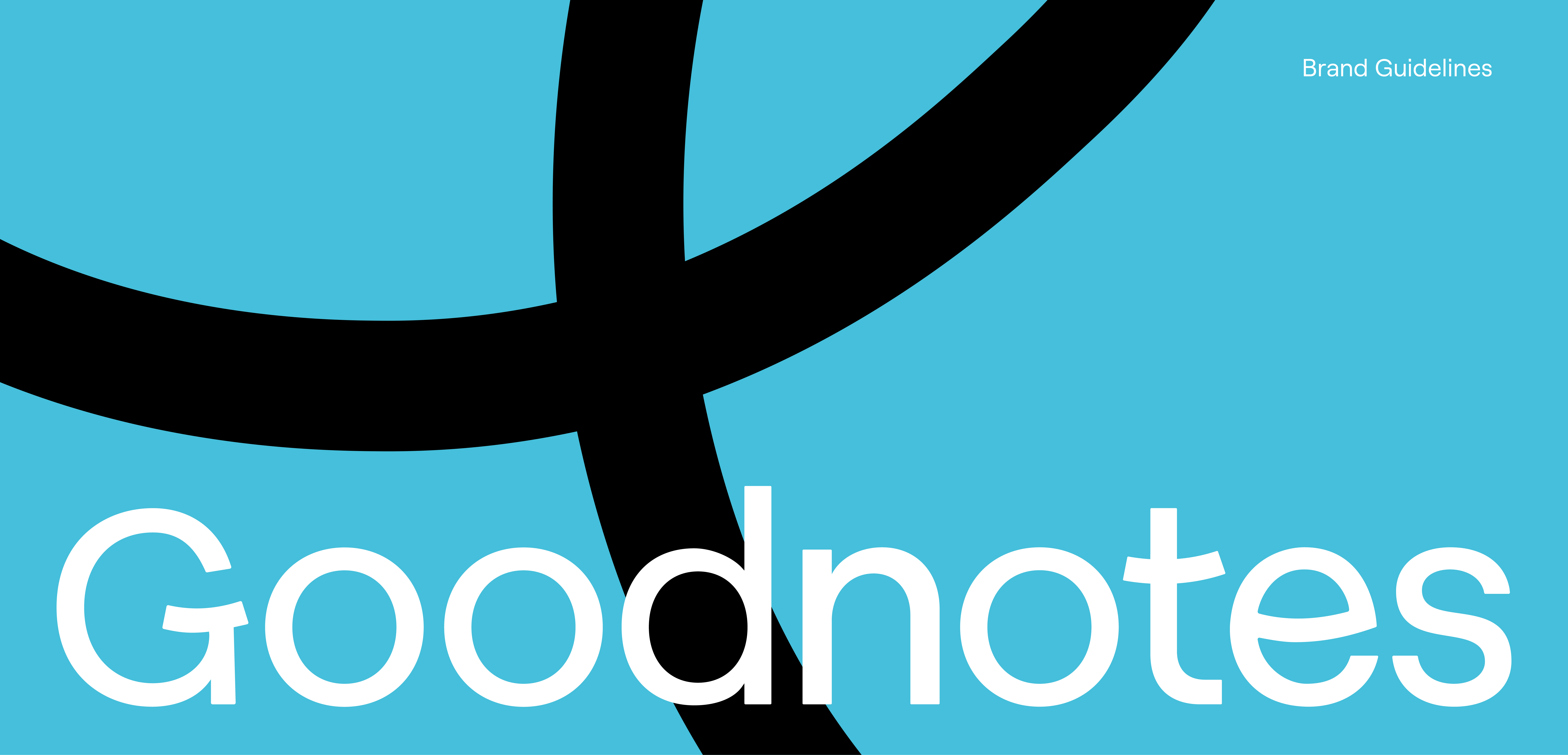
Wordmark
Our wordmark represents our business and the values that guide us. It’s vital that it's used with care and respect to ensure that all communications remain consistent, memorable, and remarkable.

Wordmark in Primary Palette


1.1
Logomark
Our logomark is designed to stand alone without being attached to the wordmark in any way.
Like the wordmark, the logomark represents our brand and its values. It can be used in secondary applications in place of the wordmark. For example, if more subtle branding is required or in smaller applications.
Logomark Variants
There are two variants of the logomark depending on the colour it is placed on.
Please try to use the Primary logomark whenever possible, only using the secondary logomark when using logo on a white background to maintain legibility.

Primary logomark

Secondary logomark
(for use on white backgrounds only)
Logomark Crop Options

Logomark in Primary Palette
Logomark in Black and White

1.2
Combination
Mark
The Wordmark and Logomark can be used together to create the combination mark.
Combination Mark in Primary Palette


Combination Mark in Secondary Palette
In campaign and advertising usage, we may employ the use of our secondary color palette within the wordmark and combination mark in order to create more consistent color palettes.
Please only ever use designated combinations, which can be found within the Combination Mark asset files.


1.3
Logo
Usage
Follow these dos and don'ts to maintain integrity of the logo in all applications.
Clear Space
The diagrams below illustrate roughly the minimum amount of space that should be allowed around the logotype, symbol and combination mark.
Wordmark
Space is equal to the size of the O in the wordmark. Hover your cursor over the wordmark to see spacing guidance.
Logomark
Space equal to the length of the middle blue line in the logomark. Hover your cursor over the symbol to see spacing guidance.


Combination Mark Spacing
Space equal to the length of the middle blue line in the logomark.
Hover your cursor over the combination mark to see spacing guidance.


Incorrect Logo Usage
Follow these tips to maintain the integrity of the logo in all applications.

1.4 Tagline Logo
Stacked Goodnotes logo with our tagline: Notes Reimaged
Primary Tagline Stacked
Secondary Tagline Stacked
2.0
Color
The chosen colors represent our brand and reflect our personality. Using our color palette consistently across all communications will build recognition for our brand by contributing to a unified look and feel.

Our Brand Color
Goodnotes Teal
Goodnotes Teal is our core brand color it displays, clarity of mind and calmness whilst
on the learning journey. It also hints to the brands constant innovation and technological
advances in digital note taking. It should appear in all our primary brand applications.
2.1
Primary Palette
Primary colours should be used in important brand moments to build recognition and association with our brand. Below are the exact values of each color. These should be followed at all times for consistency.
Navy
RGB: 37 42 77
CYMK: 52 45 0 70
#252A4D
GN Teal I
RGB: 69 191 219
CYMK: 68 13 0 14
#45BFDB
GN Teal II
RGB: 109 217 242
CYMK: 55 10 0 5
#6DD9F2
Ink I
RGB: 17 18 19
CYMK: 11 5 0 93
#111213
Ink II
RGB: 44 48 51
CYMK: 14 6 0 80
#2C3033
Ink III
RGB: 79 83 89
CYMK: 11 7 0 65
#4F5359
GN Teal III
RGB: 153 236 255
CYMK: 40 7 0 0
#99ECFF
White
RGB: 255 255 255
CYMK: 0 0 0 0
#FFFFFF
Eraser II
RGB: 230 229 228
CYMK: 0 0 1 10
#E6E5E4
Eraser I
RGB: 249 249 249
CYMK: 0 0 0 2
#F9F9F9
Primary Color
Type Combinations
Our palettes have been designed to be flexible and complementary, but not everything works together. When combining colors from the palette, stick to the suggested pairings on this page.
Teal : Ink
Navy : White
Eraser : Ink
White : Ink

2.2
Secondary Palette
Secondary colors can be applied with primary colors to support communications. Our secondary palette adds depth and variation to multiple communication touchpoints of the brand. Below are the exact values of each color which should be followed for consistency.
Matcha
RGB: 222 240 137
CYMK: 8 0 43 6
#DEF089
Sky
RGB: 205 229 255
CYMK: 20 10 0 0
#CDE5FF
Kale
RGB: 32 91 92
CYMK: 65 1 0 64
#205B5C
Merlot
RGB: 92 35 67
CYMK: 0 62 27 64
#5C2343
Lavender
RGB: 227 211 245
CYMK: 7 14 0 4
#E3D3F5
Candy Floss
RGB: 250 230 242
CMYK: 0 8 3 2
#FAE6F2
Brick
RGB: 107 40 39
CYMK: 0 63 64 58
#6B2827
Sand
RGB: 245 233 181
CYMK: 0 5 26 4
#F5E9B5
Secondary Color
Type Combinations
Our palettes have been designed to be flexible and complementary, but not everything works together. When combining colors from the secondary palette, stick to the suggested pairings on this page, with the strongest colors used sparingly.
All color combinations are shown pass AA for both normal and large text. However, these combinations do not apply to illustrations.
Kale: Matcha/Sky
Matcha: Kale
Navy: Sky
Sky: Kale/Navy/Merlot
Merlot: Sky/Lavender/Candy Floss/Sand
Candy Floss: Merlot
Brick: Sand
Sand: Brick/Merlot

Graphic Element Color Application
When using color with our graphic assets, there are various ways to apply color. Here are three examples.
These are all colors from our full palette. Please stick to these combinations when applying the journey line and type.
Note: Never use yellow for typography when Sky or Goodnotes Teal is the base color.

2.3
Accent Colors
We use accent colors in low ratios to add color to things like graphs, infographics, tagging, labeling and anywhere we need to draw attention in smaller applications of color. We use the accent colors with our Goodnotes Teal to ensure brand consistency between different color applications.
Canary
RGB: 255, 229, 95
CYMK: 0 10 63 0
#FFE55F
Apple
RGB: 4 194 115
CYMK: 98 0 41 24
#04C273
Seafoam
RGB: 28 132 162
CYMK: 83 19 0 36
#1C84A2
Fire Engine
RGB: 235 81,60
CYMK: 0 66 74 8
#EB513C
Bubble Gum
RGB: 250 181 227
CYMK: 0 28 9 2
#FAB5E3
Neutral Palette
The neutral palette provides a base for the primary and secondary palettes to be used within UI and wider brand application.
Graphite
RGB: 64 59 59
CYMK: 64 58 54 60
#403B3B
Gray Matter
RGB: 205 200 199
CYMK: 22 19 19 1
#CDC8C7
Shading
RGB: 172 166 165
CYMK: 34 30 29 8
#ACA6A5
Lined
RGB: 225 221 220
CYMK: 14 12 13 0
#E1DDDC
3.0 Typography
Typography is an essential component of our identity system. The consistent use of our selected typefaces throughout our printed and digital communications will help establish a cohesive visual style.

3.1
Primary
Typeface
The main brand typeface is Roobert.
Roobert
Aa Bb Cc Dd Ee
Ff Gg Hh Ii Jj Kk
Ll Mm Nn Oo Pp Qq Rr Ss Tt Uu Vv Ww Xx Yy Zz
Languages Supported by Roobert

Substitute Typeface
The secondary brand typeface is Noto Sans. This is for use with languages not based on the Latin alphabet (e.g. the Cyrillic alphabet).
Noto Sans
Aa Bb Cc Dd
Ee Ff Gg Hh Ii Jj Kk Ll Mm Nn Oo Pp Qq Rr Ss Tt Uu Vv Ww Xx Yy Zz
А, Б, В, Г, Д, Е, Ё, Ж, З, И, Й, К, Л, М, Н, О, П, Р, С, Т, У, Ф, Х, Ц, Ч, Ш, Щ, Ъ, Ы, Ь, Э, Ю, Я
3.2
Secondary Typeface
The Handwritten Typeface
Goodnotes Hand is our secondary expressive typeface.
It's used alongside Roobert to bring a human touch to our communications.

Ligatures and Small Capitals
Ligatures combine certain letters into a single stoke (e.g. fi, mm).
Small capitals are uppercase letters drawn at the height of lowercase letters. Use them for typing in all capitals, short titles, or emphasis in text.
You can turn both of these on and off in programs like Figma, Canva, Adobe etc...


Typography in Use
Both primary and secondary fonts can serve as headers, but in formal layouts use Roobert.
When unsure what to use, default to Roobert the primary typeface.

3.3
Multilingual Typeface
To support our global markets, our handwritten typography library extends across regions using non-Latin scripts.
This includes Simplifed Chinese, Traditional Chinese, Japanese, Korean, and Thai.

Localised Typography in Use
Tip: Secondary (handwritten) fonts works especially well in socials, events, and education-related designs.

4.0
Graphic Devices
Our graphic devices are drawn from our thick "journey line", our sketch-style "illustrations", our "grid backgrounds", and our "graphic objects". Examples are show here in this section.

4.1
Journey Lines
Note: If you'd rather not create these for your artwork manually, you can download some pre-made journey lines here.


4.2
Illustrations
Note: You can create illustrations by hand or in Procreate but please create them in illustrator using our scatter brush as your final step to make sure the line style remains consistent across our brand.


4.3
UI Graphics
UI-inspired graphic objects we use in designs.
You can find these in Figma and Canva.

4.4
Textures
Graph textured images available in select brand colours. Used as subtle backgrounds in our designs.


5.0
Photography
Our visual system adapts by audience, using different combinations of graphic devices to set the right tone.

Bucket 1
Function
In the Function Bucket, we hero the user and the product's function. We always use neutral backgrounds to reflect the functional modernity in the Goodnotes office environment.

Bucket 2
Sharing
In the Sharing Bucket, we hero the sharing and collaboration made possible by Goodnotes and our community members.

6.0
Tone of Voice
The special makeup of our voice.
To request more information about our verbal guidelines, please contact Cam Cornwell at camilla@goodnotesapp.com
01. Curious
02. Empowering
03. Joyful
01. Curious
Our voice sparks interest and intrigue. We revel in knowledge and delight in details. We ask lots of questions, sometimes digging deep. We talk like an individual, with a smart, conspiratorial quirk.
We are: Inquisitive, Personal, Conversational
We are not: Judgmental, Rigid, Prescriptive
02. Empowering
It’s not about us, it’s about you. We’re driven by our mission to help people achieve and ultimately improve society. This is not about being lofty. We are grounded and authentic. We show we care about their journey and their potential, and we are here to make a difference.
We are: Purposeful, Activating, Nurturing
We are not: Stuffy, Intimidating, Overly serious
03. Joyful
We’re pretty great to be around. We bring a lightness of touch that makes everyone feel seen. We read the room and bring in just the right amount of upbeat energy when it fits.
We are: Celebratory, Upbeat, Optimistic
We are not: Juvenile, Annoyingly chatty, Overbearing
For inquiries regarding the Goodnotes identity,
please contact:
Cam Cornwell
camilla@goodnotesapp.com
