Brand guidelines
2023
Contents
Brand resources and templates
PowerPoint and Word templates can be found here as well as the photo library and icons.
Guidance on how to use imagery, icons and templates can be found further on.
Our purpose
Why we exist and why we do what we do
To improve the health of the nation by turning science into healthcare.

Our vision
How we see the future
A world where genomics improves everyone’s health and wellbeing, based on the latest scientific discoveries.
Our mission
Our role in building that future
To enable others to deliver genomic healthcare and accelerate genomic research.
Our strategy
What we are doing to fulfill our role
To focus all our efforts on perfecting and scaling two critical services:
• Working with the NHS to deliver and continually improve genomic testing to help doctors and clinicians diagnose, treat and prevent illnesses, like rare diseases and cancer.
• Providing the health data and advanced technology researchers need to make new medical discoveries and create more effective medicines for patients and their families.
Our logo
Our logo should be applied to every piece of communication, it is the foundation from which the wider brand identity is built, acting as a unique mark of Genomics England's authenticity and commitment to genomics.
There are two versions of our logo:
• Light version for dark or coloured backgrounds
• Dark version for light backgrounds
Our logo —
Positioning
The positioning of our logo is flexible to allow for a wide range of applications including both print and digital. The logo can sit in any corner of the application, however there may be occasions where it's better centered e.g. in film.

Our logo —
Safe area
To maximise our logo’s presence and visual impact it must be positioned within a minimum amount of clear space on all four sides. This space is equal to 25% of the logo height.

Our logo —
Size
Size and legibility are always important factors. Our logo should not be used smaller than 18mm, or 40px in width to ensure legibility.

Our logo —
Brand architecture
A monolithic brand identity for Genomics England will help to build understanding and drive brand awareness over time. It ensures that all programmes and initiatives are unified and clarifies ‘ownership’ by Genomics England across all activities, internal and external.
This approach still allows individual initiatives that engage directly with external audiences – such as key programmes and research studies – to be named in communications where appropriate, alongside the Genomics England logo. But it prevents individual programmes and initiatives from creating their own identities, and avoids fragmentation.

Core Genomics England branding
Communications lead with the master Genomics England logo. The logo can sit in any corner of the application.

Sub-brand by Genomics England
Name of key programme or initiative can be featured as a sub-brand lock-up alongside the Genomics England logo.

Genomics England product or service
The name of an event, programme or initiative can be featured typeset as part of the headline copy.

Our logo —
Sub-brand lock-up
Key programmes and research studies that engage directly with external audiences can, where appropriate be named in communications as a lock-up alongside the Genomics England logo.
The name of the research study should be set at 75% of the logo height in Avenir Medium. A vertical line should be used between the Genomics England logo and the programme name to make the relationship clear, but always ensure there is a round edge to the stroke to complement our logo.
This is an approved lock-up and no other logos or variations should be used for programmes or research studies.

Our logo —
Partnerships
There are some cases where the Genomics England logo or sub-brand lock-up needs to work in partnership with other logos, for example on posters for NHS-led programmes like the Generation Study.
In these instances we recommend that the partner logo sits in the opposite corner of the application to the Genomics England logo, no greater than the height of our logo.

Our colours
Our brand colours are an important and identifiable part of our visual identity. They’ve been chosen carefully to complement each other.
We have created bespoke RGB and CMYK values to ensure visual consistency across communications. Care should always be taken to use the exact breakdowns shown here.
RGB colours should be used in digital communications for screens and other
self-lit systems. CMYK colours are the colours that we use across the majority of our printed materials. For more specific print projects which require an exact colour match or vibrancy we can use the Pantone colours listed.
*Please be aware when using digital guidelines colours may vary slightly depending on screen resolution and operating system. Always use the colour breakdowns given within this section.

Dark Blue
NHS Blue
Cyan
Green
Light green
Yellow
Magenta
Grey
White
Our colours —
Tints
You can use these tints of our core colours to help add depth and balance to a design.
Specific colour references for
10% increments are shown here.
These are for digital use only.
For more tint variations visit: maketintsandshades.com and enter the hex code using the brand colour e.g. (light green) 7ef541
For CMYK applications use tints based on the colour breakdowns shown above.

Our colours —
Usage
Our varied colour palette gives our
brand flexibility and helps to keep our
brand fresh and interesting. Different
colour combinations can create
different moods and can appeal to
a variety of different audiences as these examples show.
Limit the number of colours you use in a single piece, this helps to create more harmony.
For communications that engage directly with external audiences and may require a softer approach e.g. Generation Study, consider using warmer tones and pastel tints from the palette.

When talking about scientific and clinical research or to partners, blues, greens and greys can work well to give communications a clean, professional feel.

Digital colour combinations
When using HTML text colour accessibility compliance can be checked using this online tool.
Here you can see a selection of colour combinations that are a minimum of AA compliant.
Dark blue is one of the core Genomics England colours. It helps to bring a sense of authority and authenticity to applications. Dark blue text works well on light coloured backgrounds, for example tints. This is illustrated below using 30% tints.

White text works well on a dark blue background. Brighter 100% tints from the palette can also be used on a dark blue background to give emphasis and highlight short pieces of text, for example product or event names, but never for long pieces of copy.

In digital applications brighter 100% tints from the palette work well for UX elements to aid quick visual signposting, for example, buttons or tabs.
The examples shown here are a minimum of AA compliant.


Our typeface
Typography is an important part of our brand identity – it can be used to help set the tone of communications and to present key messages clearly.
Avenir LT Pro is our primary typeface. We use it in various weights in everything from headlines to body copy.
Avenir LT Pro is available to purchase here.


Our typeface —
Usage
Typographic hierarchy
Our typefaces help to increase readability, build personality and create a visible message hierarchy in our communications.
When a variety of type sizes are used, the differences between them must be clearly recognisable.
For clear and considered messaging where possible headings should be set in Avenir Lt Pro Book. Bolder weights e.g. Avenir Lt Pro Medium and Avenir Lt Pro Black can be used for sub-headings or to highlight key information.

Where possible we recommend left aligning text and grouping to one area of the application. This will make the communication feel cleaner and easier to read.
For content heavy posters try to use bullets to keep copy short, succinct and easy to read.
Colour can also be used to help define a hierarchy of information. Care should always be taken to ensure there is sufficient contrast for legibility and accessibility. For digital applications colour accessibility compliance can be checked using this online tool.

Typesetting guidance
Tracking and Leading are essential elements of design that can have a great impact on the readability and visual appeal of communications.
Tracking
Tracking is the space between individual characters. A tracking of -10 should be applied across headlines as a general rule and -10 across body copy depending on size of the text.
Leading
Leading refers to space between the lines of text. As a guide we recommend this space should be around 115% of type size.
Remember to give content room to breathe. When clear space is used well, the page layout feels inviting to read.

Our writing style
The words we use show people what we stand for. For guidance on our tone of voice and how we write as a company, please see our content style guide in Confluence.

Our photography
Genomics England aims to help everyone benefit from Genomic Healthcare and our photography needs to reflect this – it needs to be diverse and most importantly authentic.
Photography is a powerful asset; it can help to communicate Genomics England's work across different programmes, and to different audiences. To reinforce this our photography covers two core areas:
• People and real life
• Science and research

Cut-out portrait photography
Cut-out portrait photography is a great way to tell individuals' stories; focussing on the people who are sharing their data as well as those Genomics England want to help. Portrait images should be shot with the subject facing the camera, but it's important that the individuals look relaxed and informal to ensure authenticity rather than posed, smiling shots.
Images should cover a range of ages, genders and ethnicities so they can be used to support a wide range of messages and programmes.
Cut-out photography should be used with one of the brand colours in the background to help create a sense of ownership for Genomics England.

Lifestyle photography
To help demonstrate the benefits of Genomics England and ensure it feels accessible to people from all walks of life, lifestyle images should show real people, going about their day-to-day lives e.g. relaxing with friends and family, enjoying activities.
Lifestyle images should be shot in a reportage style, capturing moments in time when people look relaxed and informal, rather than posed.
When using models for shoots or searching for stock images it’s important to choose people that are true to life – showcasing a variety of people of all ages from different ethnicities, cultures and genders. Using quality images that don't feel like stereotypical stock images will help reinforce the authenticity, high standards of excellence and professionalism in Genomics England's work.
Our photo library contains images of the lab, newborn photography and other lifestyle images you may find useful. PLEASE NOTE: Please read the READ ME files in the collection folders before using any of the images.
Some of the images will be nicer and more usable when they are closely cropped. Consider the optimal crop when selecting an image and use the high-resolution version of the image if significantly cropping. You can then make the image size smaller using the Windows Photos app, if you need to.
PLEASE NOTE: Do not use imagery sourced from the internet as you must have the copyright to use said imagery. If you need something specific please submit a brief here

Science and research photography
Both clinical and laboratory research are key to the work that Genomics England does. Photography can be a useful tool to help communicate these complex subjects in a way that's easy to understand.
Our photo library contains images of the lab, newborn photography and other lifestyle images you may find useful. PLEASE NOTE: Please read the READ ME files in the collection folders before using any of the images.
Some of the images will be nicer and more usable when they are closely cropped. Consider the optimal crop when selecting an image and use the high-resolution version of the image if significantly cropping. You can then make the image size smaller using the Windows Photos app, if you need to.
PLEASE NOTE: Do not use imagery sourced from the internet as you must have the copyright to use said imagery. If you need something specific please submit a brief here

Our illustrations
Illustrations should be used across Genomics England communications to support key messages and stories, making them simple and easy to understand.
The Genomics England illustration style is born from bold, simple graphic shapes, which where possible draw on the geometry of the core brand shapes from within the logo (circle and lozenge).
As a starting point a suite of illustrations have been created to support core brand messages and programmes.
If you need new a new illustration creating please fill out the briefing form here.
If you do use stock illustrations please ensure they have been updated to be align with the brand style and colours. If you need help please submit a brief.
PLEASE NOTE: Do not use imagery sourced from the internet as you must have the copyright to use said imagery. If you need something specific please submit a brief.
In the link below please select the folder "PowerPoint usage" if you need to use illustrations for PowerPoint.

People
Public, participants, researchers and healthcare professionals – Genomics England aims to help everyone benefit from Genomic Healthcare. These illustrations will be a useful tool across all Genomics England communications whether for a specific programme or internal comms.
Illustrations should feature flat colours and minimal detail to help explain the subject matter in the most simple way possible. For illustrations of people this means no distinguishing facial features e.g. eyes, nose, mouth.
All illustrations are available as editable vector files so the colour of skin, hair and clothing can be easily updated to best suit the application.

Data analysis
Illustrations of genomic data analysis can be used to support complex messages in communications. Where possible human touches e.g. a hand holding equipment can help to reinforce the human involvement and impact of Genomics England.

Our illustrations —
Skintone palette
Any colour from the core Genomics England palette can be used for illustrations. A secondary palette of skintone shades has also be introduced to ensure diversity and inclusivity, although this is only for use with illustration and not in wider communications.
Remember to limit the number of colours you use in a single piece, this helps to create more harmony.
*Please be aware when using digital guidelines colours may vary slightly depending on screen resolution, operating system etc. Care should always be taken to use the exact breakdowns shown here.

Our illustrations —
Usage
To allow designers flexibility and to ensure the brand feels fresh and diverse illustrations can be used full bleed, within one of our brand shapes, or over the top of a brand shape, as shown below.
Care should be taken not to use too many illustrations in one application so communications feel clean and considered.

Full bleed illustration

Illustration within a brand shape

Illustration on top of a brand shape

Our icons
Iconography is a unified visual language that can be understood by people from different backgrounds and cultures.
Our icons should always present the subject matter in the most simple way possible to help illustrate simple messages, support quick visual signposting and to ensure icons work at small sizes in both printed and digital applications.
Icons should always use one consistent line weight throughout supported by a dot to help reinforce the Genomics England logo. Using a series of geometric shapes as a template for the icon will help give clean lines and visual consistency.
If you need any additional icons creating please submit a brief to the team.
You can download the existing library below, please use the folder "PowerPoint use". All PowerPoint templates have the icons preinstalled so you shouldn't need to download these unless you want to use them in Word.
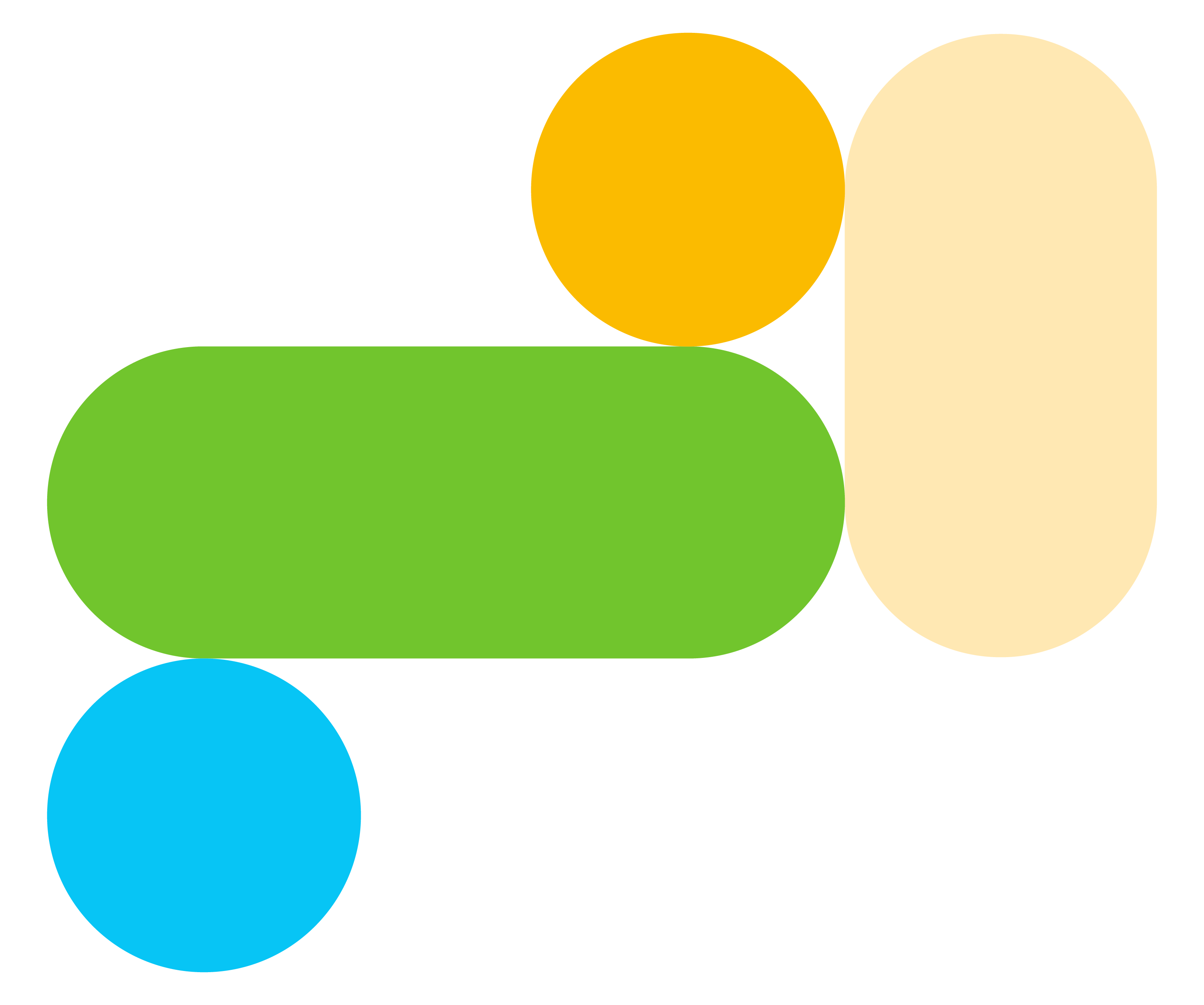
Our brand device
Born from the core Genomics England logo and inspired by cellular data, simple circle and lozenge shapes can be used as a graphic device across all materials. Use of these shapes helps to strengthen our identity and create strong, recognisable communications.
This section shows how you can use these shapes in a variety of ways to create communications that vary in their style to help communicate to different audiences, but remain aligned with our brand.

Our brand device —
Usage
Aperture
Our brand shapes can be used as an aperture to contain photography, illustration and text.
Try to only use a single image or illustration within each shape to ensure communciations feel clean and accessible.
Single shapes can be useful to tell individuals' stories for programmes like Diverse Data and case studies.

Experimenting with using multiple shapes in different combinations and configurations can help to create more expressive and impactful communications.
Larger shapes work well to contain imagery, supported by smaller shapes in different brand colours.
This can be useful for posters, leaflets, and reports. On printed communications always keep brand shapes within the margins of the page to ensure they reproduce accurately.

Pattern
A collection of our shapes can be used on their own suggesting a pattern of cellular data, or as a background for cut-out photography to give a sense of ownership.
Try to limit the number of shapes and colours to ensure a clean and harmonious feel.

Patterns can be overlaid over photography to help frame and enhance images. When using this approach care should be taken to position shapes so they don't obscure distinguishing features.

Infographic
The simplicity of our brand shapes work well as infographics to help present data clearly and simply in digital and printed communications.
When using shapes in this way consider limiting the number of colours used to make information easier to digest.
Tints from our palette work well as background colours to create a feel of scientific reports or research documents.

Functionality
Our brand shapes can be used as a functional tool in digital applications e.g. as buttons containing text and icons.

Punctuation
When a more subtle approach is required e.g. corporate presentations, our brand shapes can be used as punctuation within short pieces of text.

Our brand device —
Things to avoid
Our brand shapes are designed to be flexible, but there are some things to avoid:
Do not use too many shapes in one composition or in configurations that feel too playful. It's important that communications feel scientific and authoritative. Using a grid to help achieve sizes which work in proportion to each other will help this.
Do not use too many different colours in one composition. Colour can be a great way to help break up and define key pieces of information, but when over used it can make information hard to digest. We recommend using 2-3 core colours, plus tints of these for a harmonious application.
Do not obscure images with brand shapes as this can make applications feel busy and hard to understand.
Do not break sentences across brand shapes as this can make copy hard to read. Text can be contained within the shapes.


Using a grid
Please don't lay imagery over the shapes they should, where possible, be inside the shape. Using the shapes in a grid ensures layouts are neat and formulaic. Using a grid will also help you develop many different layout options.


Applications
Whether you’re creating printed materials, or digital assets, these examples will give you some inspiration on how the our brand identity can come to life.
*Please be aware when using digital guidelines colours may vary slightly depending on screen resolution and operating system. Always use the colour breakdowns given within this guideline.

When creating communications, always consider the end user.
There may be occasions where technical, scientific images are appropriate for a clinical audience, but warmer, more approachable lifesyle images and illustrations work better for the general public.

Annual report
You can view the full version of the report here. It gives a really concise overview of where the brand assets have been used across editorial content.


Genomics England event
For events such as GERS, the full suite of brand assets can be used to create a graphic image which can be applied across communications.


Sub-brand by Genomics England
These examples show how our branding can be applied in different ways across sub-brands to ensure each can communicate their key messages, whilst remaining part of the core brand.
Generation Study

Diverse Data

Cancer 2.0

Social media
Here are some examples of how we use the brand across our socials. If you need help creating a campaign or assets please reach out to us by submitting a brief.

PowerPoint and Word templates
The templates for Word and PowerPoint should already be installed on your machine, if you can't find them please contact Service Desk or download them from here here. Please download and edit in the desktop app, not in your browser.
To select the new PowerPoint slides Just go to: New > from template > and select master slides. Here you will have everything you need to get you started including a how-to guide. You can also go New > from template and select the diagrams deck to make the most of our most used diagrams or get some inspiration.
Please note, ensure you read the how-to section in the slide deck on how to do copy over content from old slides – do not copy over old legacy slides, only copy the content within the slide. If you copy over legacy slides the new template will be overwritten.


Merchandise
A few examples of the branding used on merchandise.


Resources and templates
If you have any questions regarding the branding please contact:
Simeon.Baker@genomicsengland.co.uk
Request design help
PowerPoint and Word templates
Download here
Font
This should be installed on your computer, please check with the Service Desk if in doubt.
Backgrounds for Teams and Slack
Download here