Visual
→ Guidelines
→ Tone of voice
No faff. No fluff. No egos. Just getting stuff done.
Our brand personality reflects our people: a tight-knit team of competent, confident pros who work seamlessly together to create really cool stuff for our clients. Most importantly, we like to have some fun in the process, because we find that friendly, happy people who like each other do better work together.
We speak in short, snappy, conversational sentences, never writing down anything that we wouldn’t say out loud to each other in normal day-to-day dealings. We prefer simple words over complicated ones, and friendly language over formal.
A few rules:
→ Use sentence case for headings (I.e. Digital product development, not Digital Product Development). It’s more laidback than title case.
→ Avoid using exclamation marks as much as possible. They come across as over-excitable. Energy and enthusiasm comes across best with punchy sentences.
→ Steer clear of hackneyed clichés and corporate buzzwords. There will be no ‘circling back’, ‘blue-sky thinking’, or ‘disruptive innovation’.
→ Pepper all copy with quirky, light-hearted, conversational asides. Because we’re nice like that.
→ Logos


→ Colours
Black
White
Accent pink
Secondary colours
When creating branded charts and graphs, we recommend using monochromatic hues that can be found here. Ensure you use the exact colour codes and do not match colours visually. These hues are also used in complex gradients.
Coral
Pastel pink
Aqua
Gradients


→ Fonts
Header font: Gradient Premium
AaBbCcDdEeFfGg
Sub-header + body font: Mundial
AaBbCcDdEeFfGg

→ Photography
We have a wide range of approved photography that can be used throughout communications. When placing in decks, be sure to mask with a rounded rectangle and apply a drop shadow.


Headshots
Headshots of every employee can also be acessed and used in decks here.


→ Screens
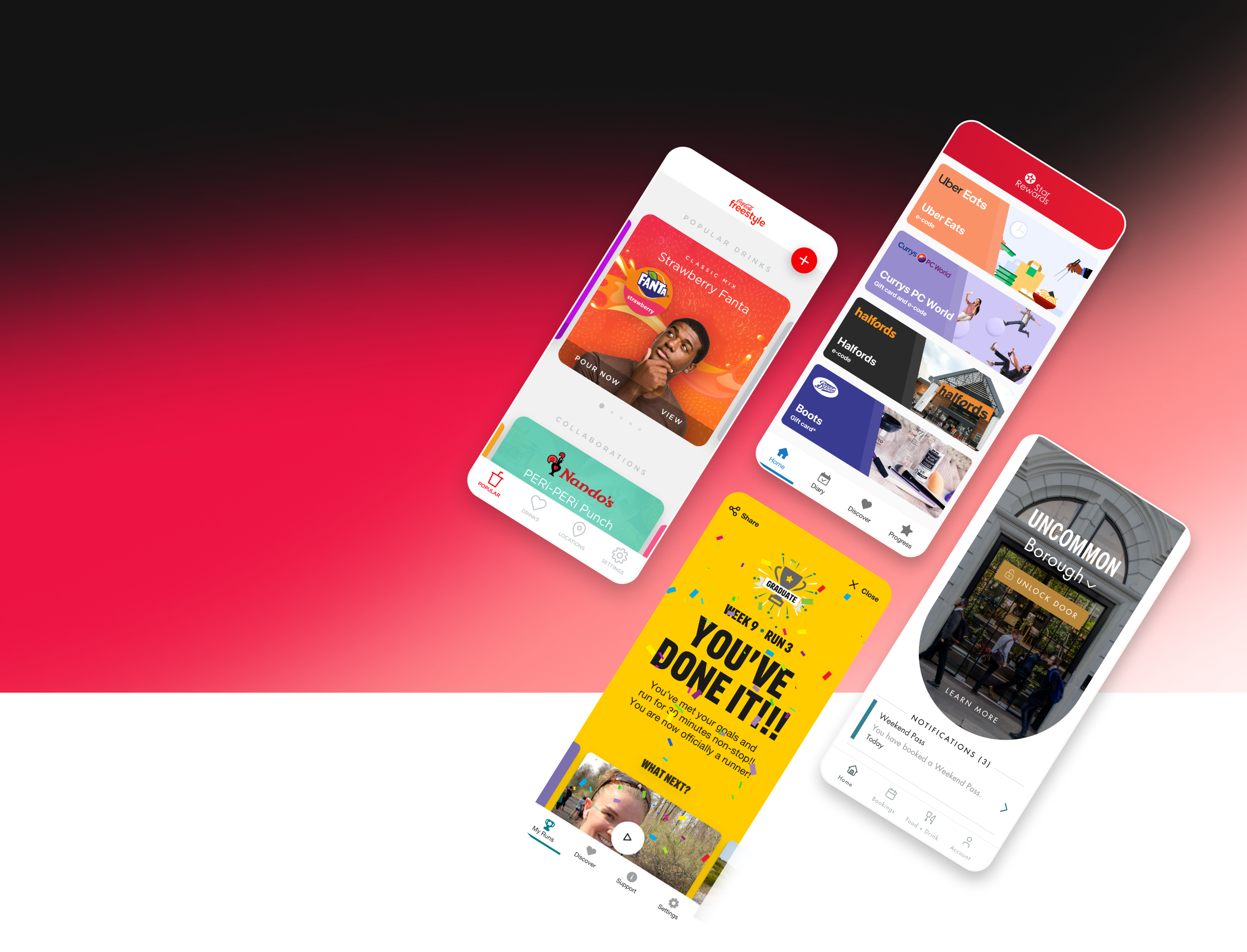
When presenting work or case studies, screens should be framed in a minimal manner (such as a simple outline stroke and drop shadow). This ensures brand consistency, and that the work itself is the focal point, rather than the mockup. This is also the most sustainable way to create long-lasting content as the presence of outdated devices instantly dates a visual.

When possible, it is encouraged to let design assets and components break out of the screens. This breathes life into the visuals and also showcases the great work we do in building systematic design systems for products.
When applicable, it is also encouraged to use videos to showcase the full functionality of products.
Providing a Figma prototype link is great, but including a concise video ensures the product is displayed correctly, and that no core functionality is missed.
→ Document Templates
Various internal document templates including:
- RACI
- Contact report
- Creative brief
- Handover notes
- RACI + document matrix
- RAID
- Weekly status report
- Release notes

→ Letter
Download a basic word template for letters here.

→ Slogan
There are multiple lockups of 'Impossible. Done.' that can be used throughout communications.


When aligning 'Impossible' and 'Done' vertically, ensure the 'b' and 'D' are in line.
If you have any issues accessing/using assets or feel there is something missing from these visual guidelines please reach out to Albert Parker at albertmparker on Teams or albert.parker@flipsidegroup.com