Edenred brand guidelines
These guidelines cover the 5 core elements of our brand system: logo, color, typography, composition, and iconography.
Logo
The Edenred logotype is a valuable element of our visual identity. The following examples are intended to demonstrate how to use the logo across a variety of situations to ensure that it is always presented with the best contrast and recognizable.
Always use in priority the red color. White color should be used as an exception.
Only one brand exists within the Edenred Group: Edenred.
Logotype
The Edenred logo is instantly recognizable through its unique typeface and red circle.
The letters "Eden" should always be transparent.


Clearspace
Clearspace around the wordmark is equal to the height of the letter "e" in lower case.


Purpose
Our purpose has two claims.
“Enrich connections” describes Edenred's expertise to make connections stronger, smarter and safer.
"For good": Edenred builds bonds that are rock solid and live long. It is also about progress and opening a better future.

Color and scale
The Edenred logo must always be displayed in red to ensure strong brand recognition. White version is forbidden.
To comply with this mandatory guideline, ensure sufficient contrast with the background or place the logo within a distinct shape for clarity.
Exception
Customized clothing.
The logo may appear in white on a red background exclusively to achieve visual symmetry.
This exception is valid only when half of the clothing units are white with the red logo and the other half are red with the white logo.


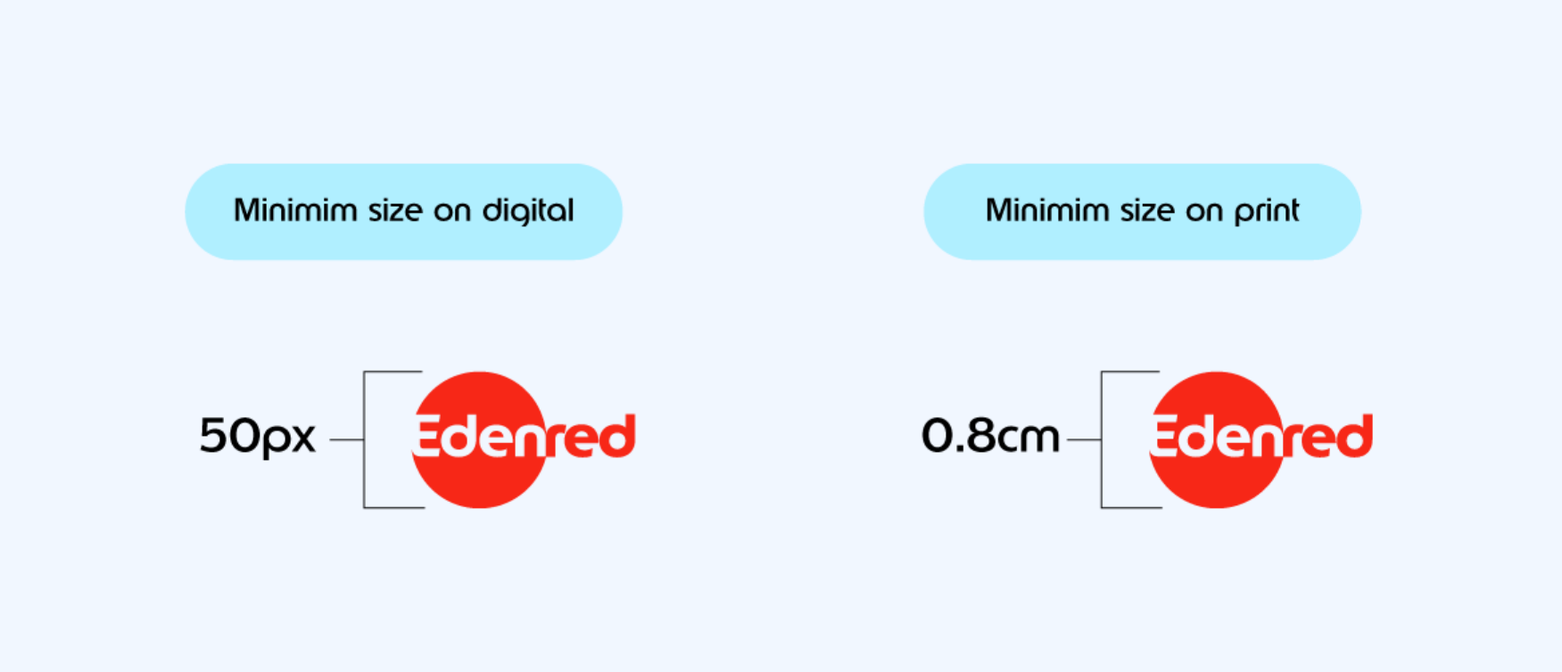
Scale
In order to ensure legibility, the logotype should never appear smaller than these minimum sizes.
Product
Only one brand exists within the Edenred Group: Edenred.
All products are under the Edenred brand.
To differentiate one product from another, product names should be:
01 Simple and descriptive (reflecting the product’s function or category)
02 Translated in local language or in English for a global identity
For example : Meal / Gift / Mobility etc.
Products must never carry their own logo or a specific brand identity. They must come written.
- Do not create product logos \ brands

Incorrect usage
The success of the brand depends on the Edenred logos maintaining a consistent appearance accross all communications.
In order to preserve the integrity of the logo, the following examples illustrate how it should not be used.
These rules apply to the monogram and the product logo as well.
01 Do not change the color of the logo or elements of the logo.
02 Do not apply the logo in white.
03 Do not color "Eden" in white or any other color. It must always be transparent.
04 Do not crop the logo.
05 Do not outiline the logo.
06 Do not rotate the logo. Logo should only be applied horizontally (180°) or vertically (90°).
07 Do not place the logo on low contrasting colors.
08 Do not place the logo on busy or complicated backgrounds.
09 Do not stretch or manipulate the logo.

Favicon / Monogram
The monogram is a visual shorthand for the wordmark. It is designed for a digital use first : social media icons and favicons.
In all other cases, the use of the Edenred logo must be your first choice.
Two ways to use the monogram


Web site favicon & Social media icon


Partnership
When we welcome a new entity within Edenred Group, we need to associate strongly their logo with ours. The best option is defined according to local factors and brand awareness.
Co-branding logotypes are designed by the e-Quarter communication team.
To sum up:
A good use of our guidelines values our brand
DNA shapes
Our graphic system is unique to Edenred and makes every communication identifiable, even when our logo is not visible. A set of two shapes allows us to play around with different compositions.
Circle & Ribbon shapes
The circle reminds of the Edenred logo red ball and the ribbon is an extension of the ball. The ribbon can be used horizontally or vertically.


How to use the circle and the ribbon ?
Circles and ribbons can be used in your design in many ways. With Edenred font, as a container, as a background or as a key asset of the composition.
How to play with the shape on a digital application ?


Ribbons and circles can be paired with typography to give rhythm to your titles. They only pair with Edenred font. The height of the shapes should align with the height of the lowercase letters. The width can be determined freely, as long as the composition remains harmonious.
Ribbons and circles can hold photographs or illustrations. Make sure to respect a minimum 2:3 ratio to build your ribbons.

Ribbons can allow the use of Edenred logotype on a color background without enough contrast.
Ribbons and circles can hold text, icons or key figures. To make sure your composition is well-spaced: the more text you put in a ribbon or a circle, the bigger the inner margins should be.


Another way to compose our shapes is by playing with cut-out and trapping, following the graphic concept of our logotype. You may use with large typography elements or only with shapes.
Ribbons and circles are visible through navigation and editorial elements as well. Buttons, tags or small dots bring consistency to our design.
How to create the ribbon
01 Do not deform the ribbon. Make sure the ends are always perfectly round.
02 Do not deform the circle.
03 Ribbon shape should be recognizable. Make sure to respect a minimum 2:3 (or 3:2) ratio.


To sum up
01
Our shapes are an echo of our logo
02
Reinforce our brand identity
Color palette
Our color theory consists in two hero colors, and a secondary system which grants greater flexibility and ensures web accessibility.
Primary colors
Edenred Red and White are our hero colors. They are made for our brand to be clear, iconic and recognizable. These two colors work to drive consistency and build equity accross all types of executions.

Secondary colors
The secondary color palette consists of 14 colors — including black. These colors offer flexibility for our communication to adapt any subject and ergonomic issue. They are made to match with the Edenred Red. They should be used sparingly.
Our secondary palette works on a Bright to Light axe. Each Bright color has a Light tint.
Pink
rgb 255 89 120
cmyk 0 85 30 0
hex #FF5978
pms 191 C
Light Pink
rgb 254 208 200
cmyk 0 21 14 0
hex #FED0C8
pms 4032 C
Cold White
rgb 241 247 255
cmyk 10 2 0 0
hex #F1F7FF
pms 656 C
Cobalt
rgb 13 138 255
cmyk 90 44 0 0
hex #0D8AFF
pms 2174 C
Light Cobalt
rgb 176 239 255
cmyk 40 0 0 5
hex #B0EFFF
pms 2905 C
Violet
rgb 113 28 255
cmyk 73 68 0 0
hex #711CFF
pms 2725 C
Light Violet
rgb 200 195 255
cmyk 29 23 0 0
hex #C8C3FF
pms 270 C
Mint
rgb 0 161 132
cmyk 93 0 57 0
hex #00A184
pms 3275 C
Light Mint
rgb 152 246 219
cmyk 27 0 15 0
hex #98F6DB
pms 331 C

rgb 129 193 5
cmyk 55 0 100 0
hex #81C105
Light Olive
rgb 220 246 145
cmyk 15 0 53 0
hex #DCF691
pms 372 C
Black
rgb 0 0 0
cmyk 0 0 0 100
hex #000000
pms Black C
Grey
rgb 109 119 135
cmyk 58 45 26 17
hex #6D7787
pms 4129 C
Light Grey
rgb 213 216 221
cmyk 16 6 0 0
hex #D5D8DD
pms 650 C
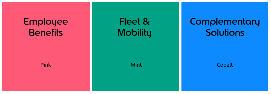
Universes colors
Edenred’s solutions meet fundamental needs in the world of work, in three complementary business line. Each universe has its color, which is drawn from our secondary palette.
How to use the color palette ?
1. Edenred Red (Original or Vibrant) is the hero color of the palette. It is cross-communication.
2. White also plays a very important role in our brand communications. It should provide balance with red.
3. Cold White can be used jointly, for variation.
4. Black is dedicated to texts and icons : it should never be used on backgrounds or large flat tints.
5. Secondary palette should be used reasonably to enhance details or informations in the composition.
It is built with a light tint for each color.
Bright colors are to use for texts, figures, icons and small flat tints (such as ribbons and circles). Their density allow us to highlight details or information. They are not to use on backgrounds and large flat tints.
Light colors are to use for icons, small flat tints and backgrounds. They help us keeping a light composition.
Usage proportions


Edenred Red and White are our hero colors.
Secondary colors are used to enhance key informations and small details in the composition.
Color variables
Sometimes, you might need additional color contrast in your design.
When needed, you can lower Bright colors' opacity following the rules below ↓
These diluted colors are to be used for data — such as graphs, figures or plans, for illustrations and for UI/UX purposes.
Only 10% and 5% opacity colors are to be used for backgrounds.


Diluted colors can be used on plans or illustrations to add contrast and depth.
Diluted colors can be used as flat tints to hightlight key figures or data information.
Web accessibility
The following guide will help you to use colors in a way that ensure web accessibility. Our reference standard is RGAA (stands for Référentiel Général d'Accessibilité pour les Administrations).
"AA" is the level of accessibility we need to provide to our users on web.
Important :
Cold White and Light colors are not to use on texts.


To sum up
01
Red and white make us iconic
02
Our secondary colors should be used sparingly
Typography
Consistent use of typography is key to bring a brand to life. Our system includes 3 different fonts.
Edenred
Edenred is a unique font specifically designed for us. It helps us to express our personality and makes our brand unique. This is the font of the Edenred logo.
It should be used for big format of texts only (titles, key messages, etc.)


Ubuntu
Ubuntu is a Google font. It offers great balance with round and large Edenred as it is slighty more condensed.
You should use it for ordinary text.


Aptos
Aptos is only to be used for office templates (PowerPoint, Word, etc.)
In line with European accessibility requirements.

How to use typography ?
Pairings
Pairing Edenred and Ubuntu highlights our main font.
When pairing, always look for contrast through size, go for balance through weight, and good hierarchy.

Call-to-actions
To create and identify call-to-actions for brand communications, you can go for a button with a shape of ribbon, a customized round cursor or a link.


To sum up
01
Our typography is a core element of our brand
02
Aim for contrast in the sizing
Mobile app icon
For all mobile app icons, we must have this combo: gradient background + white circle + red icon
The main app of each country, the entry point for most users, must be always gradient red background + monogram
When the public changes, the background color changes
For other app solutions please note that logo creation is managed exclusively by the Group Communication Department, and must display a clear icon that represents the app function
You may access all previously created logos here

Card
Mandatory rules
Orientation: vertical layout
01 We strongly recommend a vertical layout if you distribute physical cards (vs horizontal layout for 100% digital solutions).
02 Minimum content on the front.
03 Front and back must have the same orientation
and background color.
orientation: horizontal layout
01 If your solutions are 100% digital (no plastic cards),
we recommend a horizontal layout.
02 Minimum content on the front.
03 Front and back must have the same orientation and background color.


Back of card
01 Design must be consistent on both sides.
02 Card number and technical information should be on the back.
Important: Issuer logo must be on the back all the time (please contact eQ Comms Dpt if not possible).

Logotype:
Edenred in red only
The Edenred red ball is our most visible
key asset.
The use of our red logo in red is compulsory / white logo is forbidden.

Size & logo positioning
Vertical layout
Horizontal layout


Focus on Product name
Font: mandatory rules
01 Ubuntu font
02 Regular or medium font style
03 Maximum font size 12 pt
Position
Position to be defined according to the design of the card
as far as you are in the personalization zone.
Design
All colors are possible including gradients as long as the contrast with Edenred logo is good enough to ensure a very good visibility of our logo.
Example below with light blue.


If not enough contrast with color background ,
you have to isolate Edenred logotype in a specific zone.

Best practices


Collection
Red slice

Check the whole cards portfolio
of each business unit on the Brand Center
Window Sticker
Our window sticker must always contain our logo in red, centered, in a size that covers at least 80% of the space
Below that, you should enter your local Edenred website, and then inform the stores that the app is available for download

Iconography
Photography plays a key role in representing our brand in daily lives and habits. Our photographs should be authentic and positive.
Iconography is a good way to bring new forms of imagery to the brand. Our system is built on a wide range of icons that allows us to speak universally across various types of customers and segments.
People
We are a human network: behind every connection and every transaction, there is a person. Here are some tips on how to value people in our communications.
You should use in priority Edenred Brand Center photo selections.
Key rules:
01 Go for natural and authentic pause.
02 Capture diversity of gender and ethnicity whenever possible.
03 Subjects should be relatable.
04 Play around with our red color on clothes or environment if possible.
05 Use natural light and avoid any kind of filters.


Edenred brand
When you need to represent our brand and our group at large, photography is a good ally and allows us to put our Red color and logo in context. More visuals to find on the brand center.


Digital
Devices allow us to promote and enhance our digital products.
Our products are user centric, so it is ideal to show them in our users' hands. Prefer warm tones and natural light.
Ready-to-adapt mockups are available on the Brand Center. All you have to do is retouch the picture by integrating your screen.


Trends and concepts
There are some cases when you might need to use a stock photo. For example, to evoke a market trend or illustrate a concept. Here are some tips on how to choose a stock photo or illustration. More to find on the brand center.


01 Lighting Make sure that the light is uniform.
02 Color Go for natural colors. Do not use photographs that are overedited. #NoFilter
03 Framing Opt for a correct and spacious framing.
04 Tonality Avoid cliché representations.
Looking for stock photos ? Go for Getty Images (under license) and Unsplash (license free).

Icons
From interface essentials to more illustrated ones, our set provides a large range of icons.
Icons can be rendered in any color from the brand palette, as long as it remains legible.

To sum up
01
Make Edenred photolibrary your first choice
02
Go for natural and positive imagery
2025©Edenred