Contents
00
01
02
03
04
05
06
07
08
09


00
Introduction
Welcome to the Design Research Studio brand guidelines and graphic standards. Here you will find everything you need to successfully maintain the DRS brand system and avoid visual and tonal inconsistencies across brand communications.
DRS' approved brand system describes the correct design practices necessary for preserving the integrity of the brand, so careful attention must be paid to the rules outlined in this document.
This document is to be distributed to internal marketing, branding, design, and related teams within DRS, to its subsidiary companies, and to any partners producing graphic applications for DRS.
Certain aspects of the brand system are straightforward, others may initially appear vast and intimidating. But by immersing yourself in the system, keeping a critical eye, and – above all – actively seeking to improve your understanding of it, the system will soon feel like a second language.
Design Research Studio is...
1. A Creative force.
With originality of thought, and inventiveness. Having and showing imagination.
2. Variable & Versatile.
An objective practice that allows for variation and collaboration.
3. Design in Dialogue
Ideas gradually taking shape. Ability to influence each stage of the process.
4. Industrious.
Resourceful, clever, and confident from conception to execution.
01
Brand Overview
CORE WORDMARK

SHORTENED WORDMARK

TYPEFACES
Funkis Sharp Dots C Semi-Bold
Funkis Sharp Dots A Bold
Funkis Sharp Dots A Medium
COLOUR

Whilst maintaining clarity through a robust and coherent structure, the Design Research Studio branding aims to playfully boast all stages of the creative process, from conception to completion.


02
Wordmark
CORE WORDMARK
The core mark should be used in the majority of instances to best represent the brand.
CHARACTERISTICS
The wordmark uses generous spacing, and the inclusion of dots
Hover to see visual


DETAILS AND QUIRKS
Set in the brand headline typeface Funkis C Sharp Dots Semi-Bold, character is established through sharp edges and seemingly unbalanced terminals.

TRACKING
The wordmark is set with +30 tracking applied.

SPACE
Between each word and the following dot, 2 spaces should be applied.

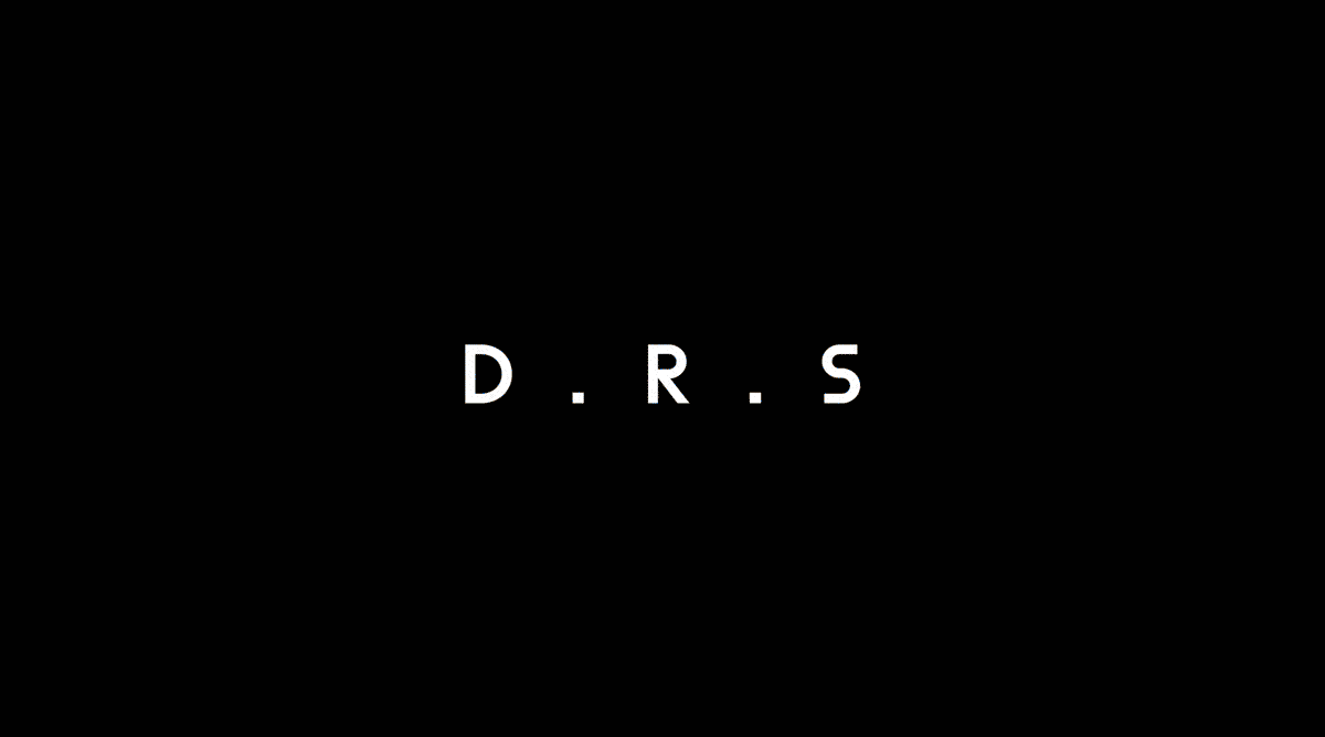
SHORTENED MARK
The wordmark can be shortened down to the acronym 'DRS'. The shortened mark should only be used in instances where the full mark cannot, e.g - where there is limited real estate.
SHORTENED MARK

SPACING
The shortened wordmark uses the same rules for spacing as the full mark; with +30 tracking applied and 2 spaces set between each word/dot.

SETTING THE MARK
There are a number of guidelines to follow when setting the DRS wordmark.
CLEARSPACE
A minimum amount of space is needed around the mark to prevent it from becoming cluttered by surrounding artwork, images, or the edge of a page.
At minimum, the clearspace should be double the width of the vertical 'i' stem. This measurement should be applied from the baseline and extend out in each direction.

SCALE
The wordmark and surrounding brand encourage the DRS wordmark to be used at a large size, however the mark works well at all scales.
There is no limit on how big you can make the mark (as long as it fits within the grid parameters), but establishing a minimum size helps ensure that the legibility of the mark isn’t compromised.

INCORRECT SETTINGS & USAGE


03
Colour
INTRODUCTION TO COLOUR
The DRS brand uses a very pared back colour palette, with only black and white being used in the majority of instances. In certain applications which will be specified later in the guidelines, a 15% black tint should be used.
BLACK
WHITE
15% BLACK


04
Typography
FUNKIS C SHARP DOTS SEMI-BOLD
Funkis C Sharp Dots in the weight Semi-Bold, is the DRS headline typeface. It should be used for all headline, title and display typography throughout the brand. Due to its eccentric and character filled nature, this typeface doesn't perform as well in larger bodies of text or at a smaller scale, and should therefore never be used this way by DRS.
CHARACTER SET
ABCDEFGHIJKLM
NOPQRSTUVQXYZ
UPPER CASE
abcdefghijklm
nopqrstuvwxyz
LOWER CASE
0123456789
NUMERALS
!?';:,.()_-–&"/[]
NUMERALS
GENERAL SETTINGS FOR HEADLINE TYPE
TRACKING
When setting headline type in Funkis C Sharp Dots, +10 tracking should be applied to maintain readability, and to allow each letter to carve out space.

LEADING / LINE HEIGHT
It is best to limit the use of the display type to headlines/titles, subheadings and short sentences (a maximum of 20 words).
As long as the ascenders and descenders don't crash, headlines should be set relatively tight. In most instances, however, the leading should not be any lower than the type size (i.e. 80pt/80pt)

CAPITALISATION
In some applications, ALL CAPS can be mixed with lower case, to emphasise certain words.
Hover to see visual


ALIGNMENT
In most instances, headline type should be left aligned. However, it is also acceptable in certain instances (e.g - socials) to centre align.
Headline type should never be aligned to the right.

SCALE IN RELATION TO WORDMARK
When setting headline type alongside the wordmark, they should be set at the same size / with the same x-height.
Hover to see visual


FUNKIS A SHARP DOTS
Funkis A Sharp Dots is the secondary typeface for DRS. This version of Funkis is slightly more rounded and balanced in comparison to Funkis C. Due to this, it is more legible at smaller sized, and should be used for body text and captions.
CHARACTER SET:
MEDIUM
ABCDEFGHIJKLM
NOPQRSTUVQXYZ
UPPER CASE
abcdefghijklm
nopqrstuvwxyz
LOWER CASE
0123456789
NUMERALS
!?';:,.()_-–&"/[]
SYMBOLS
CHARACTER SET:
BOLD
ABCDEFGHIJKLM
NOPQRSTUVQXYZ
UPPER CASE
abcdefghijklm
nopqrstuvwxyz
LOWER CASE
0123456789
NUMERALS
!?';:,.()_-–&"/[]
SYMBOLS
GENERAL SETTINGS FOR BODY TYPE
Type Scales
In most instances, body text should be a maximum of 50% of the size of headline type, and a minimum of 15% of the headline type.
Hover to see visual


ALIGNMENT
Body text should always be left aligned.

COLUMNS
Body text can be set in either one, or two columns depending on the output.

FIRST LINE INDENT
When setting multiple paragraphs of text, a new paragraph should start directly under the previous one, but with an indent to indicate the start of a new paragraph.
Hover to see visual


USE OF BOLD WEIGHT
The bold weight of Funkis A Sharp Dots can be used for subheadings, or to highlight certain details (e.g – in a caption)
Hover to see visual


MULTIPLE TYPE SIZES
In most instances, 1 or 2 type sizes should be used in one application. A maximum of 3 type sizes should be used in one application (including the size of the wordmark)
Hover to see visual


EXAMPLE OF CORRECT SETTING
Balanced leading and healthy line length. Ensure the line length for your body text is between 50-60 characters per line, including spaces.

LEADING
If leading is set too tight or too loose, the reading experience is affected. Ensure leading is balanced.
Hover to see visual


LINE LENGTH
Make sure the line length is not too short or long due to point size of body copy. Ensure the line length for your body text is between 50-60 characters per line, including spaces.
Hover to see visual


05
Composition & Layout
INTRODUCTION TO COMPOSITION & LAYOUT
In most cases there will be an accompanying template with pre determined settings for the necessary output. In the rare instance where there is no template provided, please follow these general rules.
COLUMNS
A 12 column grid is useful to use as it allows for flexibility of text columns and indents.
Landscape applications should use a grid with a minimum of 12 columns.
Portrait applications should use a grid with a maximum of 12 columns.

MARGINS
The DRS brand uses relatively tight margins, but with enough space to maintain a balanced and airy composition.
Hover to see visual


MARGINS (DON'T)
Margins should not be too tight or too generous. These parameters can flex depending on the application and the minimum requirements outlined for typographic elements.
As a guide, margins should be at least double the width of the column gutters.
Hover to see visual


INDENTS
An important stylistic element of the DRS brand is the use of indentation.

Title indents should always correspond with the grid.
Hover to see visual


FOOTER FORMATTING
Many of DRS' outputs require the use of a footer. The DRS footer should always be formatted in the same way to maintain a unified brand feel across applications.
Hover to see visual


DRS contact information should be set with the first letter of the category (e.g - T for Telephone, E for Email), followed by an indent, and then the contact details.
Hover to see visual


COLONS
Colons should not be used in the setting of DRS contact information, nor in most instances across the DRS brand.

SQUARE BRACKETS
In the majority of instances, square brackets should be used instead of round brackets.
Hover to see the visual


06
Image Treatment
INTRODUCTION TO IMAGE TREATMENT

IMAGE TYPE 1: Final Imagery


IMAGE TYPE 2: iPhone imagery


DON'T: Use iPhone images full bleed

IMAGE TYPE 3: Diagrams / Drawings

In most cases, white backgrounds should be removed, and drawings should appear on a 15% black background.
This can be achieved in Adobe software by applying the effect 'Multiply'


07
Styling Lines & Tables
INTRODUCTION TO LINE & TABLE STYLING
LINE STYLING

When using lines in designed outputs for DRS, line weight should be set to a weight of 0.5pt.


TABLE STYLING

Tables text should be set with an even top, left and bottom margin.

Text in tables should be left aligned.

Table headers should be set in bold and with a 15% grey background colour.

All of the Adobe templates use a preset DRS Table Style which includes all of the above styling.


08
Templates Walkthrough
INTRODUCTION TO TEMPLATES
Most outputs DRS will need to produce and share with clients have both a Microsoft and Adobe template. Advice for how to best utilise these templates is layed out below. Templates can be downloaded at the bottom of the brand guidelines.

LETTERHEAD: BLANK

INDESIGN

MS WORD

TEMPLATE: CONTRACT

INDESIGN
Each text element of the document has been formatted in a different typeface/size/weight (e.g titles, subtitles, body). These styles have been preset in the Character Styles.

The contract template is designed with lots of indents to aid legibility and differentiate sections of text. Preset Paragraph Styles can be applied to these text types.

When using numbering and listing within a subclause, use the Numbering/Listing paragraph style. The number should be typed (A) and then press 'Tab' key to indent the text.

MS WORD


Use the tab button to indent lists within sub clauses.

TEMPLATE: INVOICE / CREDIT MEMO / STATEMENT

The Indesign templates are designed with a preset Table Style.

To add extra rows or columns to the tables, right click.


TEMPLATE: PRESS RELEASE
Use the preset Character and Paragraph styles to format the text.

Body text should be set with a Left Indent of 7. Indents can be adjusted using the rulers.

The first line indent should be set at 0.5. this can be set by double clicking on the rulers.


TEMPLATE: DESIGN PROPOSAL / FEE PROPOSAL / PORTFOLIO
INDESIGN
Masters can be selected/changed depending on the content type.

Paragraph Styles and Character Styles are preset and can be applied to text.

Use the grid, and image formatting guidelines (above) to arrange images.

POWERPOINT
Powerpoint has less preset options than indesign so will require more manual work to format.
To see the guides, go to 'view' in the top menu.

Powerpoint does not have master pages, so to create a new page following one of the design templates, duplicate the desired layout and edit the copy.


09
Downloads
ASSETS
TEMPLATES:
TEMPLATES:
02 PRESENTATION
TEMPLATES:
03 OTHER TEMPLATES
