
Agency In Design
Agency in Design is an ontological design company focused on utilising Indigenous Knowledge informed Design principles and routines so as to produce engaging design that not only fits with our clients, but works to fit our clients in accord with all things. Specialising in strategic design and respectful brand communication we work with communities, be they community organisations, government departments, corporate clients, universities and the wider service sector.
Email: studio@agencyin.design
Phone: 0412 444 396
Address: Shop 19, Star Court Arcade Molesworth St, LISMORE NSW 2480
SJH Kreations
SJH Kreations is a Aboriginal visual arts business ran by Widjabul artist Sheldon ‘Sj’ Harrington from Northern NSW. SJH Kreations is immersed in strong cultural grounding and practice. Which has led to sharing knowledge through painting and designing. Thus creating visuals and telling story for more than 15 years. Through this work I continue to learn and share the knowledge that has been passed down through my family. The importance of connection to our Country, our family, our community and our way of being.
Email: sjhkreations@gmail.com
Phone: 0434 699 120

It is through Agency In Design and SJH Kreations the principle foundations of Cultures of Design has emerge. Adhering to culturally informed protocols and principles we move through the space of Indigenous Knowledge, aligning ontologies relationally and revealing the deep respect for the Freedom of Country which has positioned us accordingly.
Who we are

Sheldon ‘Sj’ Harrington
Director/Designer
Widjabul Artist and designer from the Bundjalung Nation on the Far North Coast of New South Wales. I have been painting, creating and designing for more than 10 years and continue to learn and share the knowledge that has been passed down through my family.

Josh Creighton
Director/Designer
Butchulla man but born, and raised, off Country; on Bundjalung Country. In my life, I have lived and worked in varying cultural contexts within this Country and this Country and Community has fostered my growth. I am also a designer and academic; having worked in Indigenous education for nearly a decade.
Our Philosophy
At Agency in Design we, as respectful designers, adhere to culturally informed protocols and principles for respectfully entering the space of Indigenous Knowledge. In this, we acknowledge all things as being in relation to Country, and then position ourselves accordingly. Like other Indigenous Knowledge informed designers, we present this from within an ontological security that recognises Indigenous Knowledge as our guiding agent.
In this space, we do not need to explicitly orient ourselves, and our routines, to appropriately position Indigenous Knowledge within any given design context, as our practice, expressed as our routines, already emerges from within this Indigenous Knowledge context. In turn, our practice recognises the shape and nature of the whole context. This is what empowers us to engage and enrich organisations though Indigenous Knowledge informed Design. The act of doing the work, aligns all of us with the work, and due to Indigenous Knowledge’s bias towards deep equity (Sheehan, 2011), such an alignment ensures that this way of doing will sustain.
This relational alignment builds enterprise that belongs with the organisations with which we work and not to us. This enterprise is a given organisation’s ability to choose what to be and how to act; it grows to hold the approaches and routines through which they can operate, translate, and articulate.
This is what we seek to empower through the relational process of Design we enact. To reveal, and support, the growth of an organisation’s agency, then demonstrate how this agency and the process of Design are related; and, ultimately, how this relationship is experienced through the visual. This is our understanding of ‘co-Design’ whereby a visual mediator, in accord with distinct Design routines, works to recognise the design capacity of everything in any given context. Through working with a mediating visual, we can empower individual agents to see their potential, so they can collaborate to position organisations to conceptualise possibilities and locate these in relation to current practice.
The visual is a fundamental aspect of being human and of Indigenous ways of being, knowing, seeing and doing, as a result, Indigenous Knowledge, as a design driven epistemology and is fundamentally human (Sheehan, 2004; 2011). As respectful designers, informed by Indigenous knowledge, we work with the visual not only because it is emergent from Country, but because it has the capacity to generate an orienting language (Sheehan, 2011) to represent patterns of relation. Through working with the visual, we can support organisation to express their knowledge as something that is alive and Placed, layered, patterned and interactive. Through a respectful design, such a process can reveal the patterns of knowledge that Country holds and position our design interactions relationally across all things.
It is their agency.
This is our respectful Design practice. One that recognises the agency of all things; acknowledging the origins of an organisations work, its place in a broader context and its connections with staff and community. As a result, at Agency in Design our drive is to support the growth of agents. To help reveal the capacity that exists within a place and further foster this to enable organisations to empower their collective agency so they can identify where they want to go. To create design that fits with our clients, but importantly, work with our clients to create design that fits in accord with all things. Such an approach transcends transactional approaches to design. It is more than delivering a product. It is an interactive process of relation that focuses on nurturing strong design communities that seek to support and enrich ‘all things’ in mutually enhancing ways (Sheehan, 2011). Source: Sheehan, N. (2004). Indigenous knowledge and higher education: Instigating relational education in a neocolonial context (St. Lucia, Qld.).
What we do
Because we are Indigenous Knowledge informed designers, who work for ‘fit’, we are engaged to work on a diverse array of projects; that span multiple disciplines, across many varied sectors.
Some of the services we provide include:
- Community and business development
- Reconciliation Action Plan Services and implementation
- Communication design (branding/marketing)
- Graphic design
- Strategic design, alignment and planning
- Personal and professional development
- Training delivery and facilitation
- Custom consultation (engagement, analysis and evaluative tool development)
Communication design - Branding and Identity
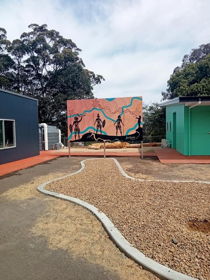
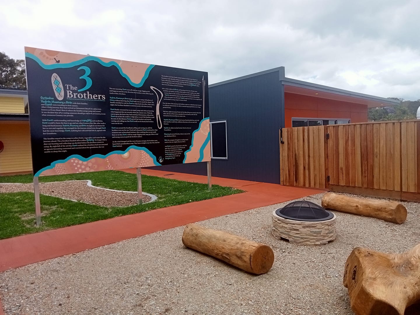
Jarjum Centre
IDENTITY, SIGN AND SPATIAL DESIGN
PLACE OF BELONGING
In 2021 the Jarjum Centre opened their new, purpose built, facility. To support this development, and commemorate their movement, the Centre engaged with Agency in Design to design a storyboard sign, a front of premises sign, and a map sign.
Our approach
We were graciously given an open brief, positioned to bring story and art to the space. However, by coming to this project quite late in the build, we had to work to adapt and adjust the design to fit with the space.
The Centre wanted the 3 Brothers Story, a story they have used in their teaching, to be prominently displayed in their new facility. When reviewing possible locations for this, and in speaking with key staff and understanding the space, we were able to design a large-scale board that not only serves to inform visitors of this important story, but by the nature of its positioning, protects the area designated for yarning circles, from being visible from outside the facility.
In addition, we had to work with the current Centre branding so as to craft a complimentary horizontal lockup that would fit in the space that the main, front of building, sign was allocated.
This work is now extending into 2022 with the design of a website, room signs and the design and production of a language based sound trail, which are all now part of a continuing, whole of organisation, project.
Logo Sysytem
Primary logo
Horizontal logo
Logotype


Signage system


Collateral


Co-Designing with living contexts
ABCD WORKSHOP FACILITATION
DESIGNING WITH COMMUNITY
Agency in Design was engaged by the NSW Department of Communities and Justice to deliver a 3 day workshop series with the aim of holding a space for service providers to reconceptualise their position in relation to their work so as to be able to design and deliver programs within an Asset-Based Community Development (ABCD) model.
Our approach
With ‘Co-Designing with living contexts’ we supported members of the service sector to engage with Asset-Based Community Development through co-Design. This 3-day workshop provided the opportunity for participants to bring their diverse knowledge’s and expertise into a safe and interactive design space where they were encouraged to see themselves as designers and empowered to learn co-Design routines. Routines that helped to better position them to understand ABCD models, co-Design routines and the community within which they work. Through a series of interactive and engaging days, participants were supported to recognise the interaction patterns of living contexts and encouraged to move from a position of designing for community towards design with community.


Rekindling the Spirit
LIVING IDENTITY SYSTEM
BRAND REFRESH
Agency in Design were in engaged to craft an AOD (Alcohol and other drugs progam) project brand identity, which included the co-Design and development of brand collateral and messaging. This process gave the opportunity, in concert with relevant staff, to undertake a comprehensive conversion of the existing branding to create an overall Living Identity System for Rekindling the Spirit.
Our approach
Through several co-Design sessions using visual dialogue processes, we are able to narrow in on the ‘What’ the AOD project was. Allowing all to have clear and shared understanding on what is AOD and how we work with it. This is where the Living Identity System wad designed. A Living Identity System is how we at Agency in Design described a modern brand identity. It is not just designed to exist within a static context but is instead designed to live in a dynamic world of changing interfaces and moving patterns of interaction. Both the AOD and Rekindling brands needed rebranding and refreshing, to make sure the communication is clear and precise and that the new identity can be independent and work in many different contexts to suit the current and evolving landscape.
Rekindling logo System

Services logo system

AOD Logo

Collateral


Connect Northern Rivers
LIVING IDENTITY SYSTEM
TRUSTING OUR NEXT STEP ORGANISATIONAL REBRAND
We were engaged to facilitate a co-Design rebrand process with the staff of Connect Northern Rivers, to reveal the identity of the place and the relationships with community. With a clear intent from the staff, we began to craft an identity system that is Connect. One that both communicates and supports the work that they do.
Our approached
We researched both organisation and the broader sector to craft a landscape that Connect was living in. Having run a workshop, and then a few impromptu online workshops to reveal Connects position. We crafted three directions that broadly spoke to these. Reviewing and gaining feedback on these directions. We crafted again, to arrive at a direction that communicates Connects position and intent.
Connect logo system
Primary team lockups

Teams vertical lockups

Secondary lockups

Team icons
Collateral


Trusting our Futures
CONNECT VISUAL ARTICUALTION

Rekindling strategic plan
A FIVE-YEAR STRATECIG MOVEMENT 2022-2026
CONNECT. REPSCT. EMPOWER
Agency in Design were enlisted to help move Rekindling the Spirit towards a renewed renewed strategic direction.
Our approach
Through this year long co-Design process we engaged all staff, and representatives from community, to craft a principled foundation from which the strategic directions could emerge. This saw us engaging in multiple visual dialogue workshops where, through a collaborative engagement with Indigenous Knowledge informed questioning frameworks, all participants were able to craft visuals as mediators. This provided all participants the opportunity, as a collective, to speak to, and through, the visuals to align their collective thinking and grow a shared understanding of Rekindling the Spirit.
From this strong foundational base, we continued to engage staff and community, mapping, co-Designing and co-creating all aspects and elements of this movement as distinct, but relational commitments. What we have crafted is a true movement; one that is Rekindling the Spirit. Reflecting the Country that it has emerged from (Bundjalung) and sharing in a philosophy that has guided its creation and will guide its future application.


GANNGAALEELAMAA
IDENTITY DESIGN
A LISTENING, THINKING, KNOWING AND UNDERSTANDING PLACE
A partnership between Widjabal Wiyabal people, Rous County Council and Lismore City Council. Provinding an holistic Cultural, Environmental and Information centre open to all.
Ganngaaleelamaa logo system


SOUTHERN CROSS UNIVERSITY CHILDREN'S CENTRE
BURRABI PLACE IDENTITY DESIGN
Burrabi Place logo system


Visual projects
BESPOKE VISUAL PROJECTS
Koori Mail
MURAL DESIGN AND INSTALLATION
OUR COUNTRY, OUR IDENTITY
For thousands and thousands of generations Country has always communicated it’s being to the people of Country. These communications have always been held close in tribes, clans and families out of respect for the intelligence of Country. The Philosophy of Country has been articulated through visual language and art, revealing the intricate and complex relation to Country through layers of simplicity (dot and line) and the emergence of knowledge. My art showcases and celebrates the hard times our ancestors have been through to keep our culture, our connections and our identity alive.
This artwork titled ‘Our Country, Our Identity’ acknowledges and pays respect the hard work that the five Bundjalung Aboriginal community organisations and staff have done to bring the Koori Mail to where it is today. And the relationship shared between all for the importance of having our voices heard. The contrast of patterns and colours shows the vast diversity of knowledge for the land and waterways within Widjabul Country. It’s an etching of our identity that has emerged through the teachings and interactions of Country.
As beautiful as it is, it is more than just a tangible object. It holds language, stories and knowledge. This is a connection to our Country, our Family, our Community and our way of being. Art is us. It is a part of who we are as a people, as being, and makes up our identity


Big W Lismore
FABRIC LIGHTBOX INSTALLATION
STRENGTH IN CONNECTIONS
This artwork is an articulation to celebrate for the efforts and the hard our community as a whole put in to keep not just Lismore but the entire Northern Rivers connected and supported through the tough times of the 2022 Floods.
The Binggings (turtles) running through the middle show the strength and resilience of our community. Deepening the generational connections and relationships. The blues and whites articulate the power of Country, revealing the patterns that change and adapt through time. This is just one aspect as to why caring for Country is an important way of being, teaching and understanding the knowledge systems that have emerge through Country.
The outer sections hold a dual purpose, one being symbolic to the different relationships that we all hold with Widjabul Country here in Lismore. The second representing and acknowledging the hard work put in by The Koori Mail which an immense connection between both The Koori Mail and Big W have established.


Wyrallah Road Public School
MURAL DESIGN AND INSTALLATION
OUR LEARNING PLACE
Creating and holding safe places to learn, share and grow are the foundations to proper education. Wyrallah Road is a sanctuary, nurturing children through their learning journey. And we see this through the owls sitting in the branches learning the patterns of Country and how this beautiful Bundjalung Country teaches all. Our children are growing more through each stage of their learning journey revealing their agency and connection to place.
Understanding the connections we all share through this sanctuary means we learn about the creation of the place we share here at Wyrallah Road Public School. You can see the connection to two of our creation stories in the sky. Our Goanna and Snake creation story link Gammi and The Three Brothers. Seeing the temporal aspect with the sky, moving from dawn to dusk as a student does from morning to afternoon. This is also representative of the time our children are on their educational journey, there is no end to learning. We are continuously learning.


Alstonville High School
HAND PAINTED MURAL AND INSTALLATION
OUR CREATION STORIES
Alstonville High School engaed SJH Kreations to tell both the Three Brother and the Dirrawong (spirit goanna) and Ngoinybah (dangerous snake) creation stories of Country through a Mural.


Northern Rivers Community Gateway
ACKNOWLEDGEMNT AND ART INSTALLATION


Commisioned Wedding gift
HAND PAINTED CANAVS
A COUPLES JOURNEY
SJH Kreations was commisioned to create an artwork to showcase a couples journey to love. Each element hold a special meaning for both along their journey.


Sugarglider Digital
DIGITAL ART PLATFORM
Displays across Melbourne and Sydney, such as 180 Lonsdale St and Charter Hall.


Visual designs
Visually articulating Bundjalung Country. Moving from the rollings hills to the flowing ocean.


Bespoke and ongoing projects
Strongbeing Journals
BESPOKE JOURNAL SOCIAL EMOTIONAL AND WELLBEING JOURNAL DESIGN
AWARENESS, AUTONOMY, ASPIRATION AND APPRECIATION.
This ‘STRONGBEING’ Journal has been designed using Aboriginal Cultural Strengths which guide the strengths-based process to deeper understanding and reflection of self in relation to all things. Cultural Strengths can assist us on the many paths we take. Developing an understanding to change our ways of learning through the doing of this journal and creating the opportunities for our cultural literacy to develop for the benefit of all (Sheehan 2012).


