The next generation
of drivetrain technology
Logo
Logo Clearspace
Joint Partnership
Logo
The Classified logo is one of our most important core brand identity elements. Consistent placement, sizing, clearspace and colour usage, our logo remains recognisable on any surface it's presented on.
Logo


Logo Clearspace
Logo Clearspace
When placing the logo, it’s important that it’s given enough space from the margins and other elements on the surface it’s presented on.
Using the ‘C’ of the logo, you can create the clearspace boundry.

Joint Partnership
Joint Partnership
When we are advertising Classified as a joint partnership, we use the same principles from the Logo Clearspace to create the lockup.
The partner's logo doesn't need to strictly follow the same size as the Classified primary logo. Use the box as a guideline to create the desired balance between the two.
Horizontal system

Vertical system
Whilst the horizontal system is the preferred layout, sometimes space will dictate that a vertical system must be used instead.

Icon
Clearspace
Don'ts
Logo & Icon Placement
Logo & Icon on Bikes
Icon
The Classified icon is a seal of approval, a timeless stamp of quality and motion, reflecting the brand’s innovative approach to cycling. We confidently use it to create a bold icon with instant recognition.
Icon


Clearspace

Don'ts
Whilst the icon and the logo can be used at the same time, they should never be used in a lockup as seen in the example below. It should also never be used completely by itself as it does not yet have the right amount of recognition to do so. Although they aren't locked up in the same logo, they should be on the same piece of communication.

Logo & Icon Placement
Logo & Icon Placement
Our logo placement system is simple and clear, but has enough flexibility to accommodate various content. These examples show how the elements can come together, but not how they should always be placed. This layout principle applies to all communications; from Instagram posts to exhibition banners, over illustrations or photography.

Logo & Icon on Bikes
Logo & Icon on Bikes
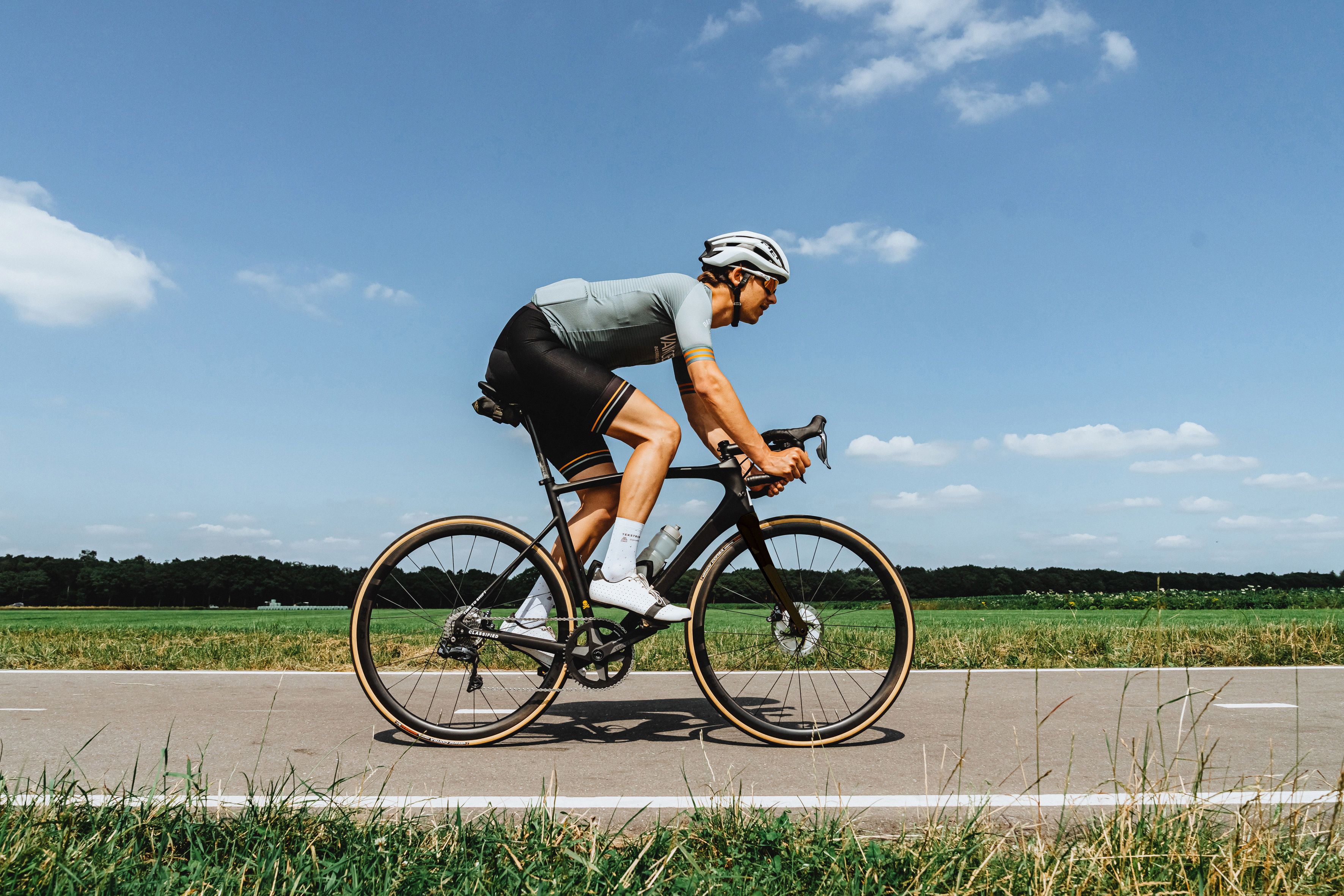
We are quite restrained when using our branding on bikes. Since we do not manufacture frames and don't want to confuse riders, our logo should be used with consideration.


Sub-brands
Powershift Hub Primary Logo
Powershift Hub Secondary Logo
Powershift Hub
The Powershift Hub technology is currently our main product, so it has its own logo lockup. The same basic principles on how to use it are the same as the main logo & icon.
The primary logo is the stacked version and should be used as default. For instances where we think the Classified brand is not well recognised, we use the second version. This will help grow our brand as we aim towards only using the primary logo.
Powershift Hub Primary Logo
The primary logo is the stacked version and should be used as default.


Powershift Hub Secondary Logo
The secondary logo is used when we think the Classified brand is not well recognised. This will help grow our brand as we aim towards only using the primary logo.


Using the Powershift Hub logo
The Powershift Hub logo should always be used in conjunction with the main logo. They should not be locked up together or even too close to each other, but need to be on the same piece of communication. This does not apply to the secondary logo which is already with the main Classified logo.

Colours
Colour Palette
Colour Usage
Colour Examples
Colours
Our primary colours are black, white and yellow. Simple and clean, with a clear accent colour to stand out on any surface where we need immediate attention.
We also use a range of greys occasionally to help maximise legibility of information. There is no set colour for the grey and can be light or dark; the only rule is that is must be completely unsaturated in colour.
Colour Palette
Black
White
Yellow
Grey
Colour Usage
Colour Usage
This graphic shows the ratio that should be used when using colour. We are mainly a white brand, and yellow is used to occasionally highlight details. When using black as the dominant colour, we still use the same ratio (as seen below).

Colour Examples
Colour Examples

There are some occasions when yellow can be the main background, but this should be used sparingly for special instances.
Typography
Sample Glyphs
Weights & Sizing
Kerning, tracking & leading
Alignment
Case
Licensing
Typography
Straight-forward with a clear, strong and polished voice. It never takes anything away from the topics we talk about. Our typeface is called Suisse — a utilitarian font that is the best Swiss Grotesk available in digital form. It’s the typeface of choice for any designer who’s fond of the Swiss Style and its legacy. Also known as International Typographic Style, it’s characterized by sans serif type typically set flush-left, in grid-based layouts that are derived from the content.

Sample Glyphs
Sample Glyphs
Below are an overview of some the Suisse glyphs.
ABCČĆDĐEFGHIJKLMNOPQRSŠTUVWXYZŽabcčćdđefghijklmnopqrsštuvwxyzžĂÂÊÔƠƯăâêôơư1234567890‘?’“!”(%)[#]{@}/&\<-+÷×=>®©$
ABCČĆDĐEFGHIJKLMNOPQRSŠTUVWXYZŽabcčćdđefghijklmnopqrsštuvwxyzžĂÂÊÔƠƯăâêôơư1234567890‘?’“!”(%)[#]{@}/&\<-+÷×=>®©$
ABCČĆDĐEFGHIJKLMNOPQRSŠTUVWXYZŽabcčćdđefghijklmnopqrsštuvwxyzžĂÂÊÔƠƯăâêôơư123456789‘?’“!”(%)[#]{@}/&\<-+÷×=>®©$€£¥¢:;,.*
ABCČĆDĐEFGHIJKLMNOPQRSŠTUVWXYZŽabcčćdđefghijklmnopqrsštuvwxyzžĂÂÊÔƠƯăâêôơư123456789‘?’“!”(%)[#]{@}/&\<-+÷×=>®©$€£¥¢:;,.*
Weights & Sizing
Weights & Sizing
Whilst Suisse comes in many weights, we only use 2: Regular and Bold. Throughout the visual identity, Suisse Regular is utilised the most. Suisse Bold is used for smaller type size headings to maximise legibility of information.

Kerning, tracking & leading
Kerning, tracking & leading
Always have the tracking settings for Suisse turned to Optical rather than Metrics. We use -10 for large headlines, and -20 for body copy. Larger titles may need some additional kerning if any characters are touching.
We want the leading to follow a similar rule of close, but not touching. Descenders should never interfere with Ascenders on the line below. A good rule of thumb is 2pts above the font size, although this decreases when you increase font size.

Alignment
Alignment
Large typography should always be left-aligned or centered. It should never right-aligned or justified.


Smaller typography should always
be left-aligned. Never centered,
right-aligned or justified

CCase
Case
When setting type, sentence case should always be used unless working with a tagline or pay-off.

Licensing
Licensing
These fonts are licensed under the Swiss Typefaces font foundry. This means, that you need the appropriate licence to use it across your products & projects — print or digital, commercial or otherwise.
Videography
Videography
Our videography library is an ever-expanding roster of great videos to tell the true story of Classified. High quality videography builds brand reputation.
Email our brand department to download the relevant videography you need for your project.
Photography
Photography
Our photography library captures the true spirit of our innovation, and our love for cycling. An appropriate use of high quality photography will accurately portray Classified in it’s true light.


Email our brand department to download the relevant photography you need for your project.
Illustrations
Illustrations
Our illustrations confidently show our products in a technical, sophisticated light. Referencing the engineering drawings from which they were created, the clean look shows our innovative spirit and also helps build brand recognition.

Illustrations Colour
Illustrations Colour
The illustrations can be used in any of our brand colours on any solid background. We do not use them over photography, or use more than one colour.


Icons
Icons
Our icons help showcase the benefits of our drivetrain technology in a quick and simple to understand manner. The simple construction reinforces our sophisticated and innovative approach to cycling.

Each icon has been designed using the same grid so that they are the same relative size, and feel part of the same group.
Use the grid to workout the size of the icon compared to its accompanying wordmarque.


Applications
Applications
Continuously updated with relevant examples.


