Brand Guide
01
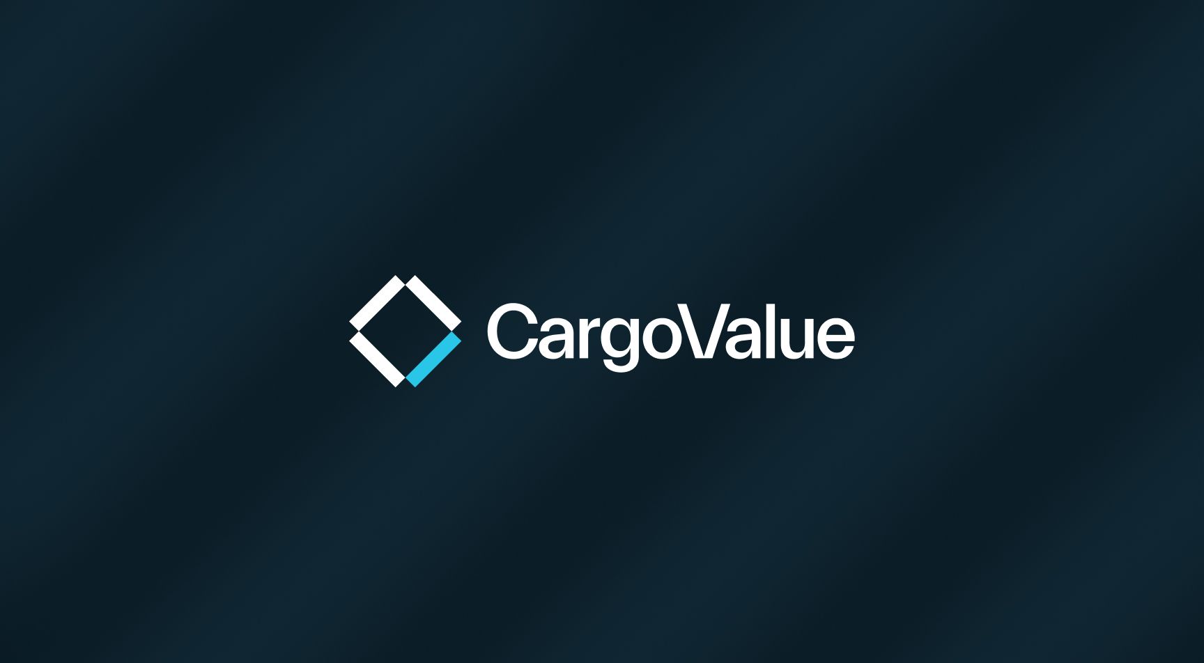
Logo
Symbol and company name are carefully put together and should never be changed. We have collected all the logo versions here. Be sure to use the right format for the right surface.
Logo
Colored Logo is used in primarily on dark backgrounds. Never use the colored logo on light or colored backgrounds. A white and black version are available for this purpose.
Always maintain a high contrast between foreground and background when placing logo.


Safety Zone Logo

Logo Symbol
The logo symbol should preferably only be used on digital surfaces, such as profile pictures or social media.


02
Typography
CargoValue uses Everett as primary font.
Everett is designed by Nolan Paparelli from Switzerland. For headings / display or bigger text use medium. Subheadings and body use regular version.
Space Grotesk is used as a secondary font for details and smaller text and also for all numbers. A mono version is included for use in apps where legibility is a priority.
Everett Sans
(Primary font)
This is the primary font for CargoValue and is used in most cases. Headlines, subtitles, quantity text and display text.


Space Grotesk &
Space Mono
(Secondary fonts)
Space Grotesk is used as a secondary font for details and smaller text and also for all numbers.
A mono version is included for use in apps where legibility is a priority.


Typographic Hierarchy

System Fonts
System fonts are used on digital surfaces where the main font Everett cannot be used. Examples are in PPT / Keynote and in Word / Pages templates.


03
Colors
The profile colors should always be used with the color codes given here. Be conscious when using colors. Text and elements should have adequate contrast and size.
Color Palette
The primary colors are darker and brighter blues. Green and purple accent colors are to be used wisely to give a more energetic look.
Ocean Blue
AI Orange
Ocean Blue Light
AI Orange Light
Deep Sea Black
Deep Sea Blue
Blue Clay Dark
Blue Clay
Blue Clay Light
White
Clay Light
Clay
Green Clay Light
Green Clay
Green Light
Color Use
Accent colors are a great way to create visuals with more energy and to make the overall feel richer. Here you see the suggested color combinations that work in harmony with each other.


04
Graphic Elements
The graphic elements are based on the the core symbol of CargoValue and can be used in different ways. There are two different elements. Lines and bars.
The assets can be zoomed and cropped to make compelling elements for any design.


05
Icons
Icons are a part of the streamline library
and the choosen style is called Material Solid.

06
Images
Brand images should be connected to logistics and have an industrial, powerful feel to them. Don't overuse images of water/shipping but find a good balance between all aspects of logistics.
Images of people should always be situated in a working environment, whether it be inside an office or out in the field. Be careful of not overusing people in hard hats and safety vests.
NB! These pictures are for reference only and will be replaced as soon as CargoValue takes their own pictures.


07
Examples
Here you can see examples of the profile as it is thought to be on various surfaces.

CargoValue is a digital twin of maritime supply chains; it is the most intuitive and user-friendly solution on the market,
managing ocean-based transportation.


Questions?