CONTENTS
Click any of the four main pillars of the BORJO MI Style Guide to explore the content. To jump straight to the content of each section, click the top-right menu.
In a hurry to get the Borjomi Brand Assets? Click the button below.
INTRO
Borjomi brand symbols are already well known all over the world. Therefore, the main goal of this guide is to maintain unique brand identity while enhancing brand awareness. Alongside the wordmark, colors, and fonts, the newly added heritage icons comprises the main components of corporate identity. Consistency in their use allows you to maintain clarity and the formed image of a unique product – Borjomi mineral water.
BORJOMI
WORDMARK
Depending on certain print conditions, is used either Pantone logo version – white or blue (Pantone 282C or its equivalent in CMYK), Borjomi Georgian Green color or its equivalent in CMYK. In the distribution of the logo in online materials is used color model RGB.
Using the logo without the slogan is allowed if it's not possible
to use the full logo.
Hover the shown examples to discover the best practice on wordmark colors and backgrounds.


WORDMARK
CLEAR SPACE
Be sure to follow the shown exclusion space for our wordmark as this will allow it to breathe. This clear space has been created using the width of the letter ‘I’. For example 'x' = the width of the BORJOMI 'I' character.
No other graphic elements should enter this zone.
The same rules apply when placing the logo on colored backgrounds or on top of an image.


WORDMARK USAGE
Please refrain the use of the blue wordmark on dark graphic background. The wordmark must never be placed inside white (or any other color) graphic container.
In exceptional cases, any other acceptable usage requires additional agreement with the brand team.
Hover the images to see the correct use of the wordmark on the different backgrounds.


DO NOT distort or rotate the wordmark


DO NOT outline the wordmark


DO NOT recolor the wordmark

DO NOT use the positive wordmark
on dark backgrounds
DO NOT apply effects to the wordmark
DO NOT apply gradient backgrounds to the wordmark

BORJOMI GEORGIAN GREEN
Hex: #007973
RGB: 0, 121, 115
CMYK: 85, 0, 42, 35
PMS: BORJOMI GEORGIAN GREEN
Tints

BORJOMI RED
Hex: #CD1E24
RGB: 205, 30, 36
CMYK: 9, 100, 100, 7
PMS: 485 C + 3% Black
DEEP BLUE
Secondary Color
HEX: #001f3b
RGB: 0, 31, 59
CMYK: 100, 80, 40, 60
PMS: 282 C
SAPPHIRE BLUE
Packaging Color
HEX: #0033a1
RGB: 0, 51, 161
CMYK: 100, 91, 9, 1
PMS: 286 C
LIGHT GEORGIAN GREEN
Packaging Color
HEX: #93ccc7
RGB: 146, 204, 199
CMYK: 48, 0, 25, 0
PMS: 564 C

GRADIENS
Subtle gradients as backgrounds make static and dynamic content come to life and works well as an alternative to solid color backgrounds.
Gradients can be made using Borjomi swatches and the different gradient tools in Adobe Illustrator or Photoshop.
Hover over the images to see the gradient setup.


In imagery, the Georgian Green should always be present. But we’re loosening up the use and rules, to allow for more vibrant and colorful campaigns. As seen in the following examples; adjusting hue, brightness, and tints of the same colors can provide a wide range of variation, while staying within the overarching brand colors.


If an image has either green or red or both (L), best practice is to use secondary colors or tints for the graphic elements. If an image doesn't have any of the primary colors (R), best practice is to use the primary colors for the graphic elements.

Image Color: Primary Colors
Text/Graphic Colors: Secondary Color

Image Color: Secondary Colors
Text/Graphic Colors: Primary Colors


Secondary Typeface
Public Sans Light (Body and web)
ABCDEFGHIJKLMNOPQRSTUVWXYZ
abcdefghijklmnopqrstuvwxyz
0123456789
Helvetica Regular (Cyrillic)
АБВГДЕЁЖЗИЙКЛМНОПРСТУФХЦЧШЩЪЫЬЭЮЯ
абвгдеёжзиклмнопрстуфхцчшщъыьэюя
1234567890!@#$%^&*()
BI-LINGUAL TYPOGRAPHY
Vowels from the Georgian Mkhedruli script are infused in the Latin and Cyrillic alphabet. This allows us to playfully use typography in various situations, while still showing and honoring the uniqueness of the Georgian scripts.


HERITAGE PATTERN
We unfold the Georgian flag, using the same shapes that form the Bolnisi Cross, as a visual system. rooted in the ornamental history of Georgia.
This highly expandable and dynamic approach is allowed to be used for all purposes regarding overall brand communication.


EXCLUSIVE ‘STORY’ PATTERN
The pattern with the embedded story should exclusively be used as
a stand-alone element. The pattern can be used on products, packaging,
posters, and OOH. Therefore, this pattern is not to be used on top of
imagery and other types of content on Social Media.
PLAYFUL ORNAMENTS
The symbols play an active part in the overarching communication and can be stacked and grouped in countless different ways. You're allowed to change the colors of the pattern, but the best practice is to use solid brand colors or tinted versions of the brand colors.


THE DEER
In photography, we welcome the deer as the mythic creature, referenced in the myth of Borjomi water. We see the deer hiding in the background. At other times it's seen as a calm and curious creature amongst humans.


The look and feel for key visuals and lifestyle images are that the leading color tone is based on Borjomi green. The image temperature is warm, and contrast is an essential setting as well on all images. The product is an integral part of all photos, ensuring that it's sharp, in focus, well-styled, and in new condition. No used can or glass bottles.
Printed on fabric, carved in stone, embossed in paper. Using the deer as a graphic entity can allow for great variety in the way we show our connection to our spirit animal.


The distinctive Borjomi mark and its unchangeable symbol is the image of a deer. It can be used in Borjomi advertising materials as an additional element.

The deer symbol is placed on a monochromatic background – mainly on white, on any light contrasting background, on black, on dark blue (Pantone 282C or its equivalent in CMYK), or Borjomi Georgian Green (100% tonality).
The color used for the symbol is Borjomi Georgian Green (or its equivalent in CMYK) with tonalities of 100% and below, depending on the background on which it is located, or its needs.
You can use the deer symbol with transparency, starting from 15% Pantone Borjomi Georgian Green color or its equivalent in CMYK. A deer symbol with less than 50% opacity is placed primarily on a white background.

Keep in mind, that not all photography should include a mountain surface. These examples should be considered as a solution whenever it fits within the context.
THE MOUNTAINS
... are used to add texture to solid backgrounds or to add a bit of depth. It can act as an extrusion, raising the paper from the surface or create a mythical setting like in the images below. This allows us to blend between tactile and digital realms.


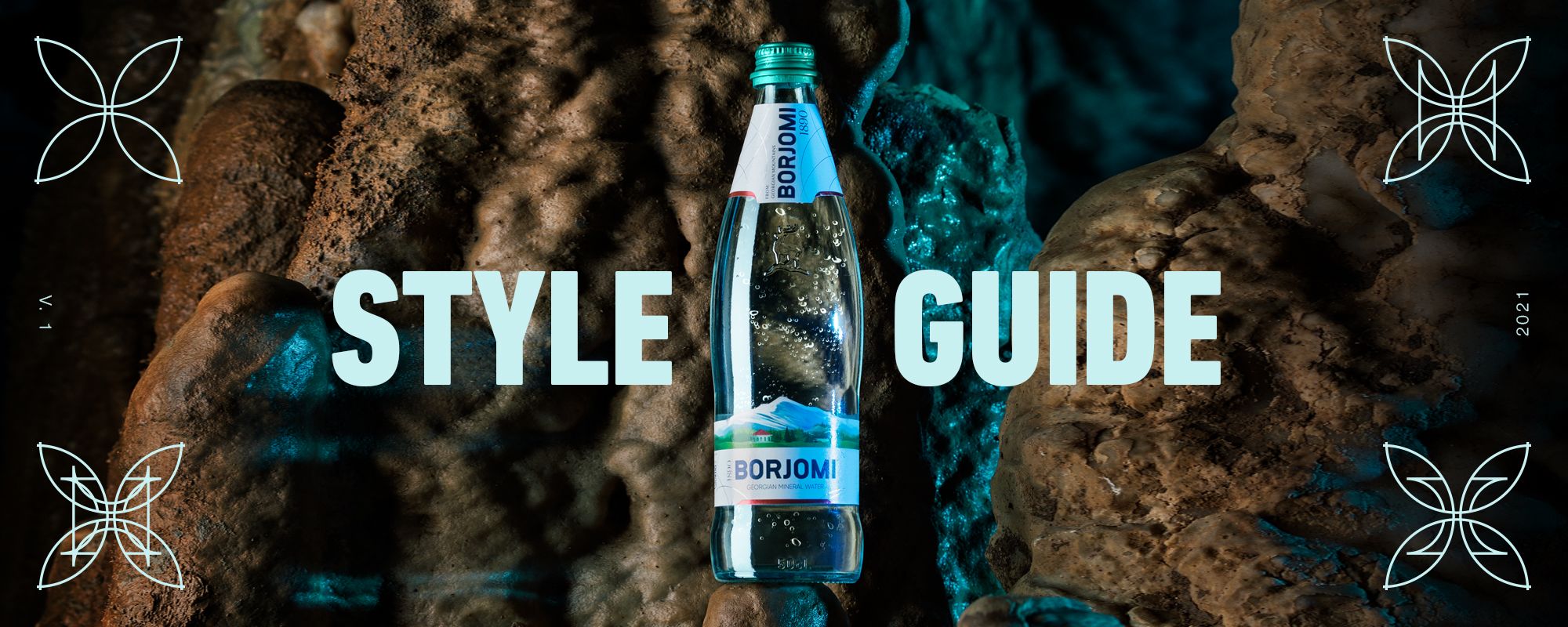
Example of cave and mountains look. Please note: It must only be real Georgian mountains. Not rocks or cliffs. Only the beautiful landscapes of Georgia.

Click the buttons to download the PDF Version of the style guide and all the brand assets.


PHOTOGRAPHY
We have created an asset bank with high-quality assets. All images are available both as final layouts and raw files.
Hover the images on the right for an overview of the different types of content.


POST STRUCTURE
When posting the content it's important to keep a variety in the look and feel. Never post a lifestyle post next to another lifestyle post and a product post next to a product post. Mix it up to make it more engaging.


PHOTOGRAPHY | POST STRUCTURE | PROFILE PICTURES | PATTERN | TOV | FILTERS & STICKERS
PROFILE PICTURES
The profile picture is created with the thought in mind that you it fits the overall design of the brand as well as having a readable Borjomi logo centered.
The logo can be used both as a circle and square for consitency on different platforms.


Alternative: Rounded rectangle


PATTERN
To ensure that the pattern is always placed consistently across all types of content, we've created the grid below. The grid works as a guideline for the placement of the symbols.


The grid has built-in clear space from the edge to the patterns. Scaling of the grid should always be done proportionally to adhere to the space around the symbols.
For carousels on social media the grid is extended to the width of the content.


PHOTOGRAPHY | POST STRUCTURE | PROFILE PICTURES | PATTERN | TOV | FILTERS & STICKERS
TONE OF VOICE
BOLD
Supported by our heritage, we stand boldly. We always write single-minded, powerful sentences that cut through the clutter.
Don’t push pride into arrogance. We elevate Borjomi, never talk down other brands or water.
UNAPOLOGETIC
Borjomi is unlike all other water, and we stand proudly by that. We don’t beat around the bush or hedge our bets.
CELEBRATORY
We rejoice in the Life Force that Borjomi gives. Our powerful messages celebrate the richness of life and our mythical heritage.
BOLD
Supported by our heritage, we stand boldly. We always write concise, powerful sentences that cut through the clutter.
• Short captions.
• One message per caption.
• Unexpected, daring twists.
Is the caption concise?
• Don’t leave the viewer confused.
• Confidence is great, but should never overrule communication.


UNAPOLOGETIC
BORJOMI is unlike all other water, and we stand proudly by that. We don’t beat around the bush or hedge our bets.
• Active statements – never passive.
• Pride in the product so strong it entertains.
• Product benefits are supreme.
Does the caption elevate BORJOMI?
• Don’t push pride into arrogance.
• We elevate Borjomi, never talk down other brands or water.
CELEBRATORY
We rejoice in the Life Force that Borjomi gives. Our powerful messages celebrate the richness of life and our mythical heritage.
• Celebrate life in all of its facets.
• Embrace our mythical heritage – but stay grounded.
• Appeal to body, mind, and soul.
Is the caption emotional?
Don’t romanticize or discount other’s lived experiences. While a good attitude helps a lot, not everything can be solved with a smile.

LANGUAGE TO AVOID
Any medical, informational, or slang-based wording. No puns or wordplay as everything will be translated.
CUT THE ADVERBS
All of them! Really, very, and basically. Slash and burn! It will force you to choose the best words (did you drive quickly or rush, race, or speed?).
PICK STRONG VERBS
Are they as precise as they can be? Maybe you edited a story, but perhaps you rewrote, revised, or polished it.
• Limit exclamation points.
• Make word choices to convey excitement, don’t lean on punctuation.
TYPOGRAPHY
A key differentiator in our communications is our hybrid script treatment. It substitutes selected vowels for their Georgian counterparts.
Priority changes are A, E, O & U
(in descending order).
Don’t change more than 50% of the vowels to ensure readability. Keep copy on images 6 words or shorter.


The Heritage Pattern should be applied as single elements in the corners, stacked elements, or as horizontal/vertical ribbons. See further references below.


The glow is applied to people and/or product. Try to keep a somewhat natural blend between glow and image. Examples of glow/image ratio below can be seen

Bubbles and droplets can be used as overlays and animated elements.
For Internal Use Only.
Last updated 17.04.2023
BORJOMI 2023 ©