Brand Guidelines
Updated October 9, 2025
Contents
1. Brand Positioning
1.1 Company Mission
We connect everyone with their past so they can discover,
preserve, and share their unique family stories.
1.2 Brand Promise

2. Key Brand Elements
2.1 Logo
The logo represents the Ancestry brand's mission to connect everyone with their past so they can discover, preserve, and share their unique family stories.
Rules
The logo is a globally recognized mark and must be used consistently across all assets.
Only use approved artwork-sourced files—do not attempt to reconstruct.
To ensure readability, the logo should always be at least 18 pixels in height in an accessible colorway.
Only use approved color combinations—the logo with the green leaf mark is preferred.
Make sure the logo doesn’t cover important details or compete with busy photography.
Use enough contrast when the logo is placed over photographs.
Only use a solid color logo when the logo with the green leaf is not accessible.
2.2 Core Color Palette
Ancestry uses a minimal color palette to ensure consistency and recognition on a global level.
Ancestry Green
Ancestry Gray
Ancestry Blue
Rules
Use Ancestry Green and gray as the main colors for all Ancestry family history marketing.
Use Ancesty Green and blue as the primary colors for all AncestryDNA digital marketing.
Use Ancestry Green, gray (418C), and blue for all printed DNA kits.
2.3 Digital Color Palette
The digital color palette mostly plays with beige and dark brown, with hints of green for the Logo Leaf.
Ancestry Green
Brown Primary
Brown Secondary
White
Beige Primary
Beige Secondary
Green Primary (Forest)
Blue Primary
Blue Secondary
Light Green 01
Light Green 02
Light Grey
Light Blue 01
Light Blue 02
Black
Rules
Use browns, beiges, and white for backgrounds, typography, and family tree.
Use Ancestry Green for the logo, Big Leaf, and family tree connectors.
Never use the secondary background colors for full landing pages or CRM—they are preferred for individual modules on landing pages and CRM or performance assets.
Use dark and light colors from the palette to reflect the dark and light product experience.
Never use white for backgrounds on performance assets.
Always use colors that contrast with the rest of the colors on the page to ensure contrast.
2.4 Banner Colors
Draw attention to more urgent information with slim banners.
Blue Primary #117FA6
Blue Secondary #07536E
Forest Green #328800
Urgency Turquoise #43D8B2
Turquoise #52B3AF
Rules
Use for CRM, GDN discovery, and performance.
Use Ancestry Green primarily for family history assets.
Use urgency turquoise for urgent messaging.
Use blue shades for DNA/Traits—can use whichever works best with the design.
2.5 Print Color Palette
The colors below represent our color palette for all printed materials—take note of special circumstances and formulations.
Ancestry Green
Ancestry Gray
AncestryDNA Blue
Ancestry Red
Beige Primary
Beige Secondary
Rules
For marketing such as tradeshow booths, handouts, print ads, etc., use the
CMYK color versions.
For packaging such as DNA Kits, swag, stationary etc., use the PMS versions.
An important note: When using the PMS version of our green ALWAYS use 382U. NEVER use 382C. The reason is that the formulas for each are slightly different to accomodate uncoated or coated papers. and the 382C prints out to be more of a neon greenish-yellow.
LAB colors are available for the Ancestry Green, gray, and blue.
Always use the CMYK values for the beige colors.
The red is only found in the DNA kit and is used for warnings, urgent, and attention callouts.
2.6 Typography
Fonts SangBleu Republic and Suisse Int’l are used across all channels. Use the serif font for headlines and the sans serif font for longer text. We have four font weights that we use in total—two for each font.
Serif
SangBleu Republic Bold
SandBleu Republic Medium
Sans serif
Suisse Int’l Semi Bold
Suisse Int’l Regular

Rules
SangBleu Medium for headlines.
Suisse Int’l Regular for subject lines and paragraphs.
Suisse Int’l Semi Bold for CTAs and price lockups.
Center or left-align text, whichever suits the layout best.
In roundels (or badges) we can mix serif and sans-serif fonts.
Price should always be in sans serif.
2.7 Leaf
The Leaf mark reflects the brand promise of Meaningful Discovery. It relates to the hint leaf which is used in family history research—appearing when a user gets a suggested hint that guides them to new discoveries. The design is formed from a leaf and a magnifying glass.

Graphic Leaf
(Only used by UX)
Should be either filled or outlined and used as an isolated element.
Make sure it always has the stem.
Use the color combination of
Ancestry Green and brown primary.


Big Leaf
Used in marketing as a graphic element or part of a photo montage.
Use Ancestry Green.
Fill or outline using a medium or thin weight.
For more information, check out the Photography section.


Big Leaf (with stem)
Used in marketing as a stand alone graphic element.


Hint Leaf
Used by UX to signify there’s an Ancestry Hint on a user’s family tree.
Used by marketing to highlight family history memberships.
Make sure it always has the stem.
Outline and fill with forest green.
Rules
Always position the leaf behind a character's head.
Use Ancestry Green at 60% opacity.
Can be either filled or outlined.
Make sure the leaf shape isn’t too big or small so it remains recognizable.
Use a thin stroke for a more subtle design.
Make sure to include on key onsite pages (ACOM, DNA, FH)—it doesn’t have to be a hero image.
Avoid overuse – particularly on landing pages or information-heavy assets.
2.8 Vertical Brands: Fold3, Newspapers.com,
Find A Grave, Geneanet logos
Our associated brands are part of the Ancestry family and follow similar rules and approaches, although each has its own set of logos, colors, and fonts.

3. Design Elements
3.1 Family Tree
Use the family tree to recreate the user experience. There are two versions—the product version which represents the actual UI and the designed marketing version which is more representative of the experience. You can show in a horizontal structure (pedigree view) or in a vertical structure (family view).
Pedigree View
Family View


Male Pedigree Avatars
Male Family View Avatars
Female Pedigree Tree Avatars
Female Family Tree Avatars

Product Family Tree
The family tree is an important part of the product experience—it’s composed of family member cards and connecting lines. Use on assets to represent the actual user experience.
Rules
Use the light or dark gray background with the gray connecting lines.
Male icons are always on the left.
Colors of male or female icons should be matched to the lines and nodes added.
Marketing Family Tree
Use this version of the family tree to help bring collage-style designs to life.
Rules
Use the product tree lines to add clear branding and help stand out against darker backgrounds and imagery.
Use avatars from the product experience or create your own historical ones to add more context to the story.

Rules
Place the product version of the family tree on devices to show users an accurate product experience.
Use the designed marketing version of the family tree as an integrated design element to show the experience in a more stylized way.
Colors can change to match the design.
3.2 DNA Box
Use packshots of the DNA box for AncestryDNA and AncestryDNA + Traits assets.
BAU DNA Box
DNA+Explorer Bundle Box
Traits Box


Angled to the Right
Tilted Back
Angled to the Left


Rules
To avoid the appearance of floating, make sure to have a visible floor and shadow.
Use over the main image or in isolation.
Angle of the box should visually align with the background perspective to feel grounded.
Different regions have different rules: for SE, DE and CA-FR make sure to use the BAU box without ‘DNA Activation Kit’ text.
Only use the Traits box for Traits assets.
3.3 DNA Pie Chart
The pie chart represents the breakdown of different regions a customer will get from their DNA results.


Pie Chart Color Specs

Pie Chart Usage
Chart Card


Within Infographic


Rules
Can use on CRM, landing pages, and performance assets.
Make sure to include the DNA box or the map where added context is needed.
Anytime you show a pie chart, make sure it starts in the 12:00 position and moves clockwise starting with the largest ethnicity percentage and ending with the least.
Use the correct colors in order going clockwise according to the examples shown above. (Green, blue, orange, pink, blue, etc.)
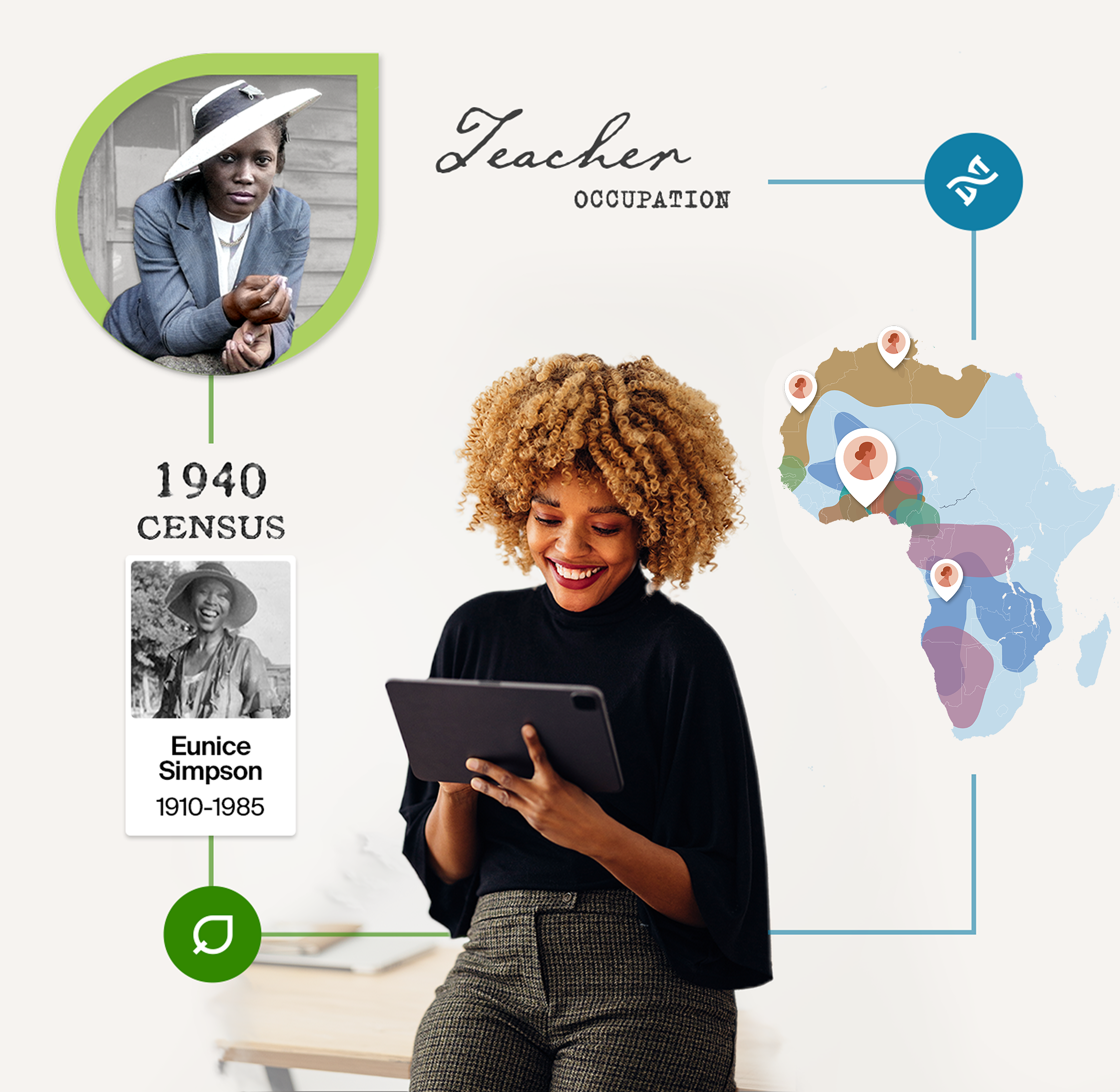
3.4 DNA Map
The DNA map represents all the different places around the world where a customer might be from. As of October 2025, there are 3,600+ places around the world but note that these ancestral regions and journeys change each year based on scientific updates.
Ancestral regions
Avatar Map

Ancestral journeys
Ancestral journeys


Product Map
The product map is a replica of the user interface and is one of the DNA elements used to show the DNA results experience.
Rules
Always place the product map within tablets or phone screens in a design.
Colors should remain true to the actual experience.


Illustrated Map
The watermark illustrative map is one of the DNA elements and is used to highlight AncestryDNA regions. The dark map is used as
a background texture across campaigns and promotions for DNA. Make sure when highlighting areas on the map that they make sense for the region the design is for.
Rules
Use transparency to highlight specific areas.
Use in the background of creative to add context.
Make sure any journeys are accurate.
Rules
Place the product version of the map on devices to show users an accurate product experience.
Use the designed marketing version of the map can be used alone or with a family tree to show the benefits of an AncestryDNA and an Ancestry membership in a stylized way.
3.5 Infographics
Infographics are used to support the creative narrative of the design. They are a visual representation of the onsite experience. We use them as a simple and effective way of visually communicating information.
Abstract UI:
This style is used when trying to give directions and explain functionality using a simplified form of our actual UI. This is a "shorthand" of what a real experience will look like. It works well in instructional videos and marketing pieces.


Conceptual Illustrations:
We use this style when we are trying to convey concepts only. These are used mainly in CRM emails and on landing pages and try to simplify sometimes complex ideas in a friendly, clear way.


Family History Infographics
These infographics are additonal elements that can support historic imagery and strengthen the overall narrative.
The majority of collages used for family history assets are taken directly from product family trees,
which can be seen in Section 3.1.


DNA Infographics
The infographics for DNA are split into three categories, DNA matches, DNA map, and DNA traits. These are used across the majority of DNA assets, often accompanied by the DNA box and other supporting elements.
DNA-Traits


DNA-Matches


DNA-Map


Rules
Infographics are only used as supporting elements in creative work.
They must only be used for their assigned category (family history or DNA).
Infographics are not used as the sole hero for a piece—exceptions can be made on carousels for any slide after the first and smaller assets like GDNs.
Family history infographics should reflect the actual product experience.
DNA infographics should represent the region that the assets would be live in.
Ensure that the copy of the asset aligns well with the content of the infographic.
3.6 Devices
Use these devices to help people envision our product in situ, typically on Apple products. These serve as "containers" of imagery, making it clear that Ancestry is accessible through laptops, phones, tablets, and desktop computers.

3.7 Icons
Use icons to make it clear which products are being spoken about. They also help link back to specific parts of the user experience.
Hint Leaf icon
DNA icon
Traits icon
Rules: colors
Use primary forest green for the hint leaf icon.
Use primary blue for the DNA icon.
Use secondary blue for the Traits icon.
Rules: placement
If using an icon with a box, make sure to centrally align it at the top.
Only use icons when there is limited space for context.
Use only the approved colors and shapes.
Make sure not to overuse icons or place them in busy assets.
Don’t create your own icons.
3.8 Roundels/Badges
The badge should be kept simple and consistent. It is used to highlight discounts and other important time-sensitive information.


Examples of badge/roundel usage within collages


Rules: colors
You may vary the colors of the roundels with what is within our brand color palette.
A couple of exceptions are:
Never use our primary or secondary blue roundels on any family history promotions.
Never use our primary or secondary green roundel on any DNA promotions.
Rules: placement
If used in a design with a DNA box, apply over the top of the box like a sticker.
For assets where it’s not possible to overlap a badge and a visual, make sure it stands alone but still in harmony with the other assets.
Never have more than one badge on an asset.
Use the price lockup without a roundel for smaller assets to maintain legibility.
3.9 Buttons
Use buttons to clearly signpost a link (see section 7.7 for copy guidelines for buttons).
Marketing Primary Button
Secondary Button
Secondary Button


Secondary Inverted
Search Clickable
Arrow Clickable


Rules
Use the regular primary buttons (CTAs) for highlighting
the most important/desired action.
Primary buttons: for onsite assets, use blue as the dominant CTA color.
Primary buttons: in other marketing, use green as the dominant color.
Use regular secondary buttons for less prominent actions—they work well with primary buttons.
If offering more than two CTAs or product offerings, use the primary inverted button.
Primary inverted button: use opacity to show various shades of gray.
Size can change depending on assets e.g., small CTAs for small performance assets.
3.10 Price Lockups
Price lockups show the sale price and the original price for clear offer signposting.
US Price Lockup
UK Price Lockup
AU Price Lockup


4 for 20
6 Months Offer
3 for 1


Rules
Use the correct currency for each region.
Only include ‘+ shipping’ for UK, IE & DE.
4. Photography
4.1 Historical Photos
Use high-quality, storytelling photos that capture specific moments or intriguing people. The photos should show candid moments of jobs, family interactions, military service, and family events—anything that tells a story captured on film.

Strong Image Choice
Poor Image Choice


Spotlight effects
Spotlight effects are a series of photo manipulations that we apply to black-and-white photos in order to bring attention to specific people and details.
3D Spotlight
Different background layers are masked and progressively blurred and faded in order to create a 3D effect.
Light Spotlight
Hero is masked while the rest of the photo is faded on a light background color—this spotlight is ideal for light photos.


Dark Spotlight
Hero is masked while the rest of the photo is faded on a dark background color—this spotlight is ideal for dark photos.
Ink Spotlight
On busy designs, mask out the background of a photograph with an ink fade—this spotlight helps the hero stand out.


Tint
Tint is another way to bring a photo to life and draw specific elements from a picture, particularly those involving groups of people and crowds. This effect can be achieved by carefully colorizing by hand or using AI technology.
Selective Tint
Color is applied to the hero only, leaving everything else in black and white.
Frame Tint
Color is applied in a square or rectangle with the aim to highlight a specific person or detail in the photo.


Watercolor Tint
Color is applied as if the photo was painted with watercolor. Use an inky brush to mask the photo.
Circle Tint
When photography is not the main focus of a visual, the colored hero can be masked in a circle with a few details popping out.


Rules
Only use images of children if they were taken over 100 years ago.
Refrain from using images depicting war, featuring weapons or showing death.
Before choosing, question whether the image could be triggering.
Don’t use damaged or low-quality images e.g., blurry, under/overexposed.
Make sure it’s clear what’s happening in the image.
If people are featured in the image, make sure their faces aren’t hidden or distorted.
Avoid images where the subject is too posed—candid shots are preferred.
Choose an image with a clear hero—a person ideally looking towards the camera
with a happy facial expression.
Images can’t include cigarettes or alcohol.
4.2 Records
Record are a vital part of the family history experience. We can promote depth and breadth by including actual records in designs.

Strong Record Choice
Poor Record Choice


Highlighting Records
Use the highlight technique for records in order to draw attention to specific names, professions, or other interesting details.
There are two main methods, either a fade highlight or a focus highlight.
Fade highlight means you can show a large part of a record, while focusing in on specific details.
Focus highlight means you can just pick out specific parts of a record and display on their own.
Rules: Fade Highlight
Use a blur, lower opacity, or layer masks to fade
out records.
Highlighted detail should be at 100% opacity.
Colors should be brown primary, Ancestry Green,
or white.

Rules: Focus Highlight
Focus on a specific aspect of a record and ignore
the whole page.
Combine parts of a record with other records to tell
a story.
Colors should be brown primary, Ancestry Green,
or white.

Manipulating Records
The records that support the narrative of the design are not always legible. In these circumstances, information such as names, occupations, and birthplaces can be manually written into the design using a handwritten script font like P22 Cezanne, Emily Austin, or Schooner Script. All of these are part of the Adobe fonts collection.

Rules
Use relevant records to highlight part of the character’s backstory e.g., name, occupation, and location.
Place records carefully so they support the hero.
Use Ancestry Green to highlight key information from the record (see next section below).
Add custom handwritten and/or typewriting elements using with the fonts P22 Cezanne or Typeka.
4.3 Use of Big Leaf in Montage
Use the Big Leaf to bring attention to a specific
character in a design composition.

Big Leaf—additional guidance
for photography:
Don’t use leaf at 100% capacity.
Don’t add effects or textures.
Only use Ancestry Green.
Don’t flip, rotate, or transform the original shape.
Make sure the leaf doesn’t hang around the neck.
Don’t use the stem in the design.
Don’t add drop shadows—solid or transparent.

Big Leaf—additional guidance
for masking photographs:
Elements of the photograph can be pulled out of the
mask for a 3D look.
Can include a second Big Leaf behind as an accent
Ancestry Green at 100% opacity.
Additional elements can be within the frame or
outside for dynamic composition

Big Leaf—additional guidance
for creating focus:
Use to pull focus onto a hero character in a full-bleed image.
Blur the background, keep in focus the hero character
and everything else in the leaf.
Frame the hero character—they can protrude the leaf
if needed.
Additional elements like records can sit either inside
or outside the frame.

4.4 Traits Product Imagery
We have a specific collection of illustrations that represent each of the personal traits you can discover with AncestryDNA + Traits. We use them to visually show and explain what you can discover with Traits.


4.5 Modern Imagery
Modern images can be used in assets to support product or site/app screens. This is done to make the
use of Ancestry features more current and contemporary.


Rules
When used for CRM and onsite assets, the hero image must be within the leaf shape.
Avoid images that feel too staged—‘candid’ images are preferred, with poses and facial expressions feeling natural and upbeat.
Smiling and interacting with a device or each other is ideal. If smiling at the camera, it must not feel staged.
Show a diverse range of people in image selections.
Show families with a range of generations where possible.
5. Applications
Here are a few recent examples that set the stage for the kind of work and storytelling we seek to achieve with these guidelines. If you'd like more examples, reach out.


6. Tone of Voice
6.1 Brand Personality: Who We Are
Our brand personality reveals our values and signals to the world what we're all about and what matters to us, creating a distinct and memorable identity.
If the Ancestry brand were a person, it would be like a personal trainer: someone who has your best interests in mind, encourages you, guides you, and wants you to put in the work.
With that archetype in mind, our 4 core traits are:
Authentic/genuine
Approachable
Knowledgeable
Inspirational
We speak simply and clearly, no pretense or exaggeration or jargon.
We draw people in, they’re interested in us and we’re interested in them. We’re thoughtful and sensitive to all ethnicities, gender identities, sexual orientations, ages, abilities, and disabilities.
We know what we’re talking about but, we’re not know-it-alls. We’re curious because there’s always more to learn.
We love this stuff! Family history and DNA are thrilling and we’re here to share that enthusiasm and passion.
6.2 Tone of Voice Pillars: How We Say What We Say
Our tone of voice is more than what we say—it’s the style and way we say it. The words we choose, the sentences we construct, and the cadence of our writing all send a message.
Tone is woven into who we are and can influence how people perceive the brand and its relevance to their lives.
Our tone should reflect our brand personality attributes so our messaging feels:
Casual, conversational,
and clear
Warm and encouraging
Benefit-driven
Active and dynamic
Culturally aware
Striking the balance between a casual, friendly tone with short, concise copy is the Northstar. Our voice has evolved and we are moving from a more formal tone to something lighter and more conversational. It’s “hey” versus “hello.”
We speak in a friendly and supportive manner, inviting users to embark on their personal discovery journeys and reinforcing the emotional value of family history exploration. Responses should feel like advice from an experienced friend—knowledgeable but approachable and engaging. Witty? Sure. Punny? No.
Copy should focus on what the customer can do instead of what we do for them. Consider writing sentences that lead with a consumer benefit.
Copy should be lively and engaging—avoid passive language or repetitive phrasing. Approach each piece of writing as a storyteller—how can you keep someone’s interest and attention, convey essential details, and give them a reason for continuing the conversation?
We approach all stories with the utmost respect, acknowledging family histories' personal and sometimes complex nature. We recognize that some histories include difficult or painful narratives and handle them carefully, ensuring cultural and historical sensitivities are inherent in our work.
We embrace and celebrate the rich diversity of all cultures and backgrounds. Our communication ensures inclusivity and respect for all identities and histories, acknowledging migration patterns, systemic barriers, and diverse family structures.
6.3 Adapting the Tone for Different Audiences
Our tone can be adaptable based on the user’s familiarity with genealogy and the tools and features that we offer.
Audience
Net New
Registrants
Tenured
Customers
Expert-level
Customers
Tone Adaptation
Keep the tone warm, inspiring, engaging, and inviting. Many of the terms we use are unknown or unclear to people new to our brand. We want to attract them and keep them interested. This requires a combination of emotional and practical language.
Use simple, reassuring language to help them take their first steps without overwhelming them with unfamiliar or unclear terms. You are holding their hands through the process and making them feel comfortable and confident that they are in the right place.
Offer advanced strategies with historical context while maintaining accessibility. More shorthand wording may be used here but they still need reassurance
and reminders.
They are comfortable and interested in more advanced ideas and terms—they don’t need an explanation for the basics but are very interested in details.
6.4 Campaign Tone and Messaging
Our U.S. campaign platform is "You've got questions. We've got ancestors." This grounds all our creative work and fuels our creative approach, no matter the campaign, season, or goals. The tone is warm and welcoming, sparking curiosity, and showing how Ancestry is the means by which you can learn the missing pieces to the puzzle that is you.
For 2026, we are adapting this platform to show how everyone can discover their American story to learn how their family fits into 250 years of history—the Story of US (U.S.)
Where did we come from?
Why do we celebrate like this?
What does this heirloom mean?
Who made this sacrifice?
How did we get here—and where do I fit in?
At Ancestry, we believe every question about the past is a spark.
A spark that connects generations, bridges cultures, and preserves the stories that shaped us.
In moments of celebration—from holidays at the table to traditions passed down through touch and taste — we help uncover the stories behind them.
In times of remembrance—from a family reunion to a nation’s milestone — we make history personal.
And when curiosity strikes—about your name, your roots,
your team, your flag, your freedom—we’re here with answers only your ancestors can provide.
As we approach the 250th anniversary of American independence, the question becomes even more personal:
What’s my American story?
The answer begins with theirs.
Because no matter the season, the surname, or the
starting point,
You’ve got questions.
We’ve got ancestors.
7. Copy Guidelines
7.1 Products
We have two main products that give you the power to explore, illuminate, and preserve your family history and heritage.
An Ancestry® Family History membership gives you access to the world’s largest and ever-growing collection
of family history records, photos, and personal stories.
Your membership serves as a vital hub for not just building a family tree, but for the ongoing exploration and preservation of your ancestors' stories through historical records.
AncestryDNA is a simple saliva test that gives you detailed insights about your family's origins, including 3,600+ ancestral regions and journeys.
We combine advanced genetic science and the world’s largest consumer DNA database to help pinpoint specific places in the world your family comes from.
7.2 Product Feature and Names Usage
For detailed explanations of each product or feature, be sure to take a look at our Product Messaging Playbook. Following are a few (but not exhaustive) selection of names and features.
Ancestral Journeys or journeys
Ancestral Regions or regions
Ancestry Hints or hints: when used together, title case. When used without Ancestry, lowercase.
AncestryPreserve (1 word)
Legacy Accounts
DNA matches or matches
Memories
Networks
Pro Tools (2 words)
Face Match
SideView technology
StoryScout (1 word)
ThruLines (1 word)
Memberships
U.S. Discovery
World Deluxe
All Access
Free Trial
7.3 Verticals Copy Guidelines
Find a Grave
Fold 3 (US)
Forces War Records (UK, CA, AU)
Geneanet
Know Your Pet DNA:
Newspapers.com
Brand Guidelines and Design System
7.4 Mechanics and Grammar
Abbreviations
Avoid wherever possible. Don’t use abbreviations or acronyms that are not likely to be recognized immediately.
For example, the U.S. is familiar; SSDI (Social Security Death Index) is not.
Capitalization
Generally, feature and page names are not capitalized, unless they’ve been branded
(message boards not Message Boards).
See Ancestry Terms for specifics.
When referring to buttons, bold and initial cap
(you tap Edit).
When referring to links in copy, bold and initial cap
(Click View your results).
Contractions
Use contractions like we’re, you’re, and it’s wherever possible, as they add a human, conversational touch.
Dates and Times
Use genealogical format (1 January 2025) used globally within the product for trees and records and offer expiration dates.
In the U.S., the standard format for conveying a date more conversationally is January 1, 2025.
The following abbreviations for months are acceptable:
Jan Feb Mar Apr May Jun Jul Aug Sep Oct Nov Dec
Don’t use an apostrophe with decades or centuries (1950s, 1900s).
Use numerals for centuries (5th century).
In legal copy, when writing the end date/time of a promotion, use:
Ends 1 Jan 2025 at 10am ET.
(day before abbreviated month, fully written year, no space or periods in time, and period at end)
Headlines
Standard page headings should generally use title case, meaning the first letter of each word is capitalized, except for articles, conjunctions, and prepositions under five letters. For example, Support Center or How to Use Ancestry or Order Information.
Landing pages and other marketing-related pieces often carry a headline that’s a full sentence, in which case sentence case should be employed along with the appropriate punctuation.
If you have several headings in sequence it’s make them parallel (all title case or all sentence case with punctuation).
Numbers
Spell out numbers one through nine. Use numerals for 10 and above.
Spell out a number that’s the first word of a sentence, or recast the sentence.
Use numerals for money (3 cents, 3 million dollars).
Spell out the word percent, but use the symbol (%) for AncestryDNA results.
Ordinals are acceptable for relationships (7th great-grandfather) but not for dates
(October 7 not October 7th).
When writing about numbers or numeric amounts, use “more than” instead of “over” whenever possible depending on the structure of the sentence and space constraints.
Punctuation
Ampersand—Avoid using them in regular writing if possible. They’re okay to use in drop-down menus or with limited space.
Comma—Always use serial commas.
En dash (mac keystroke: option + hyphen)—No spaces, used for ranges.
Ellipses—Three-letter character (…), no spaces between, before, or after. Use sparingly and never in headlines. Mostly reserved for animation indicating product action taking place (Searching…).
Em dash (mac keystroke: shift + option + hyphen)—No spaces on either side.
Exclamation points—Reserved for special cases, like a customer’s first hint (You have a hint!).
Hyphens—Don’t use hyphens for ethnicities, even when used as an adjective (German American traditions), except in war names (Spanish-American War).
Spaces—Only a single space after a period.
Relationships
Always include hyphens with great relationships (great-grandfather).
Use ordinals to express relationships generations back (7th great-grandfather not 7x great-grandfather).
7.5 Global Differences
Although we always strive for a consistent brand across all our geos, some cultural differences need to be
considered and respected.
Spelling
Always use the local spelling of a word. For example the British spelling of the word “colour” instead of the American “color.”
The Oxford Dictionary is the standard we follow for localized spelling.
Punctuation
While headlines and subheads that are complete sentences should have periods in the U.S., the British market doesn’t use “full-stops” in their advertising (question marks are used where appropriate).
7.6 Ability-Neutral Language
Use ability-neutral words and phrases, not assuming customers using Ancestry are seeing, hearing, or touching.
Disabled people are the world’s largest minority group (25% of the population in the U.S.) and ability-neutral words and phrases make the experience more accessible.
Avoid
See
Show
Watch
[video]
Use instead
View
Access
Choose
Catch up on
Check (out)
Discover
Examine
Experience
Explore
Find
Get
Go to
Learn
Read
Uncover
Play video
Start video
Why
Not everyone sees; inaccurate for people using a screen reader. Blind people do use the word "view."
Not everyone sees; inaccurate for people using a screen reader.
7.7 CTAs
Call to action buttons
Keep buttons short, simple, and clear.
Make sure language helps user anticipate their next step.
Use an active voice.
Don't use articles or punctuation,
Always use sentence case.
Avoid using “me” or “I”.
Use ability-neutral language where possible.
7.8 Trademarks
Our legal team has recently taken steps to simplify the use of trademarks for our products. This applies to all geos.
When describing any of our brands, don’t use them in the possessive
(Ancestry products and services instead of Ancestry’s products and services).
There is no trademark required for:
AncestryDNA
Newspapers.com
Fold 3
Find a Grave
Geneanet
And product features UNLESS it is in the process of
being trademarked. It would then required a ™
A registered trademark is only used for the word Ancestry in certain circumstances, if it's unclear that the usage is about Ancestry the company or Ancestry the products and services. Never use a registered trademark if the usage is about
Ancestry the company.
Another way to determine the right use is whether Ancestry is a noun (no trademark ever) or
Ancestry is an adjective (follow brand rules below).
Brand Rules for Trademarks
Never use the trademark on Ancestry in a headline or button.
Use registered trademark for Ancestry services on first mention in copy only, once used do not use again.
Always use superscript versions of trademark symbols.
A trademark is not required in the leaf logo.
Can’t use: Ancestry as noun.
Can use: Ancestry as adjective.
Must use: Very rare but legal will flag it in review.
7.9 AI usage/guidelines
AI is changing how we approach copy and communications—and it's evolving every minute. For now, it is recommended that AI tools are used as a starting point and can be a first step when a writer is looking for ideas. But no piece of copy should ever be shared with customers without the oversight and expertise of a skilled copywriter. Proofing tools like Grammarly are always helpful for a final polish.
7.10 Do’s and Don’ts
Here are some examples of situations to aim for and things to avoid. It’s definitely not comprehensive, but it can help you get started or navigate a sticky copy situation.
Do:
Use inclusive language: Celebrate diversity and ensure language is accessible to all. It’s okay to use “their” in a singular sense instead of “his” or “her.”
Use supportive and encouraging language: Acknowledge the emotional aspect of genealogical research and create a sense of discovery.
Acknowledge complexity in history: Some family stories involve migration, conflict, or loss—handle them with care and respect.
Encourage curiosity and storytelling: Use guiding prompts thoughtfully to help users stay engaged and excited
about their research.
Don’t:
Use technical jargon: Avoid complex terms or “insider” talk.
Make assumptions about heritage: Do not presume details about someone's background or assume
a universal ancestry experience.
Be overly formal or detached: Maintain a personable and relatable tone.
Romanticize or simplify history: Ensure historical accuracy by avoiding nostalgia-driven or oversimplified storytelling.
For any questions about the guidelines please email:
brandguidelines@ancestry.com