Brand Guidelines
-
Introduction
-
These brand guidelines summarize the fundamental technical characteristics of the Alphaiota brand in a practical way. It should serve as a strict guide for the production of any elements related to it.

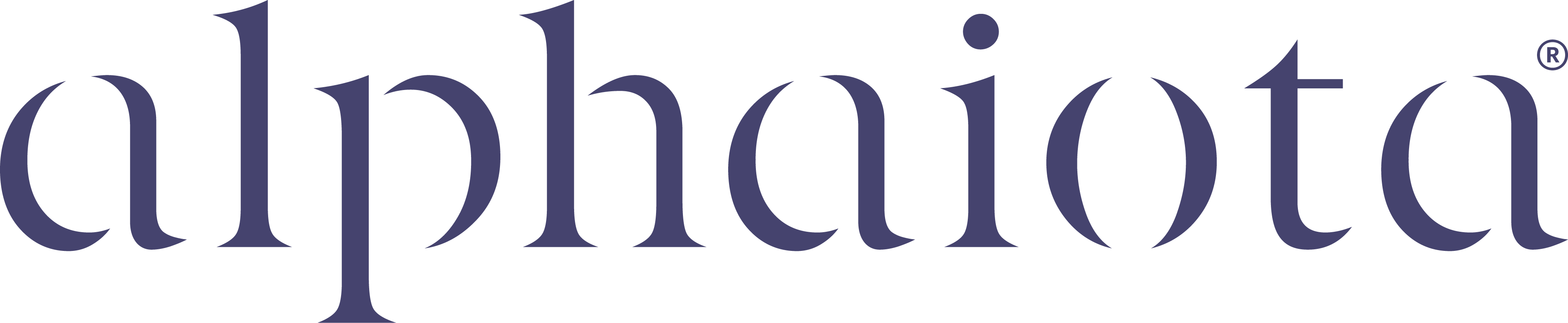
Logo
-
This brandmark is used in all scenarios, offering the best legibility. Always use the master artworks provided and do not try to create any part of the brandmark.

Logo Clear Space
& Minimum Size
-
The clear space has been created to be proportional to the brandmark. For this purpose, the x height of the 'a' has been used to create a minimum clear space of sufficient height and width.
To ensure our brandmark is always visible we’ve
determined a minimum display size for both print and digital applications.
Shown on the right is a diagram outlining the
construction of the minimum space and minimum size.


Logo Misuses
-
To avoid inconsistent reproduction, use
the brandmark artwork provided. Here’s a
list of the more common mistakes made
when using the alphaiota brandmark:
1 - Do not rotate logo artwork.
2 - Do not scale the artwork disproportionately.
3 - Do not recreate the brandmark in
alternative colours.
4 - Do not recreate any aspect of the wordmark.
5 - Do not apply effects on the brandmark.
6 - Do not crop the brandmark; it should appear
in its entirety at all times.
7 - Do not set the brandmark within devices.
8 - Do not place the brandmark on a background
that provides insufficient contrast.

Icon
-
The Alphaiota brand has a supporting brand element in the use of an icon. This icon is used sparingly throughout the brand.
We do not use the icon instead of the brandmark in any scenario unless it’s within the Alphaiota brand ecosystem.
Minimum Size
To ensure our icon is always visible we’ve determined a minimum display size for both print and digital applications.
Always use the master artworks provided and do not try to create any part of the brandmark.
Colour Palette - Primary
The colour palette is important to our brand, it truly reflects the brand’s personality and has a direct effect on how people perceive us as a company. The primary palette is used for all outward and internal communication.
Deep Indigo
Skin
White
Colour Palette - Secondary
Our secondary palette is used in limited scenarios and is reserved for internal documents such as presentations to help give breadth to the brand.
Pink
Lavender
Violet
Turquoise
Cyan
Typography
-
Aphaiota's primary Latin and Arabic typeface is Graphik. It has been chosen for its modern, future-focused personality. The font is bold, legible and sophisticated when used in a lighter weight.
Graphik Light
Aa Bb Cc Dd Ee Ff Gg
Graphik Regular
Aa Bb Cc Dd Ee Ff Gg
Graphik Semi Bold
Aa Bb Cc Dd Ee Ff Gg
Graphik Light - Arabic
غرافيك عربي خفيف
Graphik Regular - Arabic
غرافيك عربي عادي
Graphik Semi Bold - Arabic
غرافيك عربي شبه داكن
Photography Style
-
Aphaiota's photography champions the people who benefit most from our business, the doctors and patients. We use portrait shots, in black and white to add a level of precision and sleekness. This compliments our abstract photography that focuses on the miro nature of the healthcare business.
Doctors and Patients


Micro Healthcare


Brand Pattern
-
Our brand pattern is a visual interpretation of AI working in the backdrop as a supportive role in the healthcare industry.
Brand Applications


For more information, contact the marketing and creative team at Alphaiota.
Back to top