
01
—
Logo
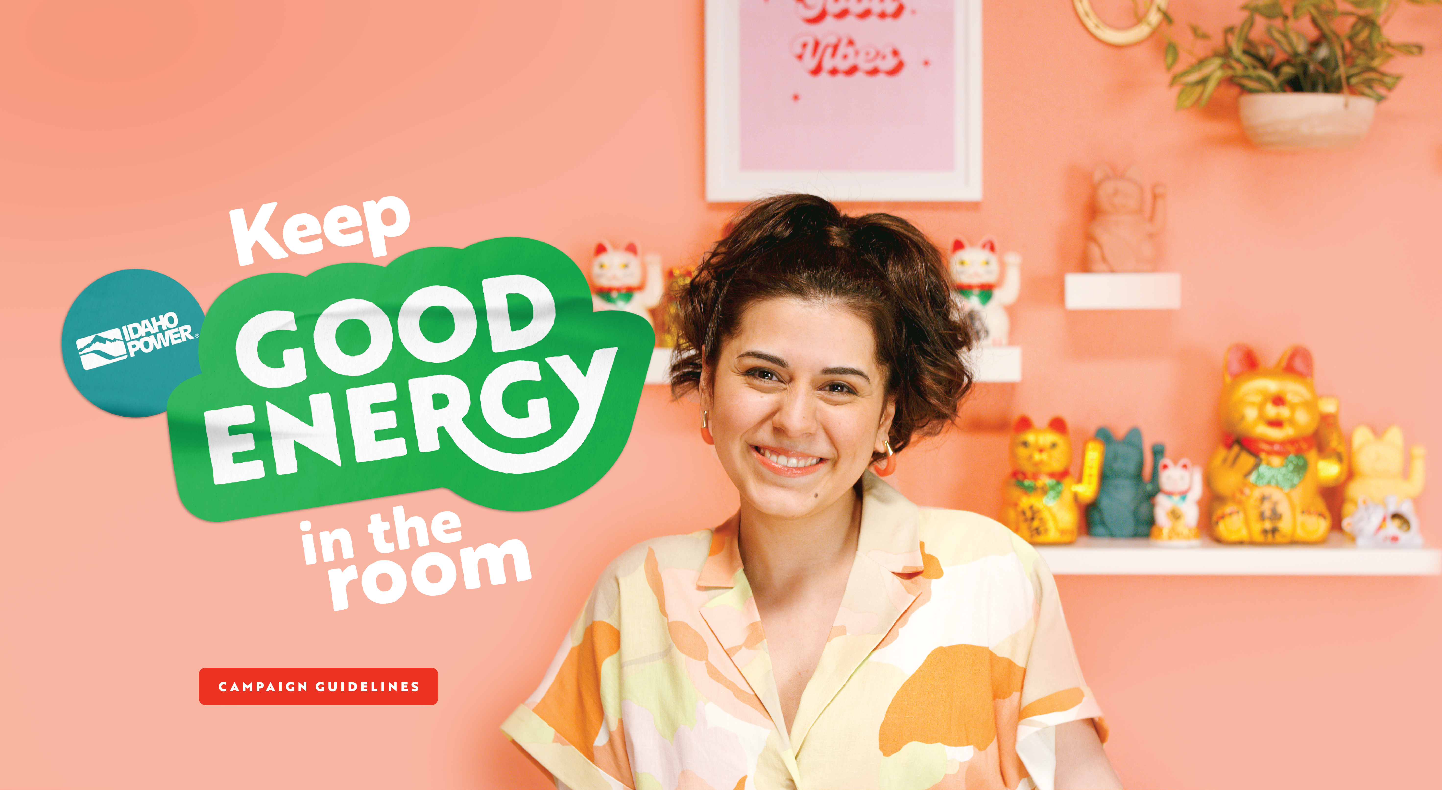
The logo for the Good Energy campaign is designed to be approachable, playful, and exude positive energy. It has been transformed into a sticker that can be applied to a variety of backgrounds, including images, textures, and solid colors. As the logo already has a lively and creative purpose, there is no need to add any additional elements to it. The sticker design allows the logo to stand on its own layer, further emphasizing its unique and vibrant qualities.
There are two color option logos to use. The preferred logo is the Idaho Power bug paired with either color option of the Good Energy mark; however, depending on the medium and application, the full Idaho Power logo bug option can be used. When selecting which color option works best for the design, make sure it compliments and is the hero. B&W versions are also available to use when color is not accepted.
A Spanish version of the logo has also been created. All guidelines above and below pertain to this logo as well. These are a part of the full suite that can be downloaded below.
See Do's and Don't or Applications for correct usage.
_
Good Energy + Idaho Power Bug Logo
(Preferred)


_
GOOD ENERGY + Full IDAHO POWER LOGO
(Use when necessary)


—
Access to Assets
All digital assets will be in Photoshelter. For access to video files, contact Annie Meyer.
02
—
Dos & Don'ts
To ensure the integrity of the logo and branding of the campaign, please adhere to the guidelines below.
DON'T
separate circle bug from logo.
DON'T
change colors of the logo.
DON'T
change the tilt of the logo.


DON'T
add a drop shadow to the logo.
DON'T
add an outline to the logo.
DON'T
stretch the logo.


DON'T
create playful hand drawings or elements to support the logo. Do not overlap with other sticker assets.
DO
stack type headlines with logo. Ensure the type has the same angle as the logo.
DO
use the sticker logo the majority of the time. If a vector logo is needed, contact the Idaho Power brand team.


03
—
Color Palette
The campaign's color palette is from Idaho Power's corporate brand guidelines. This palette can generate multiple color combinations that keep the design fresh and playful. Recommendations for combination usage are defined below the colors and values.
_
PRIMARY COLORS
Idaho Power Green
CMYK: 89, 0, 90, 0
RGB: 0, 175, 63
HEX: #00AF3F
Idaho Power Teal
CMYK: 100, 0, 30.5, 23.5
RGB: 0, 135, 137
HEX: #008789
_
SECONDARY COLORS

_
Recommended Color Combinations

04
—
Fonts
Primary Font:
Brother 1816 Printed
Logo Typeface, Headers, and Subheaders
ABCDEFG
abcdefg
123456
Secondary Font:
Frutiger
Body copy
ABCDEFG
abcdefg
123456
—
Brother 1816 Printed is an Adobe Font and can be utilized with your Adobe subscription. For access to Frutiger font files, contact Idaho Power's brand team.
05
—
Typography
The Good Energy campaign uses type stickers/bubbles to communicate tips. Use the step-by-step instructions below to create custom messaging.

1.
Set the kerning to -50. Stack the type to be visually pleasing. Tighten leading — this will need to be adjusted line-per-line depending on ascenders and descenders.
2.
When adding the stroke, the weight will depend on the medium and size of the type. Have your team use their best judgment based on the above sample. When increasing the point size, you may see spikes and imperfections.
3.
Once the stroke is applied and the outlines have been created and expanded, use the pen and smooth tools to define and shape the border where needed.
06
—
Applications
Below are prototypes for layout and design that utilize all of the elements above for creating the Good Energy campaign look and feel.


07
—
File Formats
& Color Modes
All logos in this style guide are available in three basic file formats for use in different applications and environments. There are also three basic color modes found in the 'Good Energy' campaign for use in different applications and environments.
EPS Format
EPS is a vector format designed to produce high-resolution graphics for print. It is infinitely scalable — which means it can be used for anything from a business card to a billboard with equal clarity.
JPEG Format
JPEG is a raster image type. JPEGs are primarily used for web and digital photography because of their small file size, but should not be used for printing unless used at a small size.
PNG Format
PNG is another raster image type. The main difference between a PNG and JPEG is that a PNG can have a transparent background and is generally larger and of higher quality. PNGs are ideal for websites because they can be placed over a colored background.
CMYK Color Mode
The CMYK color model is often called a four-color process because it utilizes four ink colors (cyan, magenta, yellow and black) to create various hues. CMYK colors are mixed during the printing process, which can sometimes cause slight color inconsistencies throughout a printing run. It’s usually an imperceptible change, but it’s something to keep in mind when using logos with specific color branding.
RGB Color Mode
The RGB color profile is used exclusively in digital design and represents the same colors used for computer screens, televisions, and mobile devices. Rather than ink, colors in the RGB (red, blue, green) color wheel are created by blending light.
HEX Color Mode
A color hex code is a hexadecimal way to represent a color in RGB format by combining three values — the amounts of red, green, and blue in a particular shade of color. These color hex codes are an integral part of HTML for web design and remain a key way of representing color formats digitally.